The utilization of huge professional photos, which easily fascinates onlookers by their spectacular scenes, as solid backgrounds for website design is an everyday occurrence. In order to fully understand and appreciate why web designers simply adore this approach just check out our previous amazing collection of 60 Websites Using Full Screen Photographic Backgrounds.
Without doubt, the main reason is their natural ability to enormously enhance visual experience as well as greatly facilitate the process of putting users in a proper mood. Using an image background allows you to kill two birds with one stone. First of all, as I mentioned previously, it is a great way to create an eye-catching and memorable design quickly and effectively, and secondly it is a perfect option for showcasing your best artwork in all its glory.
Moreover, practice shows that there are no limitations and requirements, designers make use of many different photos from minimal vista images and to emotional human themed portraits. You can use any photo you like as long as it fits like a glove.
Today we are going to look at a specific category that covers dark photo backgrounds. Being a bit enigmatic and totally engrossing they, in the first place, are used to offer a startling contrast between backdrop and foreground. Thanks to blackout canvases it is much easier to highlight taglines, widgets, icons and data.
Besides you won’t have any serious problems with color matching since black as well as white is perfectly paired both with light and bright color schemes. Although such designs can seem gloomy and restrained, they naturally stir up our interest and give us a boost to explore and examine a website.
Website Design Featuring Dark Photographic Backgrounds
The list below includes fresh examples of website designs that are skillfully based on magnificent dark photo backgrounds.
The Blue Cube
The Blue Cube has a neat and refined website design that provides sharp contrast for better eye perception. The slightly grainy dark background perfectly emphasizes the light data blocks.

Employour
This site has a pleasant working atmosphere that is mainly achieved due to the full screen image background. The latter is intended to demonstrate the office interior in order to recreate a sense of openness and reliability.

Welcome Web Studios
Welcome Web Studios has a nice urban vibe that is barely perceptible. The obscure cosmopolitan image in collaboration with almost glowing neon lettering significantly enhances the theme.

Hotel Bourg Tibourg
The image used gently drops a few subtle hints about sophisticated and intimate ambiance inherent to this hotel. The website even looks enigmatic due to interesting play of shadows and soft light.

Tower Films
The designer has skillfully made use of a beautiful night urban photo to create a solid background that highlights a white huge tagline and establishes a proper atmosphere in order to convey the necessary feelings.

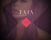
Tara Damiano
Diagonal lines and geometric touches are two main factors of this unique and slightly cryptic design of a front page. It is based on a darkened gorgeous photo of a model that perfectly interacts with a small red diamond button and light lettering.

The Website Dedicated to Hashima Island
This design has a natural oriental charm. The Asian characters with an obvious brush like stylization ably liven up the theme and effectively cooperate with a dark rustic background.

Shoot and Develop
This site demonstrates a refreshing take on a minimalism. The designer utilizes a bleached natural scene that instantly fascinates by its dynamism and power of water flow that is nicely complemented by a simple font.

Quentin Leclercq
The spectacular shot of a night city landscape is bolstered by several semi-transparent blocks that unveil navigation and biography sections. As usual, a classic contrast between black and white easily achieves optimum balance.

Payback Time
Here the dark background – that partially reveals a workflow – is aimed to provide a solid base for the tagline. The white casual font certainly looks clear and lucid. The slightly noticeable outline box that is set against the lettering slowly rotates, adding a special zest to the home page.

Martini
An advanced full screen image slider serves as a proper background as well as demonstrating vivid photos. The designer predictably chooses a light coloring in order to effectively distinguish text from the backdrop.

Lifesaver
Lifesaver is a promotional website. The front page features an episode of a film by Martin Percy. The background is intentionally blacked out in order to focus users’ attention on the essential foreground elements.

Snapwire
This is a magnificent one-page website that depicts an amazing urban image background with a lovely bokeh effect. The slightly obscure image effectively pushes the eye towards the CTA buttons and text.

Cody Sielawa
Here is a simple but offbeat portfolio that fixes onlookers attention to the huge conspicuous tagline. The latter naturally mutes the background with an exceptional cosmic image.

Jacu Coffee Roastery
It’s not surprising that a website dedicated to coffee utilizes an alluring background that showcases coffee beans. The chocolate-colored backdrop is nicely supported by neat white typography and light graphics.

Magnasoma
This design instantly engages visitors with its fantastic abstract background. Although the backdrop is quite complex and intricate, on the whole the website looks minimal and modest due to a lack of extra decorations and spare text.

Flandria
The soft red and orange shades in tandem with a sleek halftone effect give the image background its unique and exceptional appearance. The orange solid bar at the bottom along with a white common type doesn’t distract the user’s eye from the masterpiece.

Alcyon
This design has a nice asymmetrical appeal that adds to the website a sense of movement and dynamics. The central circular animated navigation with low opacity interacts with the background and adds a note of elegance.

Eureka Software
The large ultra-thin font in conjunction with a peculiar polygonal translucent neon logo goes quite well with the high-tech metropolis scene that is set on the background.

Mountain View
This design includes a remarkable image backdrop that simply attracts visitors by means of a subtle 3-dimensional feeling, there are numerous vibrant abstract graphical elements scattered throughout the screen creating a delicate, natural theme.

MediaBOOM
This is a grid-based website that makes use of a dark background in order to bring the portfolio pieces into sharp focus. The designer employs a cinemagraph to add dynamism to the website.

Black Raccoon
The designer has used a natural scene to reinforce the theme and offset a subtle delicate text.

Image Conscious Studio
The white lettering in the center, in conjunction with bright yellow accents perfectly stand out from a dark halftone canvas.

Invictus
This is a sophisticated and interactive website based on a traditional parallax scrolling effect that is aimed to stir interest and promote the Invictus Award. Each section includes its own sport themed dark image background.

Conclusion
Although we are accustomed to black on white, assuming that light designs look more pleasant and beneficial, actually, black on white and white on black have a lot in common. They are both able to properly maintain a correct balance and effectively provide a solid basis. Moreover, there are some cases when dark photo backgrounds own clear advantages over others.
Which of these sites do you prefer more? Why? Are you a supporter of such an approach? Share with us your thoughts via the comments.


