Developers are accustomed to employing a grid system as a solid foundation for their websites; thanks to that, they are capable of overcoming various challenges during prototyping. They not only simply work it into a project but also get creative with it thereby offering interesting solutions that, as a rule, include trendy styles or high-end effects. As a result not only the functional side of the project stays safe and sound, but also the front end has something to show off.
All the advantages of modular structure come from a notion that grid associates with harmony: it helps effectively organize multimedia data thereby presenting a pretty balanced structure that can be easily interpreted by regular users; it enhances usability by providing readers with easily and quickly digestible pieces of information that allocated from each other in a simple and comprehensible manner; it reinforces information hierarchy; it assists in avoiding chaos on your content-intensive website and much more. Even though grids can sometimes can be slightly disproportionate with asymmetrical balance, it is still capable of sorting and managing your data quite effectively.
Let’s take a look at some fresh examples that depict website designs based on a grid style layout.
Websites Using a Grid-Style Layout
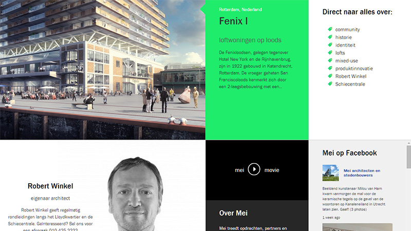
1. Mei Architects and planners
Flat style and grid-based layout on this website looks like they are made for each other. The designer harmoniously mixes bright solid color blocks with image-based blocks, giving the front page a clean and well-organized appearance.
2. Lardini
Fashion-related websites always include a batch of marvelous photos that need to be presented in a non-intrusive manner; in this case utilization of a grid system is more than just desirable. Lardini is an excellent example of this; its home page looks well-organized and stylish.

3. W3
Here, the section with listed advantages is noteworthy: it has a lovely boxy vibe. The team uses a bright square grid populated with contour style graphics that instantly give a notion about the benefits that you will get.

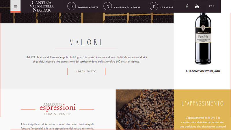
4. Cantina Valpopicella Negrar
This website looks subtle and absolutely refined, conveying a luxury atmosphere, exactly how a website that promotes exquisite wine should look. The modular approach that naturally collaborates with clean soft backdrops and line style icons helps to build up the design aesthetics.
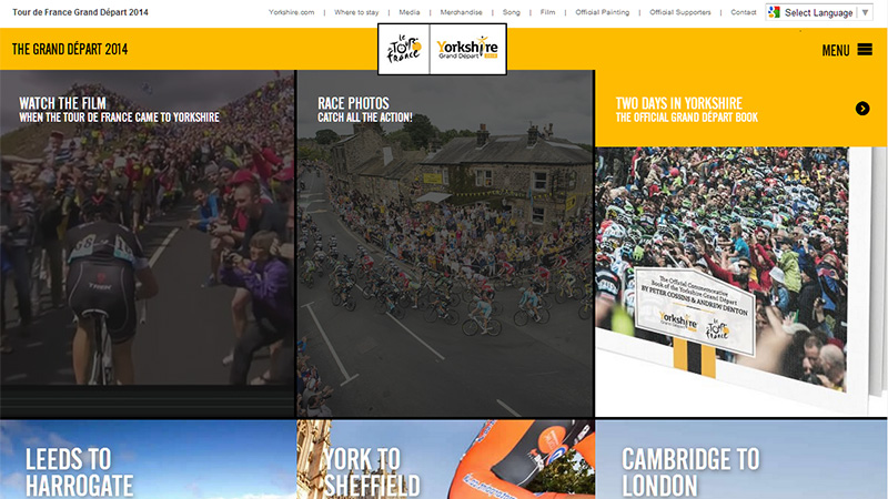
5. Le Tour de France: Yorkshire Grand Depart 2014
Websites that are rich in multimedia especially in videos are usually powered by grid layouts, since they allow avoiding visual clutter as well as help to provide a clean and pleasant way of exploring the content. This project is an excellent example of that. The front page lets you easily scan various videos and not get overwhelmed.
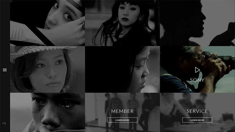
6. Tokyo Mild Foundation
Want to thrill regular users with a dozen gorgeous photos and not scare them away with an over-abundance of visuals and emotions? Then try to put into work a grid layout bolstered by gentle dark coloring that will definitely help to achieve the desired output.
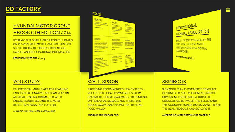
7. DD Factory
Here you will find a nice blend of a simple grid and dynamics. The team does not bother about incorporating lavish backgrounds or spectacular photo manipulations, they win over potential clients with the help of simplicity supported by cutting-edge effects.
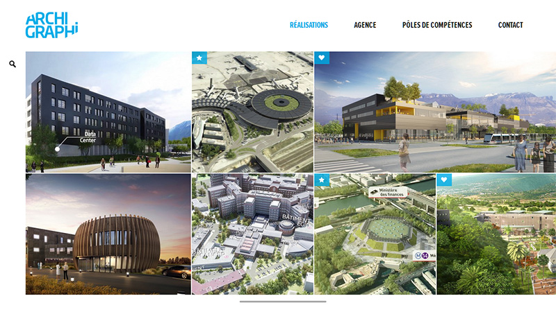
8. Archi Graphi
The front page of this splendid online portfolio depicts the latest works of the master. The website features various clever design traits. Discolored images, well-crafted solid icons, smooth blue coloring and flat style are skillfully enclosed into a well-balanced grid that provides users with an accurate page design.
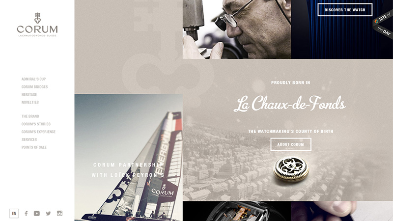
9. Corum
Line style and rectangular shaped graphics always stay in harmony with grid-based designs. Straight lines, clear segmentation, solid color side panels and delicate typography not only manage to recreate a subtle appearance but also effectively highlight images and copy.
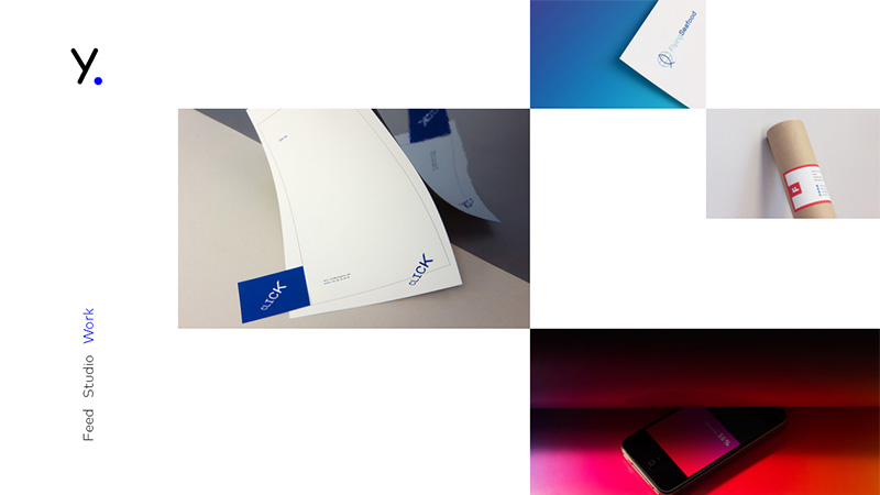
10. Your Local Studio
Here the designer gets the most out of skillful use of white space that is aimed to unobtrusively direct users’ attention to the portfolio pieces. The home page looks spacious, sleek and rather informative.
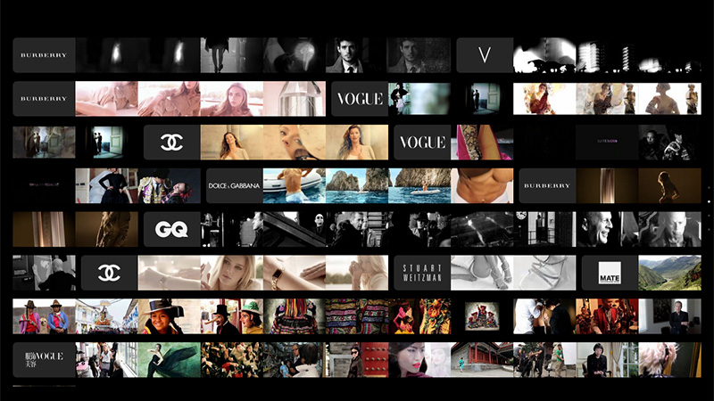
11. Look Films
It seems that the team is eager to accommodate all works in one place. There are a great deal of miniatures that characterize various projects. In this case, the website simply couldn’t do without a grid system, of course, if you care about a pleasant and comfy user experience.
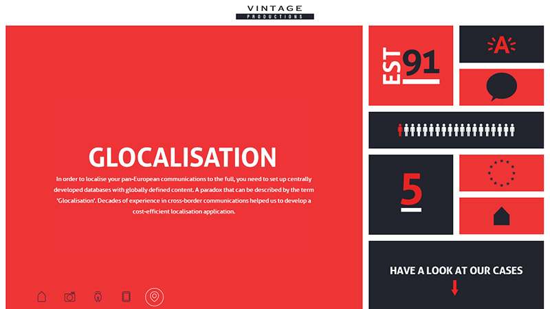
12. Vintage Productions
Here the design aesthetics strongly rely on a grid system that not only underlies the project but also is laid on the surface. Colorful, flat style blocks compactly and concisely cast a light upon the agency’s statistics.
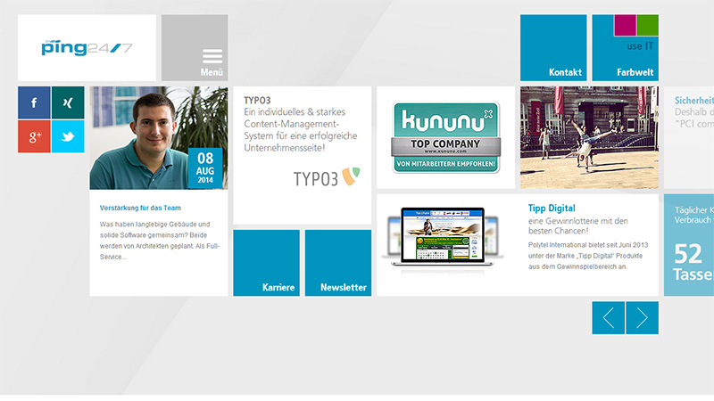
13. Ping 24/7
This landing page has a strong boxy appearance. The rectangular-shaped and square-shaped forms are tightly packed together, so that they perfectly fit into a standard browser screen and at the same time manage to demonstrate integral elements of any online portfolio such as social media, menu, clients, etc.
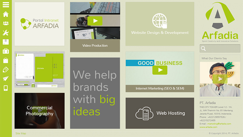
14.Arfadia
This website conveys a really serene and positive atmosphere despite a content-heavy appearance. Grid layout in tandem with soft greenish coloring and minimal sidebar navigation foster a harmony.
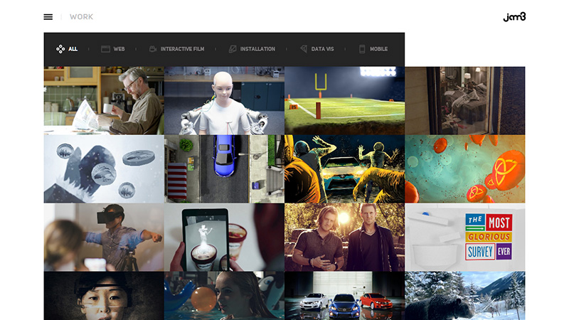
15. Jam3
Here you immediately immerse yourself in a sea of featured works, so that a grid structure is an indispensable thing. Even though there are no white spaces, margins/paddings, indents between cells – they are just tightly packed together , the page still has an organized and neat appearance.
16. imagina nas ferias
Though the welcome section includes a dozen fancy vibrant vector illustrations densely arranged together that come to life on demand, you are still able to enjoy them to the full due to a well-thought-out differentiation through coloring and an accurate grid layout.

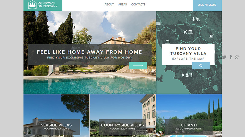
17. Windows on Tuscany
As a rule, image-intensive websites face various sorts of challenges that can turn away regular visitors, so that opting for a time-proven solution of incorporating a modular layout with several dynamic features and flat style elements instead of reinventing the wheel allows saving your time and providing visitors with a pleasant experience.
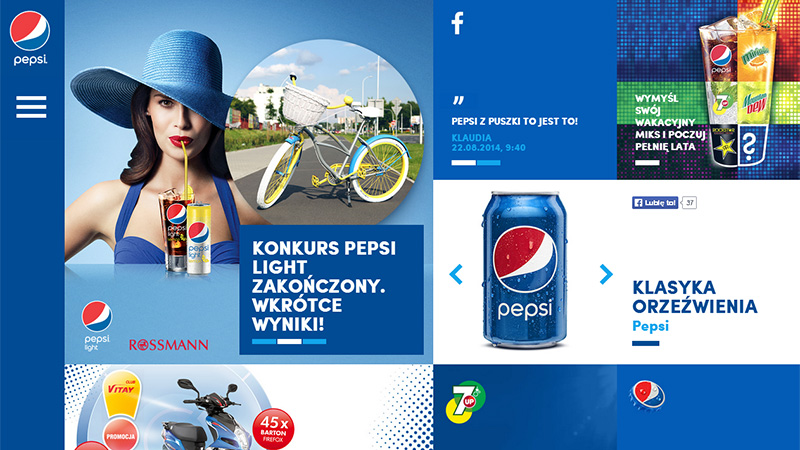
18. Pepsi
This promo website is aimed at inspiring the online audience to action through visuals. Here, blue and white tones totally dominate so in order to not get lost in all this colorful madness, the page is based on a grid that distinctly separates one area from another.
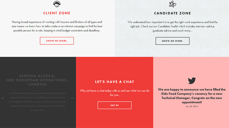
19. Nova Search
This website brings a businesslike feeling with its flawlessly executed design, flat colors and neat graphics. Relatively huge blocks that cover such essential elements as twitter widget, testimonial section, contact form, client and candidate zones form one visually-pleasing grid.
20. Gude Stoff
Though the utilization of a grid structure here is not as obvious as on previously mentioned examples, the front page is broken into 3 equal columns with irregular cell sizes. This solution clearly singles out images, graphics and monochrome blocks.

Conclusion
You may not even be aware that the basis of almost every site is a grid. Of course, as a rule it is hidden from prying eyes; however there are websites whose forefront appearance derives substantial benefits from showing it off.