
When you create a website, you want it to live a long happy life. That is the reason why you study all the latest trends so carefully. However, the problem is that web fashion is fickle, especially now when technologies evolve with lightning speed. How do you secure your website against early aging? Of course by looking into the probable future of current trends.
Here is what we did for you: a brief topical research among the web development community. Below you will find information on web design trends that are likely to continue at least for the next year. So, you can safely use them for your designs. We hope this will help to prolong your website’s life.
The Future of Web Design Trends
More Design Less Programming
The community believes that web designing will become more a part of designing and less the part of programming. From our viewpoint this is great news especially for those who don’t want to learn complicated coding. The truth is that lots of frameworks available on the market today already make the designers not have to mess with the code as much as they had to before.
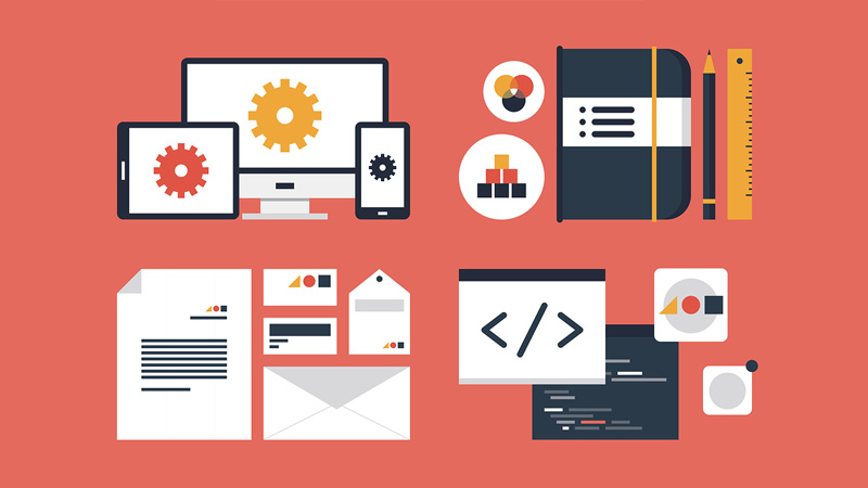
Image credit: Bigstockphoto
Open Source
This point should also make the designers shriek with joy. As according to the majority’s standpoint an open source way of web designing, with all the sets of tools in open source are going to thrive. That could definitely help in ways of increasing margins in future, if someone is looking forward to entrepreneurship in web technology and web site development.

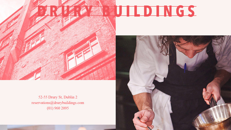
Looking Good
The following trend is going to grow more in the future as every business is critical in terms of their web presence. The market is going to be more demanding on good looking, prominent and spectacular web site designs, rather than just content. So the major areas someone has to focus on are image processing as well as new lightweight and faster technologies.
Less is and will be more in the future
We don’t think that this point needs any explanation as minimalism has grown in design so deeply, that now it’s simply impossible to uproot it from the cohort of other trends. And what is even more important, there are no reasons for that. So, we expect it to turn into over-minimalism.
More scrolling and less clicking
Web design practice shows that infinite pages don’t rile the visitors; on the contrary, they boost interest to the content. As to clickable buttons, multiple buttons confuse the user. If you want somebody do something (like clicking the button), it’s always better to narrow the aim (focus customer’s attention). In other words, the website that is targeted on one aim and has only one button will be much more efficient than its competitor with several goals and the same quantity of buttons.
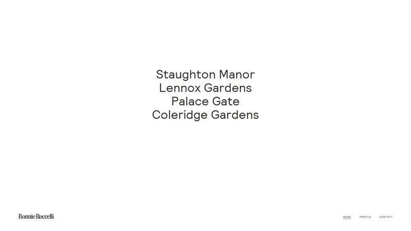
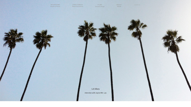
Less text
Try to make text as concise as possible. This tip emerges from the fact that people like to save time browsing the internet from portable devices when they have free time, that is, on the go. So, it’s quite logical to make the text shorter in order to convey your message as quickly as possible to the end user.
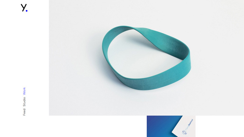
Vibrant colors
Using bright colors to emphasize the important information is a good move, especially taking into account the general web tendency towards pure, clean layouts.
Simplify everything
Making things simpler shows your care for the user. So, this trend is going to develop throughout the current and coming years and who knows when perfection will be reached.
Symmetrical layouts
Symmetry and asymmetry play important roles in web design. Surely, using symmetry or asymmetry depends on the specific case. But it’s beyond any doubt that symmetrical layouts look habitual, traditional and stir a sense of trust in users minds. The web community thinks that apps look more appealing when designers use this technique for their creation. In any case, when in doubt, recollect the golden ratio to ensure that your layout is eye-candy.
Disconnect design from content
By this statement we mean that designs will continue to become universal which will make them even more affordable due to the cost decrease.
Pastels
Pastel hues are forever in vogue, no designer and no yearly trends can do without them. So, it’s not surprising that this has a place in our list.
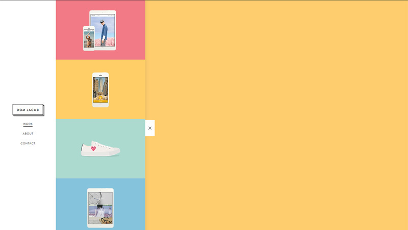
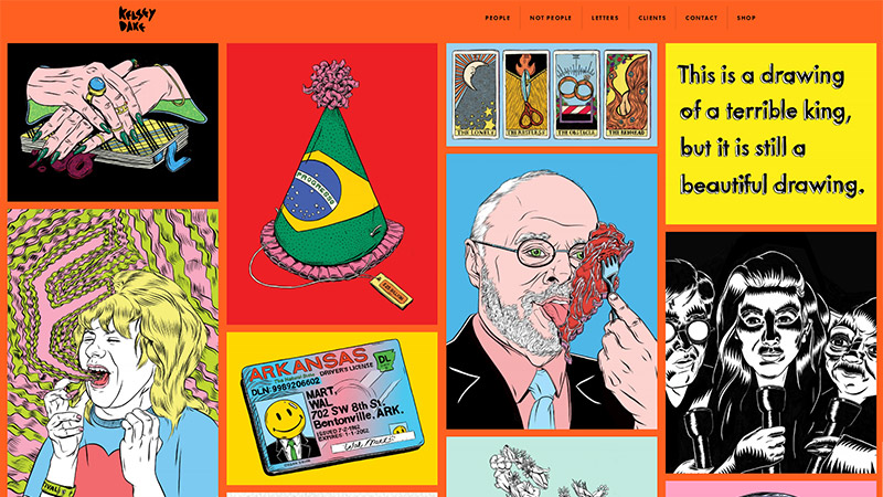
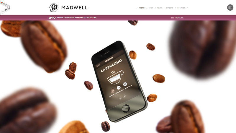
Less photos – more vectors
It’s obvious that this item is closely connected with responsive design, which has become a must-have in today’s realities. We don’t think that you will argue the fact that very soon all websites will become responsive. It’s really convenient for website owners as they don’t need to manage several versions of the same site to reach more customers and for users who are not limited by the choice of the device they use for internet access. We don’t want to say that photos will be completely replaced by vectors as they are really aesthetically beautiful. However, we bet that every developer will agree that vectors are much more usable for responsive design, and photos still remain one of its biggest problems.
Physics based animation
Advanced contemporary technologies already allow creating physically based animations. Such natural-looking animation is often motivated by the need to include complex, physically inspired behaviors in video games, interactive simulations, and movies.
These methods are intended for applications that necessitate physical accuracy and slow, detailed computations. Techniques in physically based animation are concerned with physical plausibility, numerical stability, and visual appeal over physical accuracy. Physically based animation is often limited to loose approximations of physical behaviors because of the strict time constraints imposed by interactive applications.
The target frame rate for interactive applications such as games and simulations is often 25-60 hertz, with only a small fraction of the time allotted to an individual frame remaining for physical simulation.
Simplified models of physical behaviors are generally preferred if they are more efficient, easier to accelerate (through pre-computation, clever data structures, or SIMD/GPGPU), or satisfy desirable mathematical properties (such as unconditional stability or volume conservation when a soft body undergoes deformation).
Fine details are not important when the overriding goal of visualization is aesthetic appeal or the maintenance of player immersion since these details are often difficult for humans to notice or are otherwise impossible to distinguish at human scales.
Parallax
Can you imagine the future of the web without miraculous parallax scrolling? According to our research most developers can’t. Parallax scrolling is a special scrolling technique, wherein background images move by the camera slower than foreground images, creating an illusion of depth in a 2D video game (website) and contributing to the immersion. The technique grew out of the multiplane camera technique used in traditional animation since the 1930s, and was popularized among video games in the 1982 arcade game Moon Patrol.
Flat Design
Current trends like flat design are not going anywhere for quite a while, so apply them safely in your designs.
Origami Style
Origami style may get further development. Why not? It’s original and illustrative.

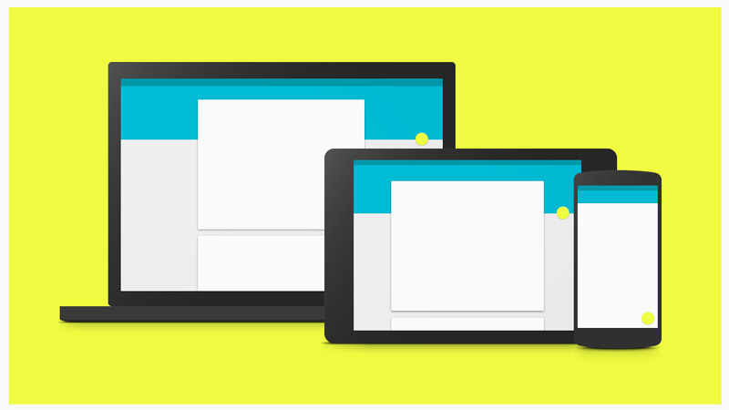
Material Design
For Google’s implementation of material design, they challenged themselves to create a visual language for their users that synthesizes the classic principles of good design with the innovation and possibility of technology and science. This is Google’s definition of material design. If you would like to know its goals and principles, click on the image.
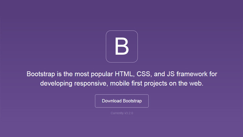
More and more websites turning to Bootstrap
Bootstrap is on everyone’s lips now and we expect it to gain popularity as Bootstrap is the most popular HTML, CSS, and JS framework for developing responsive, mobile first projects on the web. Designed for everyone, everywhere. Bootstrap makes front-end web development faster and easier. It’s made for folks of all skill levels, devices of all shapes, and projects of all sizes.
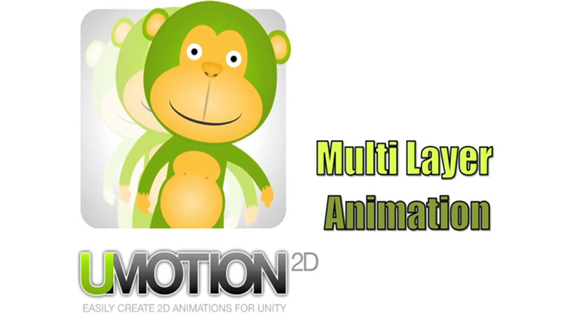
Multi Layered animations
We are waiting not only for a shift from photos to illustrations, but also for breathing life into each illustration layer. Have you seen something of the kind? It’s amazing!
Gamification
We all like playing games , so inserting playful elements like cheerful colors, funny, humorous personages, simple challenges when the award is waiting for the winner makes the user agitated, involved and happy onsite.
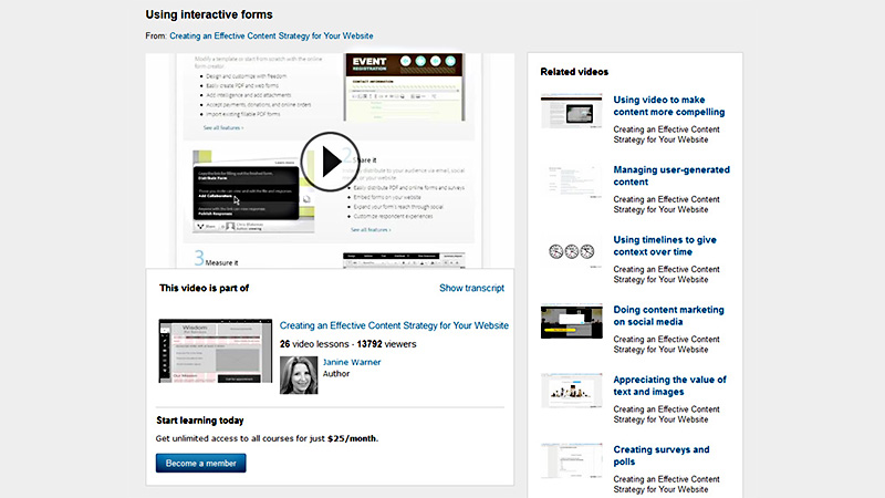
Interactive forms
You have to agree that users fill in forms more willingly when the form offers several answers to choose from instead of just questions and empty fields.
Video backgrounds with hover and clickable content
Sounds fantastic? If you don’t believe our words, you will definitely believe your eyes. Follow the link, please.
Mobile-like menu
Using a mobile-like menu only instead of desktop and mobile menus. Here we talk about the navigation menu that is hidden off screen until the user clicks on the menu icon, at which point the content slides over and darkens, and the menu slides in. The menu is also responsive vertically, filling the height of the browser window on whatever size screen it’s being looked at in. Quite usable, isn’t it?
Advanced responsive rearrangements through CSS and JS
The technology of making websites adjustable to any screen resolution is evolving together with web development techniques. Developers search for easier and better ways of making things work, and they find them.
User Centered Design Approach
A user centered design approach followed by more usability testing. Flat design, striking typography or bold imagery should depend on the targeted audience and not the client or designer’s preferences. We are sure that with the increase in implementation of gamification tactics and the death of elements such as the rotating banner (largely ignored by most users) we will see some interesting UI solutions.
Simplicity and story-telling
Some things never change. The simpler the UI is, the more chance your website has for success. And if, in addition, it tells an exciting story, the client is yours.
Conclusion
Do our predictions make any sense to you? Which of them do you agree or disagree with? Maybe you have your own thoughts on the topic?
Which of the current web design trends will die, which will be improved to perfection and which new trends will appear on the web design horizon? We really appreciate your opinion, so please share it with us.