
There are tons of articles and guides about color theory and its importance for every web designer. Colors are really essential in design and may even influence people’s behavior in many cases. Thus, web designers usually check their website colors are suitable for the overall website style and that they create a good impression for users.
But focusing on standard color theory web designers often miss one point. There is a small amount of people who see colors differently. The specifics of their eyesight don’t allow those people to see particular colors the way other people do. Your beautiful website with colorful accents may simply not work for those people. Since color blindness affects about 6% to 8% of males and less than 1% of females you could lose a significant amount of potential customers.
Improve Website Accessibility with Color Theory
Why Be Accessible?
Paying attention to website accessibility in terms of color combinations gives you many benefits. You can still make a great-looking website with an excellent color palette but you can also please lots of people with visual disorders who can now access most of your website’s features. Here are a few more reasons for you to choose accessibility for your website design:
- It allows you to score an advantage before your business competitors. If your website is color-blind-friendly and your competitor’s is not, you may win the battle and get more repeat traffic from this category of people.
- Accessible websites may rank higher with search engines.
- Non-accessible websites may fall foul of legal issues because they don’t provide equal opportunities for people with visual (and other) disabilities.
- The ethical aspect is also important. People with visual disabilities simply cannot use non-accessible websites in full. It’s frustrating and really hurts UX.
Despite your possible fears, making a website accessible for color blind people is not such a hard task. In fact, sometimes it’s even harder to make a non-accessible website. With proper planning and a clever use of color theory and color contrasts you can create a really cool website with a great UX.
Accessibility Challenges
Of course, making the website 100% user-friendly for ALL kinds of users is an impossible mission. First, it’s hard to determine how exactly color blind people see colors. To tell the truth, even average users with no color blindness perceive colors and hues differently.
There are researches that cast some light upon the idea of how colors are perceived by people with different types of color blindness. But they are not absolutely accurate, so predicting what a color blind user sees is still a challenge.
You can always prioritize website elements and content to improve it and make sure most people will see it properly. There are many ways of making vital elements stand out and user-friendly. And you should definitely make sure that those essential elements are color blind safe. The best way of doing so is using contrasting colors for the background and the element itself. Thus, the traditional use of black text on a white background is determined by the high contrast between those two colors. Navigation elements should also be highlighted so users can easily differentiate between links and the main content.
Using Color Theory for Color Blind-Safe Design
The very first step in creating a color blind-safe website is choosing legible and well-matching colors for your color palette. Your task is setting aside color meaning and psychology and focusing on good color combinations and contrasts for creating legible website pages with strong hierarchy and accents.
You can use the following techniques and approaches to avoid possible pitfalls and have an accessible website design:
1. Avoid “Bad” Color Combinations
The most common types of color blindness are the difficulty of distinguishing between red/green and yellow/blue. So, avoiding those combinations can save you from offering a frustrating experience for color blind users. Other “dangerous” color combinations are:
- brown/green
- green/blue
- purple/blue
- grey/blue
- green/grey
- black/green
- yellow/light green

2. Color Contrast is Good
As you may notice, the “bad” color combinations above are inappropriate because they are poor in contrast. Yellow and light blue colors are too close in the amount of light so they will be extremely difficult for color blind users to distinguish between the two.
Remember that color blind users should be able to easily tell the difference between two colors, like ordinary people do. It doesn’t matter what colors exactly they see; it’s about them being able to perceive them as two different colors. Note that color blind people are reportedly better at perceiving bright colors rather than distinguishing the difference between dull ones.
3. Use Complementary Colors
Complementary colors (the ones that are opposite each other in the traditional Color Wheel) are the best for achieving a great color contrast that won’t affect color blind users. Of course, except for pairing red and green colors that are also opposite in the Color Wheel but are a big no-no for most colorblind users.
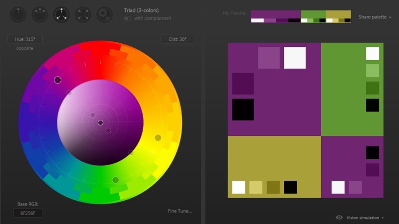
4. Choose Cool/Warm Color Contrasts
The Color Wheel can also be divided into cool and warm tones. Just divide it in half to set cool colors like blues, purples and greens aside from warm tones like yellows, oranges and reds. In most cases, contrasting between cool and warm colors works perfectly well and can be used for creating accessible designs. The idea is to combine a darker shade of a cool color with a lighter shade of a warm one. Don’t forget, that some color blind users have a yellow/blue type of visual disorder, so it’s better to avoid this combination.
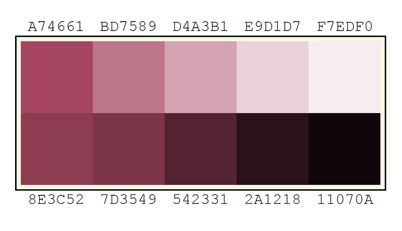
5. Opt for Monochrome Palette
To make sure you’re not using some poor color combinations that can be not color blind-safe, go for combining several tints of one color. Monochrome design saves you from making the wrong choice. In addition, a monochrome palette and minimalist style go hand in hand and make your website really trendy and user-friendly.
6. Use Texture and Thickness for Creating Accents.
Adding texture to one of your colors makes it more prominent and helps to show the difference between two objects. Thick lines and bold text will be helpful as well. Some color blind people note that they can differentiate between two colors if they have some “weight”, while thin lines and text in italic are much harder to differentiate.
Tools and Resources for Designing Color Blind-Safe Website
There aren’t too many tools and services that are focused on creating websites safe for color blind users. You can always check color combinations on various color palette generators and look for complementary colors, as I advised you above. Here are a few more tools and resources that should help you in creating a website that is easy-to-use for color blind people.
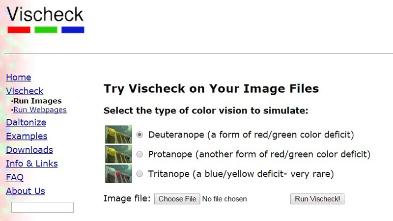
Vischeck
A nice simulator that runs tests on images and web pages. With its help you can find out how people with different types of color blindness (forms of red/green or blue/yellow color deficit) perceive them, and build your website according to the results.
Colors for the Color Blind
A great resource that contains tons of info about the nature of color blindness, its types and their peculiarities. It also offers various tests for colorblind users and tools for checking website colors online.

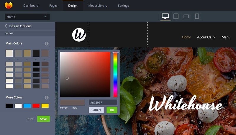
MotoCMS 3.0 Color Picker
This website building service offers a nice tool for checking colors. It automatically shows a color palette of a chosen template with 5 main colors and a row of hues for each of them. You can change the main colors and add new ones from the row below. The changes to the color palette will apply across the entire template.
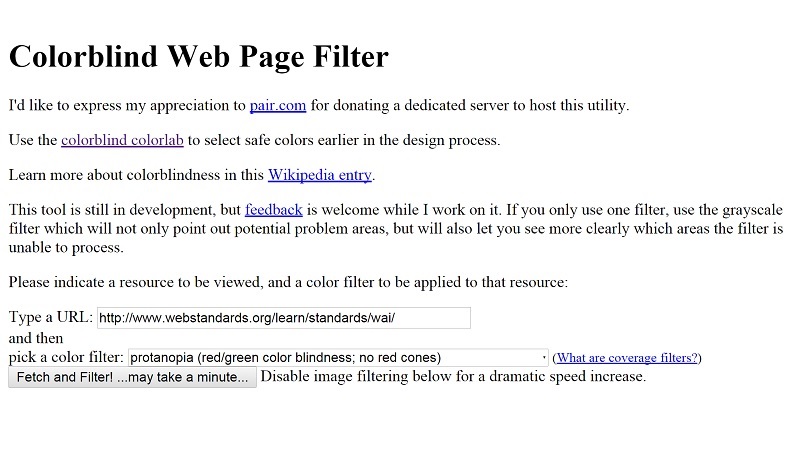
Color Blind Web Page Filter
This tool is still in development. But it already offers a cool range of filters that allow you to interpret your website as it is perceived by color blind people. You just enter your website URL in a field and choose one of the color deficiency types to check.
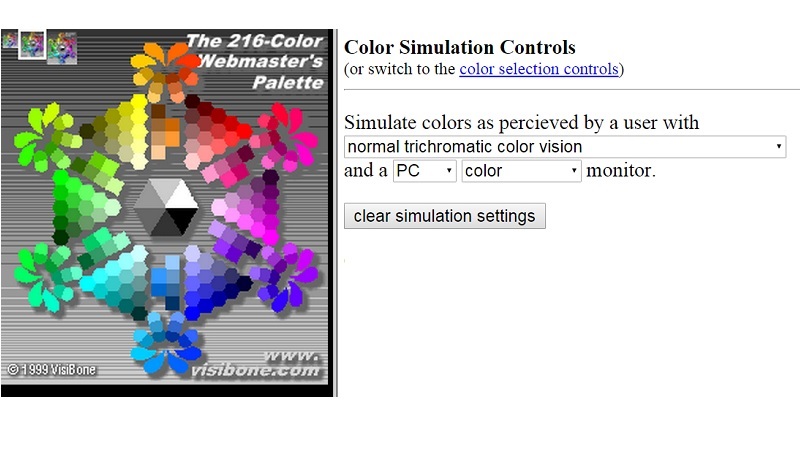
Color Laboratory
This tool allows you to check how the 216-color webmaster’s palette is perceived by people with different kinds of visual color deficiency.
Conclusion
Of course, website accessibility is not only focused on color blind-safe features. There are other aspects that you should consider to make your website friendly for all types of users. Start with tests and check often to make sure your website is comfy for use and your traffic will grow.


