
“People don’t buy food; They buy an entire experience.” And that is an absolute truth. Though we are accustomed to believing that our choice of restaurant, café or pub depends on cuisine, at the back of our minds, our final decision relies on numerous factors. And so-called “entire experience” plays an increasingly dominant role.
Of course, I do not diminish the importance of the food/dishes quality, but general feeling of the place as well as service should be on a high level. And establishing an ideal and inviting atmosphere that conveys a proper impression on your visitors begins with a well-thought-out, original and catchy visual identity.
So today, we want to reveal some excellent examples of restaurant brand identity. We have gathered different splendid projects in order to embrace various directions and styles, and as a consequence, to show you that this field can also amaze you with its ingenious solutions and clever ideas that are reflected on small pieces of paper such as menus, business cards, flyers, etc.
Restaurant Branding Campaign Examples
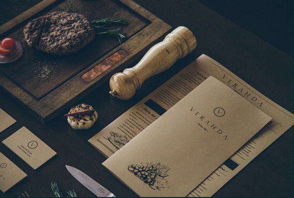
1. Veranda restaurant visual identity by Tibor Tovt&Forma Line
The visual identity of Veranda restaurant has a really classy and classic feeling. The designer leverages only time-proven materials such as wood and paper in order to clearly convey a quite old-timey and cozy atmosphere.
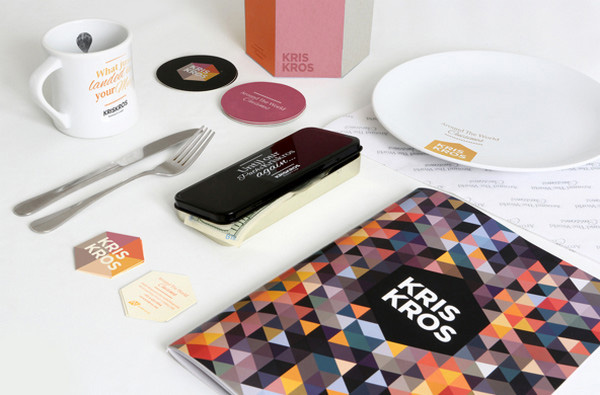
2. KrisKros by Noor Aghar
Unlike the previous example, the brand identity of KrisKros simply screams of modernity and freshness. The designer employs a geometric theme, recreating fantastic vibrant poly-style canvases and using a quite positive and rigid color palette in order to put visitors into an excited mood.
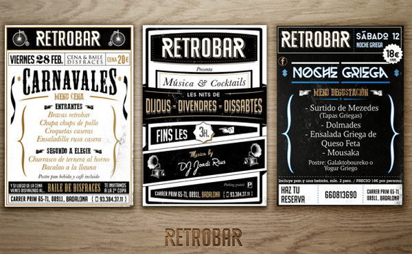
3. RETROBAR by Jose G. Bernal
As the name implies, everything here is going to be soaked with a retro air, so why not provide the restaurant’s guests with a topnotch type-inspired vintage-style flyer and menu that instantly draw you in. Though each piece presents all the information in a quite dense manner, this solution only adds zest to the project and enhances the whole idea.
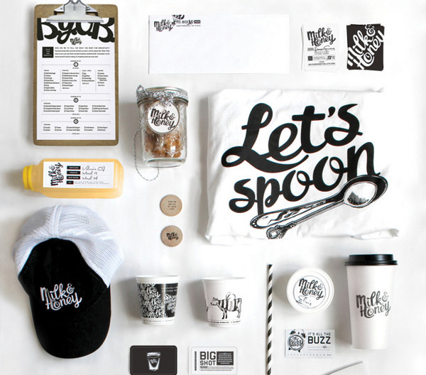
4. Milk & Honey by SeeMeDesign
Here, the huge slightly crooked typography is a highlight that simply speaks for itself. The designer skillfully makes use of a traditional color combination (that is black and white) in order to kill two birds with one stone. First of all, such an approach helps to reinforce readability of the project and secondly, to create a perfect visual aesthetic.
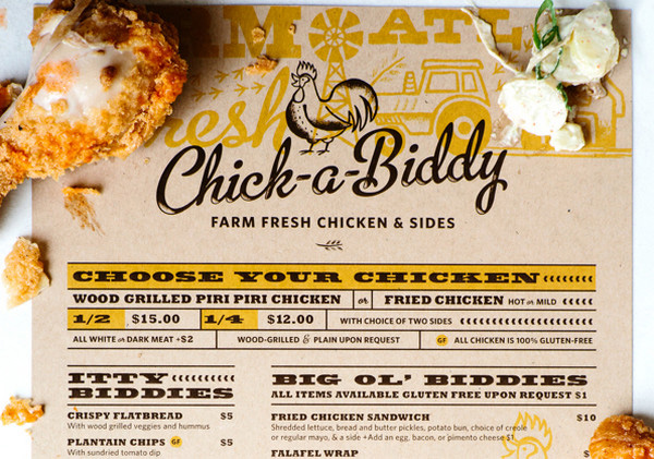
5. CHICK-A-BIDDY by Tad Carpenter
This brand identity demands your attention straight away. The designer utilizes an illustrative approach, which always has something to show. The warm yellow coloring, a funny picture of a chicken, rough yet quite expressive typography and lots of appropriate graphics that are tightly packed together, effectively create the right feel for the restaurant.
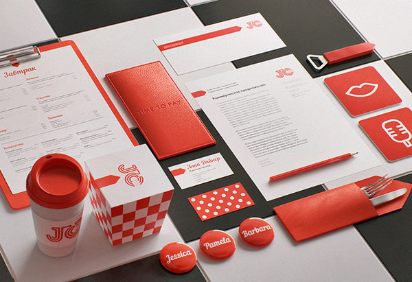
6. Jo by ho! Branding agency & Danil Volozhanin & Sergey Shishkin
The gorgeous coloring is what first strikes your eye. Though the designer keeps things sufficiently simple, the clean and neat appearance of each item in conjunction with the color scheme delivers a strong and overwhelming first impression.
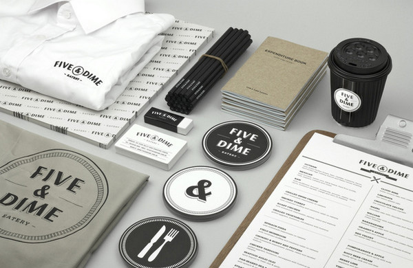
7. Five & Dime by Bravo Company
This is another matchless project in our collection that makes the most of the conventional color combination. The visual identity looks like an ideal experience that promises to satisfy your appetite for creativity and uniqueness.
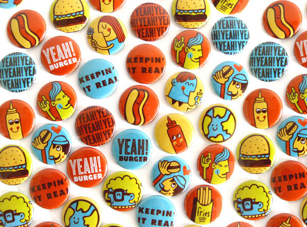
8. Yeah! Burger by Tad Carpenter
The designer does a really great job of creating a magnificent, quite memorable brand identity for a fast casual burger restaurant. The set of funny characters are bolstered by a riot of warm soft colors that altogether set the proper tone. Moreover, there are fantastic wall decals that are aimed at charming visitors with either amazing illustrations or with marvelous typography.
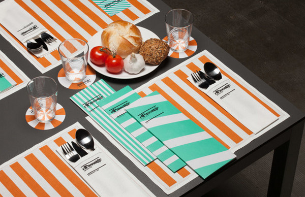
9. El Passatge by Mucho
This visual identity gives the feel of Mediterranean flair and cosmopolitan energy with its subtle coloring and geometric-style embellishments. Each item is based on an optimal combination of stripes and whitespace that add a creative edge to the whole project.
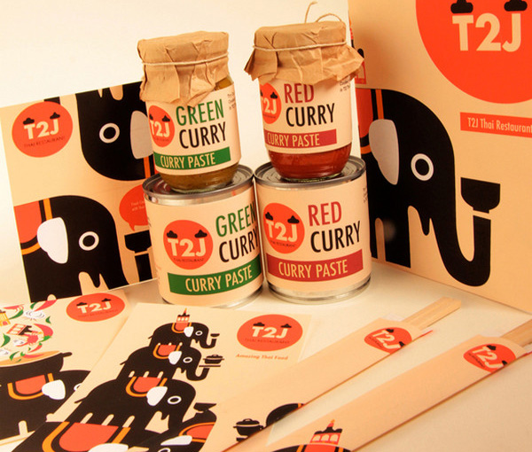
10. T2J Thai Restaurant by Bruce Ting-Yu Chen
Everything in this design is symbolic. Thus the huge funny illustration of an elephant characterizes the restaurant’s belonging to the Thai cuisine while the pastel warm color scheme that includes shades of green and red vividly portrays a famous curry paste.
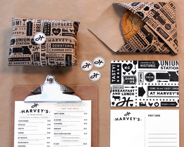
11. Harveys by Tad Carpenter
This project is rich in details. The massive typography and numerous eye-catching graphics that are capably assembled together effectively outline the friendly and convivial atmosphere inherent to this restaurant with a strong focus on travelers.
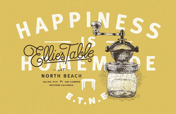
12. Ellie’s Table At North Beach by Brian Rau
How about delving into the good old days imbued with retro? The brand identity of this first-class bakery and café has managed to do just that. The team has worked for the glory by presenting exclusive vintage-style logos, menu, packaging and so on.
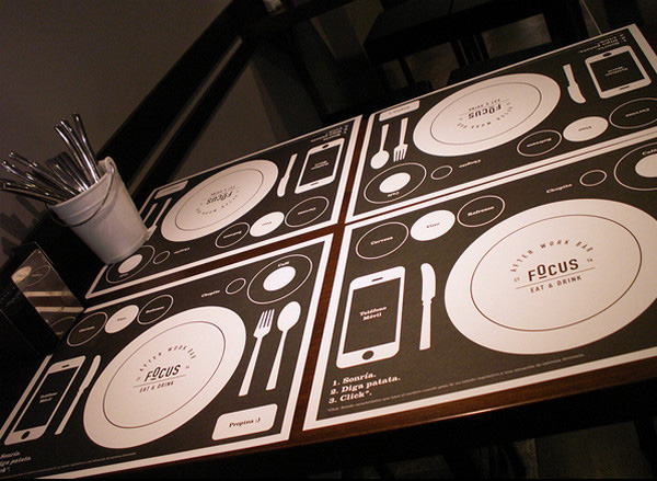
13. FOCUS Bar Branding by José Manuel Fuentes Muñoz
It seems that the restaurant’s brand identity is aimed at repairing breaches in modern etiquette by presenting a quite handy, and at the same time, instructive tablecloth for its visitors that should help them to properly arrange things.
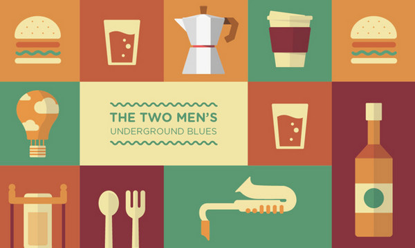
14. THE TWO MEN’S UNDERGROUND BLUES BRANDING PROJECT
The designer balances lots of graphics with ease in order to effectively contribute to the mood and atmosphere in the cafe. The flat-style symbolic illustrations in collaboration with a truly brilliant warm color scheme effectively draw visitors in.
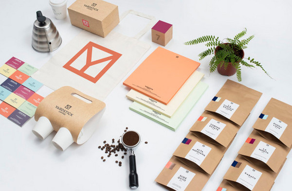
15. Yardstick Coffee by ACRE
The simple, unremarkable cardboard can also shine with creativity, especially when it is brightened by a nice color scheme, elegant typography and subtle logo. Here, neatness and modesty play the first violin.
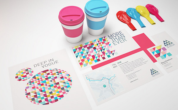
16. Ice Rock cafe by Sonia Ri
This brand identity gives immediately a glimpse of what this café is all about. The bright color scheme and lots of plain geometric shapes instantly tell you that the restaurant is meant for fun and pleasure.
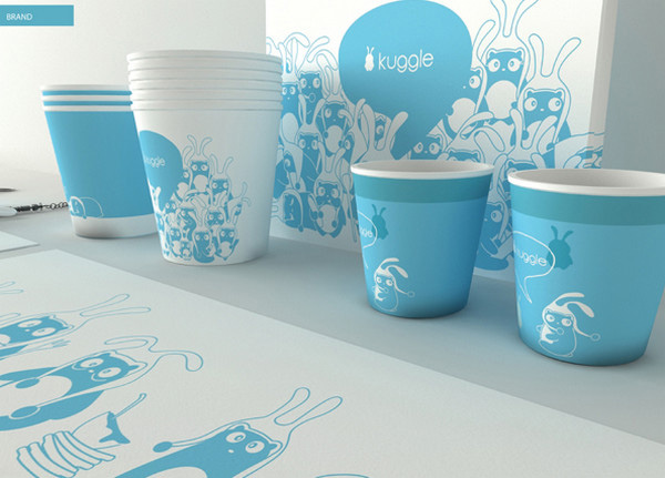
17. Kuggle cafe & application branding by sanja boskovic
This is a perfect example of how a two-tone color palette can transform any visual identity into something smashing and standout. Of course, cheerful rabbit mascots and funny illustrations here play a central role.
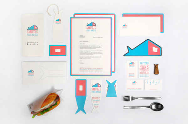
18. Smutje – Fisch am Eck by Thilo Schinkel&Zibin Florian Loi
The team wonderfully mimics technical illustrations. The geometry-style logotype, use of blue as a core color and rough typography tie the entire brand together.
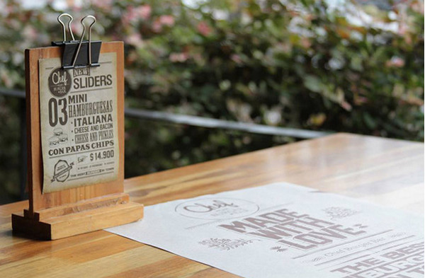
19. Chef Burger by Juan Guerrero
The designer heavily relies on an impact produced by fantastic typography. He has created a splendid menu design, wall decals and covers of other essential items that slightly spice up with a beautiful retro vibe in order to make this fast café stand out from the crowd.
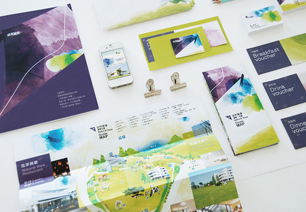
20. Natural View by ORIGIN.DESIGN tw
The lavish watercolor touch here add a little more personality and a creative edge to the project. It simply magnetizes you with its unconventional color combo and fine illustrations.
Conclusion
Restaurant visual identity is always full of surprises, interesting findings and creative solutions. Designers take advantage of various styles in order to make any eating place look sophisticated, exclusive, and of course, memorable.
Does restaurant branding make you want to make a reservation?


