
Bright colors, bold typography, and minimalism are trending web designs that are not going anywhere anytime soon. In fact, as this so-called flat design has taken over the internet by storm, you will notice more website owners, theme developers, and graphic designers hopping on the material design bandwagon.
Emphasizing usability, open space, and a clean interface, flat design lends its way to a pleasing aesthetic on your website while paving the way for a unique look that also personalizes your brand. Plus, it diminishes the need for the unnecessarily “fluff” that often accompanies 3D skeuomorphic web design.
If you are unfamiliar with flat design web concepts, or are looking for ways to maximize this trendy design on your existing website, check out some of the top things you must know before diving into flat design usage.
5 Key Concepts You Should Understand About Flat Design
Though flat design has long been touted as a trending design concept, the truth is, not all designers are utilizing its basic design principles. This is because flat design is a unique concept that stands alone and requires a basic understanding of its concepts before using it.
In fact, it must work well with your website’s overall look and feel to create a good user experience. In all, this is why learning the key concepts that make up flat design is crucial to utilizing it correctly and taking advantage of its full potential.
1. Lack of Depth
Gone are the days of using drop shadows, strokes, bevels, and gradients to create real-world shapes. In the past, all web design aimed to imitate real looking objects, as though you were seeing them in real life. They used textures and colors to add depth.
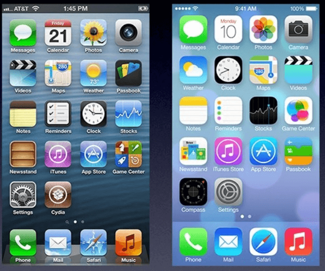
On the other hand, flat design aims to encapsulate a simpler visual effect that appears, well, flat. First released by Apple during the iOS 7 iPhone release, flat design began making headway in many phone and computer apps as people caught on, and began to enjoy, this trending new style.
2. Minimalism

Websites utilizing flat design concepts are known for their simplistic, minimal, and clean layouts. Unlike traditional skeuomorphic design, which typically uses animations, 3D effects, and attractive flashy embellishments, flat design uses vibrant color palettes and simple lines to create the appearance of impressive UI design.
In the end, a talented flat design graphic artist will be able to create movement, depth, and visual appeal using basic line structures and bright colors.
3. Typography
Since material design lacks the strong elements skeuomorphic design does, website owners have more room to add bold typography to their websites to enhance the overall look of the web page and bring visual excitement to anyone viewing the page.
However, make sure your typography choices are not too over the top. Up against the simplicity of flat design, an overly embellished font choice may look out of place.
Content is going to be the crux of your website, more so than ever when using flat design. This is because you are no longer relying on special effects to draw readers in.
It is your job as a website owner to engage readers even if your site has a minimal feel to it. One of the best things you can do is take advantage of typefaces that have plenty of font options for variety, while still maintaining a consistent primary typeface throughout.
4. Visual Hierarchy
Since material design exhibits design elements in 2D, the only way to distinguish between different UI elements is to use bold color schemes in light and dark variations, contrasting (yet not overwhelming) font styles and sizes, and muted background environments so the simple designs you are sharing with readers stand out easily.
In addition, it is important to note that material design elements rarely intersect each other. Remember? Flat design hopes to stray away from creating depth with element intersections. This means you will need to switch between color schemes and box content to give the appearance of something real and usable.
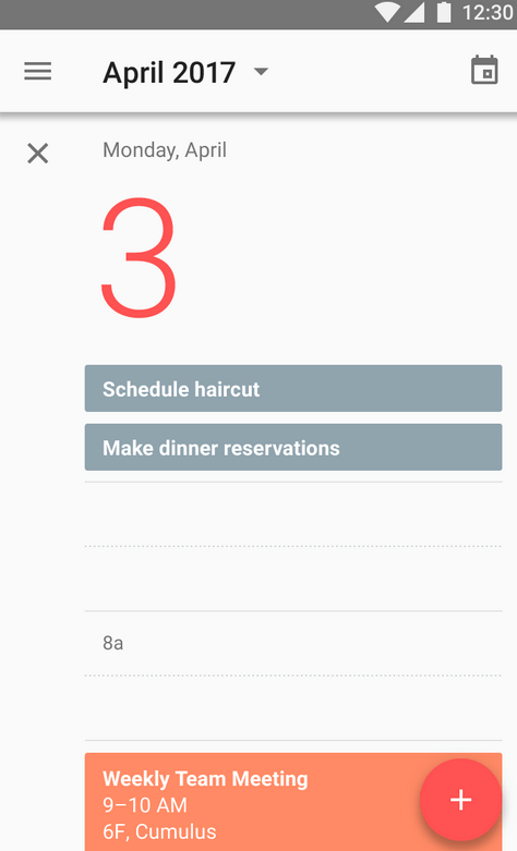
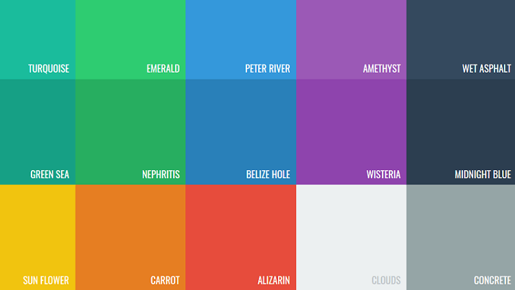
Most flat design color palettes extend beyond the typical 2-3 colors. Instead, they contain as many as 8 colors within one image. Salmon, purple, green, and blue are some of the most often used colors in flat design.
In the end, by following these flat design best practices, readers can understand the flow of movement throughout your website. Google recommends using color and composition, only a few meaningful elements at once, and images that tell a story upon first glance.
5. Simple Elements
Those implementing flat design often stick to simple interface items like icons and buttons. Moreover, simple shapes like rectangles, squares, and circles are used to create movement and depth, while remaining 2D and flat in nature.
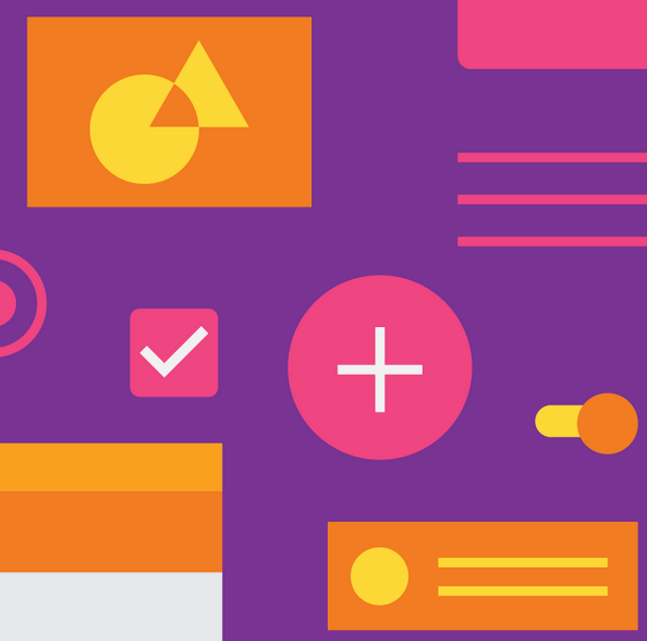
Flat design elements are easy to understand upon first glance. In addition, they encourage users to interact with them with simple clicks or taps. Lastly, minimal shape use makes it easy for simple elements to stand alone or pair seamlessly with other elements, without distracting your readers from the content you are sharing. ‘
Here are some quick tips you should know about making your visual hierarchy usable to readers:
- Make sure all elements are clear and visible
- Allow for sufficient color contrast and size
- Employ a clear hierarchy of importance
- Make sure key information is readily seen
- Ensure easy navigation of your site by reinforcing color, text, shape, and motion
In all, the simplicity of flat design exists so that you can place the focus on your website’s content without appearing drab and boring.
Final Thoughts
Just as any trending web design, flat design focuses on being usable by those viewing it. The aim is not to just impress site visitors with fancy color palettes, simple shapes, and bold typography. Instead, the point is the get readers excited about navigating your website, engaging with your website’s content, and maybe even subscribing to your email list or making a purchase.
If you are thinking about adding flat design to your existing WordPress website, incorporate all of the above-mentioned concepts into your overall design. Not only will this allow you to utilize the flat design concept correctly, it will help improve user experience and make you website more successful in the end.
Have you ever used flat design concepts on your website? As a site visitor, do you prefer to view flat or skeuomorphic design elements? I would love to hear all about it in the comments below!


