
The code “17-5641 Emerald” sounds like a call sign from the famous James Bond franchise, but actually this is an official format of the color name listed in the Pantone color system.
I suppose everyone is familiar with this powerful trend-setter in the region of color. Almost every design project is affected by its influence whether it is a print design, web design or industrial design; even if you think it is not. The team of professionals which is highly obsessed with shades, tries to help various artists effectively pick up tones as well as create color schemes in order to give their designs a harmonious and voguish look.
Today we want to draw your attention to some specific projects that were created by people who are perfectly aware of the fact that sometimes using only color is more than enough to make the design look outstanding. That is why we have collected some incredible projects that give the Pantone range of colors a dominant position and strongly rely on it.
Projects Inspired by the Pantone Color System
1. PANTONE skateboards by Pavel Kulinsky
“Made just for fun” as mentioned in the description. The concept is really tailored towards fun. Of course, this is not something new, numerous leading manufacturers of skateboards produce their products with fantastic illustrations or with some trendy styling; however this particular pantone-style variation charms with its vibrant appearance that capably catalyzes positive emotions only thanks to popular hues.

2. PANTONE People by Maxim Nilov
This is a truly original concept that is motivated by what people are wearing. Actually, sometimes we do not pay proper attention to our clothes. So it’s really pleasing to the eye when somebody notices a tendency or regularity, and capably puts it on public display.

3. PANTONE – Rain Edition by Matteo Gallinelli&Giuliano Antonio Lo Re
Using Mother Nature in projects is always a winning option. Here, the designers creatively present the new range of Pantone colors by skillfully employing a simple rain puddle. The latter acquires a completely new appearance beautifully transforming from a dirty and nasty splash of water into a centerpiece of an artwork that is nicely diluted with an urban vibe.

4. PANTONE Easter eggs by Carlo D’Angelo
Though Easter has passed and we ate all our chocolate bunnies, its spirit still hovers in the air. With this inventive project that looks really up-to-date, the designer tries to give us some hints on how to creatively decorate eggs next time. Moreover, such a fresh solution can be also used as a unique gift or an offbeat packaging design.

5. PANTONE – Nature – by Gianpaolo Tucci
This is another eye-catching project inspired by the local environment; and it’s not surprising, since nature, like nothing else, is rich in a range of various colors that sometimes suffer from people’s neglect. The artist offers us an opportunity to take a look at the primary origin of Pantone colors and thereby increase a sense of harmony in our next projects.

6. NO Pantone pillows by Andreia Constantino
This is a truly ingenious and even a bit geeky accessory for interior design. It will definitely become a splash of color in your modern high-tech style that easily stands out from the other decorations.

7. Food Pantone by Riccardo Vicentelli
The designer speculates about attractive colors inherent to food, to be more precise fruits and vegetables which exude an image of naturalness and well-being. Such an approach helps to set the cheerful mood and impress on visitors a sense of happiness and cheerfulness.

8. Balloon Typeface by BMT London
This is an incredible, highly realistic typography designed for a children’s campaign. The balloon-style symbols supported by an amazing Pantone color scheme is aimed to spiritually stimulate hopes for a better future and vividly evoke carefree and warm memories from childhood.

9. PantoHero by Alejandro Saldaña
The designer derives his inspiration from the multi-faceted Marvel universe in order to create a list of PantoHero cards. The title speaks for itself. Each card includes several colors that uniquely characterize a particular hero, so if you are unfamiliar with some of them you can use this project as a color guide.

10. Pantone – Color of the Year 2014 by Diego Marini
Radiant Orchid – is the official name of the color of the year. Numerous designers have already employed this tone in theirs projects. This high-end agency has created 5 terrific iconic images (plus 11 more) to cover various elements that can benefit from this trendy hue.

11. Your Pantone Guide to Tea by Emma Boulter
How about a vivid guide for choosing the proper taste of your drink for your traditional English 5 o’clock tea? The artist offers us to take a look at a compactly-arranged booklet that features various tea flavors including benefits and properties that are beautifully decorated with the help of Pantone colors.

12. Pantone by Richard Fraser
This is a personal project that depicts a fictional 3d scene. There are 7 different options of how the settings should look. Each picture leverages 2 colors: the first one is a Pantone color and it plays the first violin; and the secondary tone is light gray and is used for highlighting a selected element.

13. Calendario Pantone by Silvia Macedo
In order to fully explore a huge variety of colors presented by Pantone, you do not necessarily have to visit the website or buy a special booklet with the color palette, you can simply make use of Silvia Macedo’s inspiring project – Vibrant Almanac. Though it was designed for 2013, it can serve as a representative example that will always be in trend.

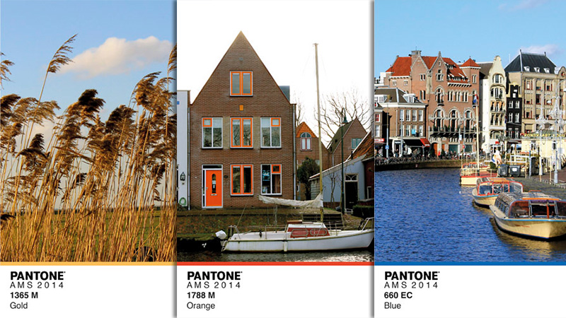
14. AMSTERDAM 2014 by Joan Carreras
Each city has spectacular views, incredible landscapes and mysterious places that bear lots of emotions. The designer tries to put everything on the surface by creating a wonderful series of pantone-style cards that are inspired by picturesque Amsterdam’s hidden places.
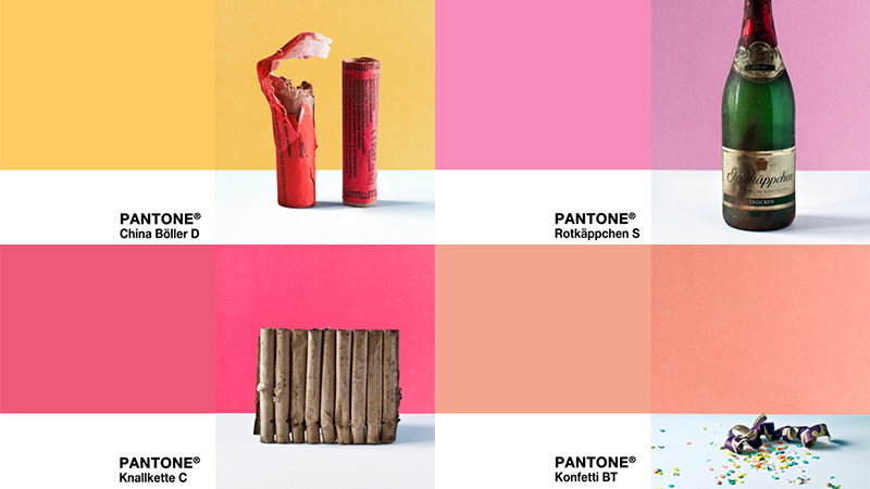
15. DER REST VOM FEST by M. Grambow
This is another ingenious project dedicated to feast, and this time the series is aimed at vividly showcasing the New Years’ leftovers. Every item is staged with Pantone colors for a better contrast.
16. Retro Superheroes Pantone by viraj nemlekar
Much like the example at number 9, Superheroes are the focal points here. The designer derives only one primary and immediately recognizable color from the wearing apparel of a famous fictional character and creates an appropriate card.

17. Pantone Shreds by Akram William
The artist wants to effectively familiarize regular visitors with an illustrative style called “Shredding” that is enriched with soft, a bit retro Pantone colors.

18. Kinder PANTONE by Aline Houdé-Diebolt
Thanks to people who have an ability to notice a popular color range in every simple thing or place, toys from Kinder Surprise are opened for us from a different angle. So from now on, you can collect them not only guided by a series but also by a color.

19. PANTONE Color Puzzles by Tad Carpenter
This is a valuable project for your kids, since it is intended to teach them in a playful way how to properly match shades. Moreover, grown-ups will also find it amusing.

20. THE SCENT OF PANTONE by Ron Hahn
The Pantone color scheme and packaging design is a powerful combination. Though it seems that there is nothing supernatural, these colorful perfume bottles inspired by Pantone-style cards look absolutely refined and eye-catching.

Conclusion
So, what about you? Do you have some ideas that rely on the Pantone color scheme? Share with us your thoughts.


