Beauty in a simple form: how many times do we stumble upon things that fascinated us by their mind-blowing and awe-inspiring appearance that are actually a skillful combination of regular shapes, straight or oblique lines, circles and zigzags.
All ingenious things are simple. This timeless concept is successfully applied to various spheres including typography. Thus, at first sight the seemingly primitive and sometimes even brutal and rustic geometric typeface can be refined and subtle with a trace of stately elegance. It is able to enrich communication and if necessary cover a whole gamut of emotions. Depending on typographers, who are in charge of creating a proper font, and on website builders, who provide a project with an appropriate environment, the geometric type can either strengthen or on the contrary destroy the whole general feeling.
In order to avoid the second unfortunate outcome, we have prepared a fresh collection, where you can derive some inspiration and explore some of the best examples.
Geometric Typography in Web Design
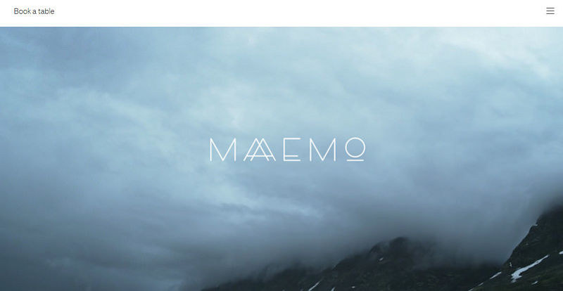
1. Maaemo
The team has put a strong yet subtle accent to the “welcome” section with the help of a delicate ultra-narrow geometric typography. It harmoniously blends with the design and perfectly complements the distinctive natural motives.
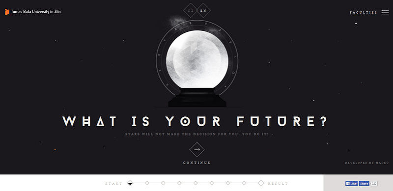
2. Tomas Bata University in Zlin
The website conveys sophisticated and high-tech feelings that take the official website of the university to the next level. Here sharp and slightly futuristic typography fits like a glove, giving the whole appearance a powerful creative edge.
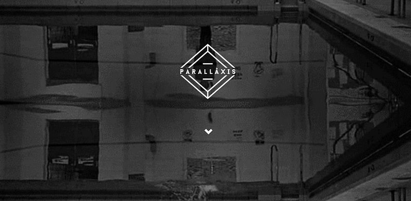
3. Parallaxis
The front page is marked by an eye-catching logotype that features a rustic geometric type. The contour style paired with the font perfectly cooperates with a slightly enigmatic dynamic background, both complementing and enhancing the whole design. The color palette also reinforces the theme.
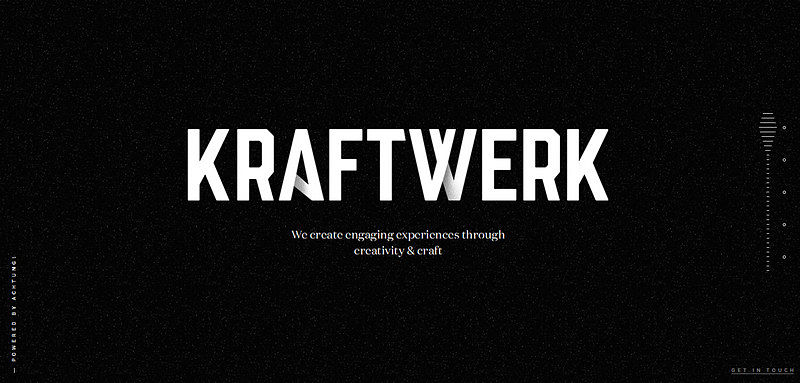
4. Kraftwerk
The massive, bold typography with slopes and lovely paper-style touches immediately strikes the eye. Here, a clean, black monochrome background as well as tiny tagline and primitive graphics easily and unobtrusively direct users’ attention to the nameplate.
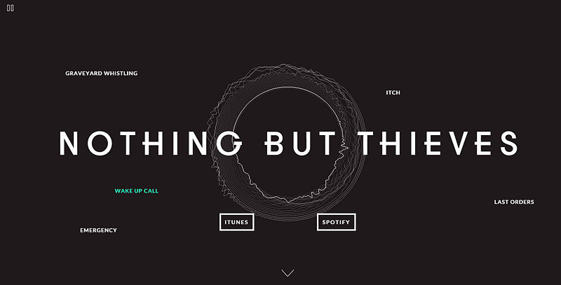
5. Nothing But Thieves
Here, the relatively huge typography breathes the beauty of geometric forms, ideally fits into a composition as well as enormously enlivens the aesthetics. It is a subtle addition that brings its note of refinement, giving the website a face-lift.
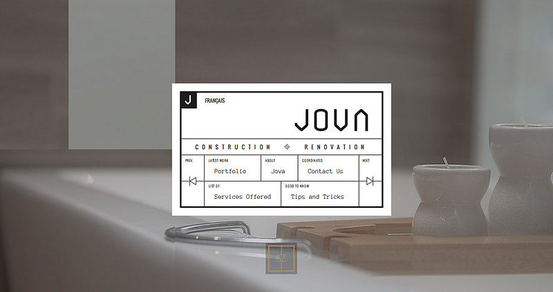
6. Jova
A non-standard navigation menu design creates a unique, modest, constructive and professional look that is well-suited for such a project. The properly-balanced, grid-style layout is beautifully bolstered by subtle ultra-narrow typography that brightens up the centerpiece.
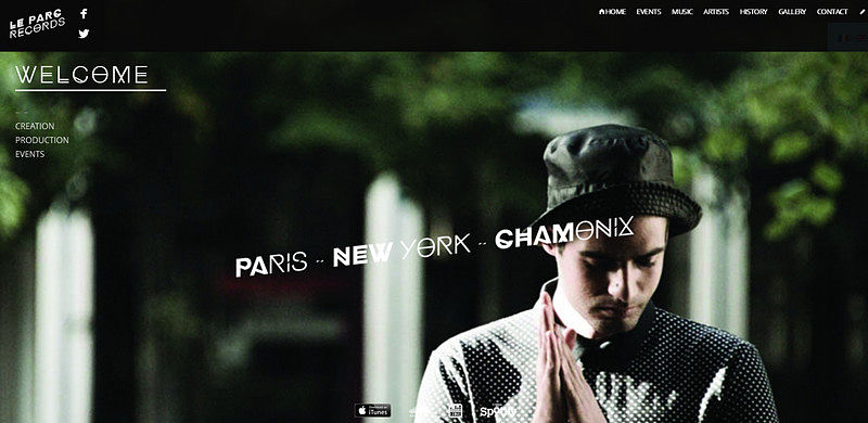
7. Le Parc Records
The project conveys a powerful urban vibe, where the typography plays a significant role in the formation of the general feeling.
Although, the better part of the aesthetics depends on a series of spectacular photos, the slightly bizarre but visually-appealing font neatly finishes off the appearance.
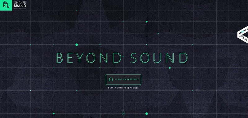
8. Shaker Brand
For a deeper and more powerful impact, the team goes for fantastic typography that harmoniously combines together geometry and delicacy, adding richness to the project. Everything looks amazing and awe-inspiring, and the typography in tandem with a brilliant color scheme is enough to fill the project with a lovely futuristic charm.
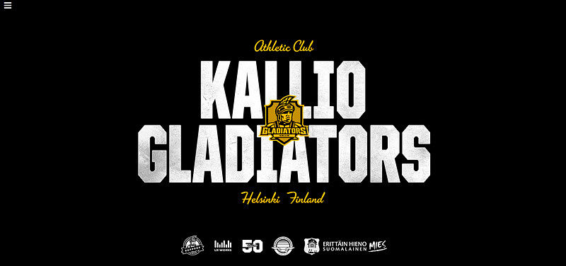
9. Kalio Gladiators
Here, the geometric typography is skillfully intertwined with a sleek grunge style. The nameplate accompanied by some pleasant splashes of yellow and retro-style components looks startling, giving the home page an air of brutality and masculinity. The pure monochrome backdrop also maximizes the effect.
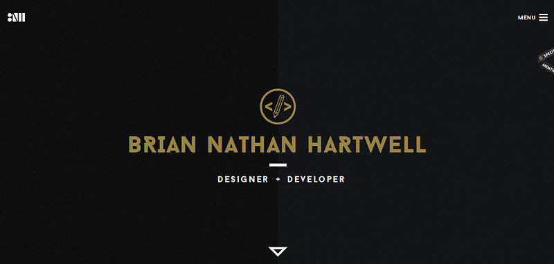
10. Brian Nathan Hartwell
Here the geometric typography is an ideal addition to the minimalistic flat online portfolio. Unlike the majority of such kinds of web projects, this one concentrates on the copy, making the content a centerpiece with the help of carefully selected type.
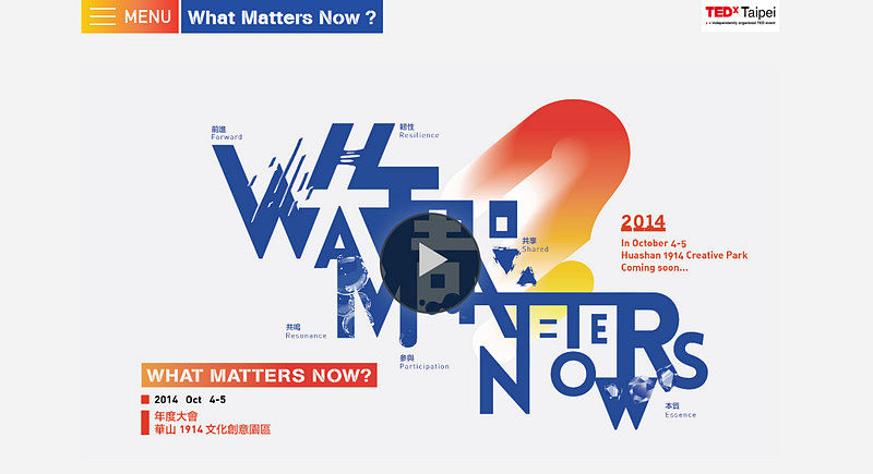
11. TEDxTaipei
A riot of colors, sharp flat forms, clean backdrop and bold typography, together form the front page. Rustic letterforms spiced up with some extra features inspire an intriguing general feeling that diversifies the project considerably.
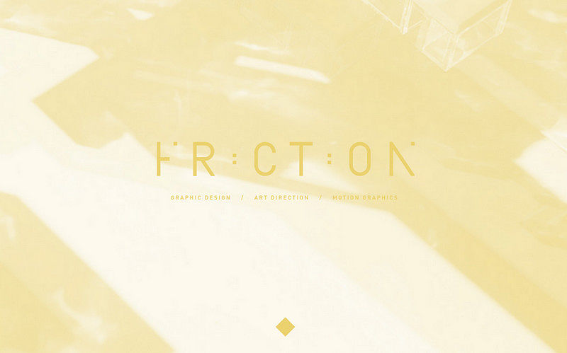
12. Friction
Friction showcases a seamless typography that not only ideally blends with the background, but also adds a touch of chic and daintiness. What is more, this distinctive geometric type is traced throughout the whole front page, subtly prettifying the whole construction.
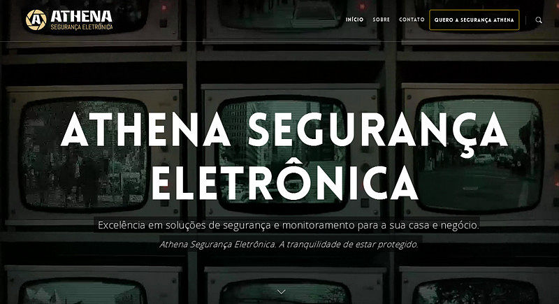
13. Athena
The sharp, bold typography contrasts favorably with the exclusivity of the image background. The geometric vibe neatly echoes with the logotype, ”ghost” buttons and contour graphics, which altogether help to put online visitors into a proper mood.
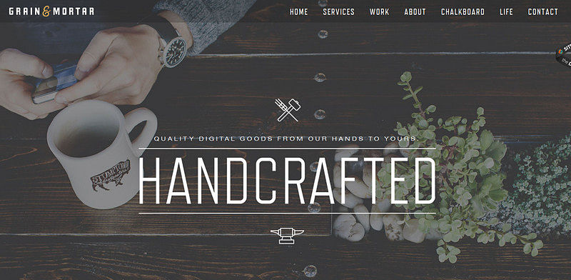
14. Grain and Mortar
Grain and Mortar has a modern hipster-inspired appearance that you just can’t miss. Here, a slightly elongated, subtle geometric type gracefully interacts with the vigilantly crafted matching environment consisting of a professional photo, complementary secondary font, matching contour graphics and themed icons.
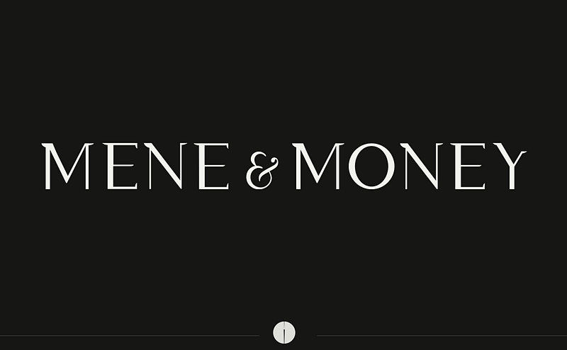
15. Mene and Money
The website adheres to the principles of minimalism thereby utilizing a standard combo of a tagline and pure, monochrome backdrop. As usual, the unique typeface catches the eye and a classic color scheme ably binds everything together.
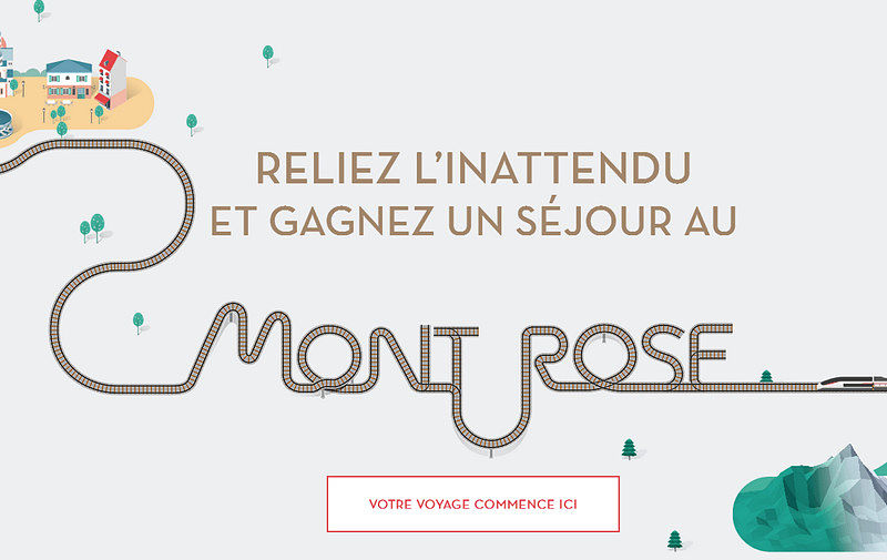
16. TGV Lyria
Much like the previous example, here the geometric type naturally cooperates with a unique, artistic railway-styled typography. Such an artistic blend allows placing particular stress on the copy and at the same time enriches the neatly crafted, fully illustrated design.
17. Mashvp
The home page radiates elegance and sophistication, so does the chief typography. It works side by side with a delicate “hamburger” button, soft muted coloring, and exclusive pictures.

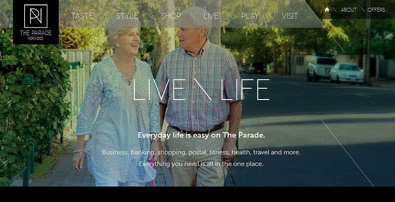
18. The Parade
This is another example of a website in our list that features an exquisite, ultra-narrow sleek typography that effectively matches the tone of the design and provides extra flair. It perfectly echoes the theme and conveys lovely feelings.
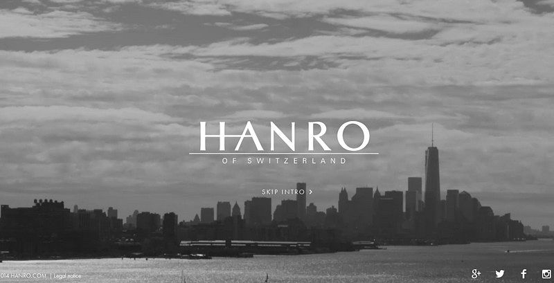
19. Hanro
Here, the smooth geometric font is an excellent match for a project diluted with a powerful urban vibe. Although the teams puts a greater emphasis on the visuals (i.e. images and videos), the font also falls into the spotlight.
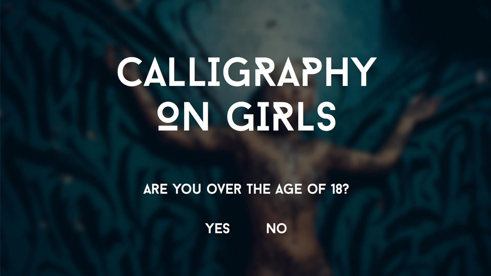
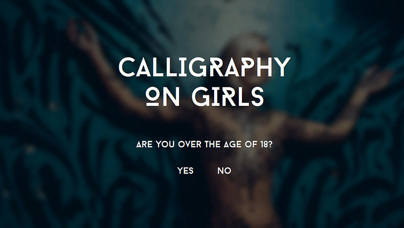
20. Calligraphy on Girls
Thanks to a blurred background, the smooth geometric font easily sets off, captures attention and adds a spicy note to the landing page.
Conclusion
Geometric type does not always have to be an accompanying component in similar designs. Sometimes it becomes the limelight or primary, decorative driving force that beautifies the appearance of conception as well as breathes new life into it.


