
Attention to detail is everything in the world of eCommerce, especially with respect to presentation and design. This sentiment is overwhelmingly true even within the prescribed world of eBay, where design is not a requirement for listing descriptions. So why exactly is optimizing a listing description crucial to boosting sales? The answer is simple: carefully designed listing descriptions increase conversion rates, and therefore have the potential to skyrocket sales.
How do I know? As a pro-seller on eBay, I utilized drop shipping directly from fellow eBay sellers. The result was my prices were by no means the lowest on the market, yet I was the highest ranked seller in my product categories. So what was the difference? – Optimizing listing descriptions.
So how did I do it? With a team of sellers we worked together to produce an easy-to-use listing editor, CrazyLister. By utilizing CrazyLister we managed to create and refine stunning, professional eBay listings based on an acute focus on conversion rates. We set ourselves apart from the competition by fine-tuning our listing aesthetic via CrazyLister’s optimized listing descriptions and of course, above all else, with a finger on the pulse of our conversion rates.
Below are 11 pro tips about the dos and, more commonly, the don’ts of designing a listing description. This information was gathered from thousands of case studies from fellow CrazyListers, in addition to years of personal experience, shrewd observation, and our own magnanimous success as sellers on eBay.
Tips for Selling on eBay
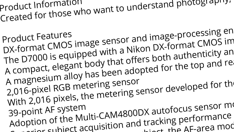
1. Great Walls of Text
To put it bluntly, do not waste the precious (and very limited) time you have to convince a potential customer. eBay descriptions must be short and concise, similar to a roadside billboard. Customers will zoom past your listing description without batting an eyelid. Use your limited time and space strategically, only include the most relevant and meaningful information. Go ahead and cut the rest. Don’t be afraid to edit.
2. Endless Scroll Listings – Forcing Customers to Work to Make a Purchase
This is one of the cardinal rules of selling: never make a customer work to discover relevant information about your item. On average, a seller on eBay has seven seconds to captivate their potential audience or lose them to a sea of competition. That is why it is absolutely crucial to keep the most important info at the top of listing descriptions.
All elements of a listing description must be easily discoverable; a customer should never have to scroll endlessly to find critical information. A great way to save space and organize your listing so that all relevant information is found in seconds is by organizing your seller policies in tabs discreetly at the bottom of the product page. (This also happens to be a sweet feature of CrazyLister, but I digress). A prime example of how serious eliminating this “endless scroll” is featured by online retail giant, Amazon. Amazon enforce a mandatory rule that requires merchants to display the five main features of the product at the top of the product page because this is how absolutely vital it is to keep the most important information at the head of a listing.
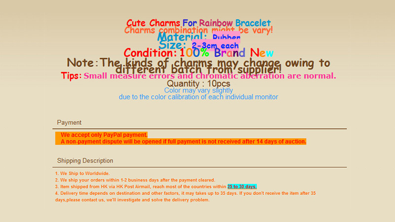
3. Highlight At Your Own Peril
If you simply must highlight or love highlighting sections of your text, choose one color to do so and do so sparingly. Using more than two colors will distract your visitors and make it overwhelming for visitors to read the listing description.
A little highlighting goes a long way! Always remember that the purpose of highlighting is an extreme form of emphasis. As such, when multiple colors are used it can often overcrowd text and make the content illegible. Below is an example of highlighting gone terribly wrong… Yikes!
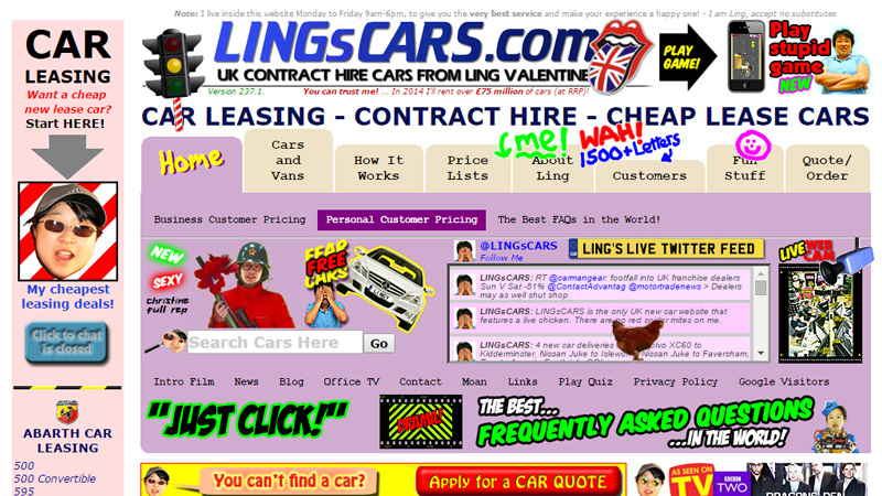
4. Unnecessary Graphic Elements
Everyone wants to jazz up their listing description. While the sentiment of creating highly aesthetic, eye-catching listings is a great idea, we stress that a smart lister is a pragmatic lister: don’t just add icons and images for the sake of making a listing more attractive or spirited.
It is crucial to view a listing description with a critical eye. That is why I encourage sellers to strip away all unnecessary design elements and emphasize the most important listing aspect: making your product sing. Your listing description is a mere vehicle to sell this product and as such, your product must be the visual focus of the listing description. Take a look at the listing below. Can you recognize the unnecessary design elements in this listing?
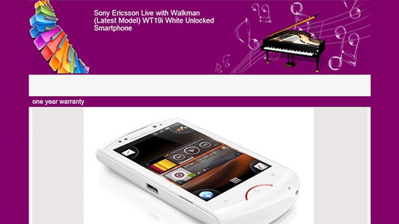
(Hint: pianos have nothing to do with purchasing cell phones)
5. Showcasing Irrelevant Products at the Top of a Listing
Let’s say I am a casual buyer on eBay and I would like to purchase a wallet. I enter a seller’s store which offers wallets, bags, shirts, shoes and other accessories. Similar to many merchants, this store has placed a scrolling gallery at the top of their listings showcasing OTHER products they sell. Wait a moment – I’ve clicked this particular listing because I was interested in a wallet! Why am I being bombarded with these completely irrelevant items? The buyer’s mindset initially reads: “I’m interested in this wallet – let me check out this wallet listing so that I can quickly find what I need”. Rather than encouraging the potential buyer to click “Buy It Now”, the seller has managed to completely distract and deter the visitor by advertising irrelevant products.
It is imperative to never stand in the way of a potential buyer from making a purchase by cluttering your listing with unnecessary advertisements, while creating seamlessly structured listing which promote positive buying decisions from store visitors. However, we understand that cross selling plays a vital role in sales. So what is the most successful way to cross sell other store items? The best placement for cross selling galleries is at the BOTTOM of the listing. By the time your visitor has reached the bottom of your listing they have already made a purchasing decision on the item they originally wanted to buy. It is only after the buyer has made this decision that it is helpful to display different products and cross sell related items.
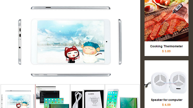
The first thought a viewer has when checking out a cell phone is probably not related to cooking appliances.
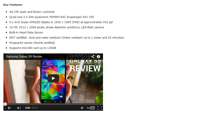
6. Including Product Review Videos
It’s hard to find a product that doesn’t have a showcase video on YouTube. Including such a video in your listing might just be the final push a visitor needs to hit that “Buy It Now” button. A picture is worth a thousand words. A video testimonial is priceless.
Including Photos is a MUST
There is a staggering amount of listings on eBay that are solid walls of text. To this day I can say with certainty that I have never met a single person who has ever read through an entire description on eBay when the description was purely text. People want pre-digested, easy-access information. As such, photos are the best way to combine information and save the limited time you have to convince your buyer. Communicate through images whenever possible. For example, if you want to convey a sense of security, why write “100% secure to buy from” when you can say it with pictures of your team, office or warehouse? Photos tell a more convincing story and build a sense of rapport far more effectively than a line of text ever could.
Another example of showcasing crucial listing information via photos is by applying the following concept:
Does your item come in three different colors? Rather than writing out the name of the colors, simply include three corresponding images showcasing the product in its available color selection.
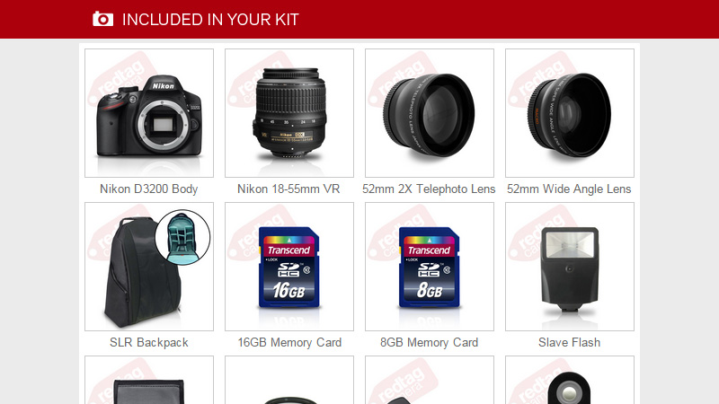
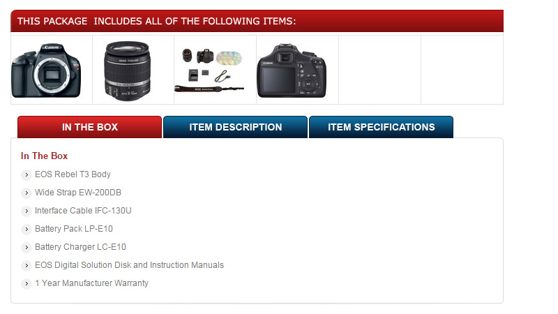
8. What’s In the Box?
Leave as little to the imagination as possible by making sure that visitors understand exactly what they are paying for. People don’t want to waste money on mystery items; as such it is crucial to close the gap between visitors and your product by communicating explicitly through images. This is why it is crucial to show the box contents in images. Do not rely on a written description when photos can offer the exact information.
9. Beware of Image Overdose: Images and Zero Text is an SEO Killer
As much as walls of text can kill conversion rates, listings that are 100% images can be even more detrimental to appearing in eBay search results. While it can be a quick-fix solution for sellers who simply grab images from manufacturer web galleries, this will result in a substantial loss of traffic to your listings.
eBay’s search algorithm (similar to Google and all other search engines for that matter) reads through your listing text content to interpret how relevant your product is for search results. If your description consists purely of images, eBay, Google and other search engines will not recognize your listing as a practical search result. That is why it is crucial to have refined text content in your descriptions. Images are great, but they are not standalone marketing tools.

10. Enforce a Sense of Urgency
This concept is possibly the oldest trick in the seller’s book, yet only a few eBay sellers use this timeless slogan: “Buy it now while supplies last!” There’s a reason why this phrase is timeless – because it works! How do I know? Take Amazon for example, a company which always instills its shoppers with an intentional sense of urgency by listing items as “only X amount of units left in stock” despite the fact that they certainly have a countless number of inventory in their warehouses.
11. Attention Grabbers – Don’t Over Do It
Sellers often focus so intensely on creating attention grabbing listings that they fail to see the forest for the trees. The human attention span is a fragile and limited thing, therefore, it is crucial to emphasize only the most important aspects of a listing and to do so with a light hand. Too often we see eBay sellers who simply cannot decide what the most important part of a description is, so they just arbitrarily bold, highlight and super-size almost everything. The result is illegible chaos.
Make sure to grab attention only when emphasizing the most critical parts of the decription. Always keep the seven second rule in mind (ie. you only have seven seconds to convince the visitor to click the buy box). Think hard – what do you want your future buyer to understand about the product, your business and your service during these limited seven seconds? Sometimes less is more.
Case Studies
Case Study: The Good One. (Yippie!)
I’d like to preface this explanation by saying that a good listing does not necessarily bear the trappings of the most cutting edge or avant-garde design. eBay sellers are in the business of business and the use of design elements are a means to an end: influencing viewers into making positive buy decisions for their products. At times it would seem that sellers lose sight of this end goal.
That is why I have chosen a particularly average listing to reference as a successful case study. I believe that eBay listings do not have to be professionally designed by any means, however they must exhibit the core elements of a successful listing which are the following: a clear selling point, easily located and well organized information, and solid social proof.
In the following case study you can visibly note all said key elements of a successful listing. First, the seller exhibits a strong logo and provides personalized information (a photograph of his family), a trust indicator, if you will. This immediately provides visitors with strong social proof and authenticity. In conjunction with breaking the anonymity of online selling with photos of his family, the seller also immediately provides accurate images of the product itself. Nothing is vague or left to the imagination. Following in suit with clear images of the product is a written description of the item.
The seller is careful not go overboard by writing a wall of text and has provided only what is absolutely critical to describe the item as best they can. Moreover, the seller has carefully organized billing and payment information in discreet tabs as to inform but not inundate the visitors with information. The tabs are an excellent example of not overcrowding the listing with excess text and restricting the listing to as condensed a space as possible. As I’ve mentioned, a listing that forces viewers to endlessly scroll through listings deters visitors from purchasing: never make a visitor work (i.e. scroll to discover information) to make a purchase.
Essentially the listing draws the viewers in a very clear path towards the “buy now,” box by emphasizing only the most pertinent information in the most minimal use of text and space as possible. This description is a great example of a seller using their listing description to design with the clear intention to inform, advertise, and ultimately to sell their product.
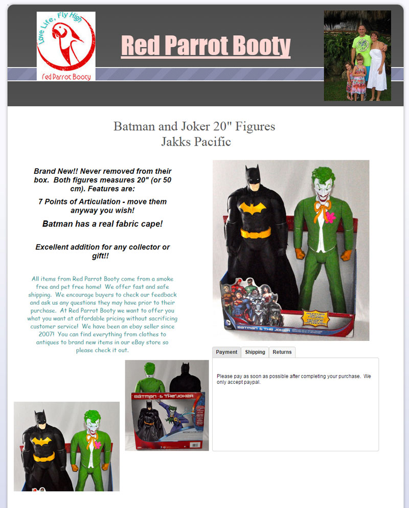
Case Study: The Bad Listing
The following listing is a prime example of breakdown within design, or where a design actually works against a seller and therefore interferes with the sale of an item rather than aiding a viewer’s decision to buy now. The first and likely most glaring mistake this seller makes is upselling unrelated products at the top of the listing. That is to say the seller uses the most valuable real estate of the listing space to advertise different products before it is even possible for a viewer to purchase the item being advertised. First the product needs to be sold before upselling becomes relevant.
The second and most obvious design flaw is that there are no actual pictures of the item being advertised – how can a person make a purchasing decision without a single image of the item? After a quick glance at the listing description there is no way to tell what is being sold in this description. Moreover, there is immediately unnecessary text information, “Quantity – one pair,” – one pair of what?
This listing takes a turn for the worse when a stream of inarticulate text in a variety of wild colors proceeds to describe the mystery item. And so the viewer proceeds to scroll, endlessly it would seem, to discover more information about the product. The sale may already be lost at this point (remember the seven second rule!) The poor execution of design elements only manages to arbitrarily highlight and emphasize the text description and completely distracts potential buyers from the seller’s goal: to inform and convince the viewer to make a purchase.
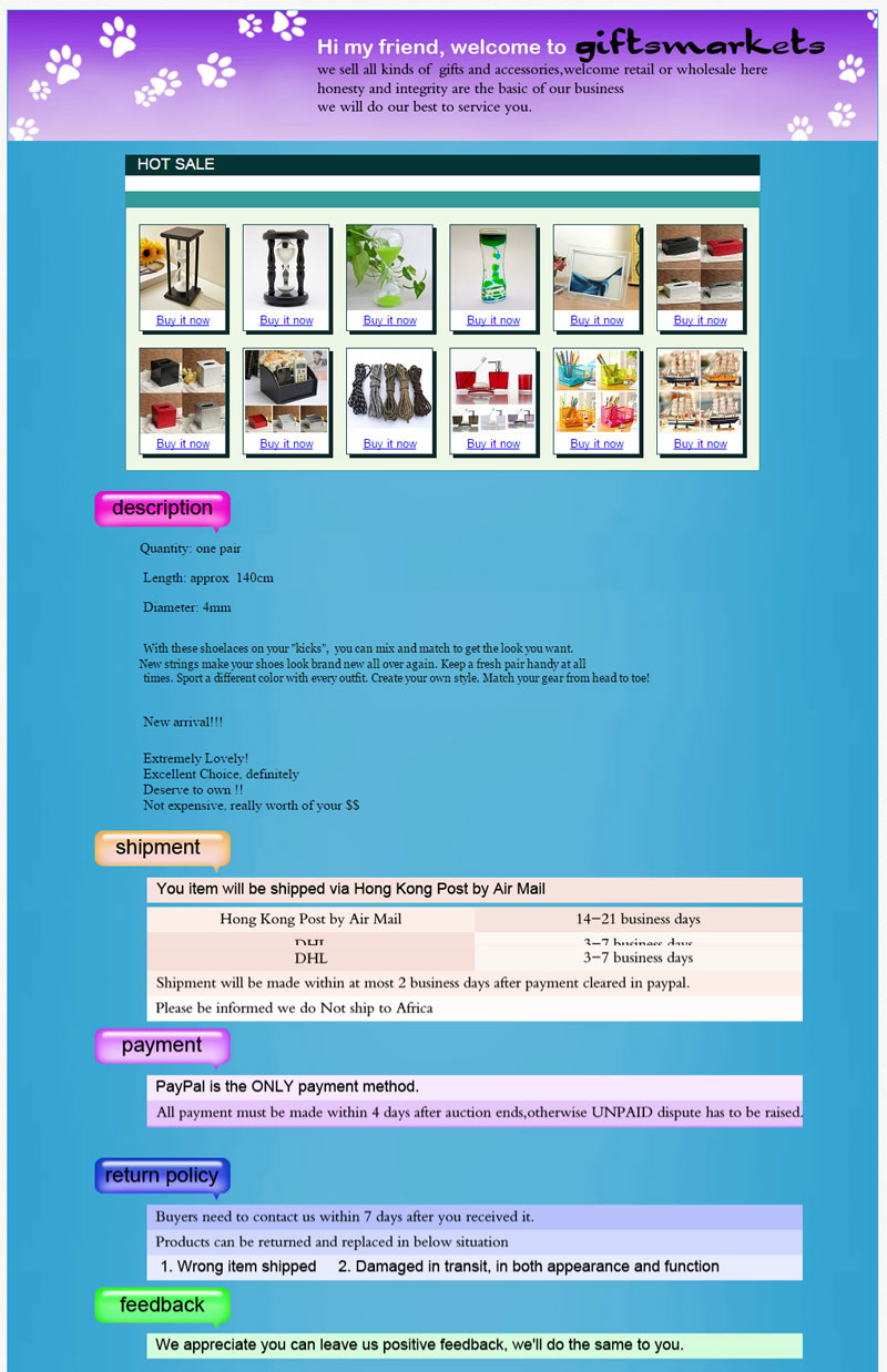
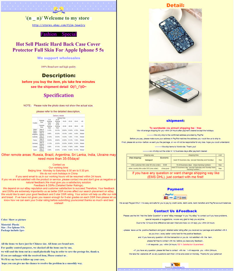
Case Study: The Second Bad Listing
This one is a doozey. At first glance viewers may have to take more than a handful of seconds to even completely scroll through this listing, which means the battle for potential customers’ attention may already be lost. Suffice to say that this listing is absurdly too long; nobody has time to scroll through a listing of this length. The viewer is then bombarded with a wall of text and non-critical information placed at the head (the prime real estate) of a listing: shipping information.
To be clear, shipping information is not crucial information and has no place at the top of a listing description. Therefore the sequence of information presented in this listing is illogical at best. There is also an almost offensive use of distracting design elements ranging from overuse of color, highlight, fonts, font sizes and text. And what’s more, the seller provides redundant information: yet another section with shipping information. Suffice to say the conversion rate for this listing is nonexistent.
Image is shown in 2 halves:
Case Study Conclusion
As you can see it does not take a degree in web design to create successful listings on eBay. Attention to relevant information, clear organization, and a simple editing tool is really all it takes to transform a listing from being a roadblock to a clear pathway towards increased sales.
Wrap Up
Now that you know what your product descriptions need, here is the how to access an easier way to edit your listing descriptions and boost your profitability.
There are a lot of tools out there for creating listings; the problem is that most of them lack the two simple features that are key to designing seamless, professional listings:
- Easy to use – you shouldn’t have to be an HTML programming wizard to edit eBay listings, nor should you have to slave away on Photoshop.
- Total customization – why use generic templates when you know exactly what you need? Editors should allow you to manipulate the design to produce the exact listing YOU WANT, not force you to work around a generic pre-designed template.
This is the exact reason why our team developed and now uses CrazyLister, a super easy Drag ‘N Drop editor for eBay listings. It allows any seller with zero coding skills to create professional, 100% customizable listings. Making changes or edits to a listing description with CrazyLister only takes minutes or seconds compared to hours of manual editing either with Photoshop or HTML code.
Enhancing listing descriptions through design is a crucial step in boosting sales, but that doesn’t mean it has to be a laborious or tedious job. With a sharp editing eye for detail and the correct listing editor you can quickly tweak and make easy changes which will dramatically increase sales. We hope our tricks and tips will serve as a useful guide in navigating the pitfalls of successful listing strategies. Happy listing and even happier selling, everyone!


