
If I am brutally honest, the design trends we have seen during 2014 have limited the range of different and unique website design. It is almost like back in the day when all sites were built on tables… but not quite! What these limitations have done is force designers to be more creative, more ingenious and apply a lot more ‘thinking outside the box’ to their designs – and of course, as we would expect, they have risen to the challenge beautifully.
More than ever before, each new trend tends to have knock-on effects that, out of necessity, create another trend – a good example of that is: the trend of using large background photographs created the necessity for transparent overlays to enhance headlines and content that had to be placed on the image as there is simply nowhere else to put it!
The high and continually rising use of mobile devices to connect to the internet is definitely the main driving force behind current trends, and will continue to be. So in this article we are taking a look at 12 current trends that we consider have enough staying power to make it through not only the rest of this year, but 2015 also.
Responsive Design
I am not going to go into a long-winded explanation about what responsive design is, as I am sure you are well aware of it – if not, then please come out of the rock you are living under! As 2014 has unfolded, responsive design has knocked mobile website versions right out of the water, and by the end of 2015 I think mobile versions will be antiquated and responsive will still be trending.
Ooyaka
This digital creative agency uses a fullscreen background image of a fun fair in shades of blue/purple, with a strip of square, transparent tiles across the middle. As you mouse over the tiles they click and a blue cross shows on each one. Every tile is linked to their home page. If you view their landing page on a smartphone, you only see a portion of the image, and the logo and tiles reduce in size accordingly.

Agigen
This web agency bravely uses a hot pink for their full-width hero area – it is actually a pink transparency, but it is so opaque that it is quite difficult to discern the mountain region it is covering. On a smartphone you see more of their site – you can see their (rather impressive) client list that you have to scroll down for on a desktop screen.

All About David
The portfolio site of this French freelancer is really, really different. It is a matter of opinion whether it is outstanding design, or just totally off-the-wall! For sure, you need strong neck muscles if you want to read everything on this site! Each image is overlaid with a solid color block and on the desktop version, that has the client name and a short description. Reduced to mobile size, the block only contains the client name.

Ghost Buttons
Here is a trend that took off a few months ago, and it perfectly complements both full screen background images and minimal design – so it is a win-win element for any site. The ghost or empty button is exactly that, just an outline with text inside. It looks clean and somehow it is pretty obviously a call to action, although you may not think so without seeing it! This is a trend that I think we will see more and more in use, and will carry through next year.
The Canadian Encyclopedia
This educational and information site uses a blurred large background image in gray tones, so the black navigation bar and the white, empty search box both stand out beautifully.

Werzer’s Badehaus
This site uses a full screen slide show and each slide has a ghost button, clicking which will take you to the page that the image represents. When you mouse-over the ghost buttons they fill with white.

Anders Hede Jensen
This portfolio site uses a full screen horizontal slide show with different gradient transparencies overlaid on the background images/videos. The typography is white, clean and clear, as are the ghost buttons on each slide that fill with white on mouse-over.

Typography
The use of typography in any kind of design is not new – in fact it is probably the most ancient trend that never goes out of date – therefore, I can confidently predict that typography in web design will still be trending by the end of 2015 – and beyond! Although typography itself is not new, the style of typography has changed over the years, and currently we are seeing quite thin typefaces, large lettering and very often in white – once again we see how other trends almost dictate the style of typography and help to create the trend.
Studio 3
I am not quite sure what this site is promoting – it is a list of names, all of which have a link – I am guessing they either work for Studio 3 or it is a collaboration of designers – or possibly both! As you move your mouse over the page, there are some dull musical beats and the background image changes.

1MD
‘We are a creative bureau’ – and then some! This landing page is really creative, using beautiful typography and small touches of animation with a stunningly crafted photo manipulation. Perhaps not what we currently recognize as ‘trending’, but worth a look for sure.

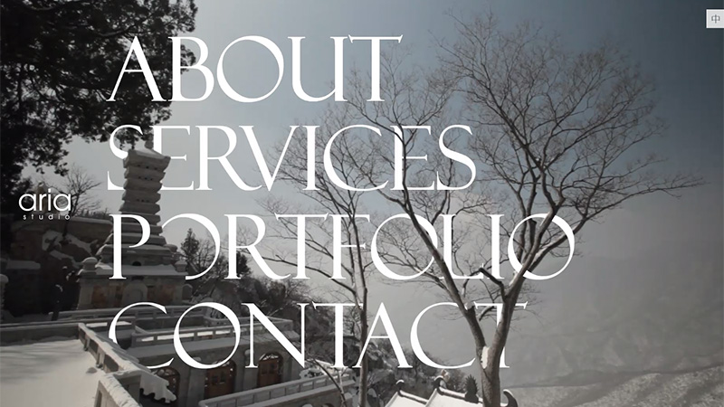
Aria Studio
This Hong Kong site uses a large white serif text navigation on a full screen image background. As you hover the mouse over each category, parts of the other pieces of text appear to disappear behind the image – except the About category. If you refresh the page there will be a different background image, including one of penguins, an animated pond and flowers.
Large Background Images and Videos
This trend has already been introduced along with previously featured trends. This is the one that has created more knock-on effects than any other, such as large, white typography, ghost buttons, transparent overlays and of course, slide shows and carousels. This is yet another ‘new’ trend that is not a new idea – marketers have been using images for hundreds of years to get a point across – we are far better able to connect with an image than with text, we understand them at a glance and a good image attracts us in a way that text simply can’t. Infographics are a good example of this, and the main infographics that we all use are road signs – it is more meaningful to see a circle on a sign than the word ‘Roundabout’. So perhaps large background images have been a long time coming in web design, in this area web design is just catching up with the rest of the world! But I have a problem with this trend’s staying power – I’m not sure it will stand the test of time and the next trend will make this clearer.
Miskini
Miskini is an Australian swimwear brand, and their landing page has full screen video showing girls wearing their swimwear, while playing a moody, summer-style song.

Le Saint
This Canadian publicity and design agency uses a full screen slide show on their landing page. However, when you click on the left or right arrows, the image only moves a little way across as the text changes, so the background slideshow is basically one exceptionally wide image that just reveals a little more of itself as you scroll across.

Phorce
This company produce intelligent bags for mobile devices that include such technology as a motion sensor, temperature sensors and a processor. Their landing page shows a full screen slideshow of images of people in different situations using mobile devices with their Phorce bag. Unusually, this site does not use a full screen transparent overlay, just a block of text on a white transparency that is the same on each slide. They also use a ghost call-to-action button.

Hero Area
A hero area is the trend that is said to be knocking slide shows and carousels out of fashion. This is usually a full-width large banner-style area at the top of the landing page that can contain an image, a large block of color, large typography or a combination of more than one of those elements. Hero areas still sometimes use a slide show, but usually with only 2 or 3 slides. This area is simply an introduction to the site, and the name has been borrowed from the print industry. So perhaps this is the trend that will be with us throughout 2015, and we will see fewer and fewer large background images, videos and slide shows – or perhaps vice versa, or maybe they will both continue to trend – difficult to call!
Design Lobby
This agency uses a full-width monochrome image with white headline text for their hero area. They also include a ghost call-to-action button.

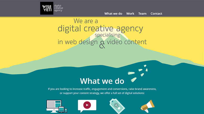
Wise Yeti
Here, the hero area is set above some illustrations of mountain peaks, using large black typography on a yellow background, and the mountain theme continues as you scroll down the page, where the shapes are created by blocks of solid color.
Chimney
This site uses a grid-style layout for their static hero area with white headline text offering visitors a welcome, with white on black navigation across the top of the page.

Parallax and Other Scrolling Effects
Scrolling effects have been gathering speed for some time in web design, and parallax scrolling trended a couple of years ago, then lost some popularity, but it is back again – which makes me think that it may peak and trough, but will probably stay in style for some time in the future. Other scrolling effects include the very eye-catching scrolling-on-a-path and horizontal scrolling (that can also be parallax). It is always a pleasure to be surprised by different and unique scrolling effects on a site, and this is why visitors enjoy it and designers will continue to push the boundaries.
Roadtrips: South Australia
This site employs both horizontal and parallax scrolling effects. As you scroll downwards, an image flies in from the right and the slightly animated background image remains in place. Two transparent blocks come down from the top, one white block that gives the title of the roadtrip and a sub-heading (such as ‘Journey through the heart of Australia’s outback’), and a colored transparent block with a link to start the roadtrip. There are 5 roadtrips to choose from. Clicking on ‘Start the roadtrip’ brings up a slide show in the same style as previously described with attractions you can discover on that particular route.

Gerber Ramonage
This is a very nicely presented site that uses some pleasant illustrations in muted colors, parallax scrolling, some animations and slight mouse-over animations.

CEZ
This Bulgarian site uses lovely illustrations, parallax scrolling and a little scrolling-on-a-path effect. The little parachutist falls down as you scroll, past the house until he reaches the ground. As you continue, the scrolling now becomes horizonal and he walks past more illustrations, both static and animated, then he gets in a car and drives a little way, then he swims (backstroke) across a channel, a little more walking, and as you approach the end of the page, you head off to the contact form and the little guy wanders off into the distance. Along the way are menus with some of the company’s achievements and links to them.

Fixed and Slide-Out Navigation
Navigation has been recognized as one of the most important elements of web design for many years. It has to be very available and easy to negotiate and understand. With so many elements currently vying for prime position on landing pages, the dilemma of navigation has been addressed and solved by the use of either fixed navigation that travels down the page with you as you scroll, or slide-out navigation that is usually controlled by a tab or button that is available wherever you are on the site.
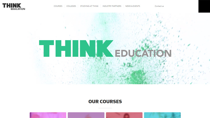
Think Education
This site uses a top navigation bar that remains in place as you scroll down the page. They also use a hero area, but have managed to include both video and slide show. When you land on the page the hero area is showing a video with music, then you are offered to skip the video and a slide show takes its place.
Hyperakt
This site uses slide-out navigation. When you click on the menu button the full screen animated image is pushed to the left and the menu takes up a good portion of the page. They also use a red transparency, white headline text and ghost buttons on this landing page.

Pauline Osmont
This portfolio site uses a fixed navigation bar on the left of the screen. Clicking on About, Work or Contact will slide the selected category in from left or right. On the Work page a sub-menu appears and clicking any of the categories will black-out those projects that are not in that category – quite a unique and interesting design.

Large Design Elements
Large design elements, or less text, is a trend that is particularly apparent on one page websites and portfolios. When designers have a relatively small amount of space to get a message across, using a large element with an icon, illustration, image or text can work wonders. It goes hand in hand with minimal design (more on that later), as it creates the need to only feature what is really important.
Dropbox User Guide
Dropbox obviously want people to easily understand how to get the best from their service, and they offer this guide as a means to that end. They use really large elements, and each category on the right has a sub-menu. Hovering over any of the category boxes puts a drop shadow behind it.

Your Local Studio
This site uses an irregular grid-style layout with a fixed navigation bar on the left. Each grid item is a link, and hovering the mouse over any of them brings up a solid block of color with explanatory text. The grid items are of differing sizes, but even the smallest are not tiny!

Essen International
After scrolling down from the full screen image slide show on the landing page, this site leaves nothing to chance in terms of visitors missing anything that they want them to see. Huge boxes in a grid-style layout offer links to some of their projects. Hovering your mouse over any of the boxes brings up some white text that gives a date and sub-title for the category – except the Profile box, which starts off white, goes black on mouse-over and the text changes.

Grid Style Layout
Until recently these Pinterest-style sites were referred to always as ‘grid-style layouts’, but they are more often called cards or tiles nowadays. Whatever you wish to call this style of presentation, it is a tried and tested way of presenting image-heavy sites beautifully. Photographers, artists, eCommerce sites, the list goes on and on – if you have to present a lot of images there is no better way to do so than with a grid-style layout.
30000sourires
The title of this site translates to 30000 smiles. They use a tile layout with a transparency overlay. Hovering the mouse over any image clears the transparency. The images are not links, but you can drag the whole page around and find more blocks of images of people smiling.

Kreativa Studio
This portfolio site shows the images clearly, but when you hover the mouse over any one of them, it expands a little and the others get a transparency over them. The site also uses a static top bar navigation menu.

Marcelo Duende Creative
Another portfolio site using tiles to showcase the freelancer’s work. These tiles zoom in and get a transparency over them when you hover the mouse over them. Once again, this site design uses a static top bar navigation.

Minimalism
Minimalism in web design is another trend that has been around for a while now, and it has been gathering speed throughout 2014, and seems set to continue throughout 2015. It works because it is easy on the eye and visitors can clearly see the important things the designer and site owner want them to see. If you have ever considered trying to convert your home to the minimal style, you will realize just how difficult a task it is to make anything minimal. You have to create many drafts and keep cutting down and cutting down until you really can’t take out anything else, and you will initially have a feeling of loss during the process. It is a difficult choice on all levels, but when done correctly, it is beautiful.
Velvet Hammer
This site is owned by a music management company, and it is minimal from top to bottom! The landing page has a light textured background with the company name and a link in 3 of the corners: Follow/Music/Soundcloud, and the company logo in the other corner. The solid black border stays in place as you scroll down the page, and you will find a page of clients, followed by a slide show of images of their clients, an About section, and some more images, then contact details. The corner links and logo remain in place down the whole site. A great example of not only minimalism, but also a single page site.

Cultivated Wit
This site has been around a while, and they have been using this landing page for some time now – it is excellent! If you hover your mouse over the stylized bird illustration, it winks. Further down the page, the design includes full screen videos with colored transparent overlays, large design elements, large and minimal text, a grid layout and the top navigation menu is static.

R&Co
This site uses a grid-style layout, but the whole site only has 10 cards. A completely monochromatic color scheme and a slide out (down from the top) navigation menu.

Single Page Sites
This trend really does go hand-in-hand with minimalism in web design. A few years ago it would have been considered impossible to include all content and images on one single page – it would have gone on forever! Nowadays it is becoming more and more popular, and it is likely to continue to do so. This trend, once again, has been driven by mobile touch-screen devices that make it so easy to simply scroll down one page rather than waiting for new pages to open.
The Wild Romantic
This is an Australian bridal dress outlet. The landing page has a slowly-scrolling slide show and top navigation – which is static as you scroll down the page. This is followed by an About section, then another slowly-scrolling slide show, but scrolling in the opposite direction, this is followed by a list of brands the store stocks, then contact information.

Beard Design
There is so much going on on this site that it is amazing they crammed it all into one page! If you click the ‘Ride with Bodoni’ (animated ghost button), you will go on a journey with Bodoni the dog, which has some nice animations and The Doors’ ‘Riders on the Storm’ accompanies the illustrations – and the line ‘like a dog without a bone’ seems to be prominent! When you scroll down the page, you will find large design elements that take the whole width of the page and large type, explaining the project each element represents. Bodoni the dog features very heavily in the presentation of this site, and they have made spoof websites featuring him, such as ‘Match for Bodoni’ and ‘Bid for Bodoni’

Akita: How Data Travels Around the Globe
This site is actually an infographic showing how data travels from its source to its destination. A beautiful example of scrolling on a path, nice graphics and quite interesting info too!

Flat Design
It is quite by design that I have left this trend until last in this list. Flat design is THE current trend without a doubt, and it is, like many other trends, wholly driven by the use of mobile devices. This is the design trend that throws down the biggest challenge to designers – how to design a flat website that is unique, beautiful and usable. Really, really not easy! But, the amazingly talented designers this world contains have risen to the challenge. They have realized that flat design is here to stay, like it or not! The world of IT currently revolves around mobile devices, and although screens have become a little larger recently, designers have to think of ‘mobile first’.
Flat design has been the root of many other design trends, but it was introduced as a result of responsive design. When mobile versions were popular, flat design could be restricted to that version. With responsive design, the site will work so much better with flat design, so this trend is most definitely here to stay for some long time, and definitely will be celebrating Christmas 2015, unless some inverted, or micro-cosmic, or self-expanding/contracting, or jump-out-of-the-screen-and-hit-you-in-the-face development comes along in the meantime!
Ryan Gittings
This portfolio site is a single page site with a nice illustration of a work station in flat illustration form on the landing page. As you scroll down the page, you will discover that this site is pretty text-heavy, but the text is quite large, in fact all the elements are large, and the contact form uses ghost boxes on a blue background. The top navigation bar is static also.

WanderWorld
This is the site for a soon-to-be-released app for iOS and Android. It is a travel journal, and the site tells the story of how it works – to go with Johnny on his worldwide travels as you scroll through the site. Here we see another trend that promised to be bigger than it actually became, and that is long shadows. It was a way to add some texture and depth to completely flat elements and text.

New York Summer
A nice example of flat design. Other trends in use on this site are a slide-out navigation menu, scrolling animations and it is a single page site.

Conclusion
So these are the 12 predictions I am making for current trends that have the strength to stay current well into 2015 if not beyond. I think some of them are no-brainers and unlikely to be questioned, but what about the others? What do you think – are there any trends included in this list that you think will die a death before the end of 2015?
Do you think there are some currently strong trends that I have missed here? And do you have any predictions for new trends in 2015? Please share your opinions with us in the comments section below.


