Simplicity, neatness and openness are the main aspects that are generally inherent to light-colored designs, whether it is an interface based on a clean, light quiet background or just UI components predominantly made with light or muted coloring. Such designs are always comfy and pleasant to look at, they easily set the aesthetic, strongly support the content, making it easy to read and scan, and can boast optimum balance.
Moreover, bright accents that are quite common and essential elements play not only a decorative role but are also functional, since they naturally give a sharper focus on specific elements and push the eye towards the content. As for emotional components, light as well as bright colored designs can effectively evoke positive feelings, making the user experience much more agreeable. Without doubt, such designs aren’t sparse or offbeat; use of light coloring is a quite conventional, pragmatic and even orthodox approach, yet it still manages to produce impressive and tangible results.
Light Colored App Design
In the list below you will find fresh modern examples of mobile app interfaces that capably utilize light coloring to make the whole design pop.
Radio App by arjun/aj
This app ably demonstrates a light and crisp music player interface with a standard set of controls. The light gray color palette is nicely diluted with green and red touches.

Foresee by Nate Dicken
Foesee has a vibrant and flat design. The pristine white background perfectly highlights monochrome circular graphics with funny smiles.

App Sneak Peak 2 by Sean Wolcott
The designer predominantly concentrates on a type-driven interface, making it entirely comprehensible. Here, the white background serves as a firm foundation for the content that is presented by means of casual type made in 2 matching colors.

Spendee Add New by Peter Had
The interface is based on a soft light background that ably emphasizes neat garish outline icons and tiny light gray titles. The sleek grid makes the layout look well-structured and boxy.

Superminds by Boris Valusek
The screen features a classic horizontal striped layout that easily presents data in a pleasant and unobtrusive manner. The muted mint tone perfectly collaborates with a white background while circular images – that are set inside rectangular blocks – get the user’s attention.

Historia by Padraig Croke
The interface instantly grabs readers’ attention by its amazing bright and eye-catching color combo. The designer skillfully leverages a neon color to establish focal points and fix users’ attention to the most significant and necessary elements.

Stats by Alvin Thong
The interface is intended to effectively display statistics. The muted color scheme doesn’t ruin the content, and even helps to capably distinguish tiny intelligible doughnut charts that are wisely bolstered by descriptions.

iOS Phone App Voicemail by Tycho Klein Severt
The interface has a clean, open and quite roomy design that delightfully incorporates a small elegant type and minor dabs of vivid color for bringing more focus to the buttons and highlighting the selected items.

iOS 7 AirDrop Popup Redesign by Ilya Dmitruk
The app has a clean and light design, whether you are viewing the main interface or a simple pop-up window. The latter is able to provide the viewer with a helpful toolkit that is represented by means of small vibrant icons.

Simon by Tint Digital
The interface is definitely a fresh and modern take on a minimal style that includes only a few graphical components and a tiny top panel. It looks absolutely spacious and neat. The color combination in tandem with a huge circular button emphatically invites users to action.

Charging iOS7 by Nandor Tamas
The interface exudes an image of minimalism and modesty. The light subtle screen comprises only necessary stuff that is aimed to graphically apprise users of the charging status.

FM by 这是艺术你不懂
This design has a light skeuomorphic vibe that instantly captivates readers with its perfect execution. The controls, especially the realistic frequency controller, look absolutely fantastic. The restrained color palette reinforces the theme by adding a note of a retro feeling.

Snapchat by JCKLY
The interface features a well-organized layout. The content is laid out in a 2 column grid where the first column serves as a comprehensible differentiation tool. It employs color and simple glyphs in order to quickly give the idea about item’s category.

Pilot TV app by Michal Galubinski
The interface has a nice and neat wireframe feeling that gives the design a unique and neat look. The contour style components made in a deep blue perfectly stand out from a pristine white backdrop.

Zen Weather by RYO NAKAE
The app is aimed to provide users with in-depth forecast information. The designer ably leverages small icons and a regular font, which are set against a soft light background in order to pull the design together.

Another iPhone app by Corey Lui
Here, the designer decided on a marvelous contrasting color combination that radiates cheerfulness and serenity. The bright green tone laconically brightens the solid color background and ably highlights components.
Flat Groove WIP by Tom Reinert
The interface strongly relies on flat graphics and a two-tone color scheme. The huge circular control looks conspicuous and slim while the typography perfectly fits into the composition.

This design has a nice circular vibe that is supported by a soft yet bright coloring. The outline icons beautifully cooperate with a slim elegant font while the alternate arrangement of elements recreates a sense of motion.

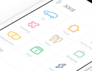
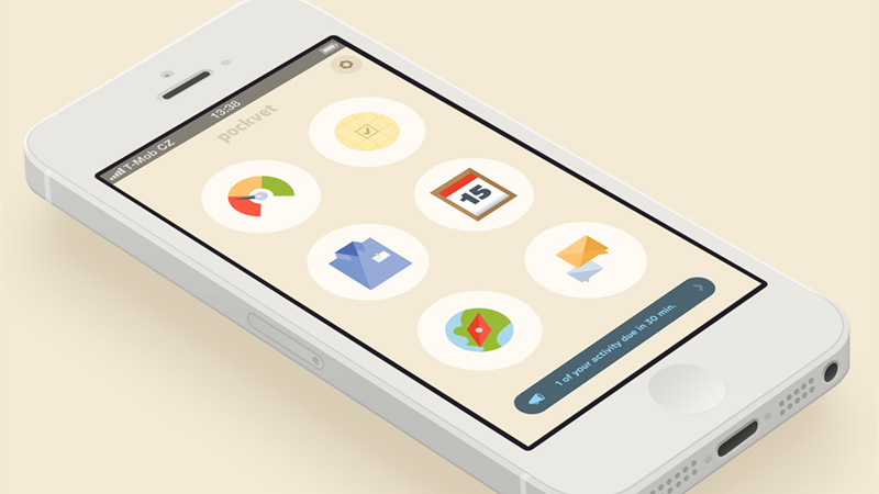
Pockvet app by Charlie Isslander
The interface features a set of colorful sophisticated icons made with a flat style in mind. The warm coloring of icons harmoniously interacts with a smooth creamy background.
Custom Soundcloud Modal iOS7 by Corey Michaud
The interface looks absolutely fantastic and sophisticated. The elegance of the semi-transparent panel that is bolstered by white controls and graphics instantly strikes the user’s eye. The bottom panel with social media icons also sets the design off.

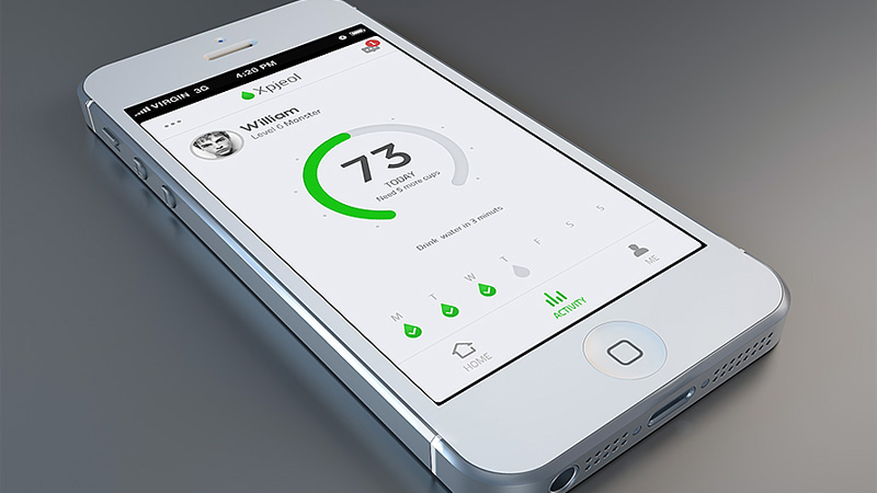
Voice Hleper by sky
The app has a light interface that ably copes with a lot of content. The designer employs green as a core color that is added to every icon. The huge bulging call-to-action button – that is also in a greenish gradient – immediately captures the attention.

Add to Order by Devin Schulz
The “Add to Order” functional screen has a bold color choice, relatively large font, slim graphics and clean background. On the whole the design looks extremely tidy.

Hours Animation by Christain Billings
The first thing that gets noticed is a handpicked muted color palette that helps to achieve an overall balance. The flat graphics as well as slim delicate type enhances the visual experience.

Banking app by Diederik Eenschooten
The designer manages to successfully present boring bank account data. The UI looks simple and comprehensible.

Conclusion
The rocking light-colored app interfaces radiate positive emotions and neatness of performance. Generally such designs are based on clean light solid color backgrounds that easily liven up graphics, and perfectly collaborate almost with any color combinations used for emphasizing foreground elements.
What do you think about light-colored app interfaces? Love them or hate them? Why? Do they look complex and refined to you or vice versa simple and plain? Share with us your thoughts.


