
Sometimes website designs owe their success to the corporate identity that can effectively promote the brand and separate it from others. In a broader sense, it embraces numerous aspects starting from a classic one, such as the utilization of brand coloring, and ending up with a modern one, such as displaying an image of brand identity. Today we are going to examine the latter option.
As a rule, it is considered to be a collection of various visual elements that predominantly fall into the stationery category, including office paper, stickers, business cards, badges, notebooks, pens and other. However it can be anything that is able to vividly bear the trademarks of the company. Very often these components are supplemented by matching objects that perform 2 purposes: harmoniously completing the whole look and clearly highlighting the key items.
However, let us not forget about reasonability of individual approach that implies reliance on the owner’s preferences and some other factors: so that if the company is engaged in a food and drink market it can feature a skillfully-combined composition of its popular products that certainly uniquely identify the manufacturer, or if a company has a telling title or a catchy slogan then in this case, you can allow the imagination to run riot and build up an image of brand identity inspired by it.
Initially, the main reason for adapting this solution lies in its ability to firmly establish a businesslike atmosphere; however, there is no rules without exceptions, so in some cases such methods can, on the contrary, lighten the general feeling of the project. Nevertheless, one thing you can say for sure, this approach will definitely reinforce your brand. We have rounded up several fine examples of top-notch website designs that feature the image of corporate identity.
Websites Featuring Corporate Identity Pictorially
Nunomen
How to effectively establish a businesslike air in your website? There are numerous solutions from traditional to modern ones; however this agency wisely opts for a more progressive approach by incorporating an image of corporate identity that showily brightens the “welcome” section of the website. Moreover, since the company deals with various brand issues, utilization of this solution seems to be simply predestined.

Wooster Hound
Wooster Hound has an incredible front page design that completely corresponds to the nameplate. The creative team has speculated about the name of the company and has managed to bring to life a truly unique idea based namely on it. Here, the traditional English “hunting” theme is run through the website design and is executed to the tiniest details.

Rawww
Rawww’s “welcome” section entirely justifies its catchy and promising title. The team has capably created a figurative mash-up from “creativity” and “cooking” that is embodied into an eye-catching, interesting-to-explore and unique image background. This is a classic example of an image of corporate identity that covers not only stuff marked by the agency’s logotype and brand color scheme but also lots of complementary objects that help to make a composition look complete and sophisticated.

Sabra Dipping Canada
Though this is not a conventional example of corporate identity, who said that the products can’t refer to this term? They are like no others and identify and promote the brand, distinguishing the company in the global market, so that creating a pictorial composition, the pleasant aesthetics of which is achieved through a skillful blend of goods painted in the brand color scheme and supported by several complementary objects is a really good idea.

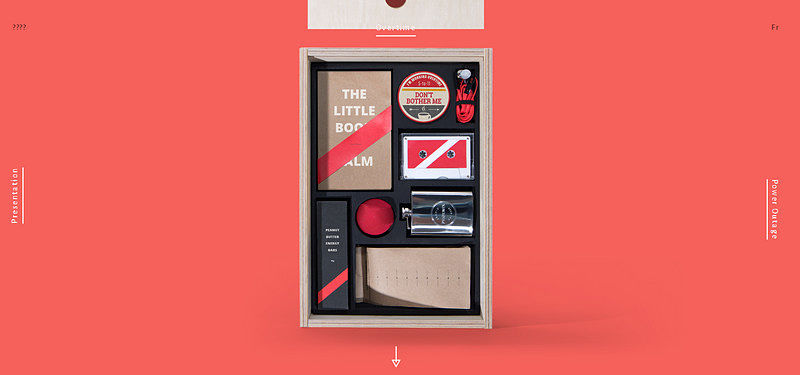
Agency Survival Kit
Here the wooden box with stuff was created to speak for itself as well as actively supporting the nameplate of the website. Agency survival kit is reminiscent of the classic image of corporate identity where, traditionally, each item is marked by the brand color and several common design elements.
The Ruby Tap
Images of delicious snacks, glasses of wine and of course, an organic rough wooden surface – here everything points to the website dedicated to the restaurant sphere. Much like in a previous example, the goods (to be more precise, meals and dishes) are intended to characterize the brand and serve as a sort of corporate identity.

Martin Auer
The creative team wisely opts for a visual solution that as we all know is more beneficial and preferable when it comes to presenting the food items. The website features an image of skillfully placed together whole loaves of bread, bread that has been cut in slices and halves of bread that are so pictorial and realistic that you can almost smell the freshly-baked crispy bread. This is an ingenious food-style variation on the corporate identity.

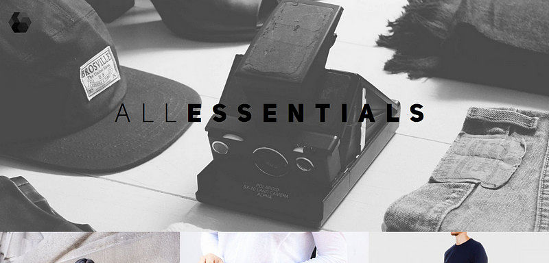
All Essentials
The designer’s labels were attached: the “welcome” section boasts a compelling black-and-white shot that features densely yet harmoniously placed together branding articles of clothing. Here the well-thought-out image of corporate identity based on wearables capably comes to the fore and enhances the whole impression.
Ooze
Ooze has 2 key images, each of which showcases complex yet well-balanced compositions. Since the company specializes in coffee and leaf tea, these two goods have become the spotlights. Each blend includes complementary “delicious” objects that are associated with tea or coffee; they help to recreate a cozy atmosphere and give an edge to your appetite.

Whatsrapp
Here the team tries to put the application in its natural surroundings by building up a really provocative and intriguing backdrop. The website is soaked with a gangster atmosphere that lures you in.

Conclusion
Corporate identity can be manifested in various ways. It does not have to be a classic interpretation in order to uniquely identify your brand and strengthen its influence on the web, sometimes other unconventional methods which can be partially attributed to this concept can perfectly do the trick.


