Utilization of the image background in a website is certainly “as old as the hills”. However, the creative folk are managing to come up with original ideas that allow squeezing every opportunity from this medium in order to benefit the aesthetics. Recently, we have observed various sleek, clean, monochromatic backdrops that have flooded the Web due to the immense popularity of Flat style. Nonetheless, image backdrops have returned with a fresh breath. Websites featuring enormous and visually-appealing images are quite popular nowadays. You can stumble upon lovely cityscapes, picturesque landscapes, funny animals, mind-blowing photo manipulations, surreal images, cinemagraphs, but amidst all this diversity, pictures with close-up faces certainly strike the eye.
Want to find out why? Then proceed to our collection, and you will see how this approach helps to add personality, express a range of emotions, establish the proper atmosphere and give the artificial project a so necessary human touch.
Large Background Images of Close-Up Faces
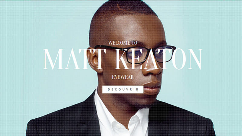
Matt Keaton
The website looks chic, fashionable and stylish. Brilliant smooth color palette, elegant typography and a series of professional close-up photos, which take up the whole screen in order to profitably demonstrate the product, form a favorable impression.
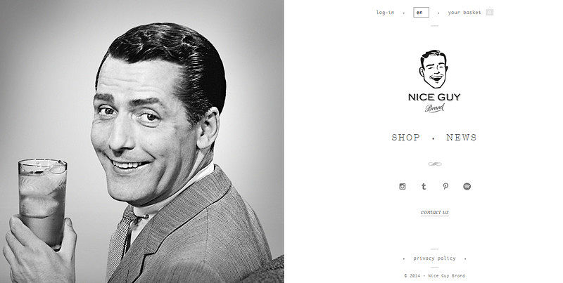
Nice Guy Brand
The website boasts a magnificent retro vibe diluted with old-time feelings. For the “welcome” section, the designer goes down a less traditional route by using a standard layout in order to maintain a balanced and slightly simplistic look. The monochromatic color scheme and several spectacular grayscale close-up images in collaboration with neat flat graphics make the design stand out from the crowd.
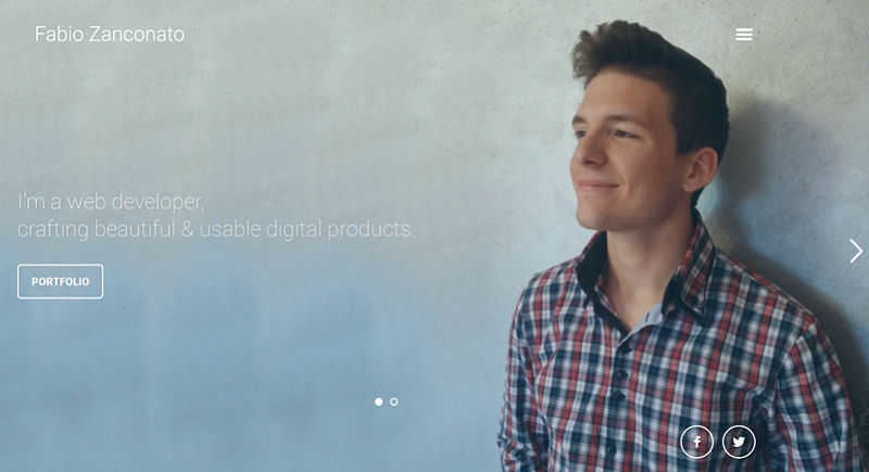
Fabio Zanconato
A great way of developing trust in online visitors is to make use of a close-up image of the artist himself. Fabio Zanconato clearly demonstrates how this principle should be beneficially put into practice. His online portfolio, to be more precise the front page, is marked by a powerful human touch that is just hard not to notice.
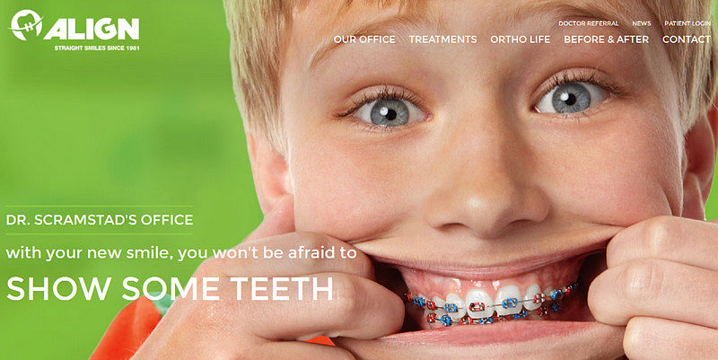
Align Orthodox
Using a happy, smiling close-up image of a child on this website dedicated to orthodontics is certainly a win-win solution, since it helps to overcome and even allay the fear that the majority of us have. Moreover, the optimistic picture is skillfully highlighted by a calm and smooth greenish coloring and almost shiny white tone that together establish a positive general feeling.
Bench
The website greets online visitors with a stylish and refined front page marked by a striking and sparkling personality. The latter is achieved through a wonderful image background with a human face. Furthermore, the well-thought-out selection of graphics, typography, and coloring adds to the project a powerful businesslike appeal.

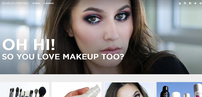
Shameless Fripperies
Shameless Fripperies features a gorgeous close-up image that visually supports the idea of the project, and of course, serves as a focus anchor. The slightly elongated tagline, small solid icons and tiny navigation aid naturally direct users’ attention to the photo.
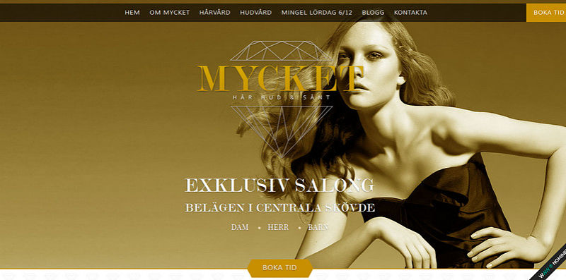
Mycket
Mycket is another startling website in our list that attains a chic, sleek and fashionable appearance thanks to a skillfully executed home page. The latter depicts a spectacular photo of a model and some beautiful complementary features such as golden typography, delicate graphics, and an exclusive color palette.
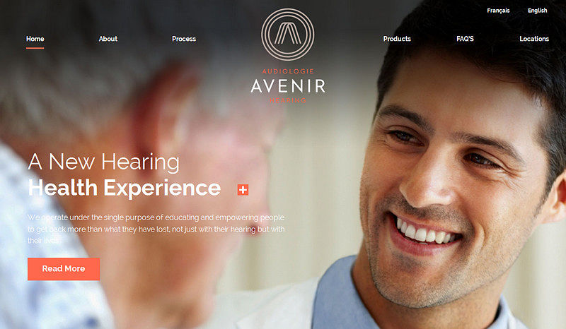
Avenir
The website tries to build up trust in users through an appealing photo background that depicts a close-up picture of a man who radiates positive emotions. Here, the design team opts for a smaller typography, subtle geometric forms, and calm coloring in order to throw the spotlight on the photo.
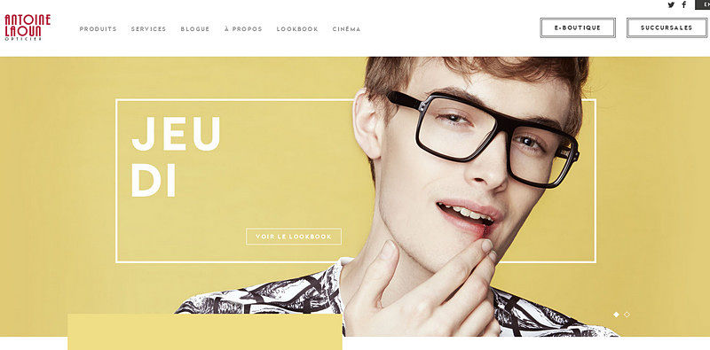
Antoine Laoun
The project evokes quite mixed feelings that certainly force us to stay. The slightly bizarre, close-up photo accompanied by radiant coloring and some stylish contour elements catch the eye.
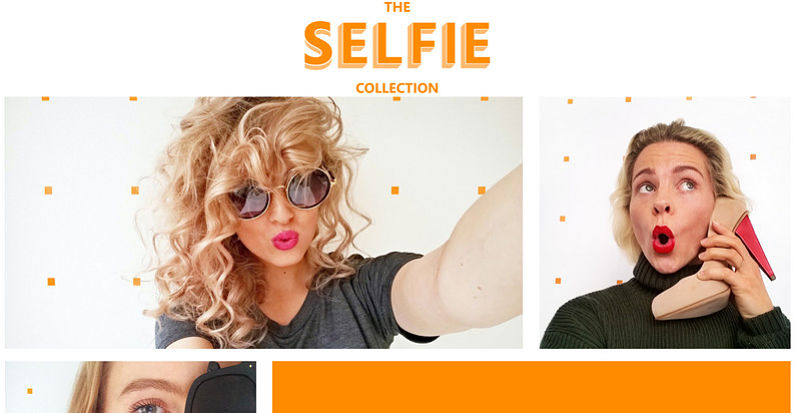
The Selfie Collection
This blog that sheds light on “Selfies” includes a collection of mind-blowing, cheerful close-up photos with faces. Thanks to the alluring human factor, the website is interesting to explore.
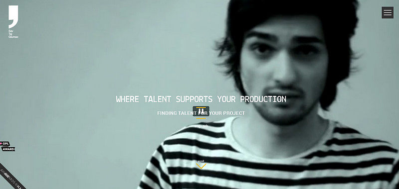
Sav Taj Glumac
The “welcome” screen displays a set of short videos, each of which depicts a close-up face of a man. Since the website deals with the search for new talent for production purposes, this solution is ideally suited here.
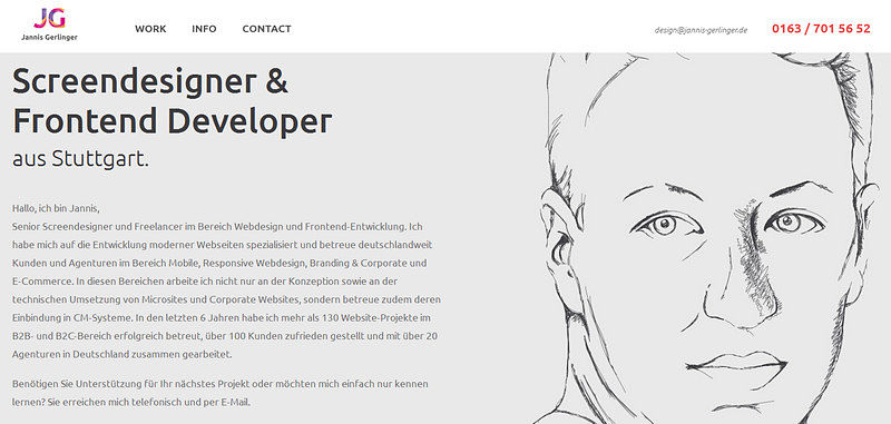
Jannis Gerlinger
The artistic hand-drawn portrait immediately strikes the eye as well as easily adds a touch of individuality to the website. A matchless sketchy drawing marks the professional online portfolio of Jannis Gerlinger in order to favorably advertise the artist’s workmanship.
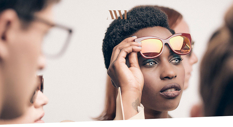
Andy Wolf
As you might have already guessed, this website is dedicated to the renowned designer eyewear. The front page suggests namely this. The spectacular image background serves as the primary driving force that stirs up interest.
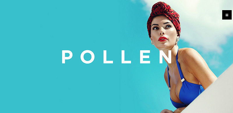
Pollen
As befits the majority of fashion-related web projects, Pollen’s website also gets the most out of professional photo shoots with models. Its landing page effectively showcases how to turn minimalism into an advantage by achieving a harmonious symbiosis of image backdrop and nothing more than just a tiny “hamburger” button and the distinctive nameplate.
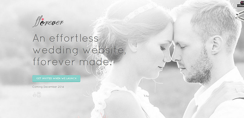
Fforever
Here an air of grace, love, and purity is prevailing. Thanks to the gorgeous light coloring, light patches, seamless typography, some themed graphical elements, and last but not least, a close-up image of the happy couple, the website looks awesome and engaging.
Vancouver Visas
Here the racy close-up image is aimed to demonstrate the natural beauty inherent to Canadian citizens. The photo backdrop ideally blends with the environment and supports the website.

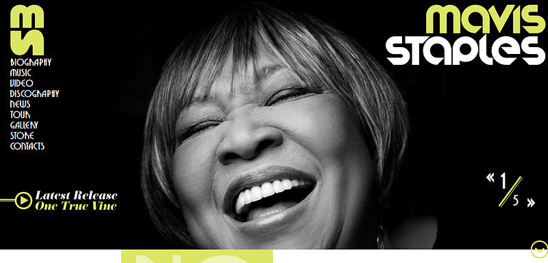
Mavis Staples
The website skillfully reflects the powerful personality of Mavis Staples, whose cheerful and joyful close-up image raises a smile. The dark backdrop along with bold, smooth typography and flat graphics naturally accentuate the photo.
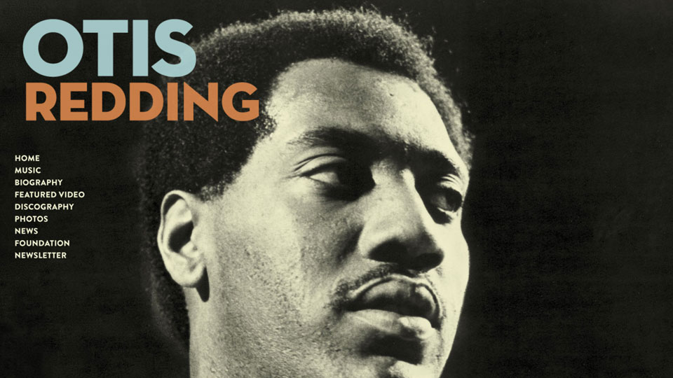
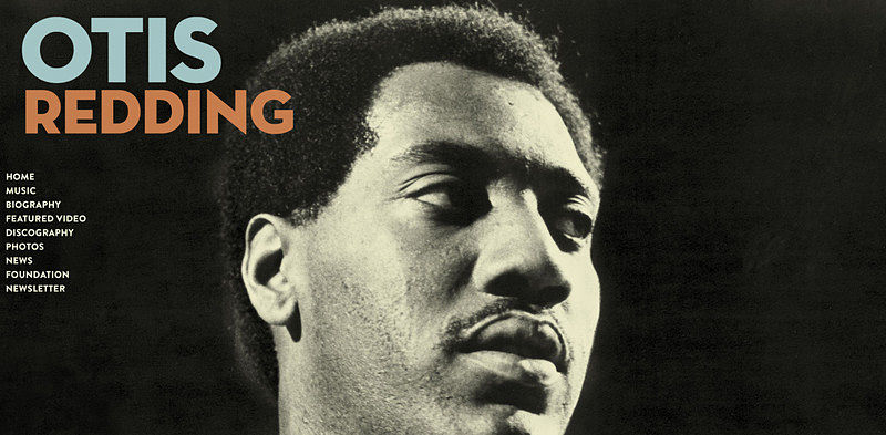
Otis Redding
Much like the previous example, here the close-up image serves as a visual focus anchor that sets the tone of the project and reveals a magnetic personality.
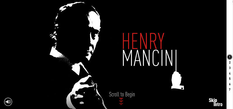
Henry Mancini
The website looks enigmatic and extremely intriguing, encouraging online visitors to delve deep into the project. Here a blackout close-up image gives the front page a charming note of artistry and creativity.
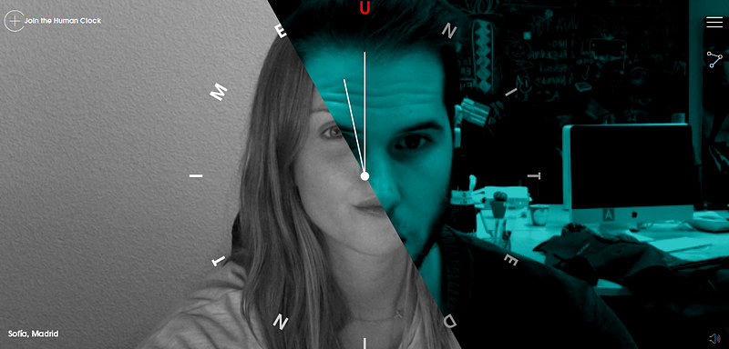
The Human Clock
Much like the blog dedicated to the “selfies”, the name of this project speaks for itself. Here, the “welcome” screen depicts different visages, providing the first page with a powerful human touch.
Conclusion
Front pages featuring close-up faces are back again. The solution is an inexpensive, but particularly effective way of adding a touch of personality to the project, showing emotions and separating itself from others.


