
In this post, I’ve gathered 29 amazing and beautiful magazine covers. They all have something to bring to the table, from great typography to interesting use of content and space. All of these covers come from creative designers who publish their work on Behance.
Some of the examples are quite simple and straightforward, yet others are busy and complicated. However, all of them are beautiful and inspiring. Let’s get started!
1. Zine
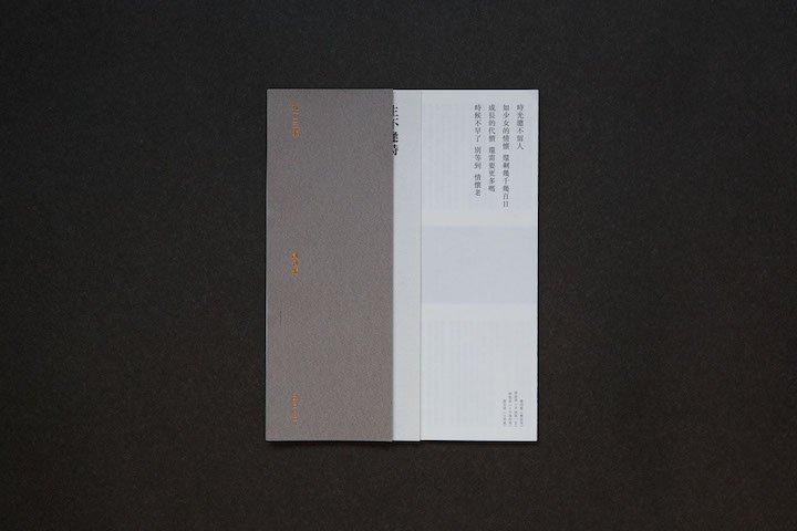
I find the design of this cover very nice. It’s minimal but interesting due to the cut-out cover flaps. The juxtaposition between the white and gray halves is a good design choice. Overall, the design is monochromatic in grayscale, except there is a hint of orange typography on the left-hand side. The orange is a nice touch, too.
2. Bau

Bau’s magazine cover is quite quirky. There is an interesting balance going on between the red circles in the top right and the black grid-like mesh in the bottom left. I especially like the small typography. Most magazine covers are overpowered with text but that’s not the case here at all.
3. Balkans
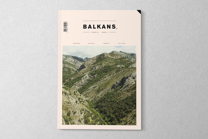
The first things I noticed about this magazine cover design is its non-white background. It looks like a soft peach/orange color. The second thing I noticed is the giant photo as well as the order according to which everything on the cover is organized.
4. On the Desk
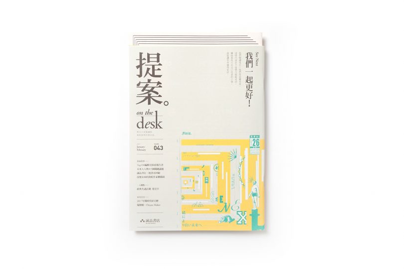
Unlike the last example, this magazine cover has a lot going on. Here, things are overlapping and a little messy. The color scheme of this design is amazing, too. The gray typography looks great against the light beige background.
5. Brik
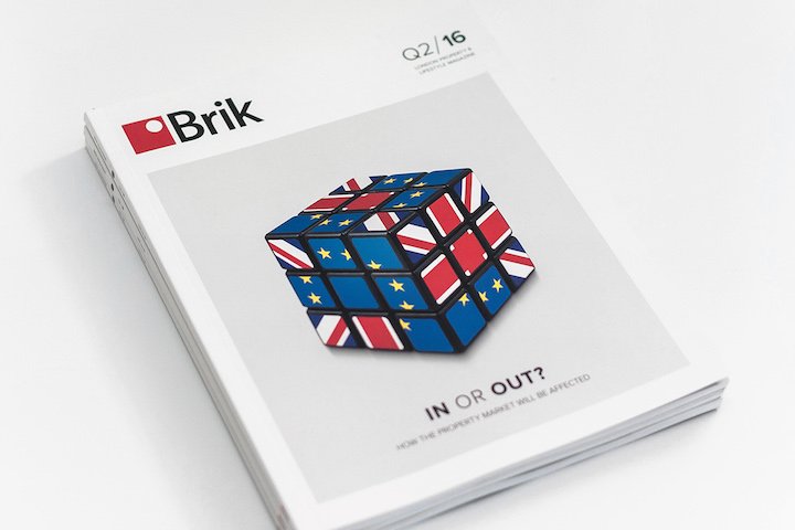
The design of this magazine cover is quite simple, actually. Birk’s layout relies heavily on the big image in the middle. Another important part of the design is the headline. It’s positioned within the image but not over the subject of it.
6. Letterpress Epoca Cover
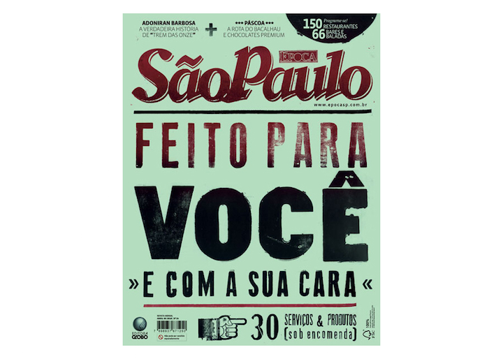
Of course, it’s easy to see that typography is the main focus of this magazine cover. The letters are large and kind of in-your-face. The various typefaces do work well together. The typography is definitely good at grabbing the attention.
7. Sicky
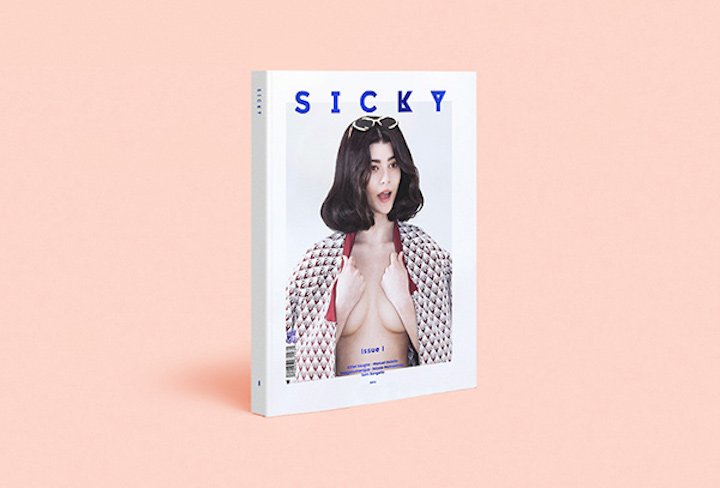
In this magazine cover design, the logo and name of the magazine are prominent. The title is bold, it’s overlapping the main content image of the cover, and it has a bright blue color that makes it stick out. The rest of the text, even though there is very little of it, is also bright blue.
8. Novum
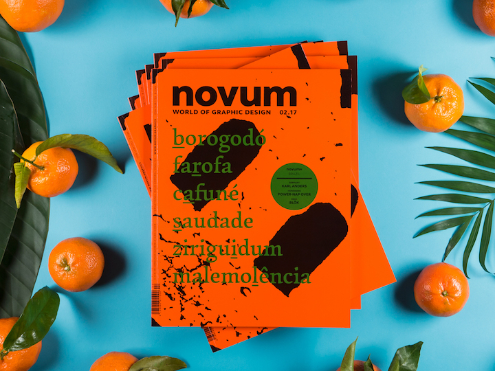
I assume the designer’s main concern was to draw attention to the cover with the bright orange color. The typography is large and features many contradictory elements such as the black splatter that makes the green text much harder to read.
This cover design was meant to make a visual statement.
9. The Space Race
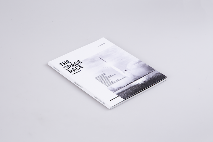
I think this cover is very subtle. The grayscale design is really nice. The overall design of this magazine cover is focused. The intent of this magazine is obvious from the cover. Looking at the title and the cover photo, it’s not hard to guess what’s it all about.
10. Novum
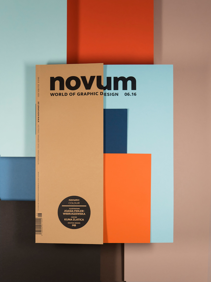
I had to include another cover design for Novum. This one is a little different from the previous ones. It uses multiple-colored rectangles that come together to make the cover. It’s minimal, it’s interesting, and it’s kind of fun.
11. The Ready Magazine
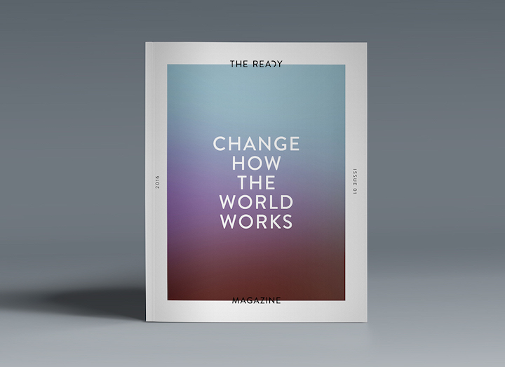
This magazine cover is something else. First, it uses the typical style of magazine cover design, with a designated photo area. Yet, it doesn’t use photos just a burst of blurred colors and a lot of typography.
12. Capital Magazine
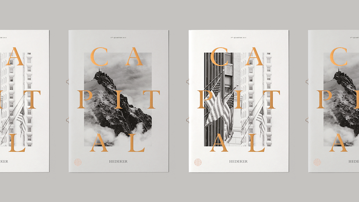
I love the style of design Capital uses. The gold and large fonts look great. I love that the typography overpowers the black and white photo in the background.
13. Full Stop.
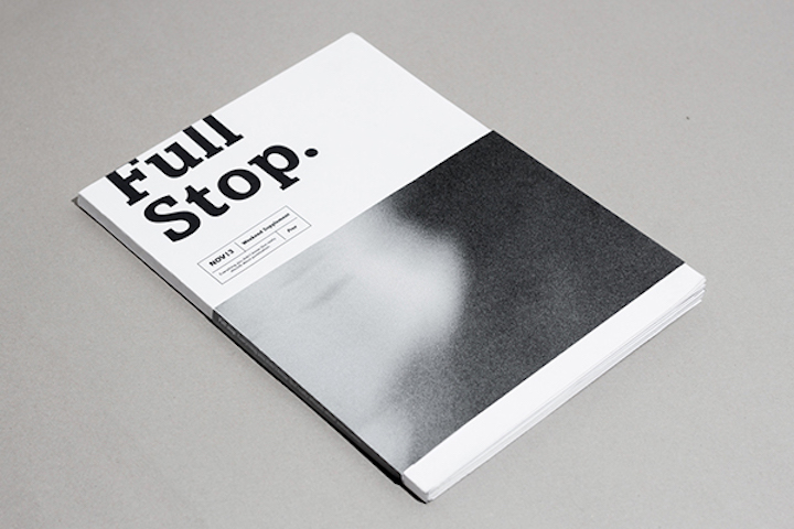
Full Stop’s cover is minimal. The image doesn’t look like anything, it’s just decorative. The title of the magazine is very large even though it’s only one of three different elements on the cover. The last elements are the details of the issue. Every element seems to have its own style, too. The grayscale brings them together.
14. 99U
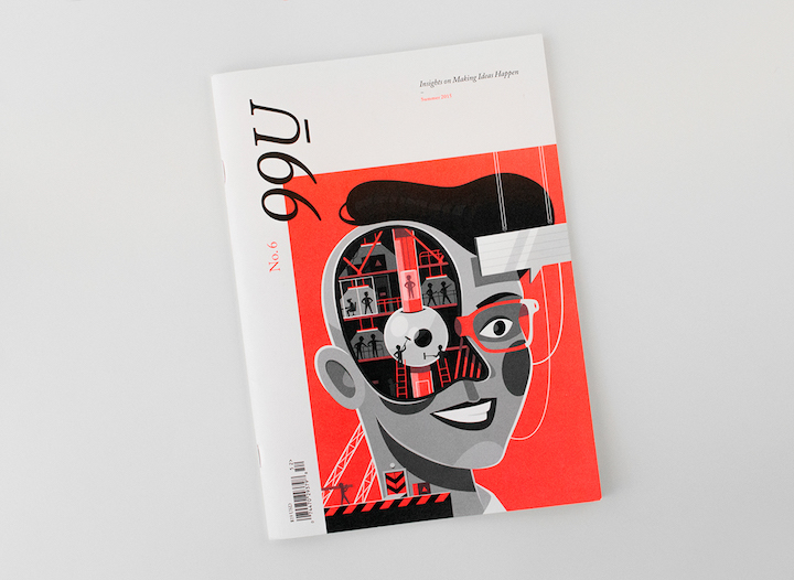
99U’s magazine cover looks great. The red is a good accent, as it makes the image more interesting. It gives the cover a lot of visual power. The rest of the cover design is clean and clutter-free, allowing the red image to take center stage.
15. The New Heroes
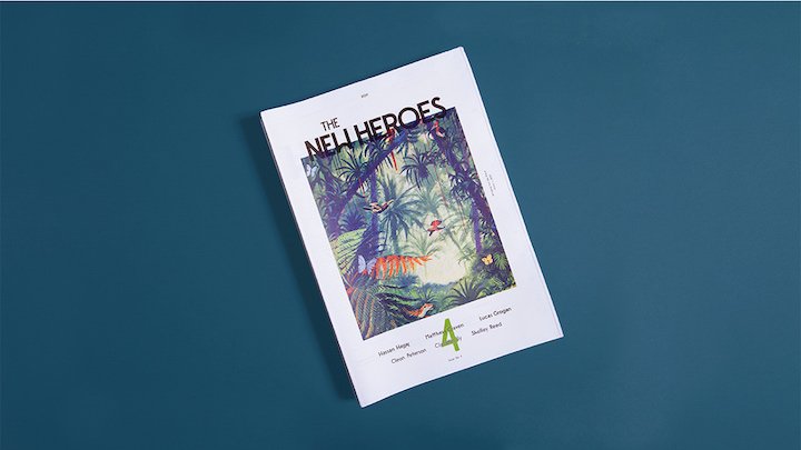
I’m including the cover of The New Heroes magazine into this list because it’s just so interesting! The imagery looks spectacular and the typography and colors are well-picked, too. The title of the magazine and the cover image are overlapping but only just a little—I like that.
16. Ting
The most interesting thing about this magazine cover design are the colors, or at least I think so. The background is so soft yet the graphic uses much darker colors. Yet, combined the two color schemes work well together.
17. Birds
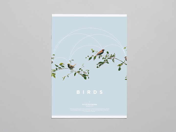
The magazine cover design for Birds is light and delicate. The light blue background sets a lovely tone for the overall look and feel. The white typography just adds more to it.
18. 2112
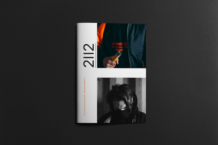
Here we have a bold magazine cover. It’s definitely due to the two cover photos. Their subjects, colors, and contrast are just bold. The juxtaposition between the red and navy as well as the black and white is powerful.
19. Szostka

Szostka, meaning six in Polish, has a good-looking magazine cover. The gold is my favorite part. The title of the magazine is as long as the grid of golden circles. It’s a busy cover, but that’s what makes it fun.
20. Botanic
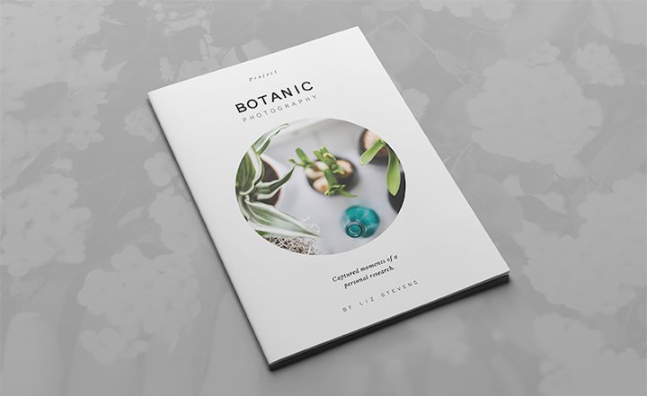
This one is the only magazine cover on this list that relies on a circular design element. Overall, the design is orderly, clean, and quite pleasant. The typography is lovely and the photo is nice as well.
21. GIST
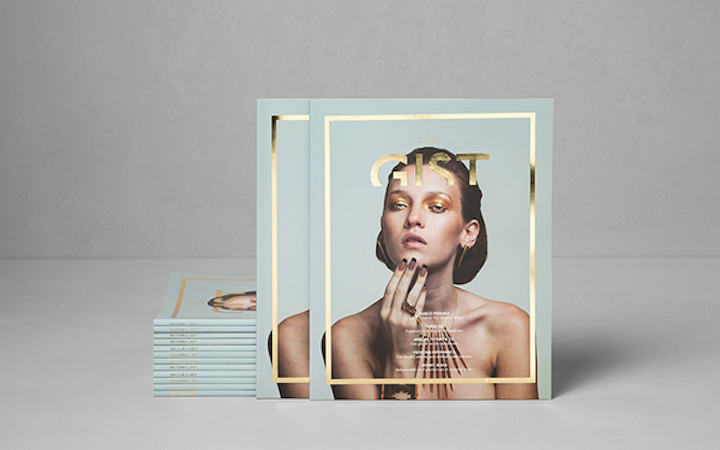
The design of GIST is edgy, don’t you think? The gold logo with the gold outline is fantastic. They look great against the high-style photograph and light blue background.
22. The Small Gardens
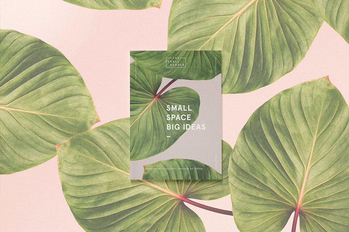
What’s not to admire in this cover design? First, the background is amazing, big, and full-spread. Additionally, the title of the issue is shown in a big, bold, and white text smacked in the middle. All of that look just so nice.
23. Dwell
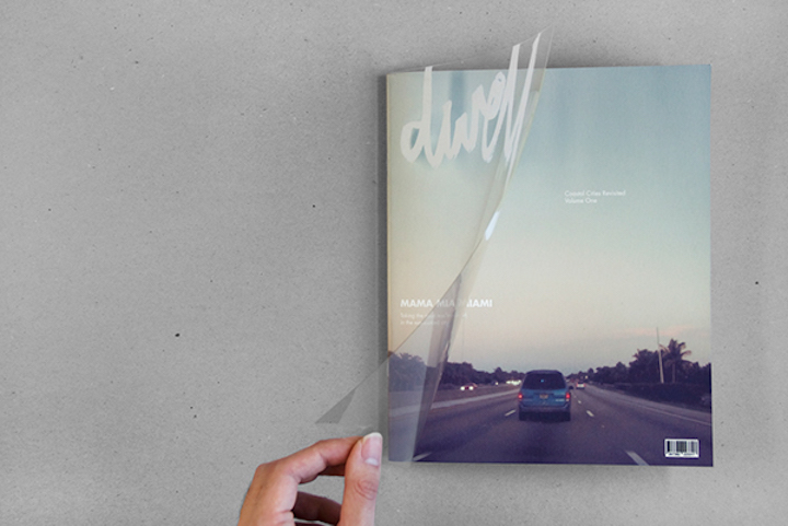
Dwell’s cover is actually made up of transparent plastic containing only the logo. Below the plastic, there is the cover image with a few headings and a barcode. The image is full-spread, so it looks really good as well.
24. Distopia Magazine
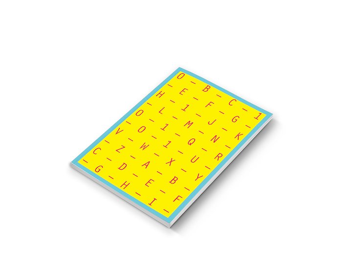
This magazine cover design doesn’t contain any image, but it’s still a good-looking cover. The design is made up of many letters spread out in an even grid that makes up the title of the issue. The colors are bright and a whole lot of fun, too.
25. Portfolio Cover
I like that this cover is smaller in size than the content. Furthermore, I really like that the cover and inside content have different colors. The colors work very well together, too.
26. What—Not
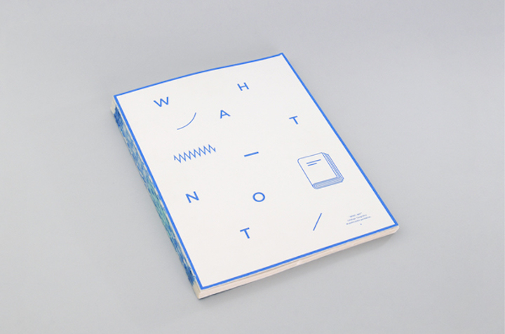
What—Not’s cover is simple yet disorganized. There is little going on, just a few random shapes and letters that spell out the title. It makes use of only two colors. All that complemented with the lack of alignment makes the design appear disorganized.
27. Trend
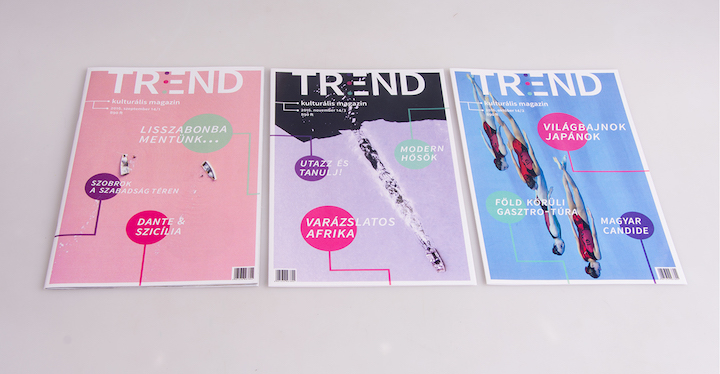
Trend’s covers follow the same layout, however each is slightly different from the others. The background seems to dictate the layout, with the text being organized around the content.
28. Poppy Magazine
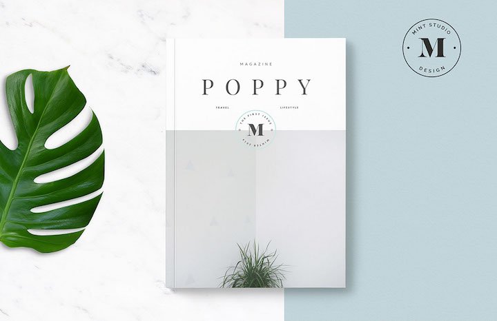
Poppy’s layout is lovely. The magazine cover is split into two parts. The top part features the title of the magazine and other important information, while the bottom part is a photograph with a small plant. The photo has a simple subject that makes it fit very well within the overall design of the magazine cover.
29. The Museum Magazine
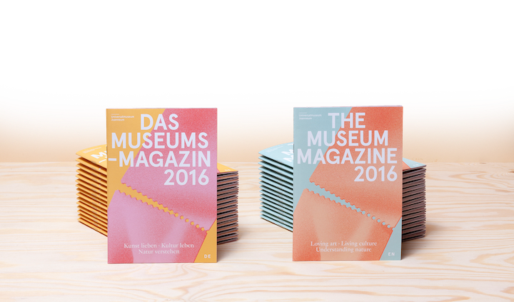
The last cover design relies heavily on color, typography, and composition. The colors are limited and slightly complementary. That makes the cover design interesting to the eye. The typography is bold, crisp, and white. The typography makes a nice visual statement against the colorful background imagery.
Final Words
That’s a wrap on cover design. I hope you enjoyed the collection. Some magazine covers are great at showcasing creative designs, be it through simplicity or complexity. Which one of these did you enjoy looking at?


