In the struggle for potential clients, the end justifies the means. In the fierce competition among creative agencies where each one can boast an excellent resume bolstered by a bulk of mind-blowing works, it’s really difficult to take a stand, distinguish yourself from others and win over new clients. So it is quite self-evident that corporate identity as well as official website design, as a rule, is planned down to the last detail. Everything is taken into account in order to avoid any possible loopholes. Here, every element, even the tiniest one, plays a decisive role that is able to gain the favor of online visitors.
From lush header backgrounds that strengthen the first impression to minor social media icons that finish off the overall appearance, teams pay attention to every component, and verbal tool of communication is also not forgotten, though it seems to be a relic of the past. Front pages are marked by motivational, catchy, smart and even bold taglines that develop friendly and healthy relationships with users as well as bring them around. Let’s take a look at a selection of intriguing examples.
Great Taglines
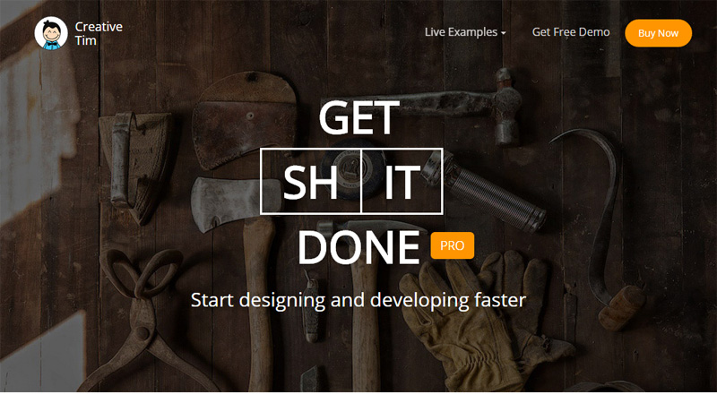
Get Shit Done Kit
Sounds rude but gets to the heart of the matter. The landing page with its rich header background exudes an image of brutality that goes perfectly well with the main tagline. Geometric shapes, sharp regular type, and a primitive color scheme adds to the overall atmosphere.
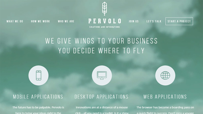
Pervolo
Pervolo’s online portfolio features a truly inspirational tagline that sets up an air of delicacy and sophistication: ‘We give wings to your business you decide where to fly’. Although due to densely packed together front page, the phrase slightly blends with the overall environment, when it catches the eye, it certainly enhances a favorable impression.
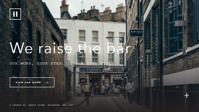
Hatch Collective
Hatch Collective opts for a good choice of phrase. ‘We raise the bar’ indicates that the agency not only keeps pace with the ever-changing world but it also is one of those who tries to call the tune. The second saying plays a supporting and inspirational role, ‘Our work, your eyes, it’s a love story.’
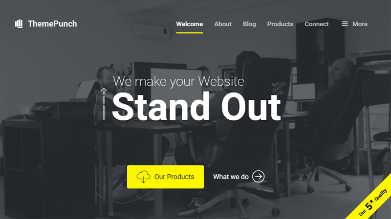
ThemePunch
ThemePunch vividly stresses everyone’s desire – that is to make their website excel from others – through putting a heavy emphasis on the last two words. The website has an informal tone with its header backdrop that features a workflow. It helps to highlight the value of the tagline more strongly. ‘We make your website stand out.’
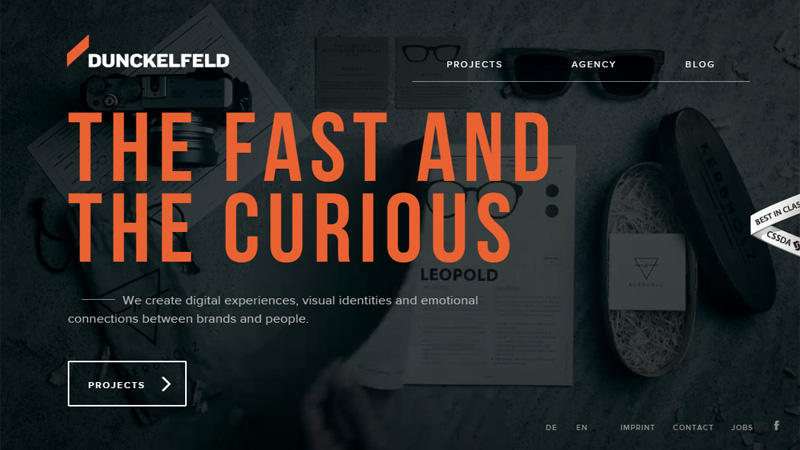
Dunckelfeld
The team skillfully leverages the title of a well-loved movie ‘The Fast and The Furious’, slightly changing it into ‘The Fast and The Curious’; however, it still reflects its powerful spirit. Standing in a sharp contrast to the dark backdrop, the tagline naturally strikes the eye and entices users to scroll down.
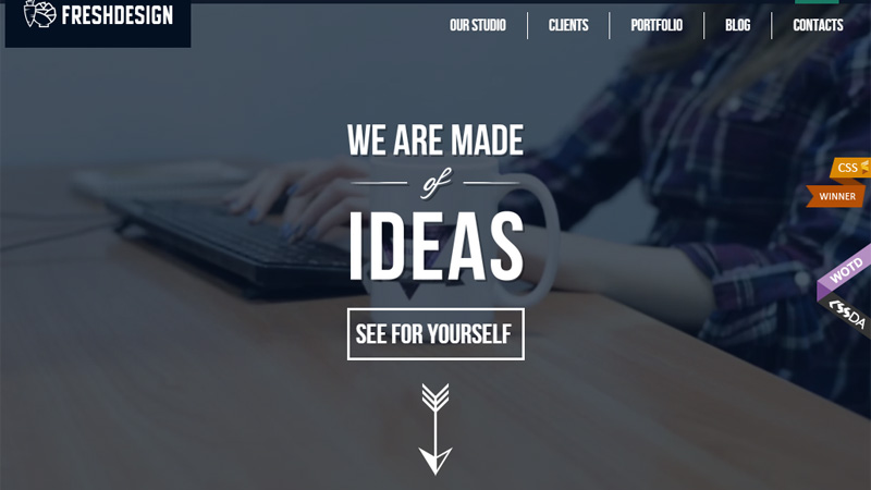
Fresh Design
Not only does the team demonstrate its creativity through an elaborate typographic centerpiece that is hard to miss but it also utilizes the verbal tool to announce this, ‘We are made of ideas’. A catchy slogan, which vividly describes the agency as a group of talented folks who are teeming with clever ideas, makes its significant contribution.
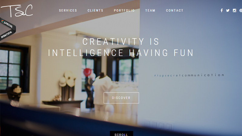
TSC
TSC tries to direct the attention to their enormous creative potential through a smart tagline, ‘Creativity is intelligence having fun’. Being displayed with the help of a subtle ultra-narrow type that gracefully interacts with the background, it goes well with ghost buttons, tiny solid icons, and an elegant logotype, creating a harmonious design.
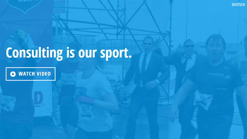
Robert Krause
Not only does the agency feature a clever motto with an interesting twist, ‘Consulting is our sport’, but it also supports it via an accompanying video that charges the page with a positive atmosphere. The saying naturally takes up the dominant position and perfectly conveys the concept.
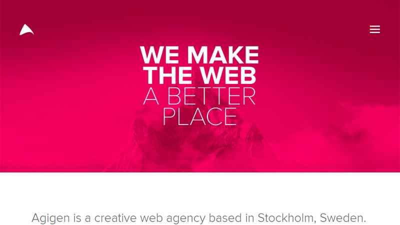
Agigen
Agigen tries to convince users to work with them by stating that they are doing a noble cause of populating the Web with excellent projects, ‘We make the web a better place’. The phrase is simply inspiring.
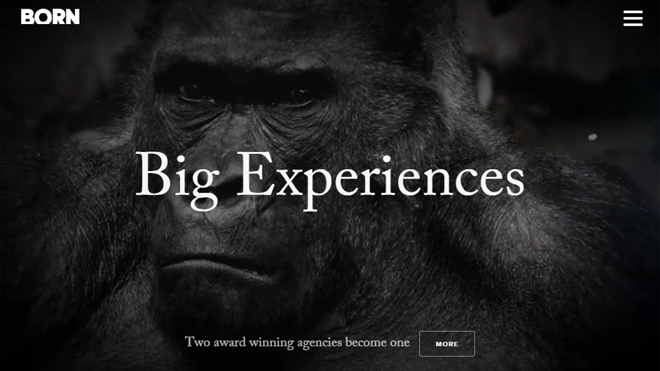
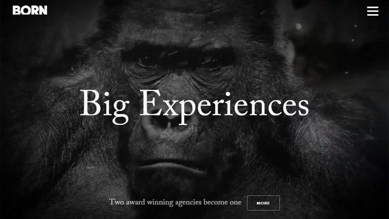
Born
Born marks its front page only with 2 words that speak volumes, ‘Big experiences’, relying on the experience factor that is necessary for each project. In order to make the impact more powerful, the team has used a strong image backdrop that reinforces the slogan substantially.
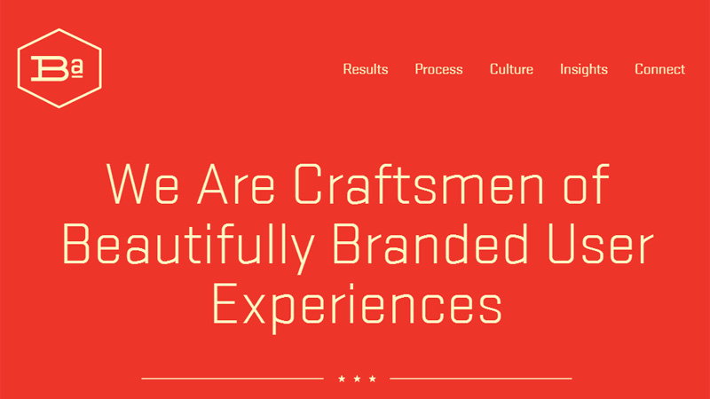
Brand Aid
Here is another phrase that utilizes “user experience” terms in order to win over potential clients, ‘We are craftsmen of beautifully branded user experiences’.
Here the creativity is evident; the landing page looks brilliant thanks to harmonious symbiosis of flat graphics and soft yet vibrant coloring. The tagline just strengthens the overall effect.
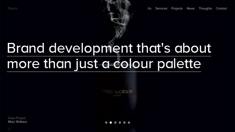
Parent
Parent with its clever statement tries to convey to the visitors that creating brand identity does not only mean to choose brand colors, as many do believe, it means much more, and they are perfectly aware of it, ‘Brand development that’s about more than just a colour palette’. As usual the startling contrast in tandem with enigmatic accompanying image backdrop dishes the meaning out correctly.
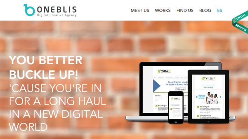
OneBlis
OneBlis encourages you to be ready for the tough world of the Web, choosing a proper phrase for communicating this message, ‘You better buckle up! ‘Cause you’re in for a long haul in a new digital world’. Although it looks a bit seamless and clumsy; however, it still manages to catch the attention.
Departement Creatif
Departement Creatif allows the image backdrop to speak for itself and create an authoritative and powerful atmosphere. The front page looks just sublimely and sophisticated. The catchy phrase ‘Rock the future’ slightly lightens the atmosphere, saving it from the pomposity.

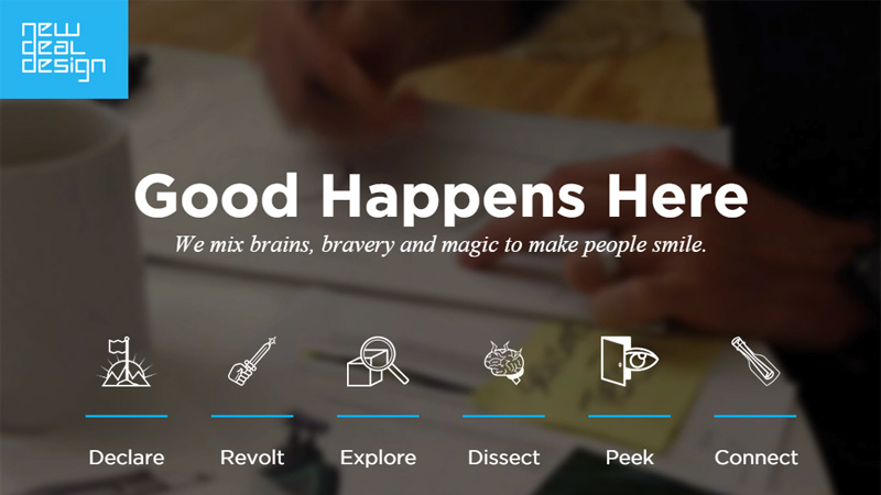
New Deal Design
Although the team gives number one priority to the statement ‘Good Happens Here’ promising to be the right place for your needs, an accompanying phrase that lies underneath it and made in a tiny size is also worth attention, ‘We mix brains, bravery and magic to make people smile’. It adds to a friendly and positive aesthetics substantially.
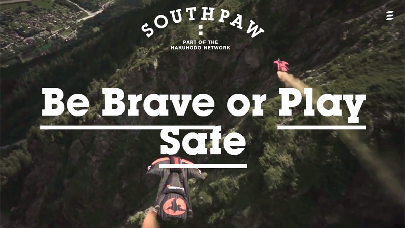
Southpaw Agency
Southpaw Agency has put a sincere effort into bringing around potential clients. The front page has a powerful, playful element that takes visitors on an actual experience. The phrase serves both as a link to the inner pages and as an inspiring tool, ‘Be brave or play safe’.
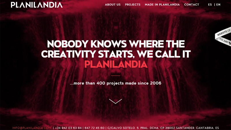
Planilandia
Planilandia seizes attention right away thanks to its dynamic and energizing “welcome” section. With its tagline, the team tries to make an indirect allusion to the fact that the agency is a birthplace of creativity, ‘Nobody knows where the creativity starts, we call it Planilandia’. So if you want your project to radiate originality you should apply strictly to them.
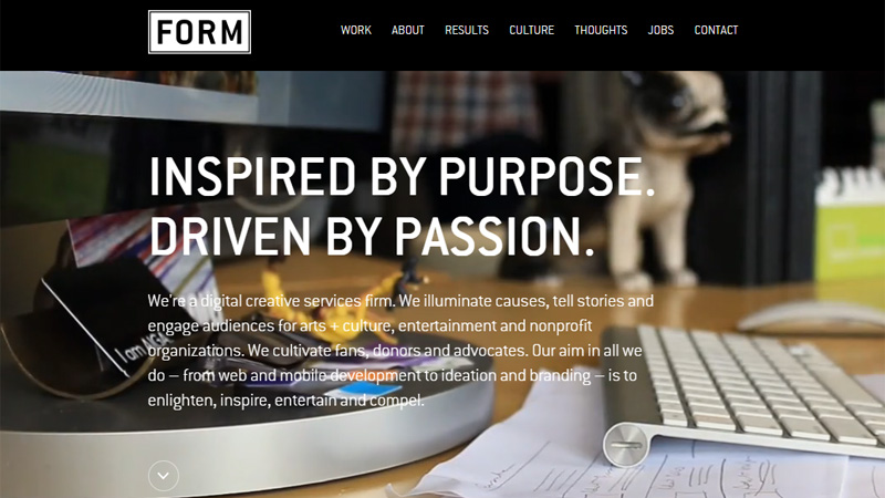
Form
Form have succeeded in reflecting the workflow in the best way through two well thought out statements, ‘Inspired by purpose’ and ‘Driven by passion’. An office-related image background perfectly singles out the tagline and establishes a businesslike appeal.
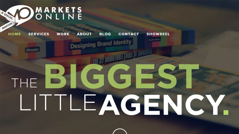
Markets Online
The team skillfully manipulates the type in order to attach importance to a couple of words. The phrase states that regardless of its small size, the agency can cope with complex projects and bring to life outstanding ideas with memorable user experience. ‘The biggest little agency’.
Thepixelage
Thepixelage stimulates users to choose their agency through two catchy phrases. The first one communicates the main appeal, so it is an eye-catcher due to its size and bold weight, ‘Bringing your digital dreams to life’, and the second one plays an accompanying role and brings its special zest, ‘An independent digital agency that is small in size but big in ideas’.
![]()
Conclusion
From outrageous and brutal to elegant and clever phrases, agencies not only push the limits in terms of design, but also try to impress online visitors with the help of a verbal communication tool. Although it lost a bit of its credibility and capabilities in the era of lavish images and splendid videos, properly implemented it still achieves spectacular results.


