Utilization of a cards-based layout is considered to be the best design technique for creating visceral mobile user interfaces, however, as often happens, the pattern has been eagerly adopted by website designers, in particular by industry goliaths such as Facebook, Google, Twitter, LinkedIn, and, of course, Pinterest. The main reason is that it is an excellent way to deal with a bulk of multimedia more effectively. Although the concept itself has many similarities with grid-powered solutions, there are still some differences.
First of all, it should communicate with users: it can include a flippable side that interacts with users, an expandable area with extra features, tooltip-styled graphics, call-to-action buttons, social media essentials and much more. Secondly, each card should embrace the information briefly and dish it up in easily digestible portions. Finally, the realization has to look well-balanced, properly organized and visually pleasing. Every aspect should contribute to the user experience, improving readability.
Today we have compiled some typical examples of card-based structures used in website design.
Websites With Cards Layout
Ashgrove Marketing
Ashgrove Marketing strikes with its clean, neat and harmonious appearance that lets user easily scan the page highly populated with artwork. The combination of lavish pictures and a robust panel with additional info on the bottom is certainly a win-win solution for this gallery.

Behance
Behance is a more simplified and compact version of Pinterest board that has managed unobtrusively to represent plenty of eye-catching snapshots of mind-blowing works of art. With such a rich appearance, the “cards” structure allows sorting out various issues and keeping everything in order.

Dribbble
Dribbble , much like the previous example, needs to shed light upon numerous relatively small images of masterpieces simultaneously, so that a rigid and well-balanced layout kindly provided by a “cards” design is vital. It naturally highlights the beauty of each shot and at the same time, avoids visual clutter.

365psd
The team has skillfully revamped the appearance of their online gallery. As a result, the front page has got a sleek and elegant appearance with a sense of compositional harmony. Each card unobtrusively draws the attention to the freebie and clearly specifies its format, title, and category.

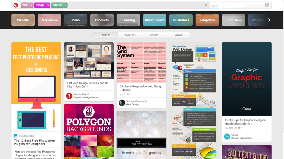
Pinterest – used in the title of this article, could not be missed out. It is one of the progenitors of this trend that vividly demonstrates how to display extravagant visuals effectively and does not overwhelm viewers with lots of focal points. Each block skillfully unveils image, piece of info and a back link.

Last Won a Trophy
Last Won a Trophy has a fantastic design charged with a sports vibe. The team capably presents each football club, displaying necessary data about it with the help of a small table. The latter includes the emblem, title, rating, and some stats.

Aria Awards
Aria Awards effectively balances visuals with simplicity, improving the readability significantly. Here the “cards” design organized through the utilization of solid clear borders, massive gutters and lots of white space, creates the right feel and makes everything look legible and very “clickable”.

Memory Design
Memory Design opts for a more classic structure when it comes to demonstrating portfolio items. Although there are no distinctive gutters, everything is flat and densely packed together; however, the “cards” design makes the gallery look organic and well-tuned.

Dishoom
Dishoom naturally matches the tone of the retro style with its sophisticated website design. Here an illustrated version of a card-based layout is used to visualize integral elements of the restaurant such as the breakfast menu or an example of a journal entry. The solution adds a wonderful flair to the aesthetics.

La Cultura del Marketing
La Cultura del Marketing instantly gives an impression of a serious online magazine that gets the most out of a well-balanced layout inspired by the “cards” design. It has managed to process lots of data, providing their online audience with easy-to-scan blocks.

Music Farmers
Music Farmers expresses movement and energy inherent to music culture. Here the “cards” design beautifully meets the bright color palette that energizes the front page with powerful emotions as well as livening up the content.

Samsung Club des Chefs
Samsung helps engage users with its new product through splendid and appetizing visuals that include both videos and images. The fancy grid helps to properly organize multimedia as well as makes the page look more readable and scannable.

Curioos
Curioos is filled with eye-popping pictures that can ruin the whole user experience because of its picturesqueness. However, the team has managed to create visual paths for users eyes by capably turning a “cards” concept to its advantage.

Happy Holidays from Ai
Happy Holidays from Ai produces a fantastic first impression that not only enhances the Christmas mood and makes the spirits bright, but it also is capable of putting forward the central idea. Here the card-based design naturally embraces 30 entertaining offers and eliminates the need for solving issues with visual mess.

Kringle Candle
Kringle Candle gives the product a more dominant position with the help of spectacular custom photography enriched by refined ultra-thin borders and delicate typography. Here cards are used to separate each item from another, set priorities, and, of course, embellish the website appearance.

Yes
The gallery has a clean, subtle and crisp look, achieved by a well-crafted layout. Teamed up with light grayish coloring the cards-inspired design naturally keeps each item apart from the mass, providing users with distinctive focus anchors.

V76
V76 exudes an image of brutality and masculinity. Professional photo shoots, elegant grunge touches, sharp and exquisite typography enrich the visual experience enormously and strengthen the overall impression. The right half of the home page features decorative cards that seize the whole attention and reinforce the general feeling.

Coffee Beans Delivered
The landing page of Coffee Beans Delivered gets its top-notch and jaw-dropping appearance from a gorgeous and well-thought-out combination of custom photography and flawless badge-style centerpieces with nifty grunge touches. The rigid grid that underlies the card-based design helps to strike an optimal balance between lush multimedia and free space, and add individuality to each block.

Canopy
The “cards” design is able to improve any gallery, especially those that need to demonstrate a range of products showily. Beautiful, soft muted color scheme of Canopy in collaboration with such a solution inspires online visitors to purchase goods as well as makes the page look compact and organized.

Fonden Voxhall
Fonden Voxhall has adopted an original variation on the “cards” design. Combined with flat style and bits of bright colors that pop against the backdrop, it has managed to enhance album covers, as well as highlight a personality for every item.

Conclusion
Cards-based design is a revised and improved version of grid-style layouts that are capable of handling and operating lots of multimedia data, saving a website from a messy appearance and preventing projects from ending in visual chaos.

