
How to engage visitors? It is an age-old question that worries all website owners. Regardless of the type of project, sphere of work and target audience, all we want is to win over as many followers, readers, and potential clients as possible. Of course, the time-tested way of drawing users’ attention through interesting information still works well. Content is a king. However, a harmonious symbiosis between text and multimedia as well as relevance of the material should always be taken into account.
But if you want to break away from traditional patterns and surprise visitors with a memorable and unique user experience, there is another modern solution that is slowly but surely earning recognition among creatives. It has already taken its rightful place in the list of web trends of 2015. Creating a storytelling experience is a great way of addressing to your audience in a captivating manner. Thanks to the parallax effect, a bunch of interactive details, subtle motion and refined flat style that accompany almost every such project, the method has managed to produce fantastic results that leave no one indifferent. Today’s collection reveals dozens of fresh case studies to prove this.
Telling a Story in Web Design – Examples
Let’s Make History
The website features a series of mind-blowing watercoloresque artworks that charm with intense and vibrant coloring and flawless execution. It instantly entices you in and absorbedly takes you from the header to the footer, stirring up interest in each section.
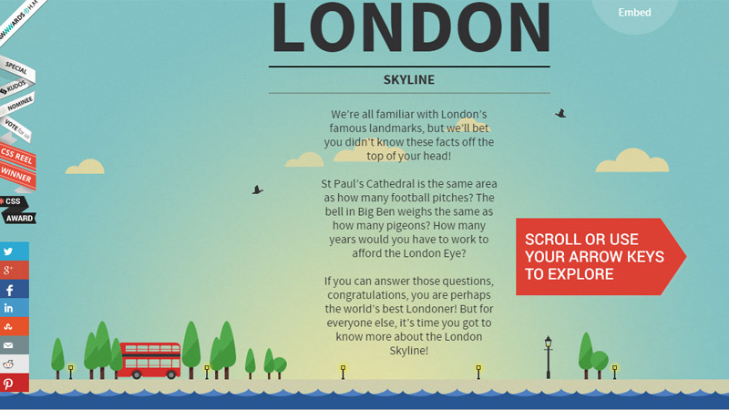
London Skyline Interactive
In order to get the whole idea of Kurve’s London Skyline Interactive, you should look through the entire website first. You can do it with the help of the arrow keys or scrolling. The project is driven by a neatly crafted horizontal parallax that brings to life tiny details, as well as serves as a supporting device for a fully illustrated environment.
Ionic Security
Ionic Security tries to win over potential clients through offering them to plunge into a subtle storytelling experience bolstered by some minor animations. The solution unobtrusively sheds light on their sphere of expertise and potential of the agency.
The only drawback is that you are allowed to navigate only with one control and only in one direction.
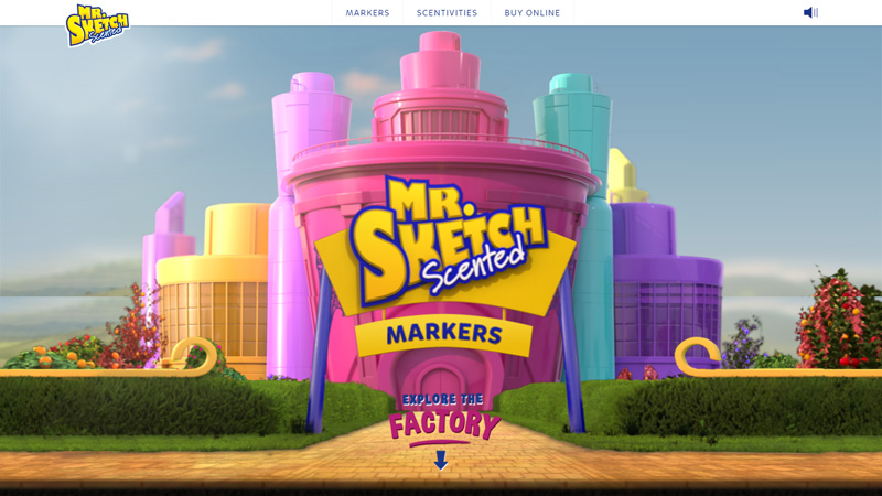
Mr. Sketch Scented Markers
The website offers you to take a look inside the factory through demonstrating the manufacturing process in a graphic manner. Fully illustrated environment in tandem with scrolling technique creates the fantastic visual storytelling experience.
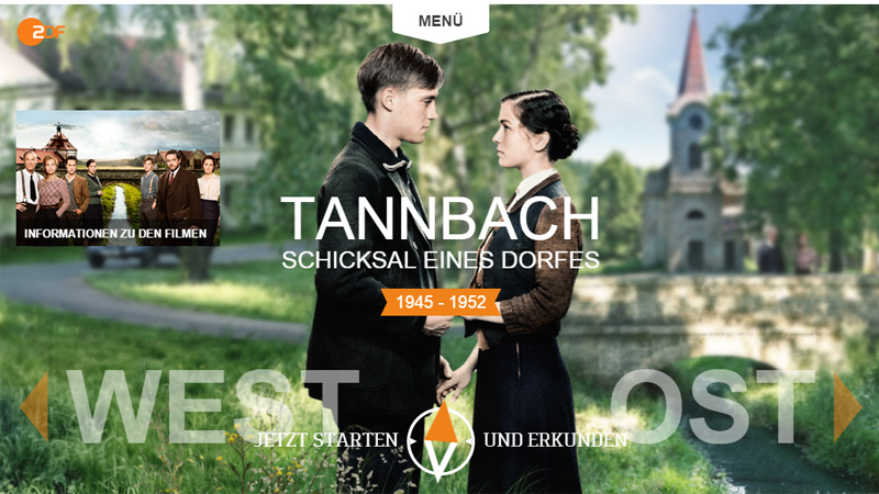
Tannbach
Tannbach is an entirely interactive website that is going to take you on an actual visual experience. The website fascinates by its picturesque scenes, tiny dynamic details and skillfully dished out information and videos. Subtle motion that enhances elements of the composition significantly contributes to the general feeling.
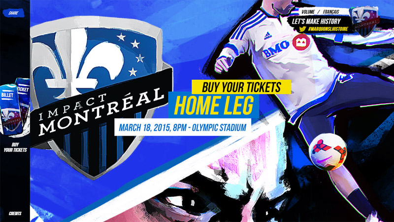
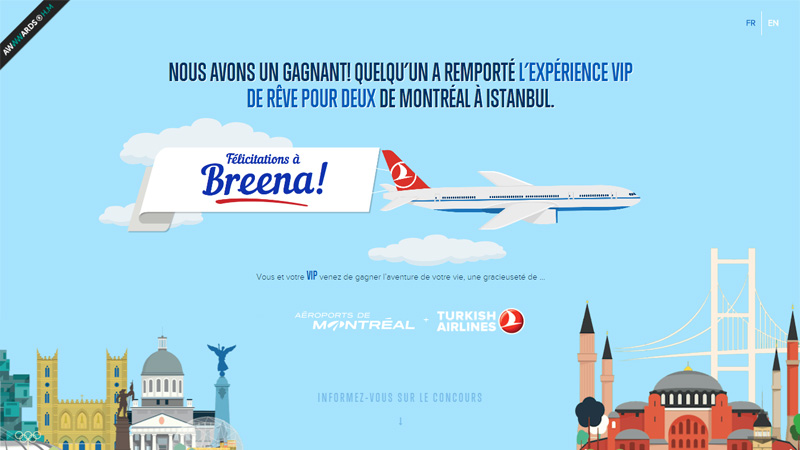
TKMontreal
TKMontreal is a promotional website that is neatly crafted and charged with subtle motion. Everything looks alive and intriguing. The fully illustrated environment easily gives the content the dominant position as well as recreating a pleasant atmosphere.
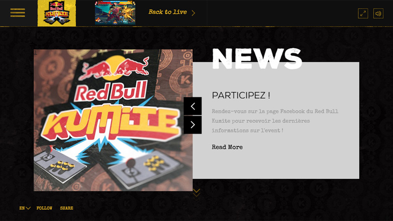
Kumite by Red Bull
As befits any industry giant such as McDonalds or Coca-Cola, Red Bull is famous for its fantastic and highly engaging websites that gain users’ attention right away with unique ideas and professional execution.
Kumite is another website from Red Bull that can boast an excellent storytelling experience. It owes its sparkling appearance to a lovely and subtle Japanese theme.
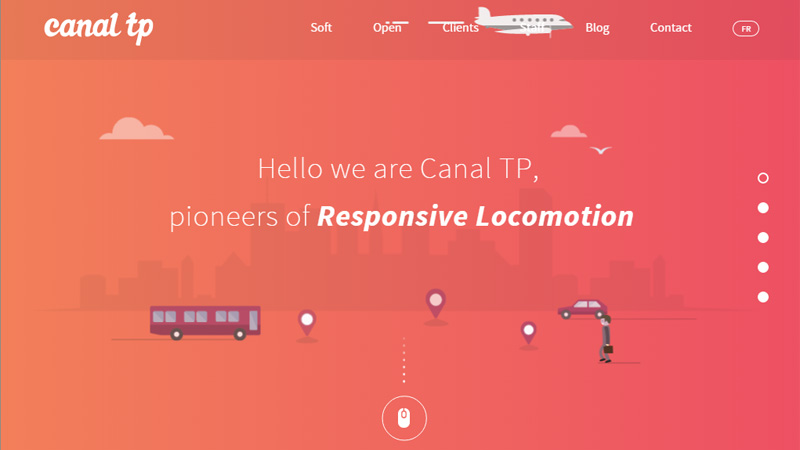
Canal TP
Canal TP greets the online audience with a dynamic front page where the carefully crafted environment is supported by subtle motion. The project certainly has an element of playfulness that urges users to scroll down and take part.
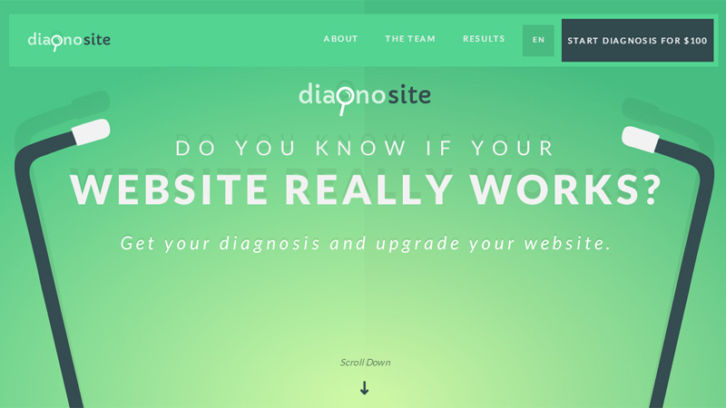
Diagnosite
Diagnosite makes the most of flat style and a gorgeous bright color scheme, engaging users in a frisky and visually intriguing manner. The project keeps everything interesting and maintains users’ attention right to the end.
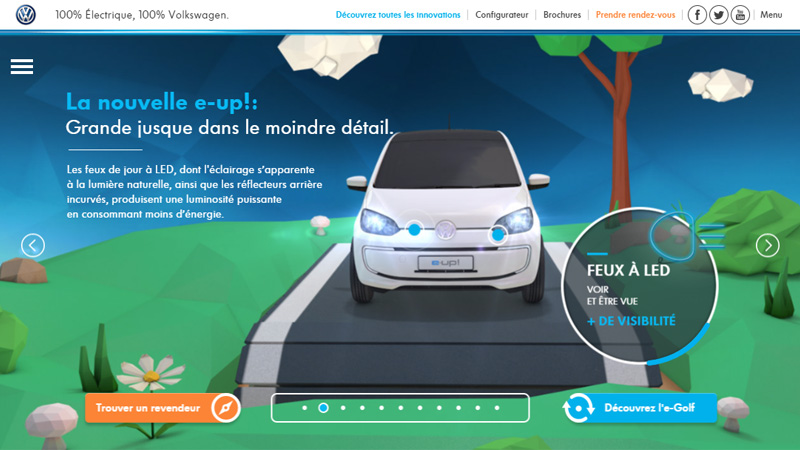
Volkswagen Electrique
Here every detail counts. An automotive website based on a fully interactive environment demands interaction from users in order to reveal benefits and essential features. The idea is brilliant, and the realization is simply astonishing and captivating.
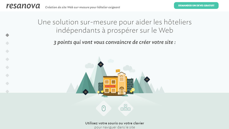
Resanova
Resanova includes a bulk of friendly animations that establishes friendly and appealing aesthetics. While illustrations are made with a splash of personality, the scrolling mechanism ties everything together providing users with a great storytelling experience.
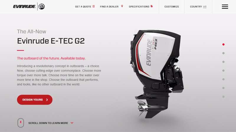
Evinrude
Evinrude demonstrates how to promote a new product properly and keep users’ focus on it till the end. Combining clean grayish gradient canvases, a considerable amount of whitespace, well-formatted text blocks, dynamic details and spectacular photo shots together add visual interest to the project and form a pleasant experience.
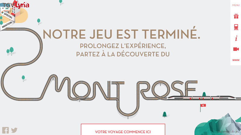
TGV Lyria
The website has a distinct eye track that shows the way of exploring the project. Along the journey you will encounter various pointers that open a lot of interest, enriching your stay. As usual, a magnificent storytelling experience is achieved through a perfectly executed blend of refined illustrations and robust scrolling mechanism.
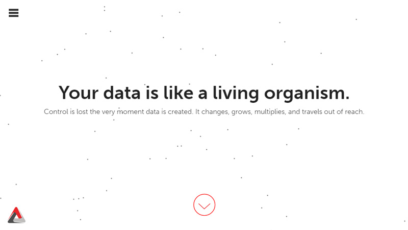
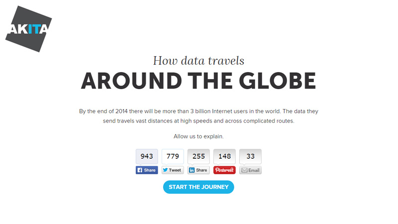
Movement of Data
Movement of Data is an informative website that aims to explain complicated things in simple language. Thanks to spectacular and intelligible illustrations, the website will be interesting to everyone.
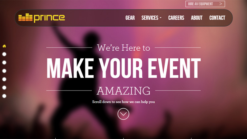
Prince AV
The website exemplifies how the agency helps people to organize their events. It delivers the necessary message, naturally reflects the concept, embraces the idea and provides visitors with an excellent visual experience.
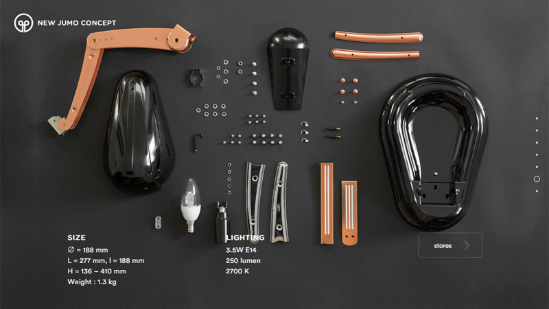
New Jumo Concept
New Jumo Concept easily catches the attention with its range of impressive photos. The product is presented in all its glory. The landing page includes some focus anchors that inevitably involve users, arouse curiosity and hold the attention.
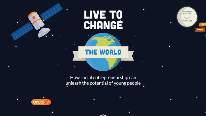
Live To Change The World
Live To Change The World tells a beautiful story that shows how to unleash your potential via social entrepreneurship. The project draws users in with its splendid cosmic theme beautifully populated with statistical data and bolstered by some minor animations.
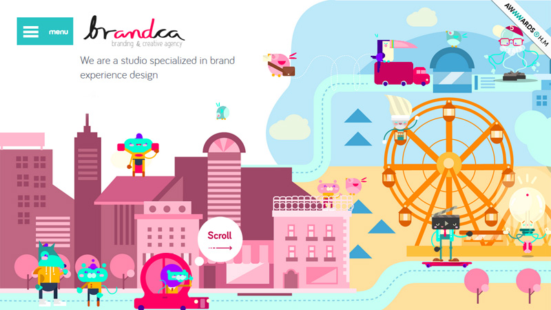
Brandca
Brandca evokes positive emotions straight off. Although at first it seems that the website has a messy and clumsy appearance due to the richness of an illustrated scene and riot of colors. However, the page looks intriguing and appealing, leaving users with a distinct impression.
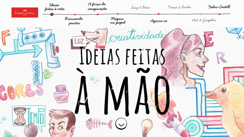
Faber Castell
Faber Castell offers you to go on a sumptuous journey realized on the basis of brilliant sketches that are filled with positive emotions. The website lets you move from left to right and find out interesting things along the way.
Conclusion
The storytelling approach is quite popular among web developers nowadays though it demands a great deal of effort, much time and mastery of skills. Done properly, it engages users more effectively and is able to leave an indelible imprint on the memory.


