
Large type in web design is certainly trending at the moment. It is a trend that has, in some cases, almost been forced upon designers through the trend of large background images. Big type is needed to stand out against a busy background image and be noticed. As we know, designers are problem solvers by nature, and this was how they solved the problem of using large background images and including content or titles that are easily visible for users. In this article we are taking a look at how to use large typography, who should use it and the reasons to include big type on your site or your clients’ sites.
Big Type in Web Design
Why use big type?
There are many reasons to use big type in web design, and we touched upon one of those reasons in the introduction – big type stands out on a large background image.
To Get Attention
If you have to get an important message across, huge lettering does the trick admirably. This is not a new idea, it has been a tried and tested method since the early days of print. It is one of those ideas that simply works – people will naturally look at a huge headline first, if it interests them, they will read on. So your large lettering has to be meaningful or a killer headline to make your readers stay on the site and read further.

To Connect with your audience
The use of big type, especially when there are text effects used, can connect with visitors emotionally. The text can tell a story on its own, or give an explanation that the viewer will immediately understand, thereby making the connection. There is a negative side to using emotion in any kind of web element, conveying the wrong feelings can send your visitors scurrying very quickly from your site!
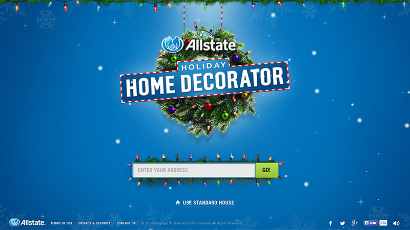
The American insurance company, Allstate, produced this website for the Christmas holiday period. They use a Christmas wreath with a large banner for their text headline. They also have the Jingle Bells music playing. You are invited to input your address (just a town and state), then you are asked to decorate the building with Christmas decorations. Unattended candles or overloads on fairy lights will cause everything to catch fire… proving how much you need household insurance! This is a very well thought-out and presented emotional website that uses large typography to get you in the mood.
To Establish Your Name
There has been a lot written about why you should have a portfolio, whether you are a web designer or developer, photographer, etc. If you want people to remember your name, write it BIG. Just shout your name out to your visitors to help them remember it. It happens too often that a potential client will visit your portfolio, see something they like and register it in their brain, but move on to other portfolios. After viewing a few more, they make the decision that your work suited them best, but they can’t remember your name! Putting it right ‘in their faces’ can help a lot with this, even if it means looking back through their browsing history their memory is jolted.
Mikel Porras Hoogland has an amazingly simple website design. It is flat, uses large blocks of retro colors, and the landing page has an animated image of the freelancer with a green transparent layer and his name and field of work in larger than normal white text.

In place of images
If your site is image-light, large typography can work as well as an image in some situations.
The Verge is an online technology magazine, and is very content-heavy. They use a grid-style layout with small images with gradient transparencies. Each featured article has a piece of headline text in large white lettering. The Verge logo is also designed in large type.

The New York Times uses a very similar layout to its printed newspaper, and here we can see where the large text idea crosses over between print and web. The header title is large and in an old English-style font, and each section is divided by larger than normal text as a new section header. This is how newspapers have been laid out for many years, light on images, heavy on content and using various sizes and weights of text to attract the reader’s attention.

Who Should Use Large Type?
I think there is no reason for anyone NOT to use big type in their website design, but it works better with some trades than with others. I would say that a very image-heavy site probably does not need to use big type. As mentioned above, if you want your name to be remembered, big type can do the job admirably, therefore it is ideal for portfolios.
The Cut use huge type on their landing page… you are not likely to forget their name if you visit their page! All of the typography on this page stands out, and the little touches of red (including their simple logo) make it look very newspaper-ish. The lettering is not on a large background image, it is large to put the name into your mind.

Ruben Sanchez has a similar idea to the above example, but here we have white on dark colors with touches of red. The large lettering for his name is designed to put it at the forefront to help you remember it. This site overall is very dark.

The Italian fashion company Zeis Excelsa use large text to get their message across – that they sell brand name fashion. This is another industry that can benefit from large type to convey a message rather than put forward their name.

How to Use Large Type
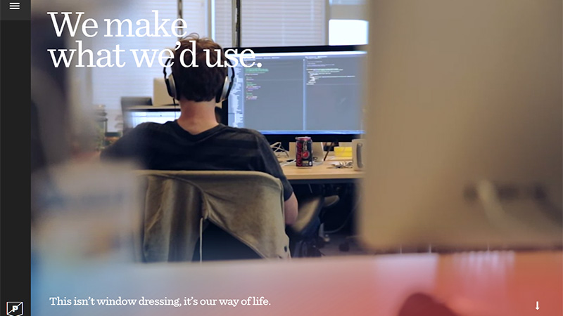
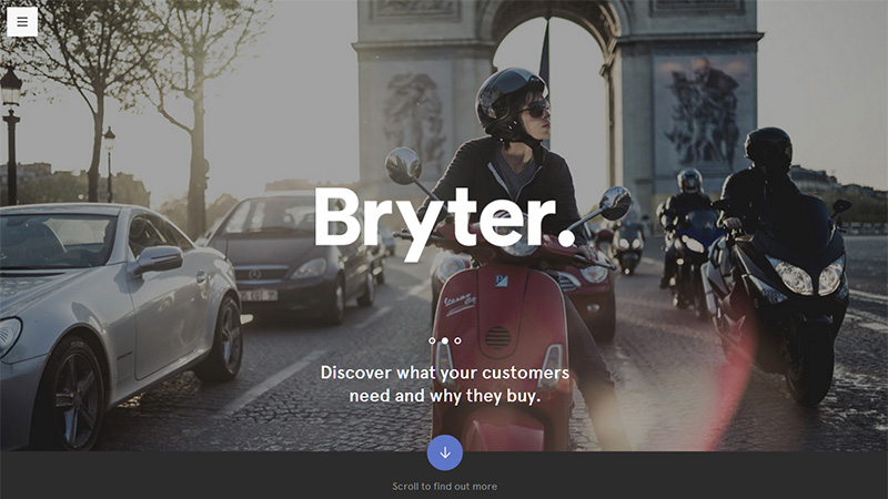
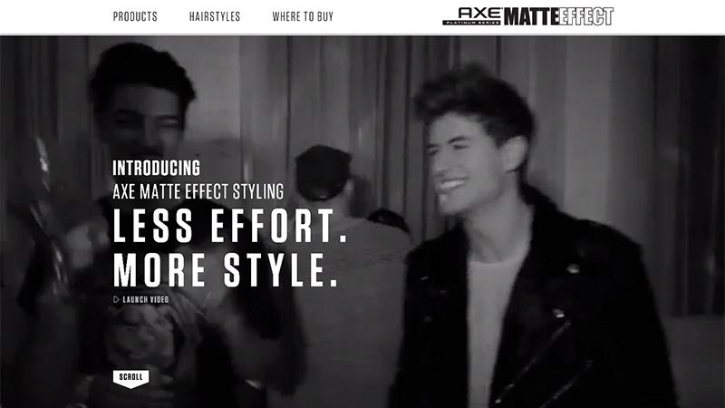
Of course, the best way to show how to use any design element is to showcase successful projects – which is exactly what we are doing here. This list of featured sites use large type on their landing page either to put forward their name or to present their message, sometimes using large background images with transparency, or in a minimal way, bringing the text right into the spotlight.
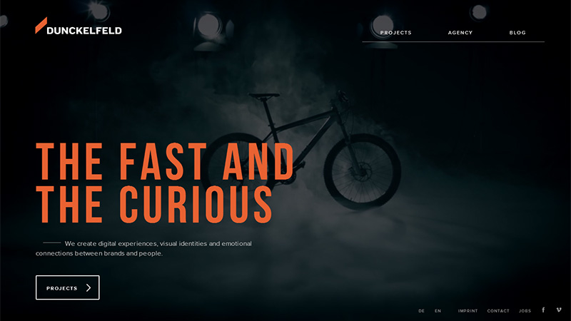
Dunkelfeld
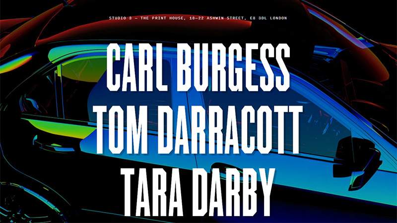
Studio 3
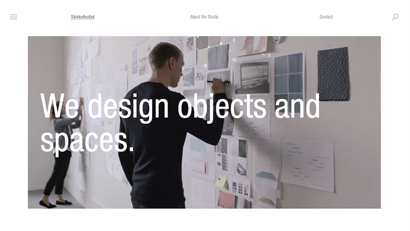
StokkeAustad
Purple, Rock, Scissors
Bryter Research
Cultivated Wit
Axe Matte Effect
Waterloo

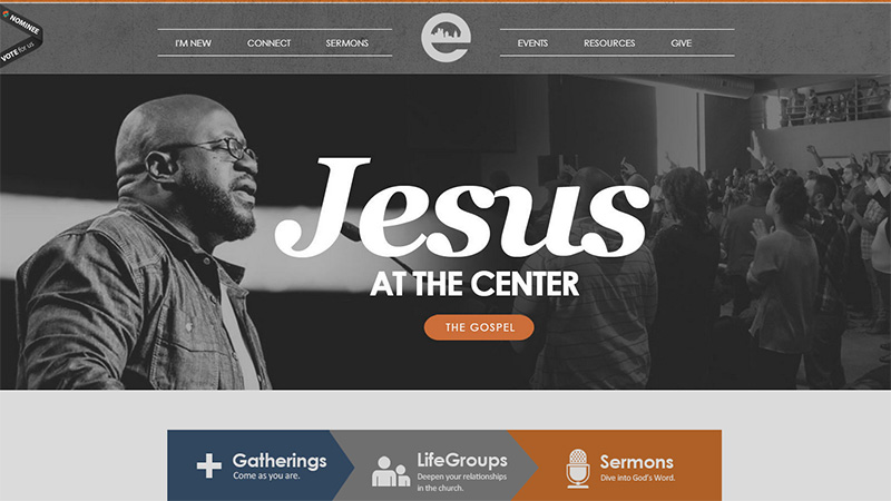
Epiphany Fellowship
Labcase

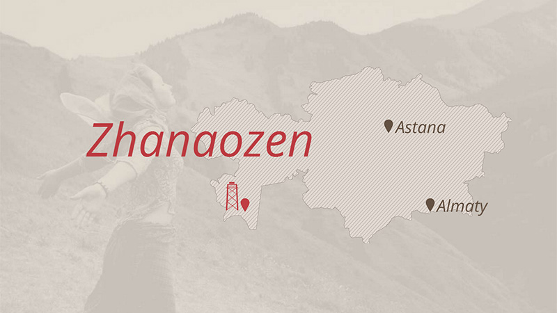
Zhanaozen
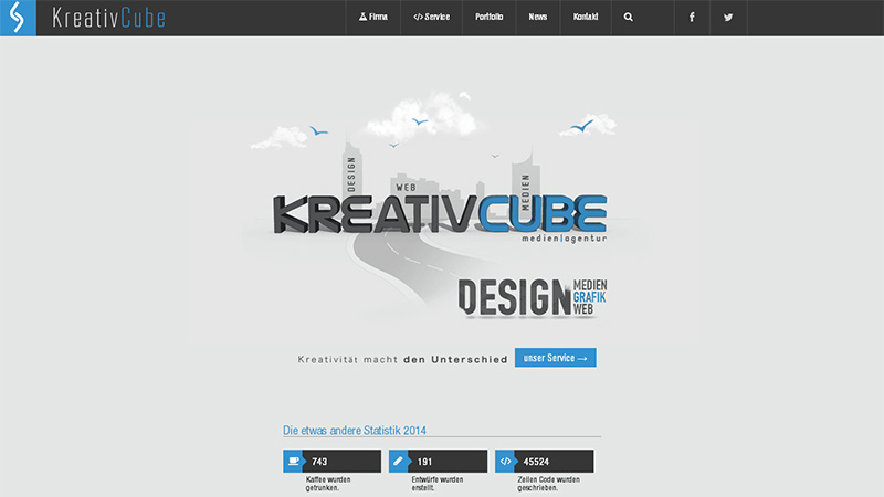
Kreativcube
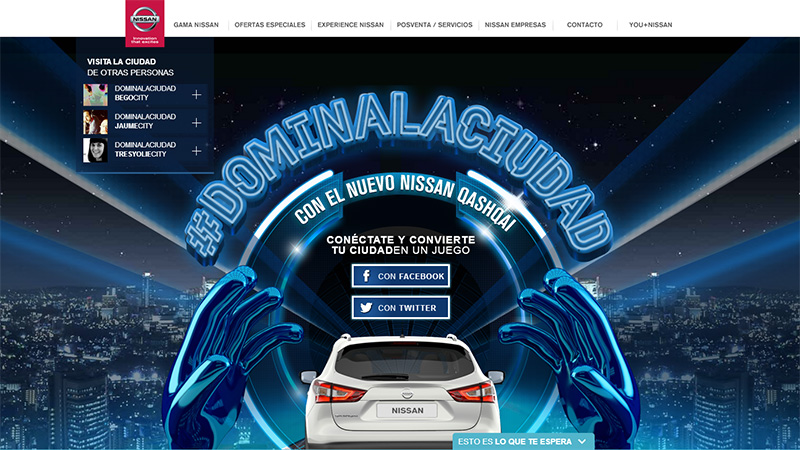
Nissan Qashqai
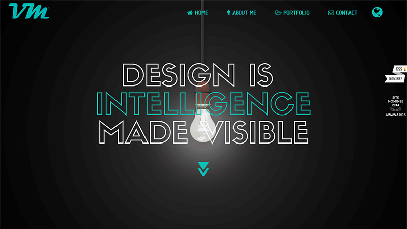
VM Alonso
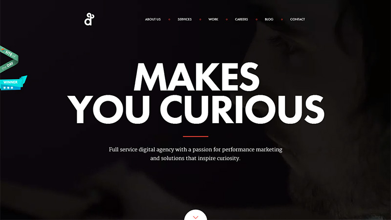
Degordian
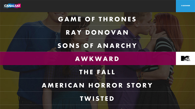
CanalSat Series
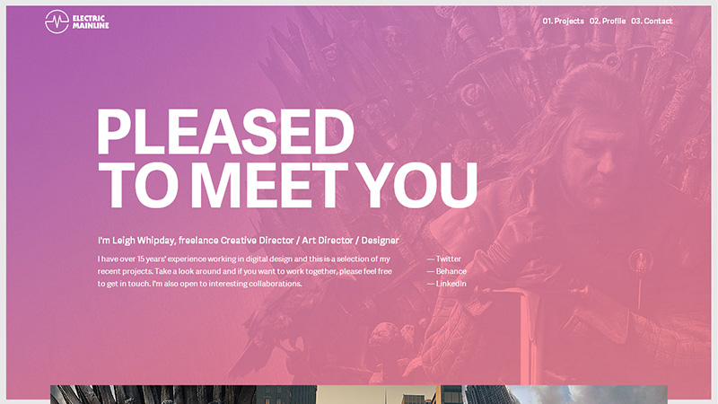
Electric Mainline
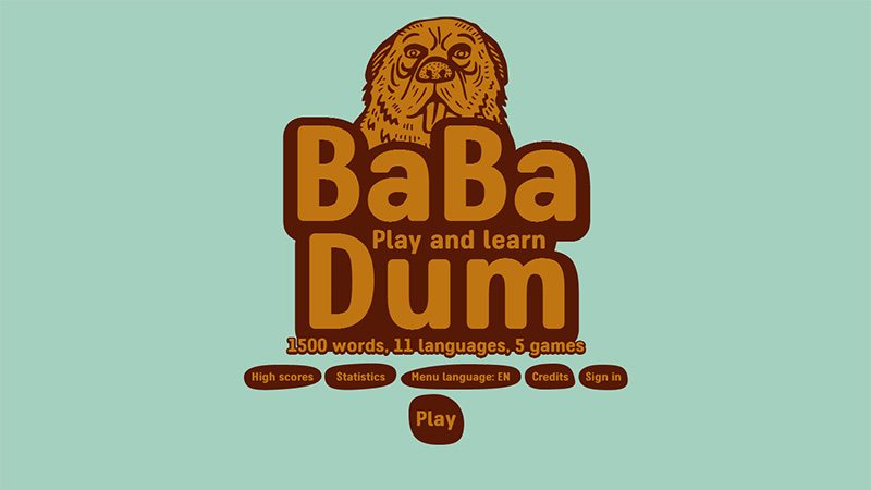
Ba Ba Dum
Mercedes-Benz: The Perfect Kilometre

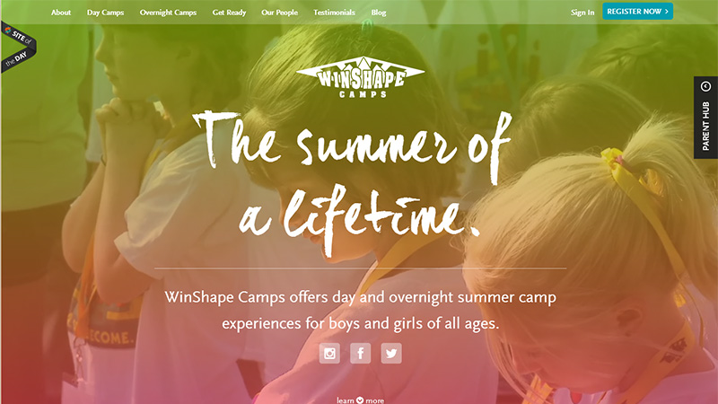
Winshape Camps
Conclusion
As we have discussed, large type can be used to put either your name or your message out in such a way to help visitors remember it. It can be placed over large background images to make it stand out from the busy background, or it can stand alone on a white or colored background just to reinforce the name or message.
Have you used large type in any of your projects or on your own website design? Please share your links and opinions with us in the comments section below.


