
We should all agree that the primary navigation must always be visible and be a salient feature in a website, however, the last couple of years this fundamental rule has undergone some changes that are mainly caused by current tendencies.
Today main menus can have a more inconspicuous appearance. Numerous designers prefer to hide the navigation behind a simple icon, which reveals the navigation panel on demand. And if earlier designers took care about free space, having made the menu as compact as possible, then nowadays slide-out navigation is able to occupy as much space as it needs. Being borrowed from mobile and tablet app interfaces, they can easily delight users with their diversity.
They can appear from various sides of your website, have horizontal or vertical orientation. Also, if necessary, they are enlivened by some amusing effects. The classic version, of course, is a horizontally-oriented slide-out menu that appears from the left side, however nowadays numerous websites are populated with vertically-oriented menus that elegantly drop from the top. And today we are going to examine exactly this particular solution.
Slide-Out Menus in Web Design
1. Pablo & Rusty’s
We are going to start with Pablo and Rusty’s website. It features a basic slide-out menu that is filled with some high-quality images; each item has its own marvelous picture, icon and color, however, since the menu is superimposed over another spectacular image that takes up almost the whole area of the welcome screen, its beauty slightly fades and merges with the environment.

2. Kevin Lagier’s Portfolio
Unlike the previous example, here the menu occupies the whole header section. The designer plays on contrast, making the navigation look noticeable mainly due to light coloring. Ultra-narrow subtle typography is not an accidental choice here as well; it effectively fits into the whole design, adding elegance and sleekness to the appearance.

3. Levi Van Veluw
Here the menu also stands in stark contrast to the background, of course, thanks to the utilization of dark and light tones. Moreover, the navigation is divided into 2 essential parts, the first one as befits comprises integral pages, and the second one is linked to portfolio items.

4. Nike Pro Combat Recovery
Nike’s promotional website can boast a truly conventional vertical drop-down menu. Here you will find the classic variant of a truly comprehensive navigation panel that is stretched across the entire width of the screen. The greyish coloring and black as a secondary shade make the content look easily readable.

5. Synergy Yoga
The subtle pull-out menu occupies the whole screen, so you definitely won’t miss it. The warm soft greenish coloring that is used for the main backdrop recreates a positive and calm atmosphere that is necessary for a website dedicated to Yoga courses.

6. Essen International
Here, the menu wisely takes up only half of the available place. This is a really excellent solution for those who want to clearly display navigation, and at the same time, draw users’ attention to eye-catching portfolio pieces.

7. Scotch & Soda
Scotch & Soda is a topnotch website dedicated to a popular apparel brand. It also has a massive navigation that should be presented in a clear and non-intrusive manner, so here much like in example 4, the choice has fallen on a traditional drop-down menu that compactly comprises all categories, featured items, and even extra data.

8. Michele Mazzucco
The website radiates minimalism and neatness; and so does the menu. Though it embraces only 2 blocks of links, where the first one is responsible for providing users with easy tools for sharing data via social media and the second is a regular vertical menu, yet it still has a really elegant and well-thought-out look.

9. Your Majesty
When the landing page is populated with magnificent images and videos that should fix users’ attention to agency possibilities, the menu that is based on a clean rigid background, sharp typography and the absence of any embellishments is a truly perfect and highly effective solution.

10. Philboss Design
This is a sleek online portfolio of a high-end designer/developer. He skillfully leverages space of his website, making the menu look rather small yet quite noticeable. The latter takes up only one tiny line placed on the top of the website.

11. Audi CES
The website has a distinctive, overwhelming geometry vibe that is capably transmitted into a menu. The navigation simply enchants by its offbeat and eye-catching triangle-shaped items that are based on various automotive images.

12. Lee Gargano
Here the slide-out menu uncovers not only the main navigation but also several key features such as social media and news feed. The bright green coloring in collaboration with black and white tones, which are used for graphics and font, establish a quite sophisticated appearance.

13. OXYDO
This is another fantastic website design that is dedicated to the apparel industry. However, in this case, the menu occupies only a small part of the screen, presenting data in a compactly-arranged manner.

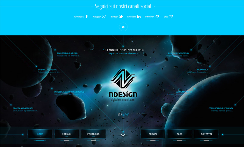
14. Ndesign
Here the drop-down panel consists of only social media links. The calm bluish coloring laconically contributes to the whole composition and corresponds with the cosmic vibe, which permeates the entire site.
15. Julius Ehrlich
Julius Ehrlich has a subtle and slick online portfolio that has confidence in a mix of a smooth heavily blurred background and elegant tiny typography. It seems that the designer wants to provide his online audience with lots of room for a pleasant stay. The navigation is also tightly-packed and has lots of whitespace.

16. CoolFarm
The green color certainly is a primary one that recreates calm, convivial and cozy general feeling. The menu also utilizes this tone in order to naturally fit into the design. The blend of relatively huge typography, white hue and clean solid color backdrop gives the navigation a neat appearance.

17. JCM Ink
JCM Ink has a matchless website dedicated to their Tattoo salon. The designer leverages magnificent textured graphics, classy black-and white color combo and some pleasant effects. This theme also nicely runs through the navigation panel.

18. RSR
RSR take care about the clarity and simplicity of the menu, making it look neat and primitive in a good way. Relatively huge bold typography, contrast coloring and clean background are the main building blocks of the design.

19. Volkswagen up
The dark coloring comes through the whole design and the menu is no exception. It has a lovely touch of flash-style navigation that is aimed at fascinating online visitors by its delicate appearance.

20. Pete Nottage
A narrow stripe, which slides out from the top of the website, reveals the chief navigation. The latter includes several trendy ghost buttons that immediately grab attention.

Conclusion
Using a slide-out menu is a truly huge trend this year. Numerous websites have resorted to this type of navigation in order to save space, and at the same time, not to lose readability of navigation. There are various implementations, and we have considered a vertical-oriented one that is gaining popularity each day.


