
It may seem a strange concept that the fonts you choose for certain tasks can tell the reader something about your personality, but let’s face it, fonts have replaced handwriting as very few of us put actual pen to paper these days – most of our communication is carried out via email or text messages. As we had handwriting experts who could tell a lot about a person from their writing style, it is considered that something about a person’s personality can be gleaned from the fonts they choose.
What Your Font Choice Says About You
Survey
The Software Usability Research Laboratory at Wichita State University conducted a survey that returned results showing how people view others on the strength of the fonts used in certain situations, such as business documents, website content, emails to friends, etc.
20 fonts were used in the survey and participants were asked to rank each font between a pair of adjectives (such as Formal – Casual, Flexible – Rigid, etc)
The participants were then asked to assess perceived uses of the fonts in a simple yes/no format. They were given 25 uses, divided into 6 categories: Websites, Documents, Reading Material, Correspondence, School-Related and Other. The uses included textual content, eBooks, Letter/Memo, Online Tests and Brochures.
The results were definitely interesting, and could be worth paying close attention to and applying in your writing!
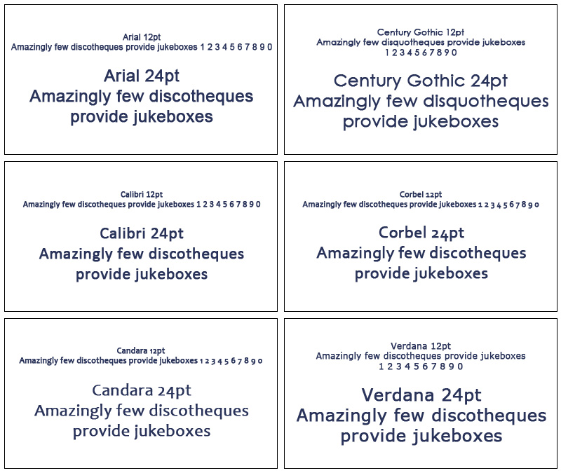
The 20 Fonts
Participants were shown the fonts as images using the three pangrams as shown below, and each in size 12pt and 24pt.
Serif Fonts:

Sans Serif Fonts:
Script/Fun Fonts:

Monospaced Fonts:

Display/Modern Fonts:

Font Traits
As mentioned above, the participants were asked to rate the fonts between opposite adjectives, the results are shown below:

The following table shows the traits broken down more precisely – the top 2 scoring fonts for each trait:

So, in summary, this is the main trait you display through your favorite font choice (mainly based on style rather than particular font):
- Times New Roman: Stable, Mature, Formal
- Georgia: Practical
- Kristen: Flexible, Happy, Cuddly, Youthful, Casual, Passive
- Gigi: Creative, Exciting, Feminine, Unstable, Rebel, Impractical
- Monotype Corsiva: Polite, Attractive, Elegant
- Impact: Assertive, Rigid, Rude, Sad, Unattractive, Coarse, Masculine
- Courier New: Conformist, Unimaginative, Dull, Plain
Uses For Fonts
The participants were given 25 general uses for fonts and were asked to choose their 1st, 2nd and 3rd choice, as well as the font they would be least likely to use. They were also asked to indicate which font they would probably never use for any purpose. Here are the results:

What Can We Learn From The Results?
Considering 60% of participants in this survey were students, 45% were in the 20-29 year old age group and 20% were in the 30-39 year old age group with 81% of those participating reportedly visiting websites on a daily basis and 46% reading on the internet for 2 to 6 hours per week, the survey centered around the younger end of the spectrum with a very fair input from regular internet users.
So just looking at the green blocks in the table above, are you shocked? I was! Even youngsters seem to prefer to read serif fonts over sans serif – have we been misled by typographers and text experts?
It is no surprise at all that the ‘Last’ column is very populated with pink blocks… script and fun fonts are pretty illegible, so we definitely wouldn’t expect to see the font examples the participants were given to feature highly in a usage table.
Sans Serif fonts only hit first place for 4 uses, and Verdana did not make first place at all, and only made second place in 4 instances.
The final row – fonts that participants would not use for anything is also no surprise. Agency FB has little character, is very small and very square in appearance. Rage Italic is highly illegible, as is Gigi. But once again, Times New Roman was the font that the least of the participants would never use.
Perhaps we are a world of traditionalists after all!!
This was a properly conducted survey, but I think perhaps their choice of fonts was not inspired – for instance, Helvetica didn’t make an appearance, neither did Franklin Gothic or Palatino Linotype, Futura or any of the other currently popular fonts – but then this survey was conducted in 2006!
Nevertheless, I think the results are still surprising, no matter the age of the survey – I still think serif fonts would win the day, just maybe not TNR – or maybe so!
According to Website Magazine, these are the most popular fonts in website design at the moment:
- Proxima Nova (Sans Serif)
- Avenir (Sans Serif)
- FF Super Grotesk (Sans Serif)
- Rooney (Serif)
- Kulturista (Serif)
- Rimouski (Sans Serif Upper Case)
- Acto (Sans Serif/Display)
- Ataxia (Serif)
- Museo Sans Rounded (Sans Serif)
- Mentone (Sans Serif)
- Maga (Serif)
- Brandon Grotesque (Sans Serif Upper Case)
- Calluna (Serif)
Conclusion
So it seems that designers are still split between serif and sans serif fonts, although, as has been the trend for some years now, sans serif seems to be ahead by a nose!
It would be great if some university or type foundry would conduct another such survey to see if things have changed at all over the last 9 years – but somehow, I think the results would be similar, and I think it could just possibly be that it is only really designers who think sans serif fonts rock!
In the meantime, it is pretty obvious that using a font such as TNR gives a traditional, stable impression, whereas at the other end of the scale, a font such as Kristen has a child-like, playful aura, so of course, we wouldn’t send a job application in Kristen, but we probably wouldn’t present a young children’s book in Times New Roman.
The final word is – I am not sure your personality can be defined through the fonts you use, but your typography skills definitely can be!


