Every year and even every few months, new design trends pop up. Personally, I love watching other creative people devise new takes on design. Today, we’ll discuss 6 up and coming design trends in web design in 2019 so far.
1. Cleaning things up and keeping the simple
Clean, minimal and simple designs have always been around. However, recently, I feel like there is a new breath of fresh air coming out in clean designs.
N26
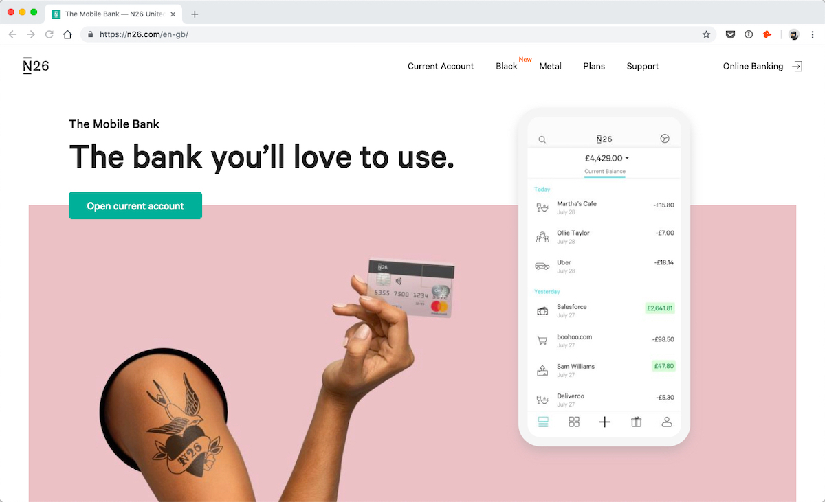
N26 is a UK-based bank with fantastic branding and sense of design. All of their pages are well designed; they are clean and simple. But, they are not boring. Their design creatively uses different elements such as colors, shapes, and animation to give interest to the different pages. And it works really well.
Greensight
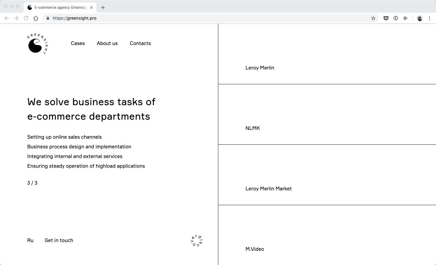
I love Grensight’s homepage. It’s black and white with loads of white space to spare. Yet, the design doesn’t feel empty. The large amounts of white space allow the homepage to keep the focus on the few elements that are present. The animations, the typography, and the borders certainly make this clean and simple design stunning.
Starship
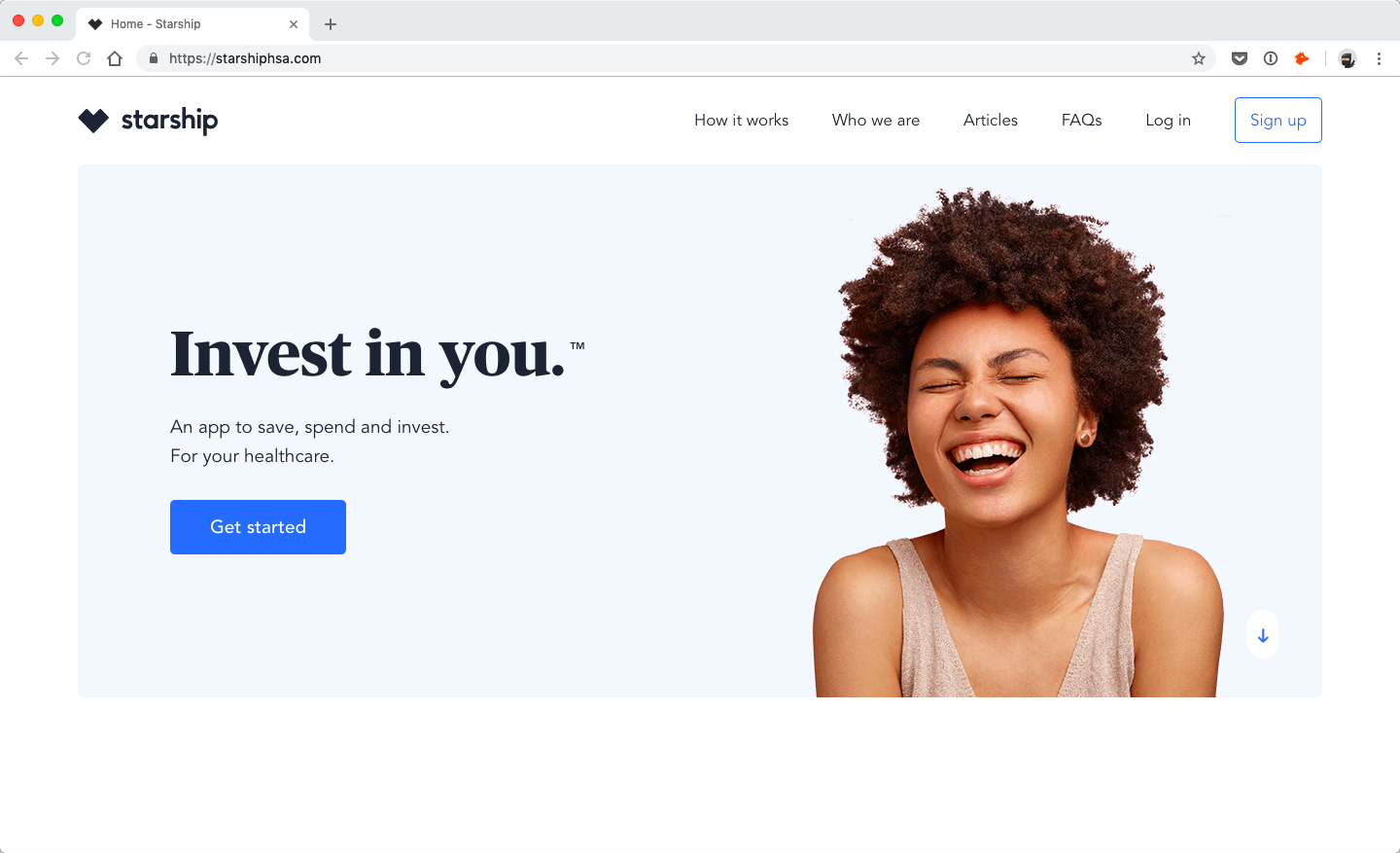
Starship’s branding is also exceptional. Once again, the pages are clean and simple but they feel full and whole. The designers truly made the best use of minimalist layout here. Highlighting different sections with backgrounds, bursts of color, typography, and spacing gives the different pages so much interest and points of attention.
2. Emphasis on typography
Some designers are putting a lot of emphasis on typography nowadays -especially big and bold typography. Because text is the main form of communication online, it gives typography lots of creative potential.
Work and life of Stanley Kubrick
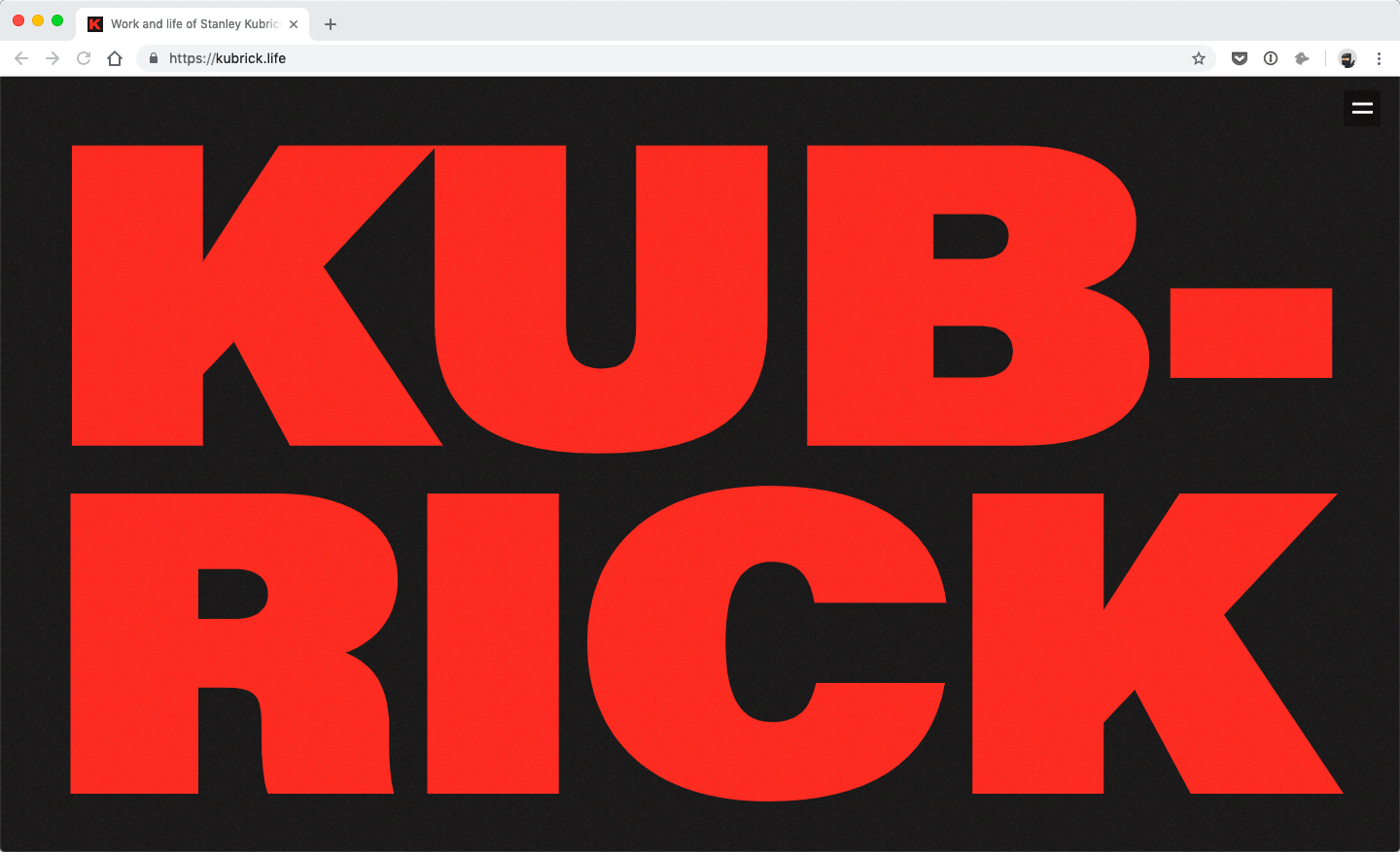
Not only is the typography a big design element in the hero section of this landing page, it’s also a fundamental design element throughout. The copy is kept very short and there are many different sections that help tell the story of Stanley Kubrick. Typography is at the center of telling this story.
Concrete
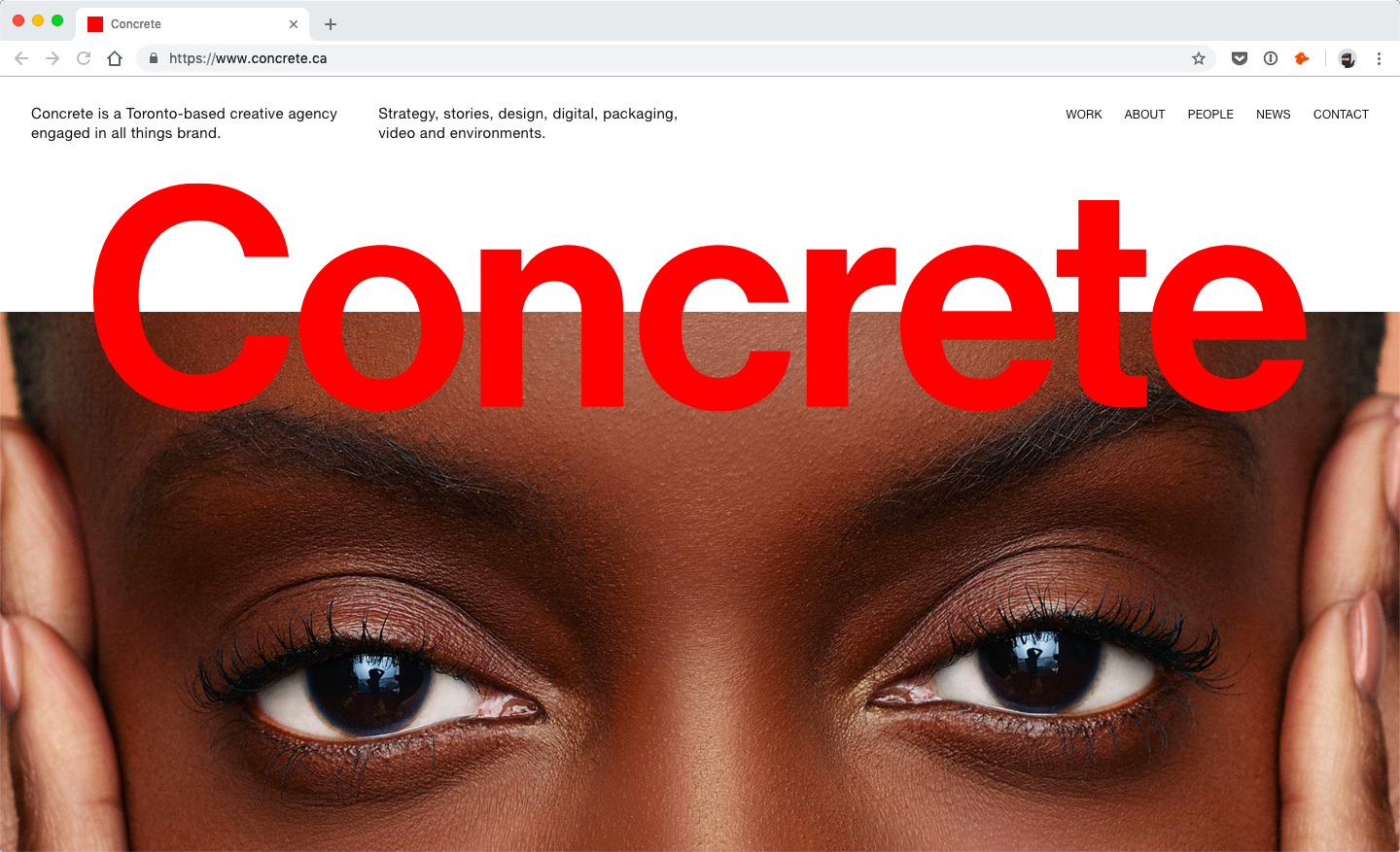
Concrete is a creative agency and their online portfolio is a great creative piece too. I love the hero sections of their different pages because the page title takes front and center to the design of this section.
Sean Hobman
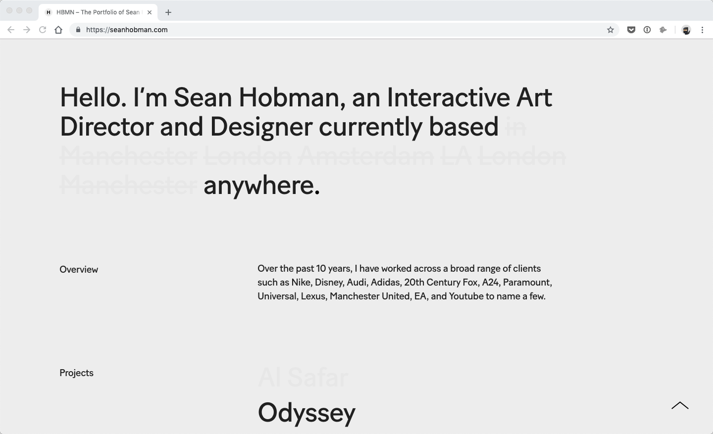
Here we’ve got another portfolio; this one courtesy of Sean Hobman. Not only is the portfolio simple, but also the key feature is the typography which incorporates animation, grayscale and layout design quite flawlessly.
3. Ease of page flow
Another up and coming design trend that I’m quite fond of is the use of graphic elements such as backgrounds to help transition the different sections. When done well, it improves the flow of the page tremendously making scrolling as well as content digestion easier.
Dipsea
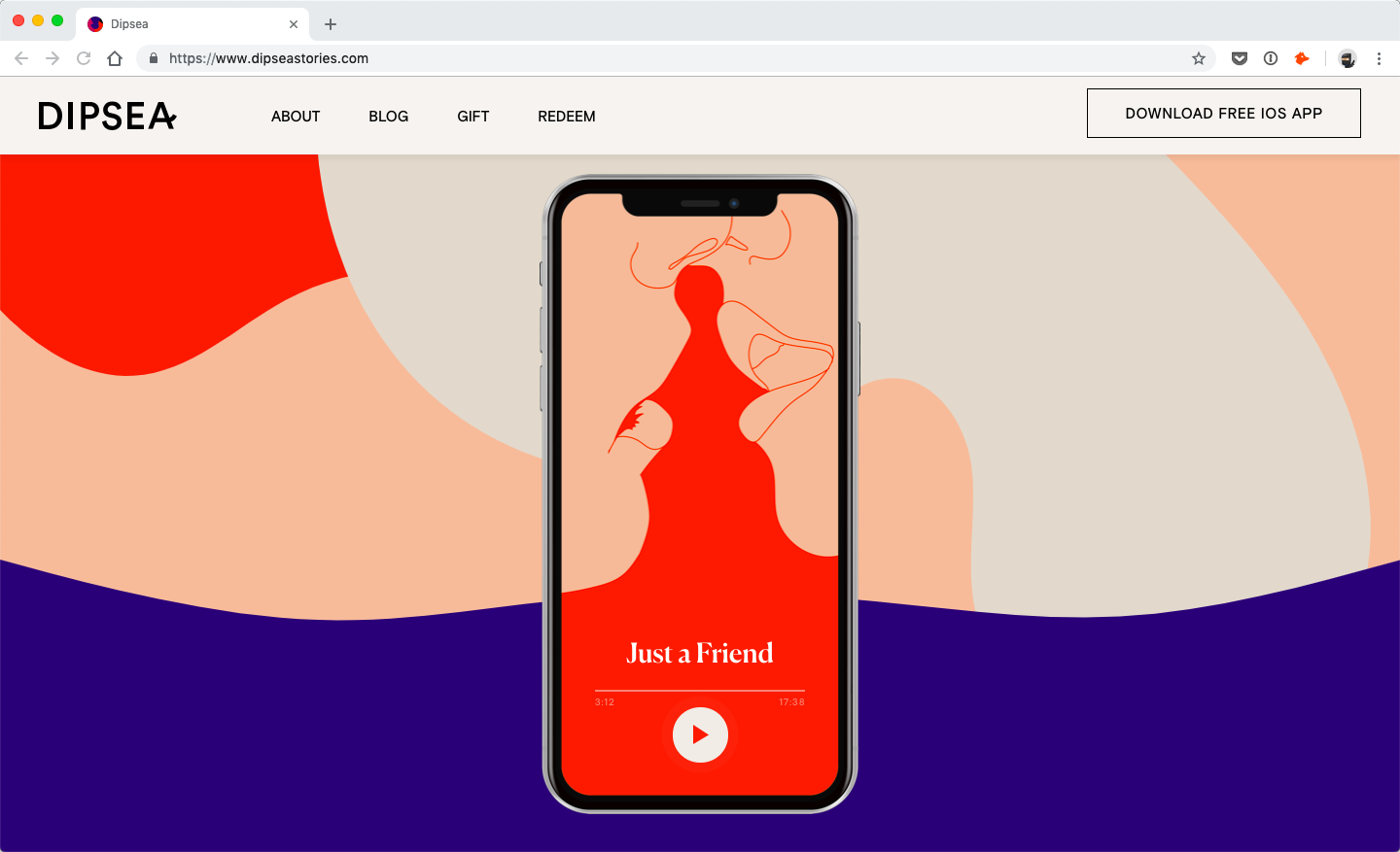
The homepage for Dipsea is just stunning. It’s exceptionally creative, including in its execution of the page’s flow. The curved section edges combined with the colorful background shapes are a fantastic design touch which make scrolling on the homepage intuitive.
Dinosaur
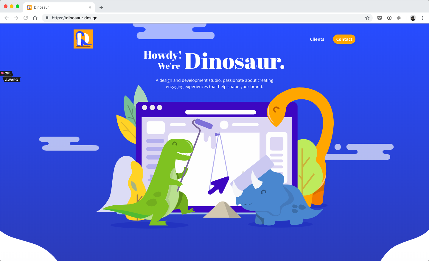
Dinosaur’s landing page design also uses irregular shapes as background. It’s a short page but the flow between its three sections is marvelous. The curvy edges of the backgrounds guide the visitor’s eyes down allowing for smooth and intuitive scrolling experience.
Bloom
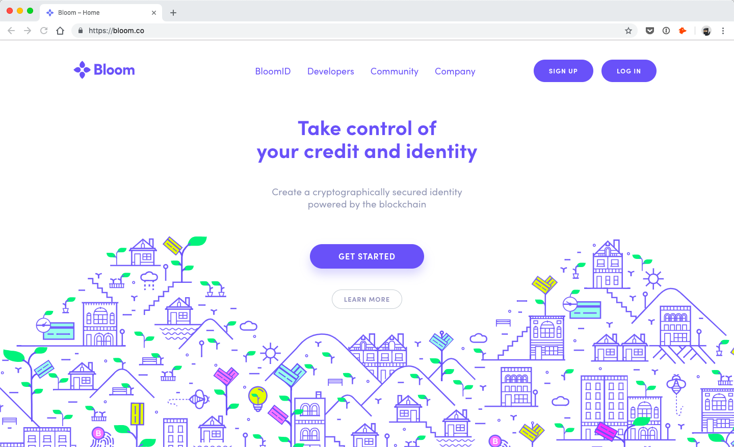
What I love about the top of Bloom’s home page is the creative use of the graphics that pulls and guides your eyes further down the page. The graphic wraps around the two different sections exceptionally well.
4. Offset layout grids
Designers have been playing with layouts for a long time. Some designs adhere to strict grids while others do the exact opposite. Recently, the creative use of offset layouts and grids have become a lot more popular.
Gauche de la Lune
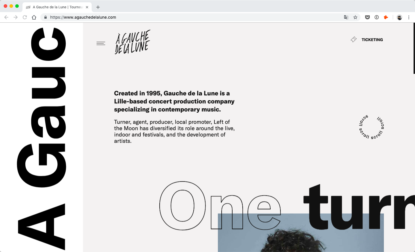
The hero section of Gauche de la Lune has a wonderful offset layout alone! All the different design elements from the logo and the images, to the copy and the scroll indicator, seem to be all over the place. They’re not, otherwise, it wouldn’t look this good!
by Humankind
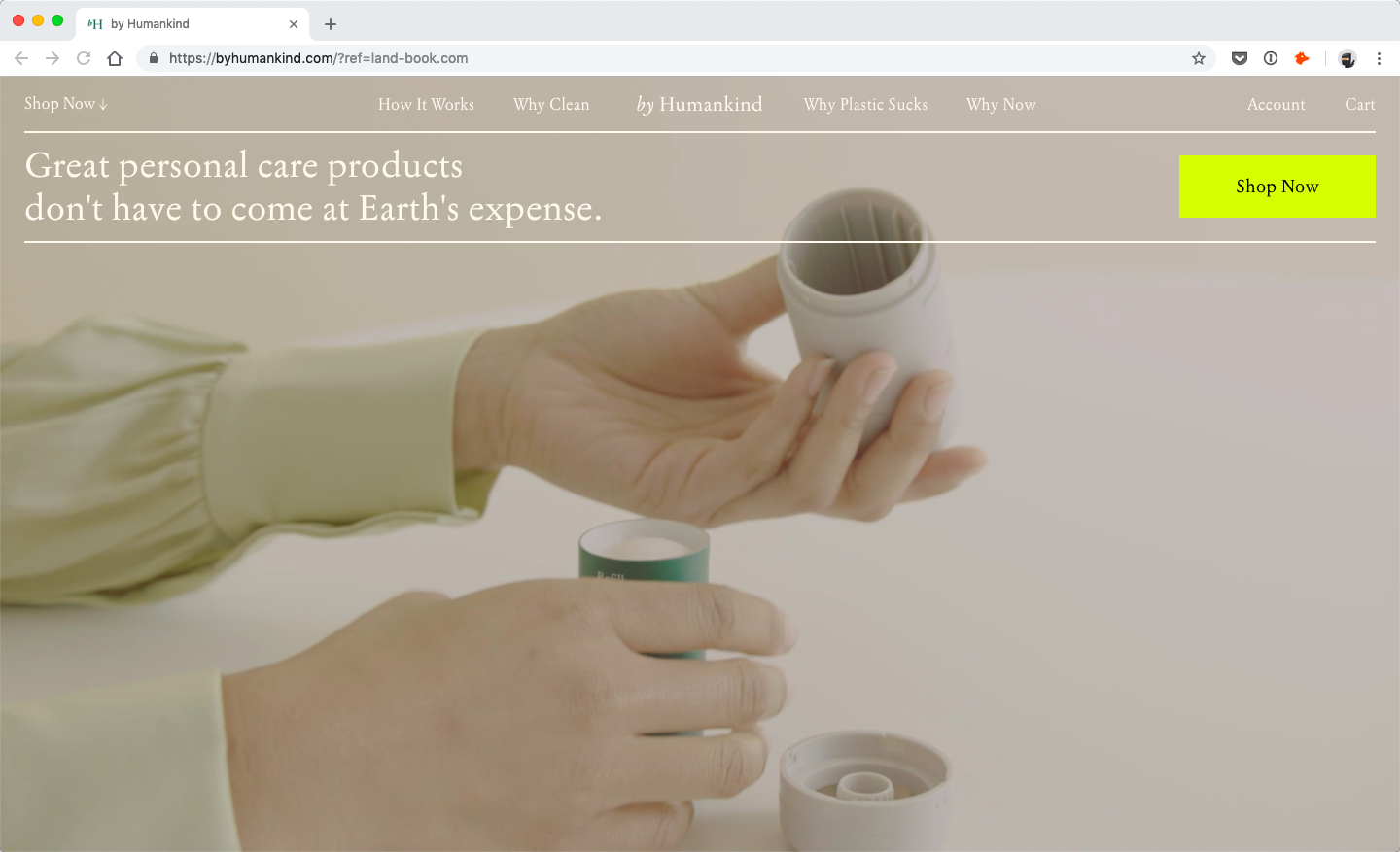
I like this example because although the vertical grid looks more or less traditional, the horizontal grid is not. Specifically, the text is very much top aligned which quite unusual and looks exceptionally fantastic.
Carbon Beauty
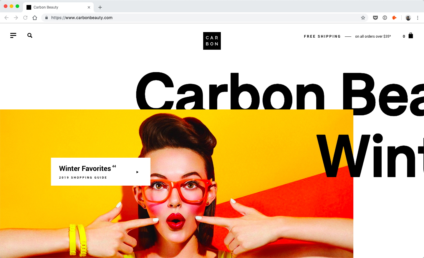
I love the design of Carbon Beauty because the different design elements such as the pictures and headings seem to be intertwined and off the traditional grid system. It’s definitely something distinctive to experience, especially the animations as you scroll down.
5. Creative, fun and functional animations
Speaking of animations, they are a great way to bring some creativity into any design. Recently, web design has been seeing a big surge in animations both for fun and for function.
Austin Mayer
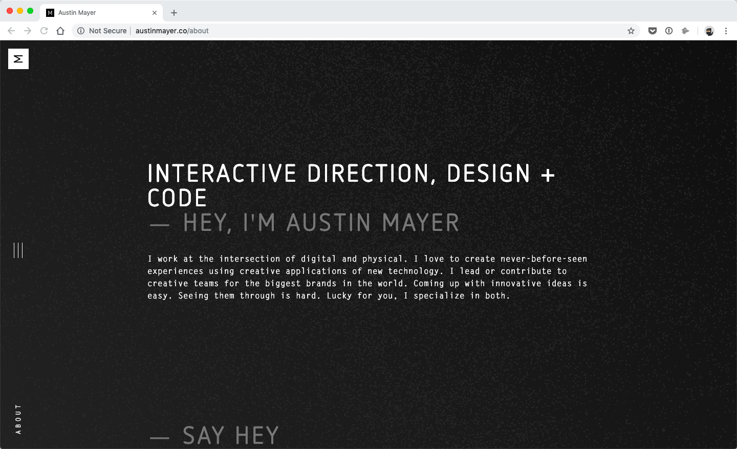
Austin Mayer’s portfolio has a cool, animated loading screen as well as an interactive feature animation on his homepage. The menus are animated, as are the page transitions, the links, and the background. He is an interactive designer, after all!
Jordan Sowers
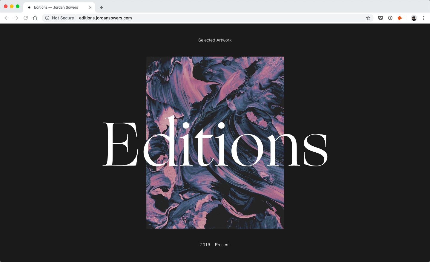
Jordan Sowers’s editorial section is fun to use. There are plenty of subtle yet interesting transitions when browsing through his editorial work. It makes experiencing his portfolio significantly more interesting and memorable.
Cisternerne
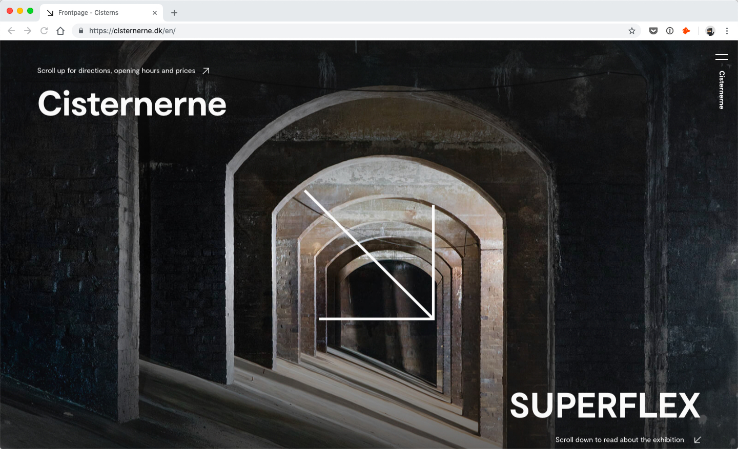
Cisternerne’s creative use of animations and scrolling is so amazing to encounter. Everything on the site has a soft fade. There are a lot of visual clues as to what’s going on – some of which at animated too like the intro skip link. It’s such a creative website example, don’t you think?!
Serverless
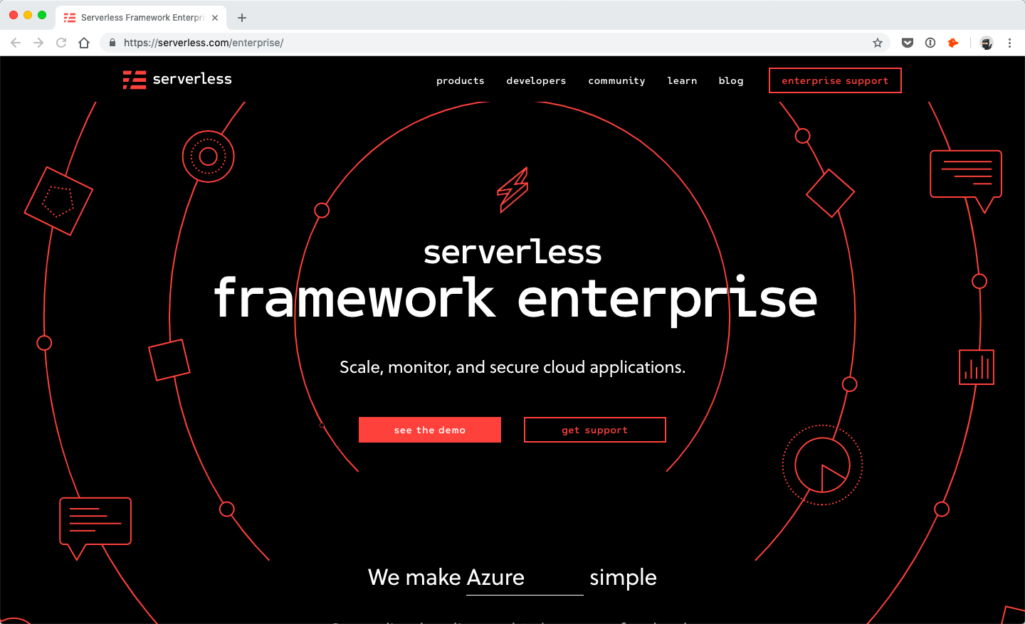
Serverless’s design includes various graphics animations. I love the circles atop their homepage because they literally frame the CTAs and guide the visitor’s eyes to focus on the buttons. It’s a pretty clever animation concept that helps improve the experience of the overall design.
6. Creative use of color
Lastly, we have a few examples of color trends. These examples are creative, fun and practical.
Dims
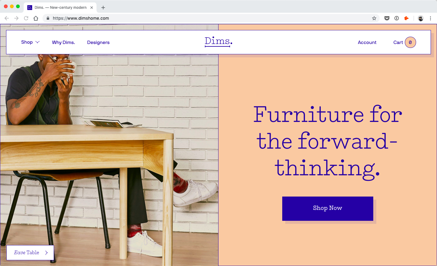
Dims’s overall branding is unique and non-traditional. No wonder their use of color isn’t either. Color plays a big part in this design especially the lack of traditional white background and black text.
Relode
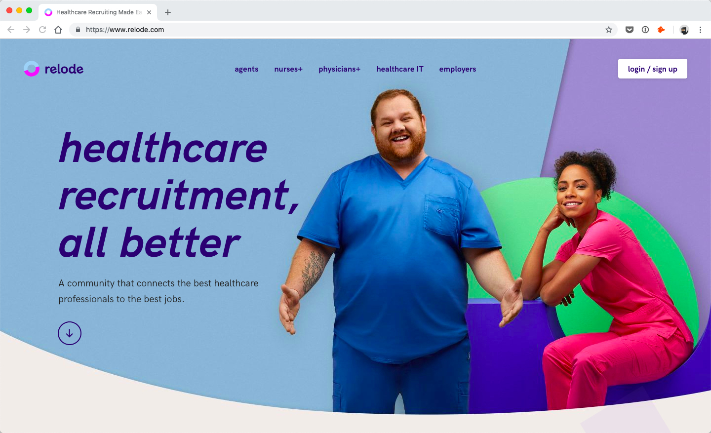
I like Relode because it seems that they wanted to cover their whole homepage with color. The design uses many different shades that give Relode’s brand a super vibrant, fun and approachable vibe!
Hang the DJ
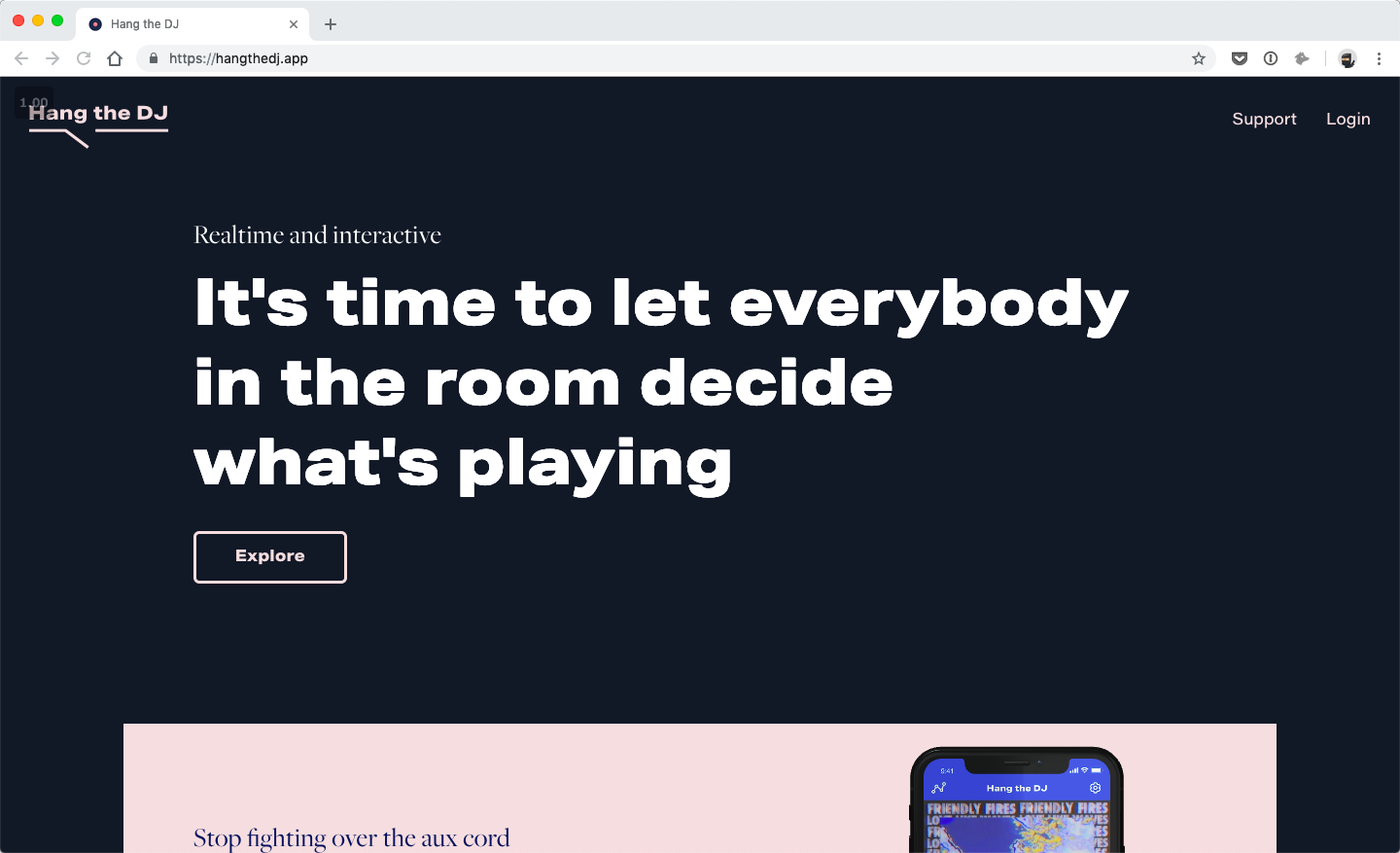
Hang the DJ’s use of dark, navy background along with pastel pink is such a nice color scheme. The blue grounds the visual design while the pink give it an eccentric vibe. The two colors play so well together!
What’s our favorite trend?
As you can see, there is a lot going on in web design right now. I’m curious what you think about these? Are there any design trends you’ve noticed yourself recently as well? Let us know in the comments!