
More than any other profession, designers and developers both freelance and agencies, need to make an immediate impression on prospective clients. Many agencies and freelancers do this through introducing themselves on their landing page: ‘Hello, my name is…/ we are….’, and this is a tried and tested friendly approach that interests people. However, there are other means of interacting with visitors and giving a certain first impression – this could lead to attracting only a niche market, but if that is the agency’s strength, then aiming for those types of clients can’t be wrong. Here we have selected some agency designs that are both creative and emotive and will certainly draw the attention of clients looking for a certain style.
Web Agency Website Designs
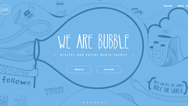
Bubble
This digital and social media agency present their site in such a way that viewers looking for a casual, hand-drawn or illustrated site would be immediately attracted to delve deeper. They use a couple of taglines on their landing page: ‘Born to fly’ and ‘Those who tell stories rule the world.’ Scrolling through their pages is done either by clicking the arrows that appear on mouseover at the side of the page, or clicking on the progression bar at the bottom, and the pages flip like the pages of a book.
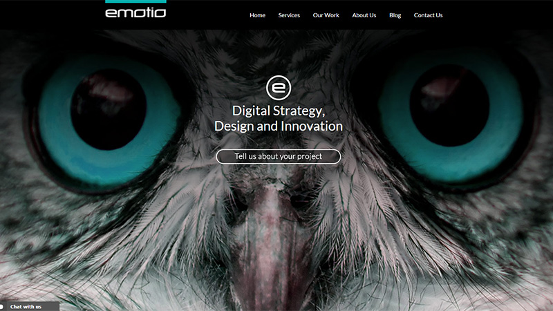
Emotio Design Group
This agency uses some beautiful images on the landing page slide show. The image shown below indicates attention to detail with the owl’s eyes being the focus. The eyes have been colored blue – a shade that runs throughout the site and is the same shade as the line above the company name at the top of the page.
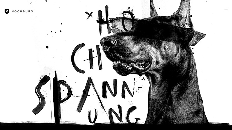
Hochburg
This design agency uses a lot of grungy brushstrokes and splatters, as well as the landing page slide show being completely monochrome. This approach indicates a kind of freedom of thought – no creative restrictions.
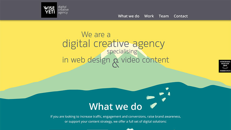
Wise Yeti
Here is another design that indicates freedom of thought – wide open spaces, but this time you could expect a site they build for you to have clean lines, bold colors and a certain symmetry.
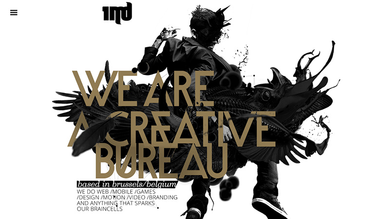
1MD
This agency uses the tagline: ‘We are a creative bureau’ – and quite simply, their landing page proves this to be true! With small touches of animation, the silhouette-style image is stunning.
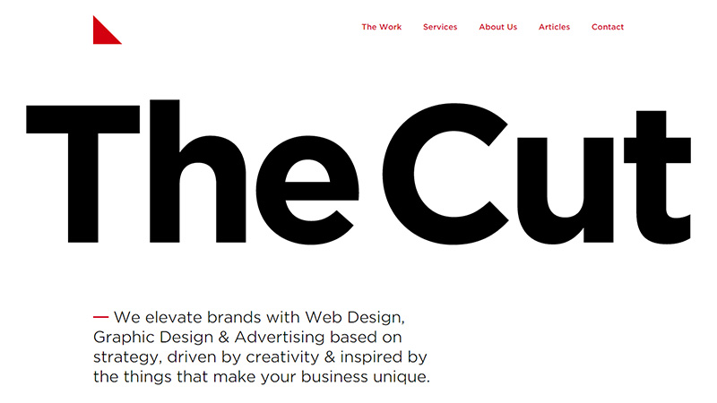
The Cut
This agency almost shouts at you with the huge headline text – but you would believe it if it was called The Cut Above – it is so stylish and elegant. Even the logo is a simple but effective triangle – everything about this site screams ‘class’.
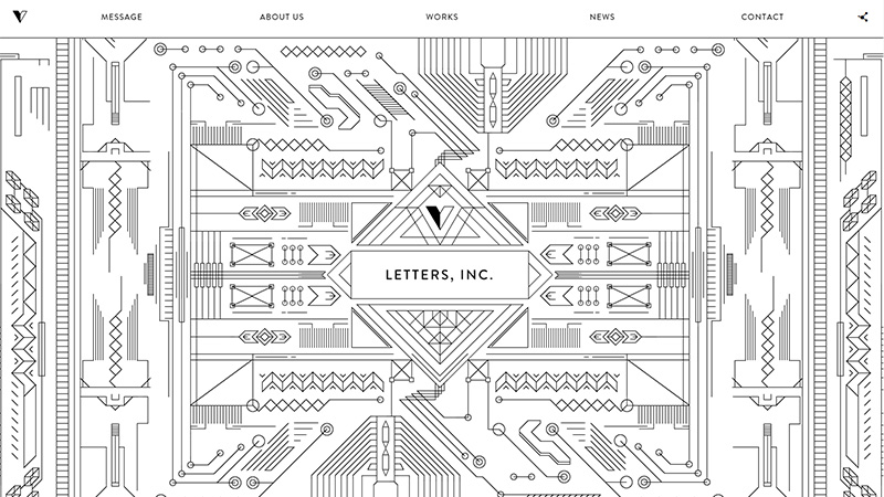
Letters, Inc
This Japanese agency displays amazing attention to detail with this design. Small touches of animation help liven the page up. As you scroll down the page more line drawings appear – not quite so detailed as the landing page, but this site must have taken a lot of time to bring it all together.
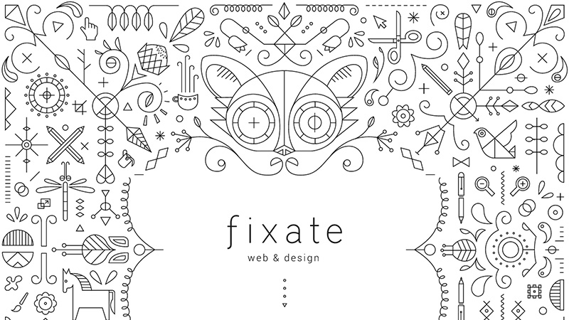
Fixate
This South African agency uses a similar approach to the previous site with some amazing line illustrations. To help solidify the brand name, the eyes of the cat/creature in the middle blink. Prospective clients could expect great things in terms of illustration from this agency.
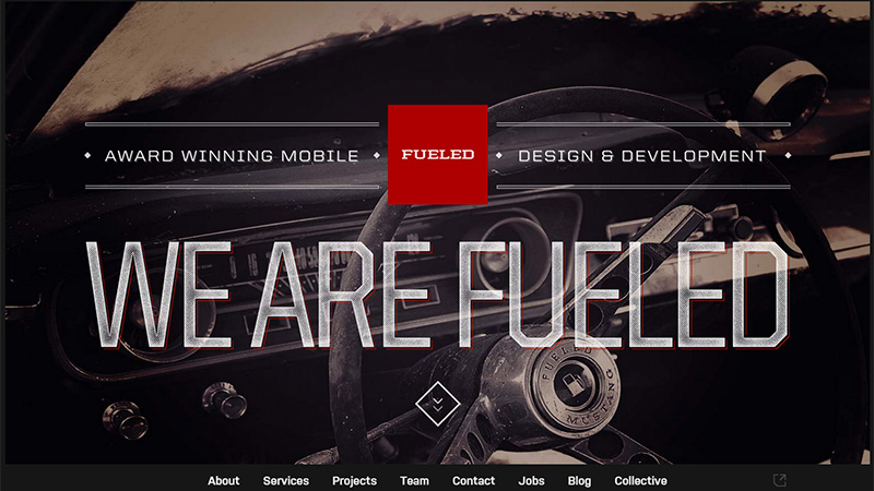
Fueled
This agency display in large text ‘We are Fueled’ – and somehow you believe it! Is it the texture and grubbiness of the text? I don’t know, but you feel they are fueled and ready to go and not afraid to get their hands dirty!
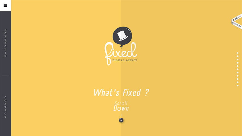
Fixed Digital Agency
Scrolling through this site is a nice experience – each page is a different, slightly dirty/retro color with a crease line down the center, and as you see, the landing page asks ‘What’s Fixed?’ These are the answers: ‘It’s a touch of imagination in every digital strategy’ – ‘It’s a touch of ingenuity by creating viral social media activities’ – ‘It’s a touch of dexterity optimizing your web presence’ – ‘It’s a touch of accuracy when structuring the perfect media plan’ – ‘It’s a touch of wooing by romancing actual clients and researching new ones’ – ‘It’s a touch of curiosity when analyzing web performance’ – ‘It’s a touch of liveliness by creating fun mobile strategies’ – ‘It’s a touch of swagger designing beautiful and powerful websites’ – ‘Fixed is…. a touch of personality’ – any prospective client would have to ask themselves what more they could want!
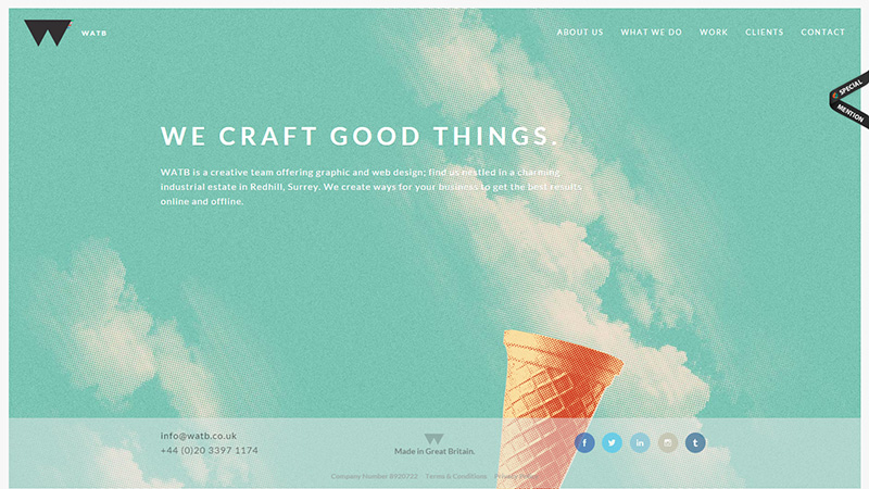
WATB
Those initials stand for What About the Buttons – no surprise they are just using the initials! This agency uses the tagline ‘We craft good things.’ The image of a summer sky and an ice cream cone definitely makes us think of good things. They also use another tagline on their About page: ‘We’re in it to make your idea work, if you succeed we succeed’ – this is a great draw for clients, and I personally think they should have it on their landing page.
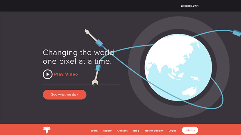
Tectonica
This site simply has the best tagline ‘Changing the world one pixel at a time’ – it must be a long, arduous task, but someone has to do it!
PopArt Studio
Just look at these guys… they are waiting for your instructions! This illustrative approach to presentation gives an indication of flexibility and teamwork. I’m not sure quite why the guy on the right doesn’t have a face – maybe they are a team member down? The image fades from color to a black and white line drawing – very nicely presented.

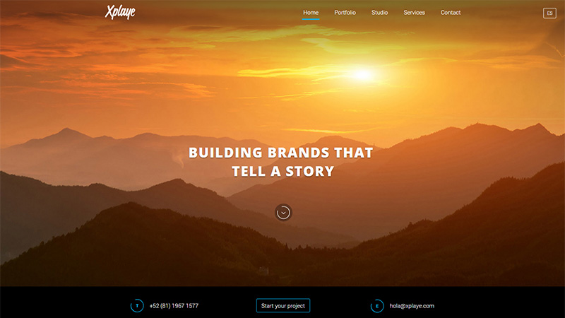
Xplaye
This agency uses a full screen slide show with photos of wide open spaces, whether they are mountain regions, the sky, etc. This, as discussed previously, gives the impression of out-of-the-box thinking and creativity. This site also uses some nice taglines: ‘Building brands that tell a story’ – ‘Turning simplicity into an experience’ – and more.
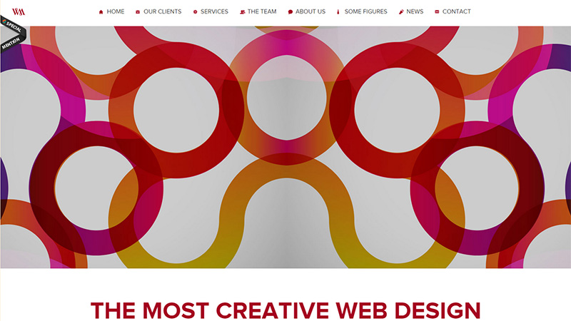
8 Ways
The full width image depicts a lot of play on the figure 8. Very creative, and I would imagine they would create beautiful logos – if only that was one of their services!
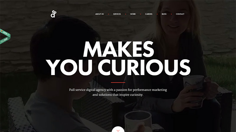
Degordian
One of the cleverest taglines ever: ‘Makes you curious’ – it certainly does!
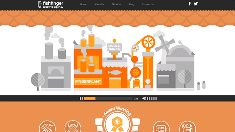
Fishfinger Creative Agency
This site has an amazing animation when you land on it, showing a factory-like process of ‘creating magic’. They use the very suitable Left Bank Two music by the Noveltones, and the whole thing gives the impression of fun and wonderful illustrations.
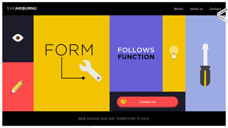
SVKAriburnu
This agency is located in Spain and Turkey. Their landing page is presented almost as a wireframe design with the ‘Form follows function’ tagline. Any prospective client looking for a clean website would be attracted by this landing page.
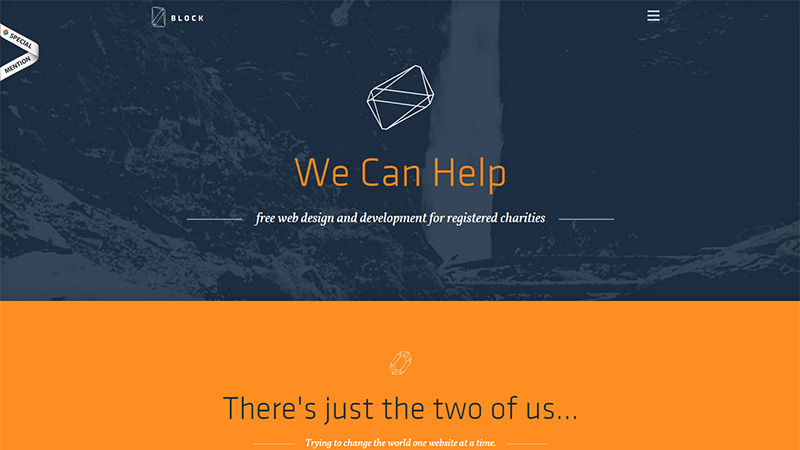
Made By Block
This 2-man agency sends out a caring message with their tagline: ‘We can help – free web design and development for registered charities’ – somehow it comes across better than just saying ‘we care’!
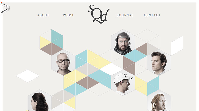
The Squad
This design shows the company’s team – it also has a series of boxes, but the team are not portrayed in the boxes – they are in hexagons, therefore, out-of-the-box! If you want creativity in your design, you will want to look deeper into this site.
Conclusion
This is just a small selection of web agencies that have tried and succeeded in putting emotion into their design. In the current cut-throat marketplace prospective clients need to be immediately drawn in or they will simply move on.
Have you injected some emotion into your home page? Do you think it is good to do so, or do you think agencies that do are reducing their prospective clients and looking for a niche market? Please share your links and opinions with us in the comments section below.


