It may seem that website design and policy of imposition has nothing in common, yet it is not so. Of course, not in its original understanding, but presented in another angle: various call-to-action pop-up modules/windows are the spotlights of our article.
We are going to consider various types of such notifications. They can be conditionally divided into 2 categories: the first one involves elements that overshadow everything that is behind them and include nothing more than just a piece of data that users need to read in the first instance – they can be considered as instruments of obtrusive encouragement, and the other ones that suggest can’t-miss-it offers or free helpful stuff, so as to say some kind of a sweet “carrot”, that can be considered as a skilled marketing ploy.
While both of them pursue one goal (i.e. gaining more newsletter subscribers, social media followers and/or community members) they have some differences: some of them can evoke positive feelings, while others can turn you away. In order to find out, we have compiled 18 websites that are equipped with such elements.
Modal Pop Up Windows
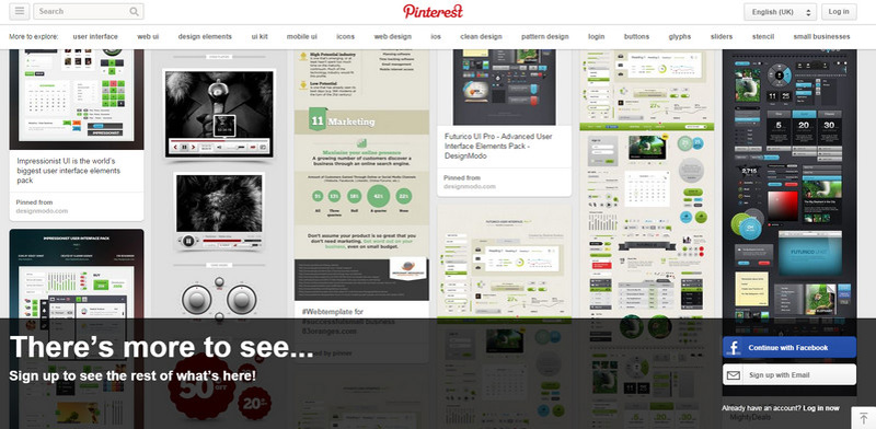
Pinterest skillfully utilizes a relatively high panel that is stretched over full screen width. It is based on a semi-transparent background in order to not distract attention from the images, but at the same time, provides the content with a solid contrasting foundation.
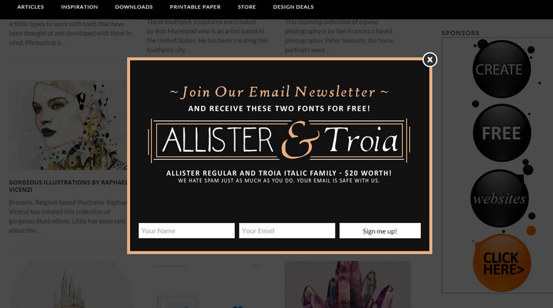
Inspiration Hut
Inspiration Hut has an email newsletter box that appears instantly when you start scrolling down the blog. Since the website offers various inspirational posts, the window has a complementary decorative vibe that is accomplished through line style graphics, hand-written typography and coloring.
Joystiq
Joystiq has a truly modern and leading-edge newsletter box that draws attention to a visually-appealing photo-based centerpiece. It includes compactly arranged data that is displayed via an excellent mix of font styles and choices.

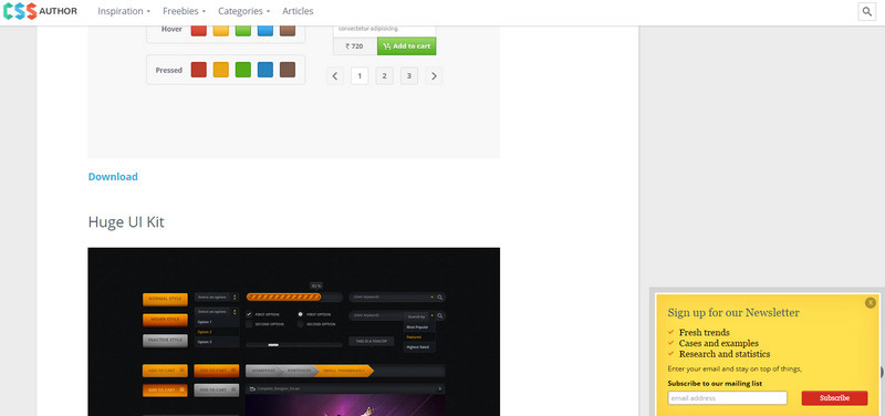
CSSAuthor
This is a commonly-used solution among numerous bloggers and owners of online magazines: while you are reading through the article, the small module with a “sign up” watchword slides out from the bottom and accompanies you till the end of the post.
Vandelay Design
Vandelay Design also takes on the same approach. However, in this case the box aims to promote the special offer. The window looks really nice and eye-catching thanks to a pleasant vibrant vector illustration, neat button and proper text formatting.
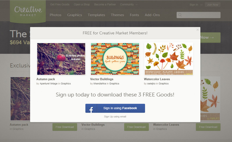
Creative Market
Being a huge marketplace for selling and buying graphics, the Creative Market tries to win over potential customers and visitors through giving away some professionally-executed goods. The front page is marked by a basic pop-up info box that emerges immediately when the page fully loads.
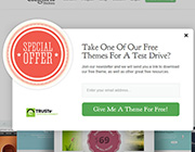
ElegantThemes
ElegantThemes also follows such an effective strategy. The team offers you to download one of its free WordPress themes through accepting a regular newsletter subscription. The team also leverages a pop-up box that has an eye-catching badge style special offer decor element that instantly grabs attention.

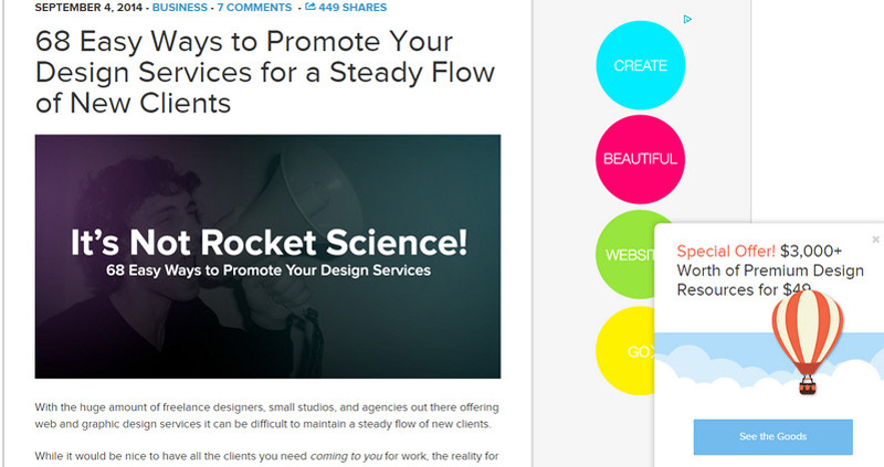
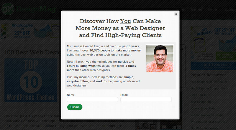
DesignMag
To my mind the owner, to put it mildly, has overdone things with this info box, behind which you do not even have an opportunity to enjoy the blog itself due to the dark overlay screen until you close the window, yet it still may have its benefits.
The Next Web
The online magazine has equipped its inner pages with a sort of a push notification that appears when you finish scanning the article. It features a related article that falls under the reader’s interest.
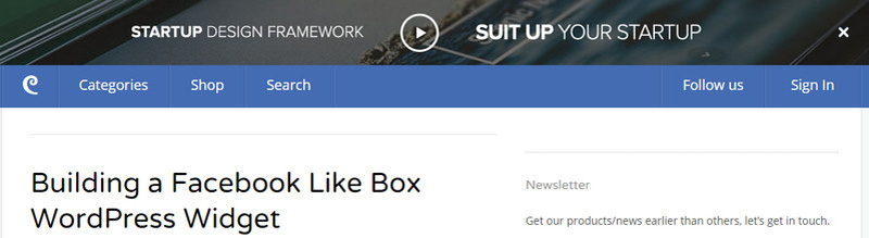
Sitepoint
Placing a narrow bar at the top of the page that reveals a special offer with a call-to-action button made in the same style and manner as the whole website is an optimal way of drawing attention to whatever you want to put in front of your viewers.
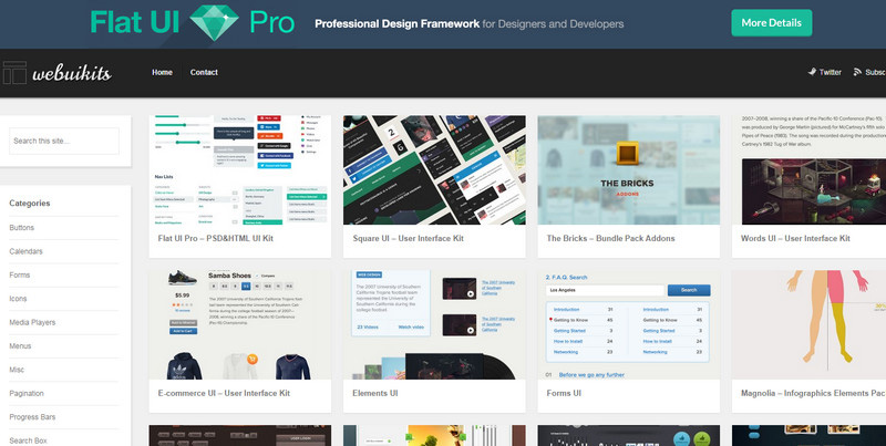
WebUIkits
Much like the previous example, the website features a full-width bar with an advertisement that sticks to the top of the page and reminds viewers about itself while scrolling down the article.
DesignModo
DesignModo has several topnotch valuable products for web developers that need to loom before users’ eyes as often as possible, so the online magazine features an elegant vibrant narrow panel with a video-based advertisement that sticks to the top and follows users while they are looking through the front page.
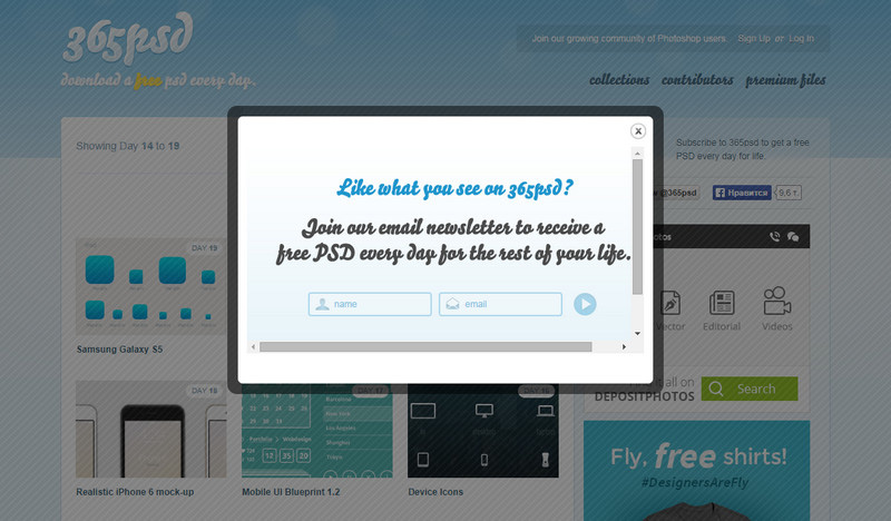
365psd
The home page is marked by a pretty plain subscription module that appears as soon as the page fully loads; its design totally corresponds with the overall theme.
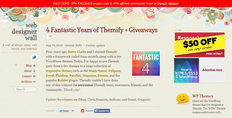
Web Designer Wall
Though the website fascinates by its mind-blowing lush illustrated backdrop and lots of vibrant ad blocks, the owner has managed to make the offer quite visible through utilizing an ultra-narrow panel based on a rigid solid color canvas that immediately catches the eye.
WebDesign&Such
The pop-up module looks really sophisticated and subtle. The flat style in tandem with contrasting coloring and perfect typography produces a pretty pleasant impression.

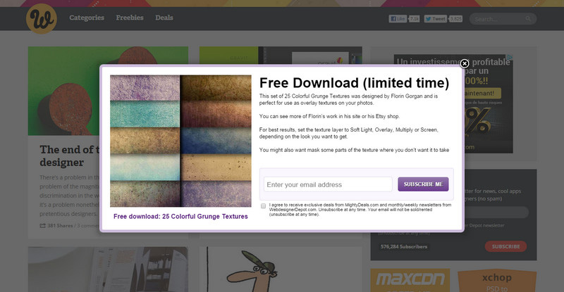
Webdesigner Depot
This highly popular online magazine for designers and developers meets its online audience with a freebie. The free stuff varies, so you can easily stumble upon professionally-crafted textures or GUIs.
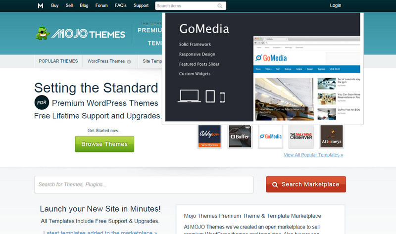
Mojo Themes
The team goes for the same solution as Themeforest does: it presents its range of digital goods(aka themes) via a set of miniatures where each item is displayed in more detail through a pop-up box, thereby helping you to make your decision quicker.
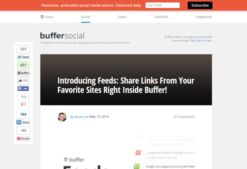
Bufferapp
The blog makes use of a standard solution that includes the incorporation of an ultra-narrow bright conspicuous panel with an offer to become a subscriber that is fixed to the top of the page.
Conclusion
Pop-up modules and sticky top bars are often-used instruments for directing attention to important issues such as getting new subscribers, promoting products, making special offers or simply encouraging readers to stay for a while by proposing to them an interesting related post at the right time.
What do you think about our featured pop-ups? Which one do you prefer? Which one does scare you away? Share with us examples that you consider irritating.


