
It should come as no surprise that the core of any website, including yours, is its content. More specifically, the crux of your website is the text that, when put together to form words, sentences, and chunks of understandable information, make up the content that your site visitors see, read, and enjoy.
The words that make up your website’s content, in their most basic, typographical form, must be readable, easily digested, and understood by those consuming it. This is why the typography of your website is so critical when it comes to overall web design.
It is easy to become overwhelmed by the sheer number of choices you have when it comes to choosing the perfect font for your website.
In fact, ask yourself this: do you even know what web typography is or which fonts to use on your website to appeal to the masses, spark an interest in readers, and keep them engaged for long enough to explore entire web articles?
If not, don’t worry. I am here today to give you the basic rundown of website typography so that you can better understand the fundamental web design that can make or break your website from the moment a site visitor clicks on your website.
What is Typography?
According to Wikipedia, typography is “the art and technique of arranging type to make written language legible, readable, and appealing when displayed.”
It involves the arrangement of type, which when further broken down, equals things such as typefaces, point sizes, line lengths, leading (line-spacing), tracking (letter-spacing), and kerning (the space between pairs of letters).
Furthermore, let’s look at the foundation that makes up typography:
- Typeface. The most generic grouping of a stylized type of lettering. Typefaces come in a variety of styles like italics and bold, varying line thicknesses, and differing sizes such as 8, 10, or even 72. For example, a popular typeface is the well-known, and widely used, Helvetica.
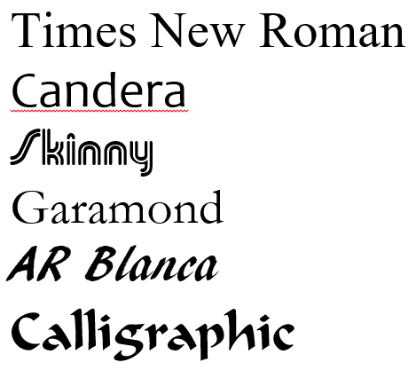
- Font. A particular size, weight, and style of a typeface. For instance, using the Helvetica typeface example, Helvetica bold size 10 is a font.
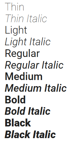
Though often used interchangeably, there is a distinct difference between the typographical terms typeface and font. That said, it is easiest to remember that fonts simply represent different ways of styling one particular typeface.
Overall, typography is more than the placement of similar looking letters, numbers, and symbols next to each other in order to form readable works. In fact, it is an art form that requires skill, knowledge, and an eye for beautiful design, especially when used on websites.
Common Font Categories
Though there are literally thousands of different typefaces and fonts to choose from, it is good to know that there are four distinct categories that most typefaces, and their fonts, will fall under: serif, sans serif, script, and decorative.
Serif
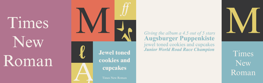
This typeface will have a classic style to it thanks to the small tails or feet extending beyond the ends of each letter. Typically found in printed works such as magazines, books, and newspapers, serif fonts guide your eyes to follow long-form, published text. Great examples of this include Times New Roman, Baskerville, or Georgia typefaces.
Sans Serif
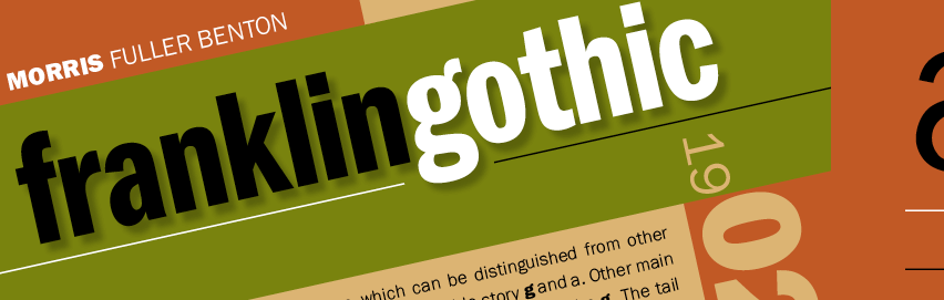
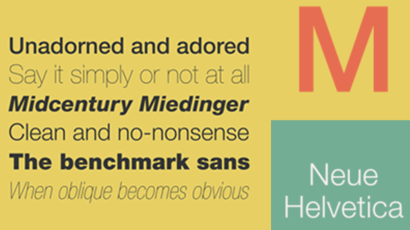
On the other hand, this typeface will have a more modern and clean feel to it because it lacks the small tails at the edge of each letter. In addition, they will have a thicker line than serif fonts. These fonts are best used in web design because of their crisp look. The most commonly used sans serif fonts are Franklin Gothic, Helvetica, and Century Gothic.
Script
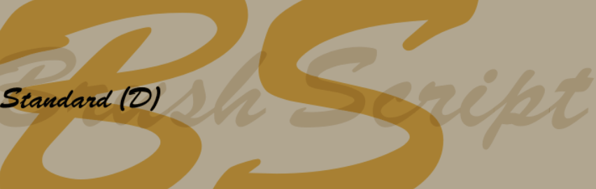
These are the stylish, often cursive looking typefaces found in many printed and online materials. The connecting letters create an elegant, fun, or even casual look and can even be crafted to appear as though actually handwritten. Common examples of script fonts include Marketing Script, Brush Script, and Lavanderia.
Decorative
Lastly, decorative typefaces are those that pack a visual punch and grab a reader’s attention right away. They do not typically fall under any of the other three categories because of their unique look. In addition, they are not intended to be used in large doses. This is because they are not always clear or readable if used for the majority of your content. If you want to use a common decorative font, try Curlz, Pinewood, or Betty Noir.

As you can see, typefaces, and their corresponding fonts, can have a large impact on your website’s overall design.
Mastering the Art of Web Typography – Choosing the Right Font for Your Website
Typography is an ancient art form spanning back hundreds of years. And, as time and modern technology have advanced over the years, so has our use of typography. No longer are we just worried about what our newspapers, magazines, and novels are going to look like when they hit the printer.
Rather instead, people are concerning themselves with how their written content is going to appear to the thousands of site visitors that click on their website looking to see what is in store for them.
In fact, some may even argue that nearly 95% of what your site visitors see on your website, regardless of the imagery, video, and audio you include, will comprise of plain old written text.
This is where an understanding of web typography comes in.
With that said, let’s see what you should consider when it comes to choosing the right typography for your website.
1. Pair Typeface (and Consequently Font Type) with Subject Matter
Picking a typeface that is unique and cool looking is not going to do you many favors when it comes to attracting, converting, and retaining regular site visitors. Sure, standing out is important when it comes to your website. However, choosing a typeface that is too bold is not going to appeal to the masses, will not be useful or appropriate for most site visitors that click on your website, and may even cause visitors to bounce before reading a single lick of text. In the end, the key is to pick a typeface that is versatile and appropriate for your website’s subject matter.
2. Be Choosy When it Comes to Color
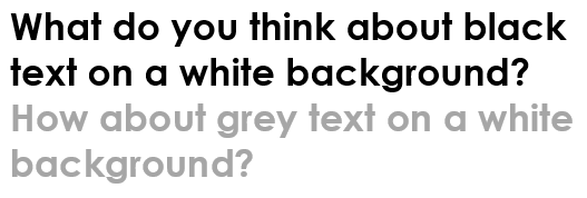
Finding the right amount of contrast between the colors on your website and the fonts you use can be challenging. Some people say that higher contrast is best, with black text on a white background being ideal. However, others say that too much contrast actually strains the eyes. In response, it is suggested that you use a shade of grey for your font to improve your site’s readability.
Unfortunately, what works for one website may wreak havoc on another. Depending on your website’s background colors, amount of text, typefaces, and fonts, what looks good for your competitor’s website may be distracting for yours.
The best thing you can do is test variations of background colors and font colors to find the right match. In addition, don’t forget to see how a mobile device will render your website when outside. Natural sunlight is much different from indoor fluorescent light. In the end, you should cater to all site visitors and share the most pleasing color combinations possible.
3. Be Mindful of Font Size
The last thing you want your site visitors to do is have to squint to see your website’s content. In fact, accessibility is one of the most crucial factors when it comes to choosing the right fonts and layouts. However, make sure you do not use a font size so large that your website’s real estate becomes overwhelmed.
Doing this, you run the risk of cluttering your reader’s screen. Plus, it may cause readers on mobile devices to have to zoom out and scroll horizontally, both of which harm user experience.
In addition to watching overall font size as it relates to the bulk of your content, it is a good idea to choose a font that can create a perfect hierarchical balance. Anyone with extensive experience writing for online publications know that an excellent SEO optimization tip is to create a typographic hierarchy throughout your content.
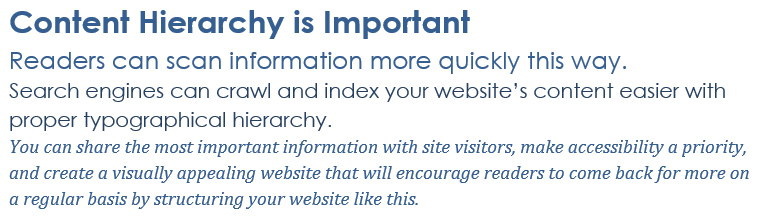
This means structuring your content to have headings, subheadings, and prioritized content in varying sizes, colors, and font types. Not only does this make the digestion of your content easier on your site visitors, it allows major search engines to crawl and index your site more appropriately.
4. Pair Similar Typefaces
It can be easy to get crazy when it comes to typefaces and fonts on your website. A common mistake that many website owners make when it comes to web typography is placing too much variety on one web page. This creates an imbalance and can overload your site visitors’ senses.
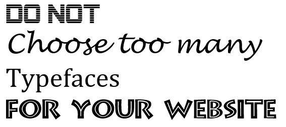
If you do include more than one typeface on your website, research the types you wish to pair. For example, make sure they flow, are easy to navigate and read, and add to the design of your website rather than detract from it.
Final Thoughts
In the end, equipping yourself with the basics of website typography can help the overall design of your website. In fact, regardless of the kind of site you operate, creating a sense of ease amongst your site visitors, one that encourages further site exploration, is what good web typography can do for you.
If you are looking to spice your website up a bit, without overwhelming readers with too much variety, try following some of the above-mentioned tips for choosing the right typefaces and fonts for your website. Trust me, doing this will satisfy your loyal readers, drive more site visitors to your website, and make your website even more successful than it already is.
What typeface and font do you use for your website? Is there any other tips you would like to share for choosing the right fonts for a website? I would love to hear all about it in the comments below!


