
When creating a website, you can use layout and design to help ensure that your message gets across and leads your visitors to your goal action. In order to use design to convey your message, you need to first understand factors such as how the human eye moves across the screen and how the human brain processes information.
In this article, we will discuss the importance of colors, images, typography, contrast and the size of objects and text. Manipulating these elements will help you control the experience your visitors have and help ensure that you will have the impact you seek.
Using Design to Make Your Point
1 . Our Eyes Scan Pages the Same Way
Whether words or images, visitors naturally read content from left to right and from top to bottom. We scan images the same way as we read text.
This means that the top left section of any content block serves as an anchor for your visitors; this is the first place they will likely see when their eyes scan your site or a specific item on your site. Put in this real estate an image or text that will attract your visitors to stay on your site and read on.
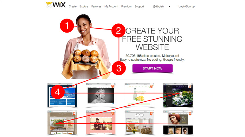
The image above shows the homepage for Wix.com. The photos (1) on the top left are attractive and catching. To the right of them, Wix has put the main message (2) and the main action desired (3). Below that, the visitor can scan sample sites. (4) As we move down the page, the content and images become smaller and more detailed. The content higher up on the screen was carefully selected to bring visitors in, attract their attention and keep them engaged.
2. Colors Set the Tone
Colors play a strong role in setting the tone of your website and are a fundamental tool for communicating your message. They send instant cues to the visitor about what type of business you are. They are also integral to creating a mood for your website – professional, fun, relaxing etc. A deep red can say powerful and sexy, while black, gray and blues are neutral, professional colors and are often used in business and technology websites.
Weddings and romance are often associated with white, pink and turquoise and warm brown tones can be used to create a soothing feel, good for spa, crafts or home design websites. Greens are a natural fit for websites associated with the outdoors, the environment or ecological products.
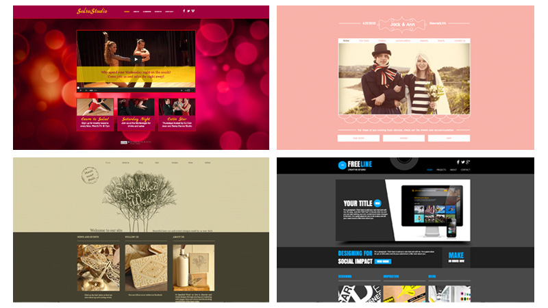
- Audacious red and hot pink: These bold, sexy colors match the tone of the Salsa Dancing website.
- Playful pink and innocent white say wedding – and a fun one too! Who would miss this event?
- Earthy tones and touches of green in Speckled Wood http://www.speckled-wood.com/ site combine both a relaxed feel that is connected to nature. Perfect for handcrafted, wooden products.
- Blue and gray say corporate and professional for the Freeline http://www.freelinetech.com/ site. You can trust this business with your tech. needs.
3. Images Also Set the Tone
In addition to helping set the mood, images convey to visitors how professional your business is. A good website depends upon good images. Even the best graphic designers will struggle to create a great website without quality images. The quality of your images and photography sends a message to the visitor – about how serious your business is and what kind of work you do. Snapshots look sloppy and convey laziness and a lack of seriousness.
While many small businesses will resort to purchasing stock photos off the internet, these photos can often detract from your site. If photos look and feel very “stock,” readers may suspect that they aren’t authentic and feel misled. Spend the time to take quality pictures of your work. It will make all the difference in how your final site looks and feels.
Lacking confidence in your photographic abilities? Here are some tips from Etsy on how to take great photos of products:
When choosing images – keep in mind that we’re all people people. Faces attract attention.
Faces work like a magnet for visitors. Our eyes are naturally drawn to the face and features of our fellow man or woman. You can carefully place pictures of people to get your message across, to convey a certain mood or to attract the visitor’s attention to a certain part of the screen.
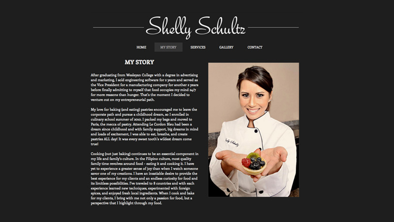
In this Shelly Schults baking website, for example, you can tell the photos are authentic and create a feeling that Shelly is a professional. Furthermore, the large image of person immediately attracts the visitor’s attention.
4. Typography: Choose Fonts to Match Your Message
Like images, fonts have a strong influence on the tone and feel of your website. Analogous to a person’s voice, they can be gentle, loud, stylish or playful.
Our eyes jump to bold, large fonts so you want to use these to quickly convey your key message. Often times, the size and style of the font can be as attention grabbing as the words or font itself. You can use contrasting fonts to draw the visitor’s attention as well.
There are tons of fun fonts out there, but use them wisely. Ideal for headlines or titles, “decorative” or display fonts are attention grabbers. For larger blocks of text, you want to stick to easy to read fonts – the “body text fonts.” These tips offer more details on types of fonts.
The type of font also sends a message – from additional information in italics, tucked between parentheses to the power of bold, capital titles. Choose fonts that accurately reflect your key message and remember to keep it simple here too. Using too many fonts will overwhelm the visitor, confuse the eye and detract from your message, so try to stick to two or three fonts on your website.
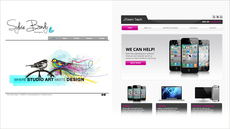
In both of these websites, the fonts help create the feel of the site. The first website uses an artistic, handwriting font for the name (Sylvie Bondy) and contrasts it with an easy to read, bold sans-serif font that clearly tells us what the business is about (Studio Art and Design).
Similarly, the JTown Tech website uses an easy-to-read sans-serif font. Here, the use of capitalization and bold, simple headings convey a feeling that this company is organized and professional.
5. Contrast Attracts Attention
Our eyes jump naturally to places with a lot of contrast. When an element on your page contrasts with the background of your site, it will attract the attention of visitors. The greater the contrast, the more it will grab attention. Text contrast also increases readability. For example, if you place white letters on a black button, it will be more readable than white letters on a gray background.
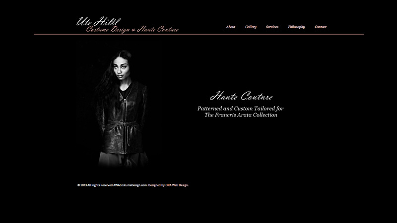
Note how in the Ute Hiltl website, both the woman’s face and the words “Haute Couture” pop up. This is because of the significant contrast between the white of the image and words, and the striking black background.
6. Size Matters
This may seem obvious, but it’s important to keep in mind. The larger the text or image, the more it will attract your visitors. Once you have their attention, text can get progressively smaller through the use of sub headers and smaller text size to give them more detailed facts. Same goes for images.
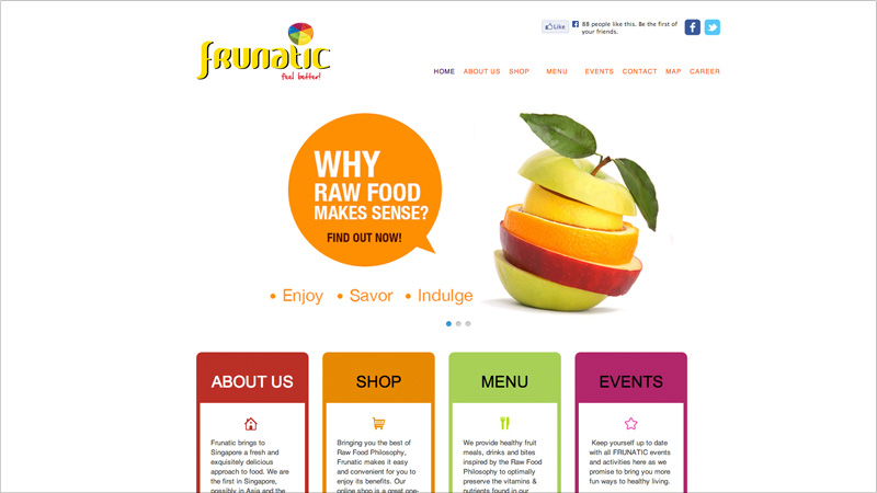
In this website, Frunatic, the designer draws the reader in with progressively smaller text. It begins with a teasing question “Why raw food makes sense?” which gives the viewer an initial sense of what the website is about. The eye then goes to slightly smaller text with the call for action “Find out now!” and category titles: “About Us, Shop, Menu…” Finally, we read the smallest text below this to learn the finer details of the site proposal.
7. KISS (Keep It Simple, Stupid)
The more simple and clear your message and design, the better your results will be. Apple is the king at keeping it simple and it’s wise to take our cues from them. Express what you need to say in a minimum amount of words and images. Keep it clear and concise.
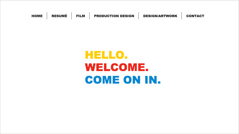
Emma Berliner’s homepage has a very simple, clear message which is extremely compelling. It makes the visitor want to “come inside” and spend more time on the site.
Now you know the rules… What do you do with them?
By playing with placement, colors, images, text and contrast, you can create a blueprint which maps how visitors will scan your website. Starting with big, bold text or an image that conveys your primary message, you can then introduce them little by little to the finer details of your message and product. Lead the visitor down the screen by incrementally decreasing text size (from headline, subheading and text boxes) and placing content lower down on the screen.
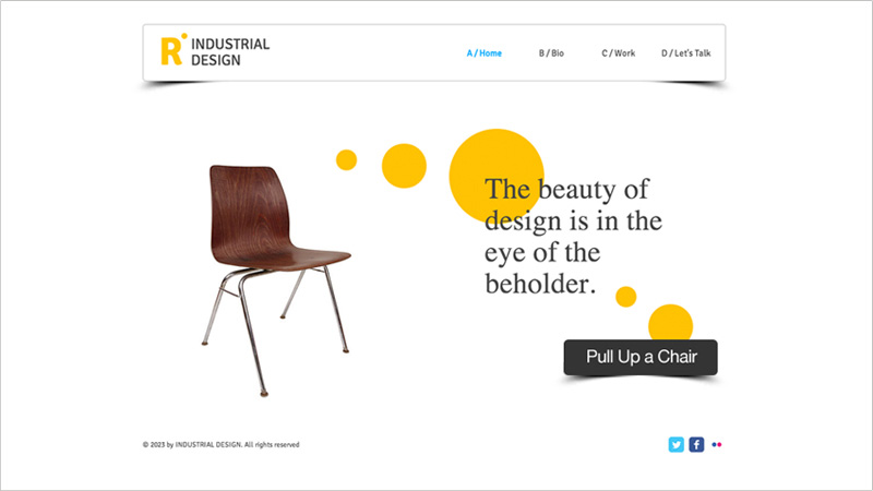
Note how this website integrates all of the above rules.
- The logo is located in the top left corner and the chair below it draws the visitor in before introducing the main message in text. From there, the visitor’s eyes move down the text before being asked to act, on the bottom right. (“Pull up a chair”) The yellow dots serve as a map of how our eyes scan the site.
- The colors are warm, clean and stylish, setting the tone for a store that sells products which share these elements.
- The single image of the chair, standing alone, attracts our attention immediately and begs curiosity. Why a picture of a chair? Read on!
- The typography is simple and modern, in line with the color scheme and the products being sold.
- The black font against the white background pops off the page and is easy to read.
- The large font size also makes for easy reading.
- Simplicity is key here. The site is not overcrowded with text, images or a variety of fonts.
Conclusion
From top left to bottom right, the composition of your website should be designed to first grab the reader’s attention and then take them by the hand as you tell them about your business. Once you have gotten the message across, you want to leave them with one clear Next Step – the Call for Action.
So what’s your call for action? It’s time to start planning your site!


