
It’s incredible to think that in the past ten years mobile devices have practically overpowered the general population. I mean, think about it. Smartphones and tablets allow consumers to access information and make purchases like never before. And, as proof that mobile device use continues to rise, it has been estimated that as of February 2017, nearly 50% of all web page views worldwide can be attributed to a mobile device.
Statistics show that in 2016, there were 4.8 billion mobile phone users. To add to that, 58% of United State searches come from mobile devices, smartphone video consumption accounts for nearly 45% of all app traffic (with Netflix and YouTube being major players), and it is estimated that by the end of 2020, global mobile data traffic will explode sevenfold.
As a website owner, these statistics should alarm you. Having a fully responsive website that is equally mobile friendly is no longer an option. In fact, it hasn’t been for some time, yet still so many websites fail to render correctly for those accessing them on the go.
One of the most crucial parts of providing an exceptional user experience to site visitors accessing your website from a mobile device is seamless navigation of your site. Site visitors need to be able to click on navigational menus, maneuver the checkout process, and view your content and images without having to scroll, zoom, or flip their devices.
Unfortunately, however, though most websites have a built-in navigation feature, not all are using it to their full potential, especially when it comes to mobile design.
That’s why today I am going to share with you some of the best ways to keep your website’s navigation on point so that even those visiting your site from a small device, with an equally small screen, can see what you have to offer without a hitch.
1. Make it Simple
Those on mobile devices are not apt to have a lot of time (or patience) on their hands. After all, many of them are on the go and just want to see what they are looking for on your website, without having to click through a bunch of options to get there.
Remember, the longer it takes pages to load, especially if you force users to navigate through several before reaching the endpoint, the more likely your visitor is to bounce. Aim for three levels of navigation, or less, if you want to avoid visitors going elsewhere.
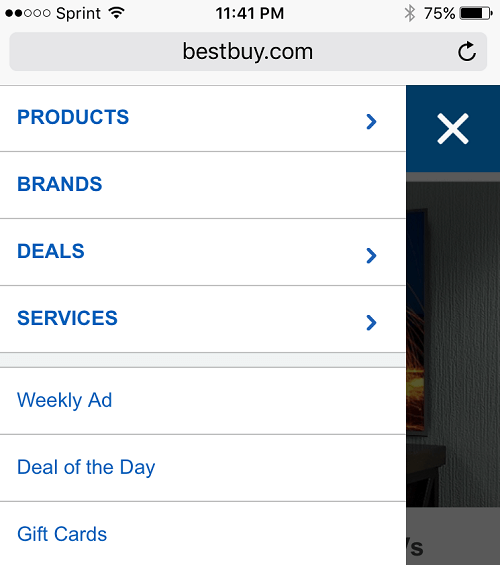
Another great tip is to avoid offering too many buttons for visitors on mobile devices to click on. This clutters the screen, especially on those of mobile phones, and can cause a lot of confusion. If your desktop site has a lot of navigation buttons, try building your mobile version to have less buttons with more nested menus instead.
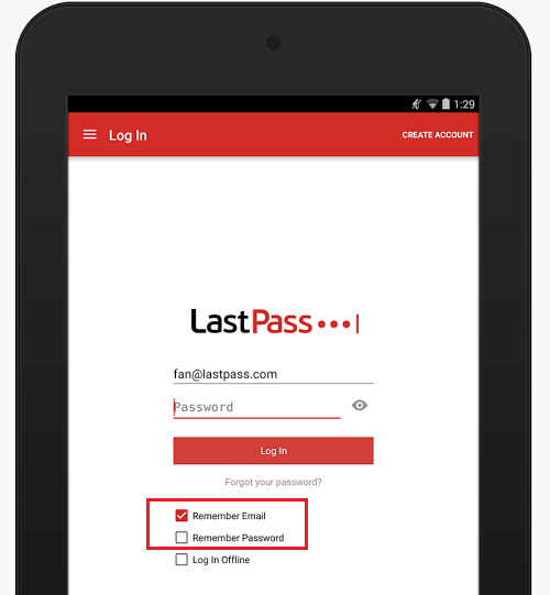
2. Avoid Making People Type
Fat fingers, tiny keyboards, and the annoyance of having to input so much information into a website or online app are just some of the complaints people have about mobile website displays. And, don’t assume that your site visitors are going to hold their mobile devices, specifically their phones, in the landscape mode.
Despite the fact that holding a phone horizontally is much easier, especially while typing, it has been suggested that 90% of people will continue to hold their phones vertically anyways. Catering to this is a must.
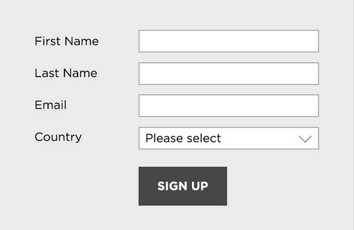
If your website requires typing of some sort no matter what, try the following:
- Implement the “Remember username and password” function
- Utilize autofill capability to minimize typing
- Aim for geolocation services that automatically determine a user’s location
- Evaluate every field that requires typing and ensure it is necessary
3. Be Mindful of Icons
Icons can have a major impact on the success of your website. Take a look at some of the benefits they can have on your site’s overall design and functionality:
- Scalable without sacrificing quality
- Completely customizable
- 100% responsive by design
- Cross-browser friendly
- Usable via a mouse and on touchscreens
However, there is some research showing that not many icons are universally recognized which can confuse site visitors and create navigation issues.
For example, the triangle play symbol and “x” close button are widely used on websites across the web. And increasingly, the hamburger symbol (you know, the three lines stacked on top of each other) is becoming more well-known across mobile device users.
However, icons such as the star or heart can have multiple meanings and may require icon labels so visitors clearly understand what they are designed to do.
4. Be Clear
Copywriting is critical for any website. It helps balance your message with credibility, helps brand your company, affects your visitors’ perception of you, and serves the purpose of communicating to your targeted audience.
But things are a little different when it comes to mobile devices and site visitors being able to effectively navigate through your website.
Menu items should use simple language that clearly defines where a person will be taken to once clicking on them. However, sometimes high-end companies make things overly complicated in an effort to stay trendy, and end up losing a large percentage of their target audience because of over clicking and frustration.
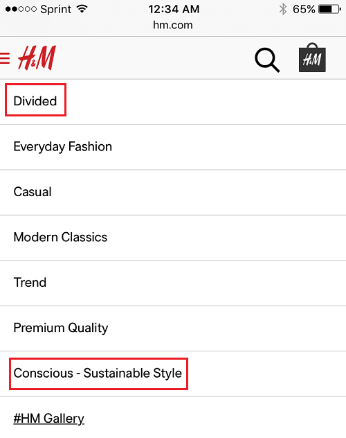
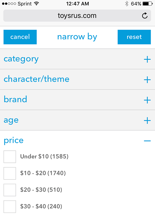
5. Consider a Filtering Option
A lot of major eCommerce sites, those with lots of products and services available to customers, implement a filtering option on their mobile sites to make navigating through the product pages easier. Think of categories such as brand, price, color, size, and age range. Ultimately, the criteria will depend on the type of website you have.
Additionally, try avoiding any mention of page numbers. When looking for the perfect product people do not want to be faced with the thought of having to navigate through dozens of pages. Obviously, the reality that there are that many pages is very real.
However, finding a way to avoid reminding customers of that is very useful in helping interested customers continue to navigate your site. Try instead a “View More Items” button or a continual scroll. This paired with appropriately applied filters will do wonders for the overall user experience.
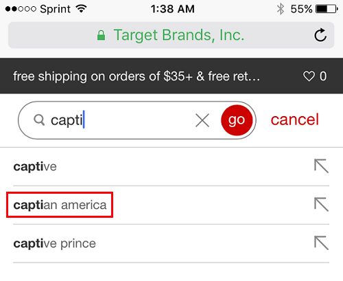
6. Improve Your Site’s Mobile Search
Google has reportedly stated that 9 out of 10 smartphone users will take action after conducting a search, and approximately half of those will continue on to make a purchase. This statistic alone shows you how important mobile search functions are. But creating a mobile search is very different than creating a desktop search.
Take a look at some of the most important things you should consider when optimizing your mobile site’s search navigation:
- Mobile searches are often local, meaning, those with brick and mortar shops should optimize search results to show local content
- Those searching on their mobile device are looking to take more immediate action, meaning, you should provide plenty of information in search results to help people make purchasing decisions
- Anticipate misspellings and include them in search results
- Manage a separate keyword list for your mobile users
Final Thoughts
In the end, catering to your entire audience base, regardless of how they access your website is crucial to garnering, and maintaining, success as a website owner. You must see your website through the eyes of those on mobile devices – no matter the type or screen size. You must meet their needs, anticipate the information they are seeking, and make getting to that information as easy and intuitive as possible.
By following the above navigation tips, you will inevitably improve your website’s mobile design. Plus, you will see the results in the form of increased site traffic, email subscribers, and purchases. So start optimizing your mobile site today and reap the benefits right away.
Have you ever implemented any of the above-mentioned mobile design tips for improving your website’s navigation? Have I left an important tip off that you think I should include? I would love to hear all about it in the comments below!


