
Minimal design, in a similar way to vintage and retro design is never really in or out of trend – it is just always around! The ‘less is more’ philosophy is a well loved style of design and, in the early days it was a very difficult style of design to achieve, but designers have learned to ‘declutter’ to the point of it being almost second nature. However, some take it a step further and strip away almost everything from the home/landing page. Here is a selection of some extremely minimal landing pages.
Ultra Minimal Website Design
The Afrix
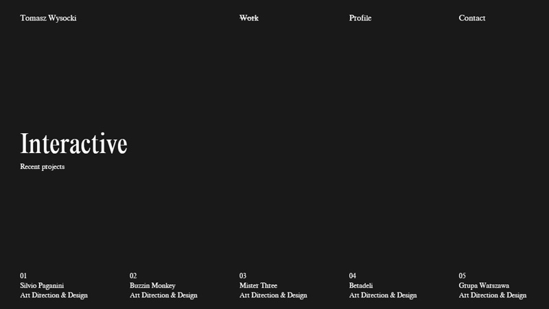
This is the personal portfolio of Tomasz Wysocki, and the landing page is simply white text on a black background. When you hover the mouse over the links at the bottom of the page, a dreamy black and white image appears as the background.
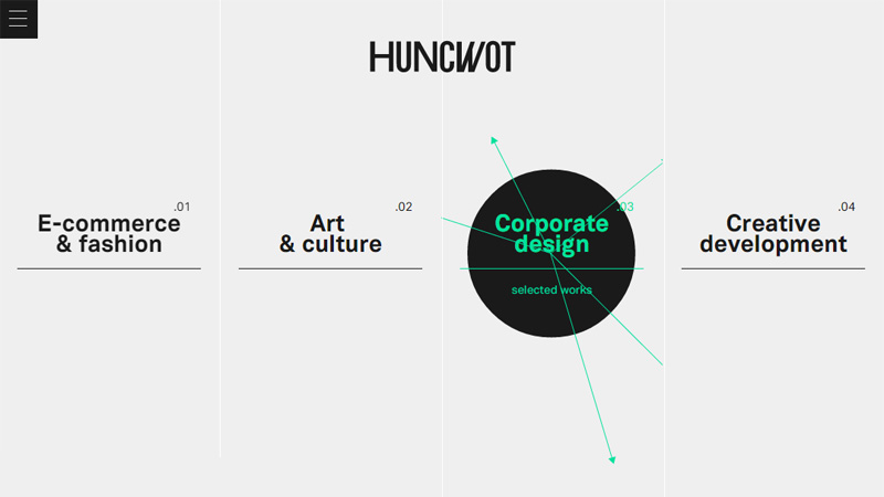
Huncwot
This site uses a very pale gray background with thin, hardly-visible white lines separating the categories that are displayed in black text across the page. When you hover over any of the links, a shape with colored lines/arrows appears, adding a lovely splash of color to the page.
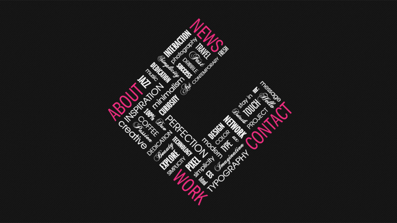
C2
A typographic-filled letter C is the only thing on this landing page, placed centrally on a black textured background. The pink words are the links.
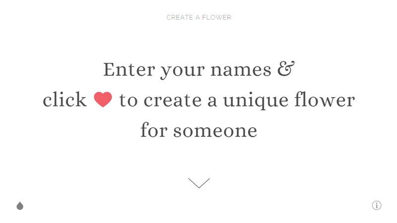
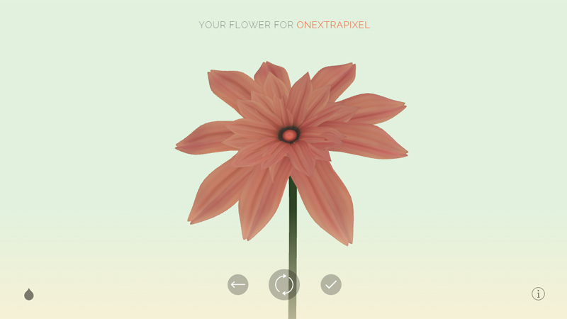
Wildflower
To be honest, it is no wonder that this fun little site is very minimal as there really isn’t much content throughout! The landing page has black text on a white background with the addition of a pink heart in the text, and the next page is similar, just asking you for your name and the name of the person you want to give a flower to, then you get your flower, which you can change if you wish. This project belongs to Resn, a digital agency.
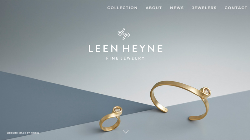
Leen Heyne
This jeweler uses just two pieces of jewelry on their landing page. The geometric background in shades of gray adds a feeling of depth.
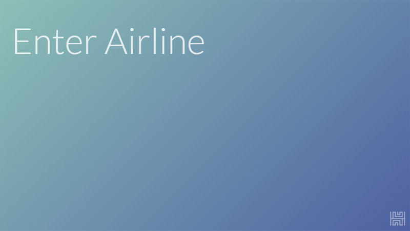
Huggable
This is really extreme minimalism. This app will tell you when a flight is due to arrive. You enter the airline, then you are asked for the flight number – if that flight number is relevant to more than one flight you will be offered the days of the flight to choose from, then finally you are shown the departure and arrival times – or when your ‘huggable’ time is! This is great if you are waiting at an airport for a delayed flight – as long as the airline actually has some idea of arrival time, you can get the info.
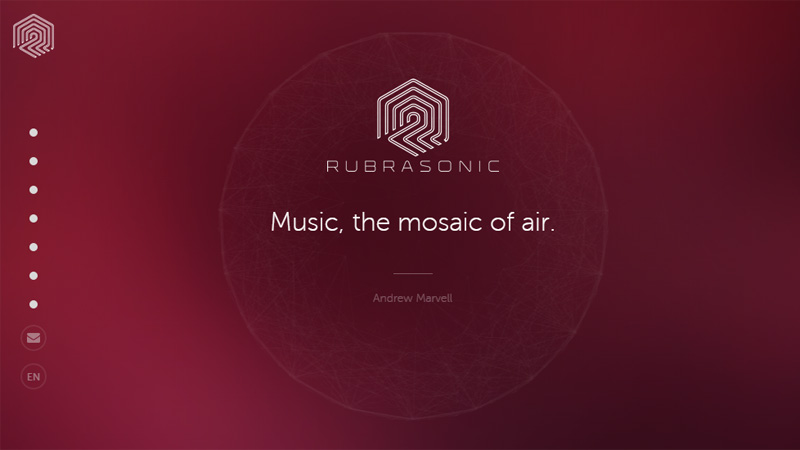
Rubrasonic
This site uses a changing red background that, to be perfectly honest, is a bit harsh on the eyes. The white center circle shows some music-related quotes, such as: ‘Where words fail, music speaks’ (Hans Christian Andersen) and ‘After silence, that which comes closest to expressing the inexpressible is music’ (Aldous Huxley). The white dots on the left of the screen are the navigation menu and hovering the mouse over them brings up the category title.
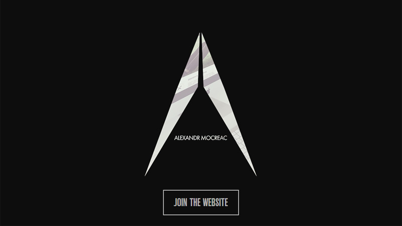
Alexandr Mocreac
This portfolio site opens with a central design with an animated background going on behind it. It took me quite a few seconds to figure out that the background shows examples of the designer’s work.
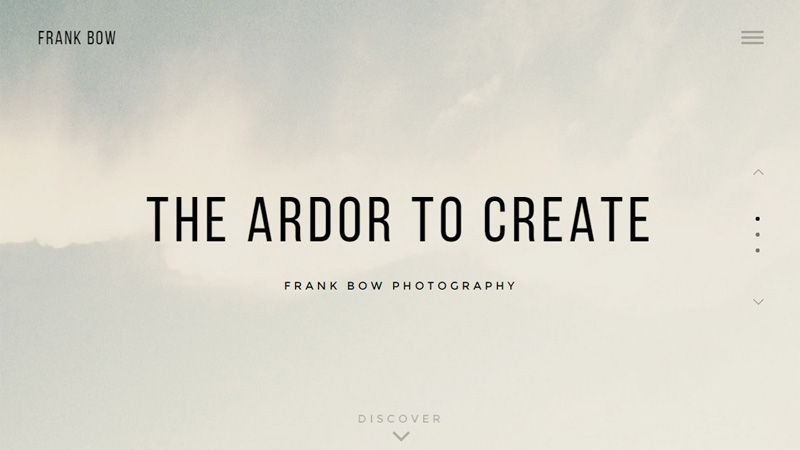
Frank Bow Photography
A slide show of three foggy mountain scenes greets you when you visit this photographer’s portfolio site. For a photography portfolio, the whole site is presented in quite a minimal style.
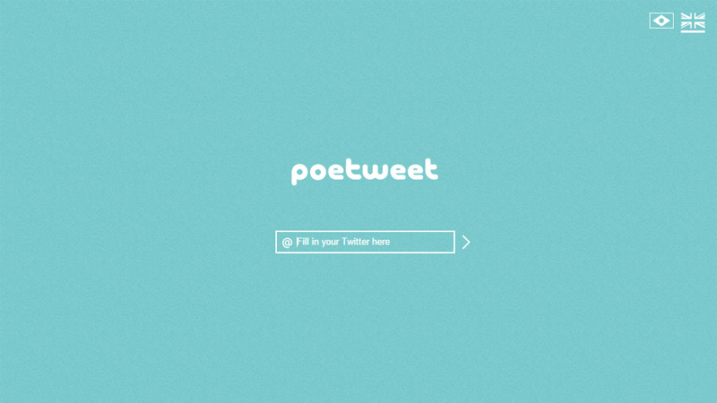
Poetweet
A real fun site – put an existing Twitter name in the box – it doesn’t have to be yours and you don’t have to be logged in to Twitter. On the next screen you are asked to select the type of poem you want from a Sonnet, Rondel or Indriso, then a poem is created from the Tweets on that account, which you can choose to share on Twitter if you so wish.
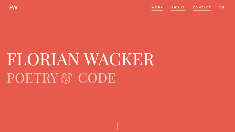
Florian Wacker
Florian Wacker has two relatively diverse careers – he is a published author and a web designer. He uses a quite bright orange background with white text on his minimal landing page.
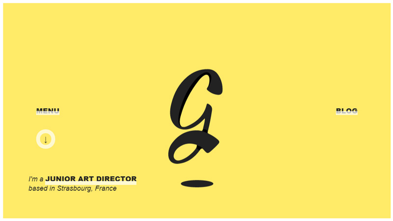
Gaetan Pautler
A solid yellow background with a bobbing G in the center and some links around the page are all that can be found on this landing page. If you hover the mouse over the ‘Menu’ or ‘Blog’ links, the white transparency expands to cover all of the text.
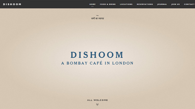
Dishoom
This landing page is really an introductory page to the non-minimal website that follows. As is to be expected, there are a lot of images and quite a lot of text promoting this restaurant further into the site.
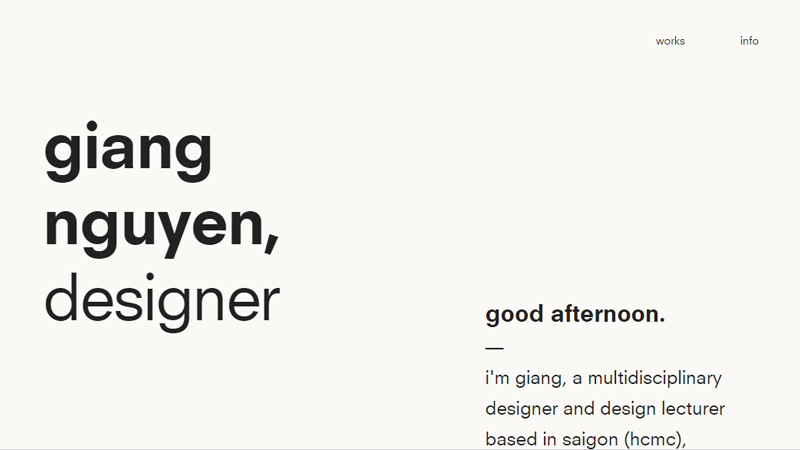
Giang Nguyen
This designer uses the landing page simply to introduce himself. He obviously uses a local time plugin to welcome you with ‘good morning/afternoon/evening’ according to your time of day.
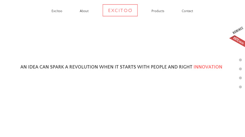
Excitoo Innovations
This site uses shades of gray on a white background on a very minimal landing page. Small amounts of red add a little interest to the page, in their logo and the rotating word at the end of the sentence: ‘An idea can spark a revolution when it starts with people and right innovation/invention/design.’
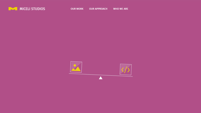
Miceli Studios
Using a purple background that makes their yellow logo really stand out, this site has an animation going on on their home page. Starting with a see-saw illustration that evolves into a circle with white text that explodes and finishes with their yellow logo.
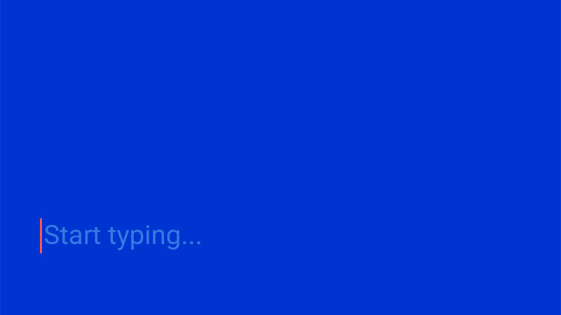
Jacob Grubbe
Jacob Grubbe has added a real fun element into his website design. This extremely minimal landing page offers you to start typing… When you do, no matter what you type, you get the following: ‘Hello there, I’m Jacob Grubbe. I’m working as the creative director of Stinkdigital in Berlin doing all sorts of virtual stuff.’
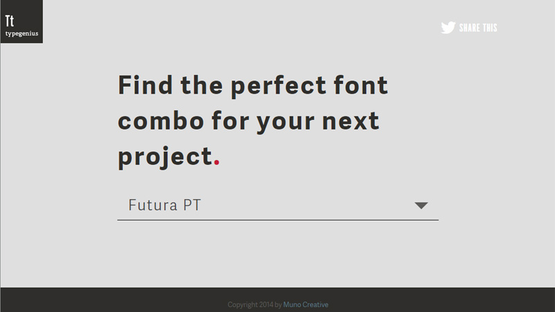
Type Genius
This is another one of those sites where it is no surprise that it is presented in a minimal style. If you want to figure out what fonts go together, you choose from the drop down list your headline font, and you will then be taken to a page of matches for your chosen font. Of course, this could all have been put onto one page, but the minimal presentation is a nice touch.
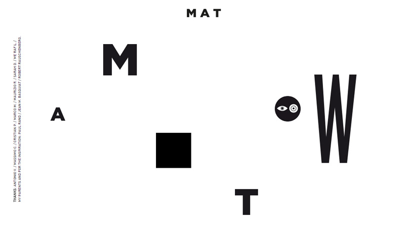
WMAT
Here is a seriously minimal home page design. Most of the elements on this page do something – the letters are the navigation menu and show the categories on mouseover. The solid black square shows some video clips when you hover the mouse over it. The only element that does nothing is the circle.
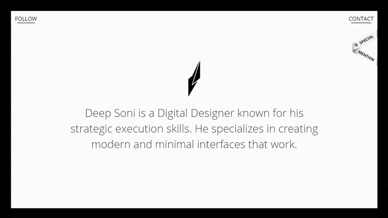
Deep Soni
This digital designer uses his landing page as an introductory page about himself. A solid white background with a black border and black text and logo – this really is minimal design.
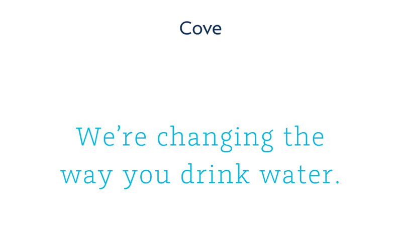
Cove
Cove have created a water filtering system that is promoted by this site. Using dark blue for their name and a more water-blue for the tagline: ‘We’re changing the way you drink water’, the minimalist approach on this design makes the visitor want to scroll down to learn more.
Conclusion
There is definitely an art in stripping website design down to this kind of level for most projects, and with today’s advances in coding a lot can be hidden behind small elements, as long as you are sure the visitor will know to move the mouse over the page to find the links, everything can be found on such extremely minimal sites – but therein lies a problem… it seems that designers can be guilty of assuming all visitors will know how to look for links, and I don’t think we have reached that point yet – so for freelancers looking for work, these extremely minimal sites could work against them when non-tech-savy visitors drop by.
What do you think about such extreme minimalism? Have you created such a site either for yourself or for a client? Please share your opinions and links with us in the section below.


