
Paper, magazines and typography have an elusive non-destructive bond. It is through the unique typeface used for a masthead that people, in the first place, recognize their beloved printed matter on the shelf. Highlighting key topics on the cover is another common use of typography. As well as these two important tasks that are entrusted on the fragile shoulders of typography, it can also play a decorative role.
Usually it happens when striking illustrations are not enough to make the cover stand out, or when the artist wants to refer to the original purpose of the cover itself, namely, briefly interpreting all the information that is hidden inside the magazine. In this instance, a traditional approach of using sets of typefaces, various font properties, and spacing that is spiced up with abstractions or illustrations can do a great job in making a cover look both informative and ingenious.
Today, I want to show you a collection of magazine covers that have used typography as a main tool to draw customers’ attention.
Magazine Covers with Amazing Typography
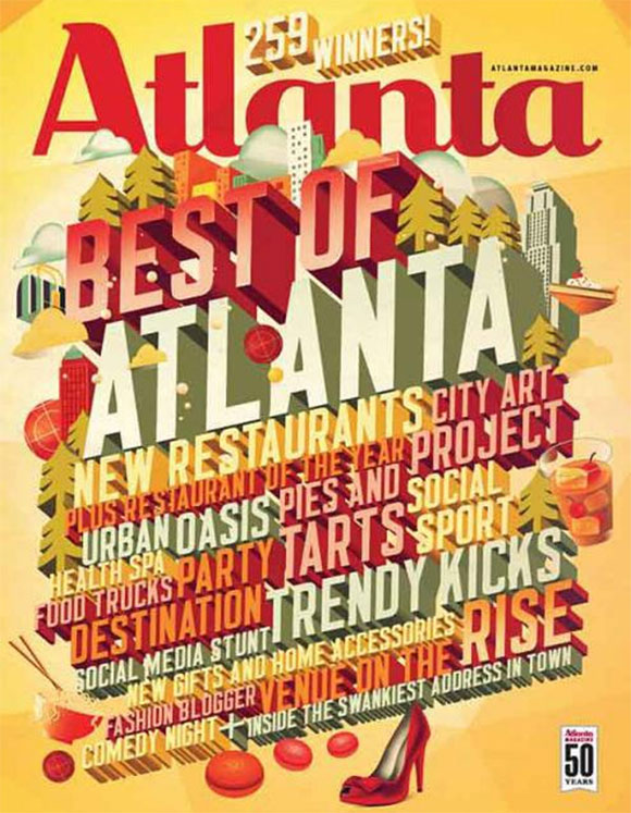
Atlanta Magazine
Atlanta Magazine spices up the cover by concentrating all the strap lines in the center. Use of 3 dimensional typography avoids confusion by transforming every cover line into a mutually reinforcing block which all together form an improvised wall of magazine features.
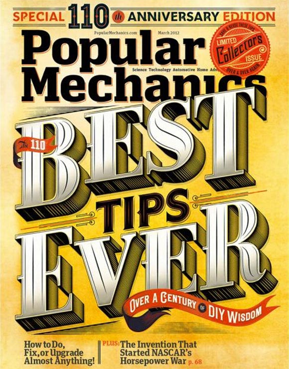
Popular Mechanics 110th Edition by Jordan Metcalf
This cover also uses a 3D typeface to draw customers’ attention. Since the cover mimics the retro theme with ribbons, tags and ornament lines, the font is also executed in vintage style giving the whole design an old fashioned personality.
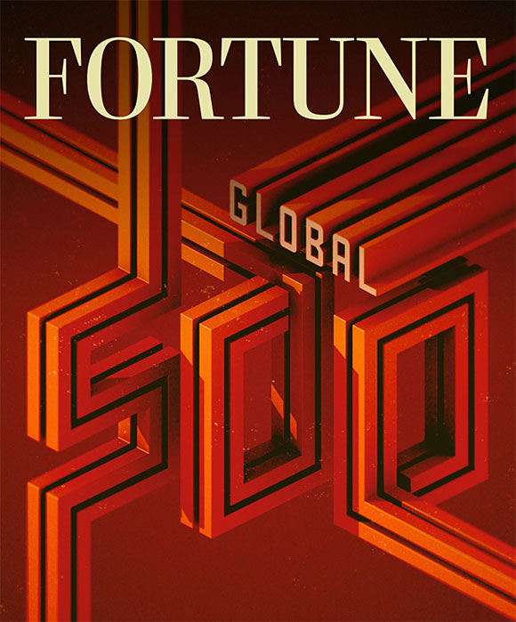
Global 500: Fortune by Alex Varanese
This cover uses a truly shining retrospective typeface that captures the 80s disco glitz. A warm color palette and well-defined contours of the characters with a gentle touch of grunge give the cover a bright-looking effect.
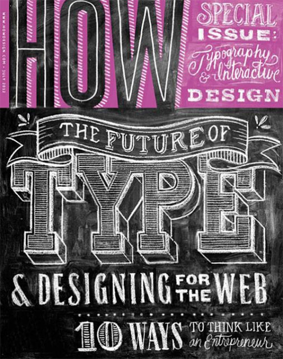
HOW magazine
This is a great example of a digital variation of chalkboard typography. Different handwritten fonts that are complemented by slight chalk stains are used to emphasis the key points and provide the cover with a scholastic and intriguing feel.
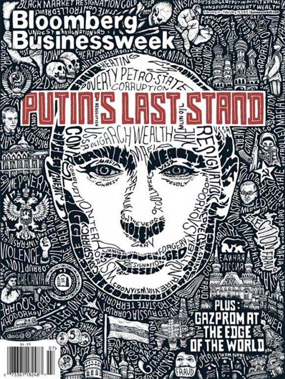
Bloomberg Bizweek by Sarah King
This issue of Bloomberg Bizweek uses flexible cursive fonts and special arrangement of words to portray the lead story unveiling not only visual but also informative pictures in the issue.
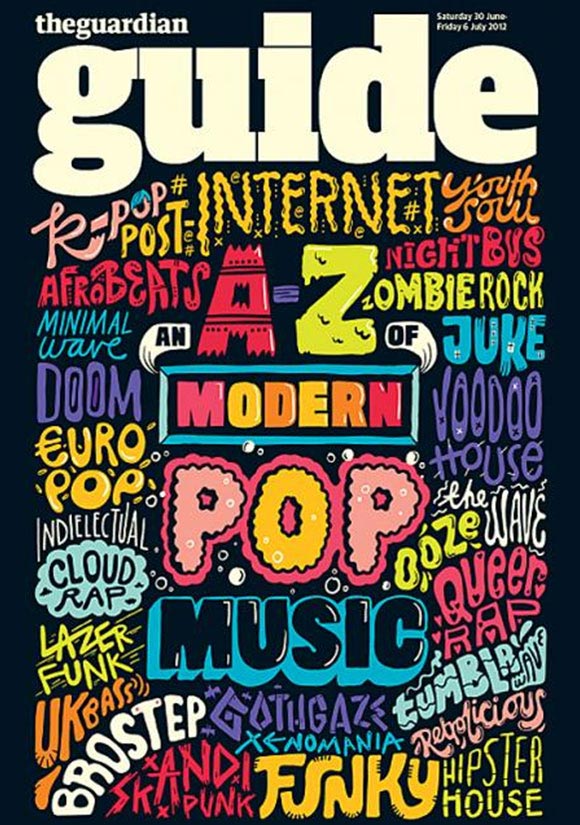
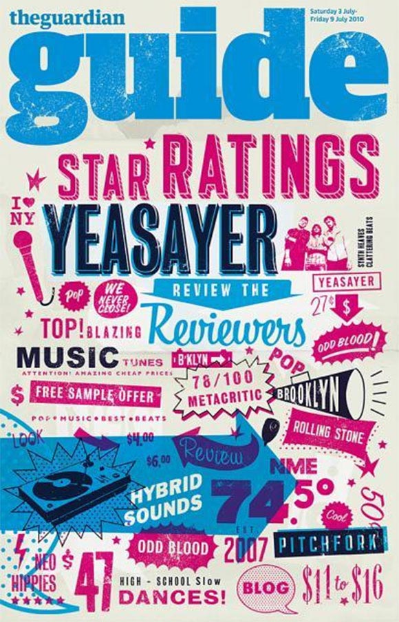
The Guardian Guide
This cover includes various music subculture names each of which has been executed in an appropriate typeface style. Compactly arranged titles create a slight colorful mess adding emotions to the issue.
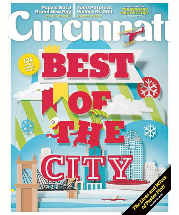
Cincinnati Magazine
This issue’s cover features a paper-based composition that was created by transforming colorful sheets of paper into scenery.
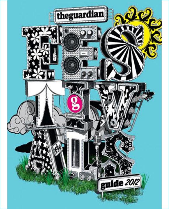
The Guardian Guide
This cover embodies the music festival feeling through lettering. Huge metallic characters with pop culture prints as well as parts of musical instruments that are embedded in several letters create a title with inner meaning.
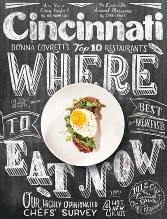
Cincinnati Magazine
This is another good example of using chalkboard typography that plays both a decorative and an associative role. Since the majority of restaurants prefer to show their main dishes on a board near the entrance, using a blackboard texture as a canvas and chalk hand-written inscriptions with precise and clear lines is the best way to convey the correct message dedicated to eating.
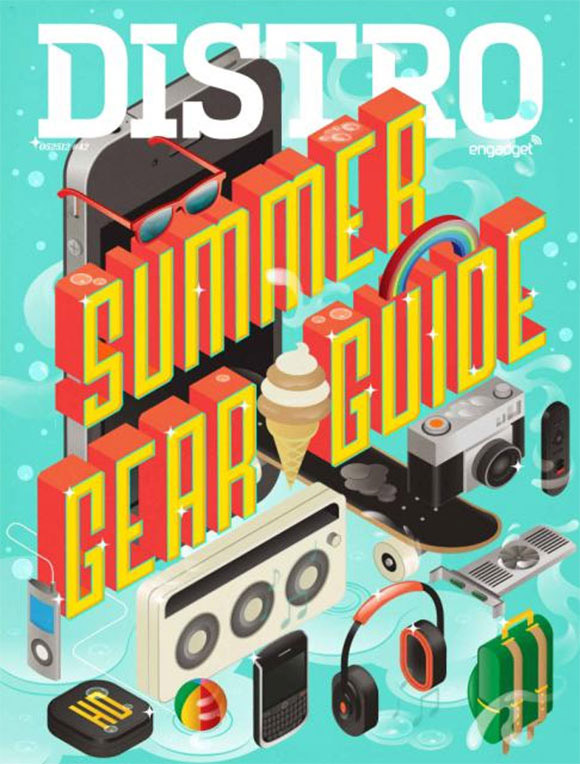
Distro Magazine
The cover of this issue of Distro magazine uses typography with a summery feel. 3-dimensional type based on retro style and executed in a warm color palette perfectly merged into graphics that have been placed at an unusual angle.
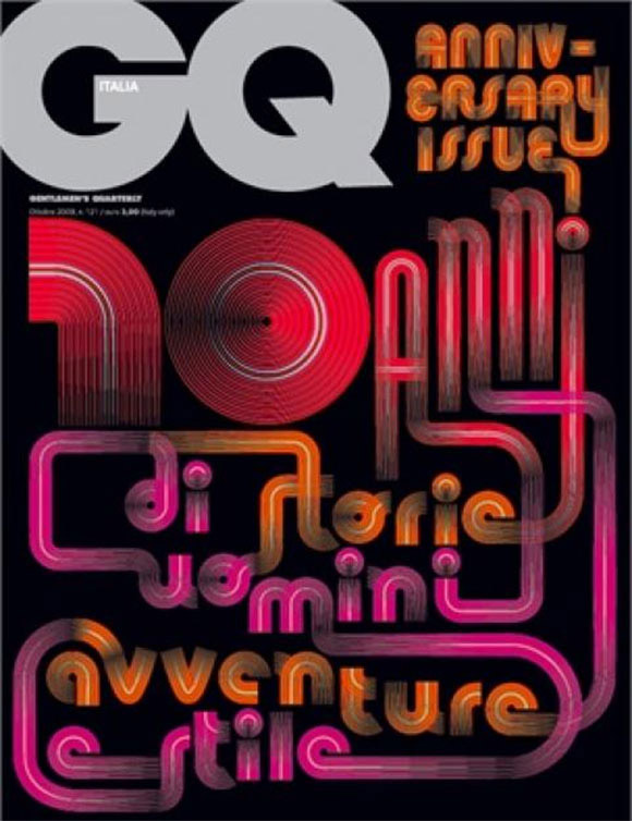
Italian GQ
This cover illustration pulls the type out of moving colorful neon trails. Despite a rather illegible looped headline, on the whole, the cover has 1980s design aesthetics with a nice bright effect that efficiently attracts people.
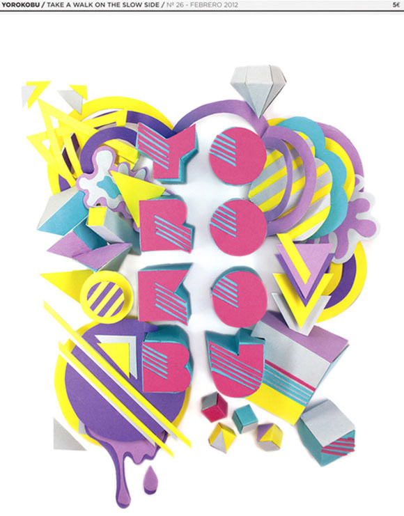
YOROKOBU by Noelia Lozano
The effect on this cover turns a boring everyday typeface into amazing artwork by cutting, folding and molding simple paper sheets. Solid fat letters and a layered background make the composition look pleasant and dimensional.
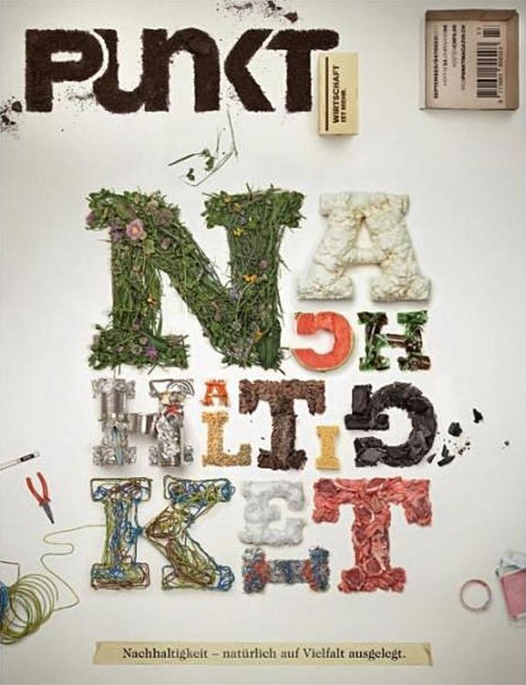
Punkt magazine
This illustration isn’t just a fully computer generated artwork. The cover showcases a real handmade font that was produced basically from natural ingredients. Such an explicit integration with the environment makes the cover look unconventional and memorable.
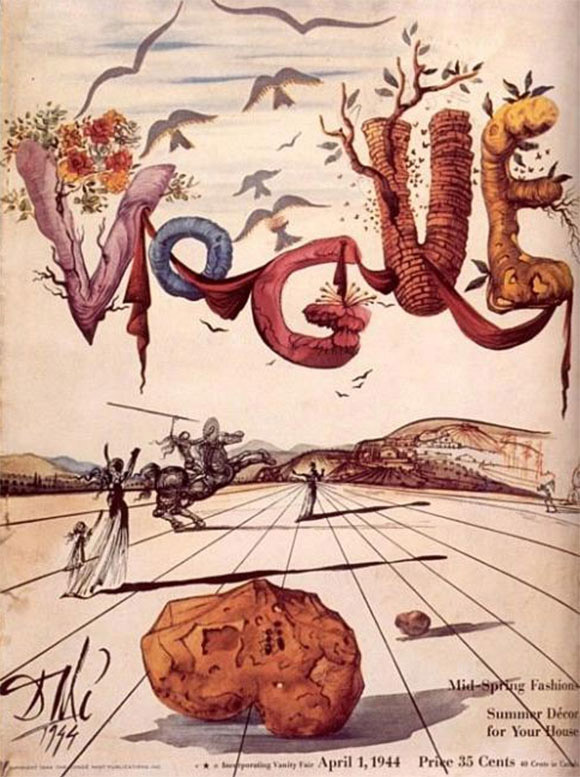
Vogue Magazine Cover by Salvador Dali
The cover for this 1944 issue of Vogue has a bizarre and dream-like appearance. Being created by Salvador Dali, the masthead illustration has a truly surreal touch, every letter has its own individual style with inlaid nature elements.
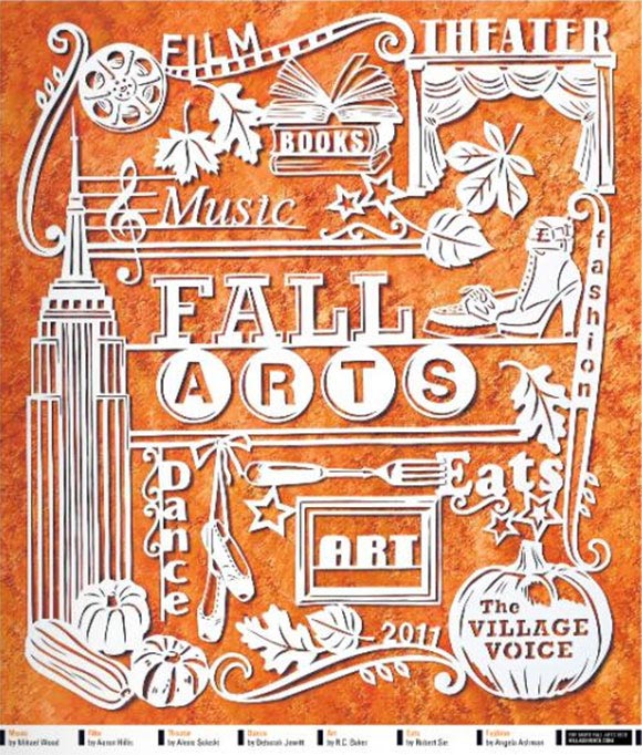
The Village Voice
This cover uses the technique of paper cutting. The whole illustration is cut from a single sheet of paper. Despite the complexity of the process the artist gave every word its special surrounding, size, typeface and weight.
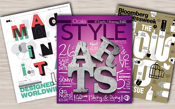
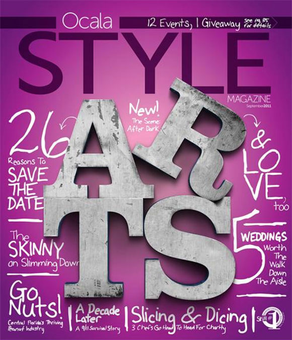
Ocala Style Magazine
This illustration exudes an image of solid rough handmade lettering. Perfect 3d casual typeface with a slightly scratched metallic texture breaks the monotony of the noised monochrome of the cover background.
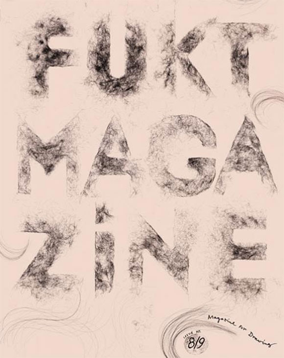
Fukt Magazine
This cover boasts a whimsical style with an unconventional typeface. Cotton wool textured symbols with slightly constrained blurring edges add a note of mystery.
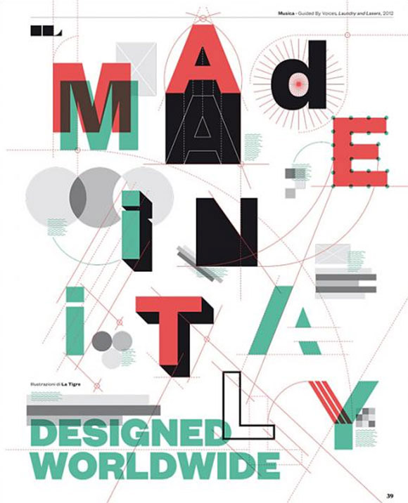
IL Magazine by La Tigre
The cover illustration for this issue of IL magazine is inherently “geometric” from background to typography. A bunch of nonrepresentational plane shapes play the role both of canvas illustrations and letter stylization making every character rustic and mundane.
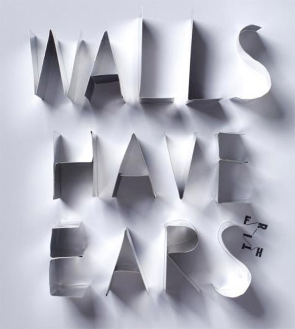
Wallpaper Magazine
This illustration boasts of having an elegant vibrancy. Properly installed lights and shadows make the title protrude from the wall and scream the words that are so important.
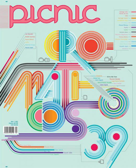
Picnic
This issue of Picnic has a new take on a disco style for it’s cover illustration. Muted rainbow colors in conjunction with vinyl-like symbols stylization add a load of fun to the typeface making it look bright and open.
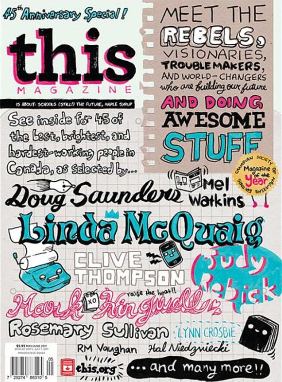
This Magazine
The cover for this issue of This magazine includes a great variety of vivid handwritten fonts plotted on a paper-textured background. This approach gives the cover appearance of a remarkably fully illustrated school notebook page.
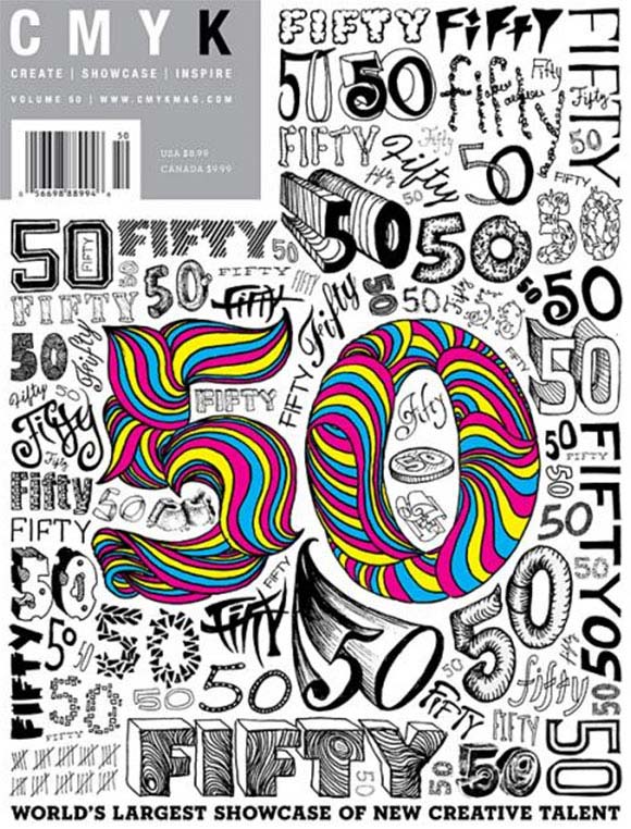
50 x CMYK
This cover touts a highly illustrative “50” as the epicenter. the designer has blended different graphic variations of the figure 50 using unique typefaces to make the cover an amazing source of typography inspiration.
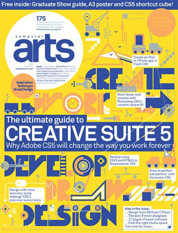
Computer Arts Issue 175
The cover for this issue has a real construction vibe with a great variety of building themed illustrations. Supported by clumsy typography that gives every letter a bold and geometric feel, the artist makes a clear connection between the visual personality and the lettering.
The Guardian Guide
This illustration leads by retro style. Vibrant old school typography in conjunction with typical art deco illustrations makes the cover powerful in messaging and in expressing nostalgic emotions.
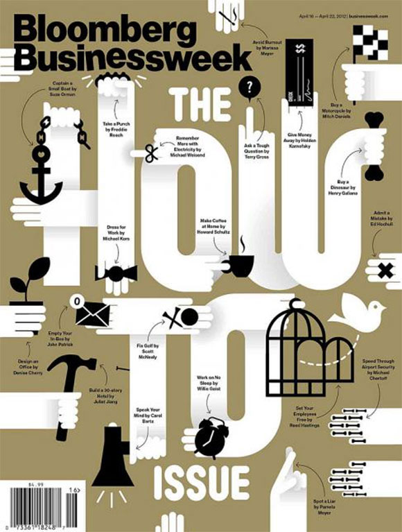
Bloomberg Businessweek
This cover has human style typography treatments. Each letter includes a hand with different instruments or objects that all together symbolize and visually interpret the main idea of the issue: “How to”.
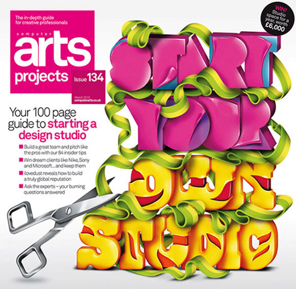
Computer Arts Project Issue 134
This cover has a candy-like headline that is accomplished by the use of glow volumetric characters. A hugely fat typeface marked by several vivid colors conveying enjoyable and yummy feelings.
Conclusion
As it turns out, sometimes it’s not necessary to create an outstanding photo manipulation in order to make your cover noticeable. Even a simple array of characters that are organized in a special way can bring aesthetic pleasure. Since there are a great deal of magazines and books that are published every month, it’s really impossible to shed light on every well-made typography cover.
So if you have a good example that perfectly fits into our collection share it with us. Also, tell us what you think of these type of covers. Do you like them? Or maybe, you prefer covers with bizarre or realistic illustrations?


