
A brilliant product page is the first step to higher conversions. Every eCommerce site exists to make money so you want to design a site that’s easy to use and that encourages sales.
Of course you’ll want to focus a lot on the checkout process from the user’s cart to entering payment information.
But the product page is also crucial to make sure visitors can find exactly what they’re looking for. And in this post I’ll cover a few UX tips for crafting a great experience on the product page for any ecomm site.
Clarify Pricing & Features
Perhaps the most important thing with any product is the price.
So keep the total price clear and prominent right on the page. Make sure you clarify this early near the top of the page and near the product title/photo.
Also make sure to mention optional features related to the purchase. For example, different sizes & colors if you’re selling t-shirts. Feature these options prominently near the pricing and update that price accordingly if certain options cost extra.
Your goal should be transparency with potential customers. Be upfront about costs and don’t try hiding anything with the hopes of tricking people into buying.
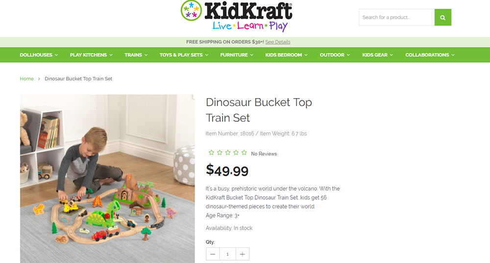
The KidKraft website is an excellent example of a clear product page. Each item is clearly titled and the pricing is in big bold letters right near the top.
This pricing text is also much darker than the rest so it really stands out from page.
You’ll also notice there’s a good amount of white space around the pricing too. This lets the visitor quickly browse through everything from total reviews, total pricing, and total features.
Quick browsing is key to most interaction design on the web so this is an excellent design trend to follow. But you might also try messing with color and placement like in the JBL example below.
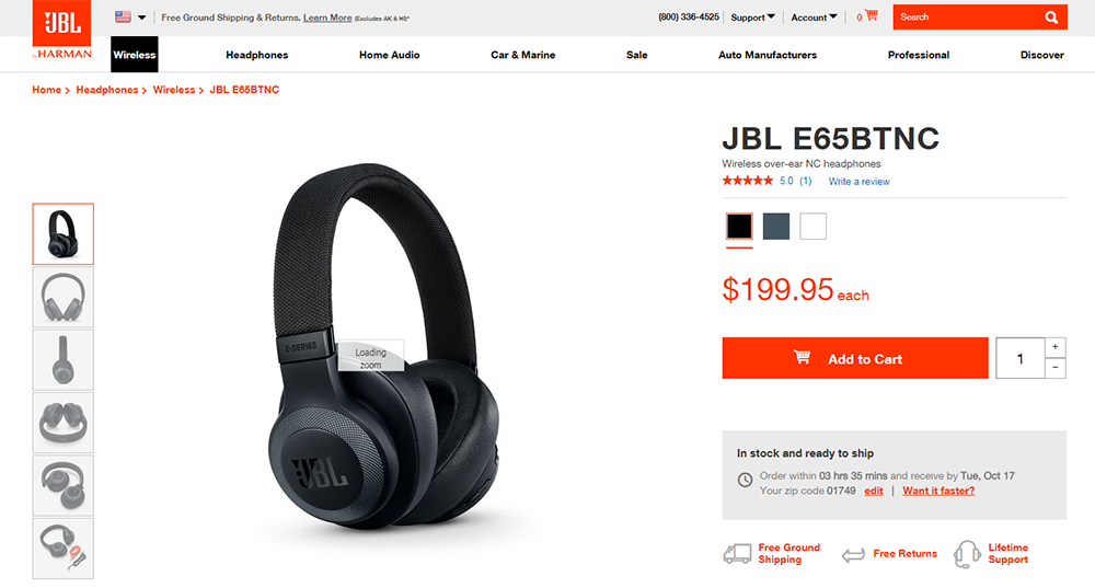
Notice the pricing text is large and clearly visible, but also bright red to match the CTA.
In fact, the design almost seems built around this shade of red to draw attention with a common theme. Definitely a great strategy if you want your pricing to blend into your layout.
Doesn’t really matter if you change the color, font, size, placement, whatever. Just make sure the pricing is easy to see and clearly accessible from the top of the page.
Customer Reviews
One of the best ways to build trust is through reviews. Unfortunately your brand isn’t really the best for reviewing your own products; but other customers are.
Make sure you feature customer reviews prominently with their own section on the page. This shouldn’t be right near the top unless you’re quoting snippets from certain reviews.
But I do recommend adding a small link or an overall star rating near the top of the page. This can give visitors a quick look at the average customer rating and link down to the full list of reviews.
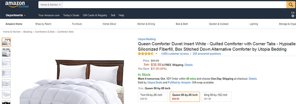
I have to include Amazon here since they’re the king of Ecommerce. No doubt Amazon has split tested their product pages over & over to tweak small features for big returns.
Their review section is very clear and everyone knows to check Amazon reviews. Customers can sort by most recent reviews or most helpful reviews along with sorting by certain star ratings.
Notice the average star rating is always at the top of every product page. Try to include this if you can because it’ll go a long way towards building trust with your audience.
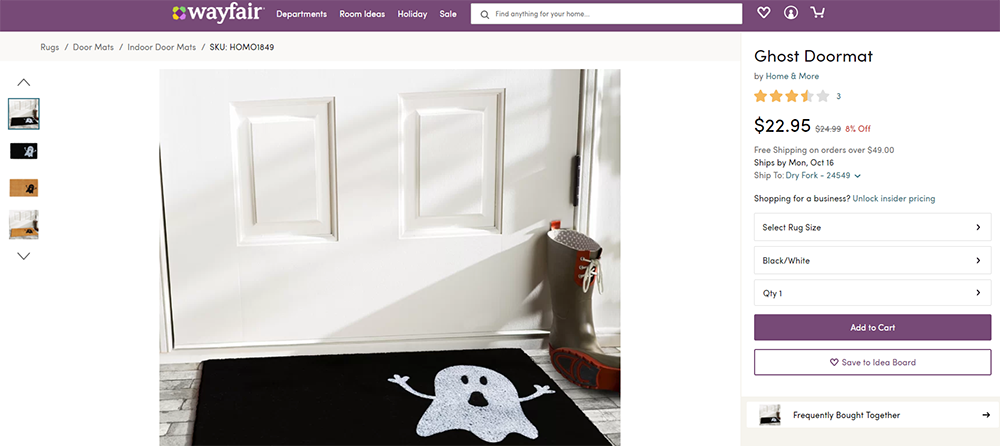
I actually like the style on Wayfair’s website too. Their stars take up a lot of extra space and they immediately grab your attention.
This is great for building trust with visitors since they can quickly glance at the overall user rating and work from that. Plus their pricing section is super clear which follows the other trend I mentioned.
Really Wayfair’s product page is a goldmine of stylistic design choices you can replicate and test for your own shop.
Add Images That Sell
This one may seem obvious but images really do sell. The problem is finding the right kinds of images that grab attention and let visitors know exactly how your product looks.
You might go for a bunch of different photos & angles, or just one great shot. Doesn’t matter how many pics you have(although more is usually better). The ultimate goal is to show off the product and give people a digital taste of what it looks like.
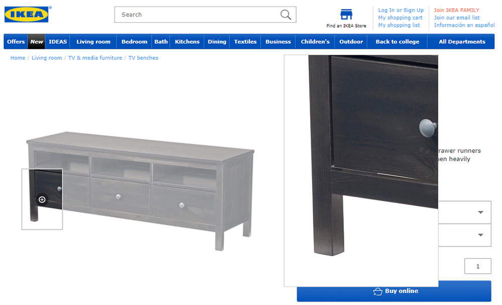
I think the IKEA product page is superb with two very important photo features:
- Click-to-zoom
- Thumbnail galleries
Each photo is fairly large and takes up a good portion of the page so you can really examine the pics. Not to mention the zooming feature is super handy for anyone buying furniture.
But notice the quality of the photos and how they feel on the page. You want very similar types of photos for your own site & try to match that level of quality too.
Now if you’re selling products that serve a specific purpose you could also include action shots. These might feature pics of someone using your knife or strainer while cooking, or maybe a pic of someone making their bed with the bed sheets from your shop.
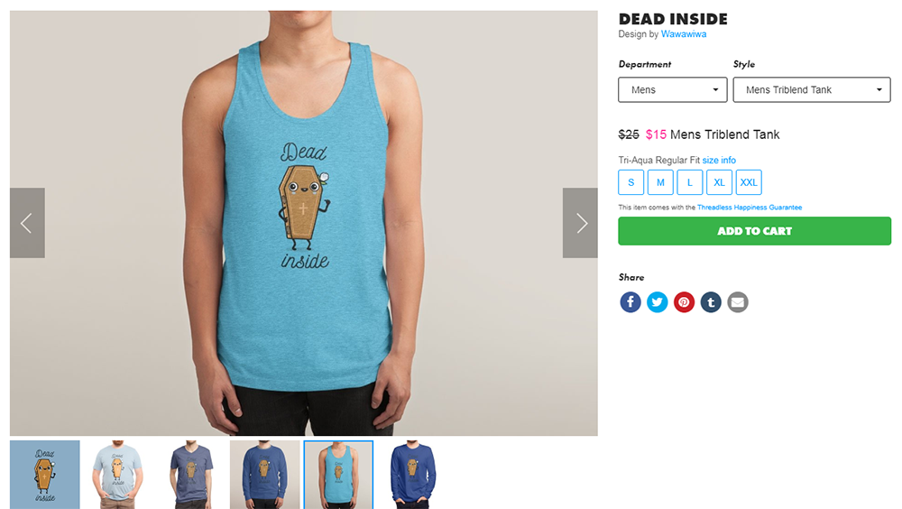
The clothing store Threadless includes many pics of each shirt with different models. This way you can see how the shirt looks in different colors, sizes, and different styles between men’s & women’s clothes.
Picture quality comes down to the specific product you’re pushing. Certain types of pictures work better for certain types of products and it’s your job to figure out how to capture the best pics that add value to your customers.
Skimmable Product Descriptions
I mentioned earlier how most people skim the web. This means you’ll grab more attention by presenting product information together in a skimmable format.
Note on the Redbubble page you’ll find a list of product features right beneath the main product header.
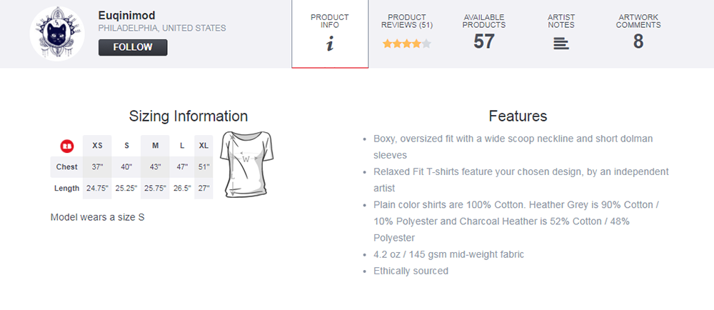
This is a great way to share pertinent information about your product without requiring paragraphs of reading.
It’s even labeled with a strong “Features” title so the customer can tell at a glance what the list is about. Pretty cool!
One other example is the Skinny Ties product page with small feature boxes underneath each photo.
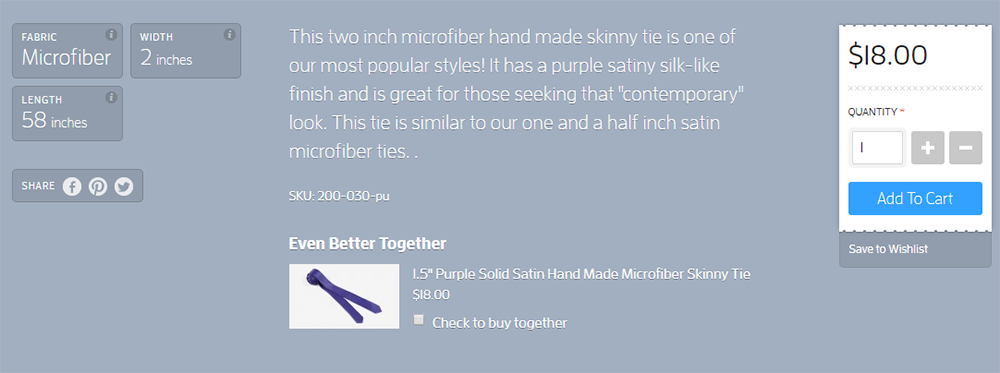
You can find quick info on the tie’s fabric, size, and width/height. This data shouldn’t be buried inside a product description so it fits nicely in skimmable boxes.
Again your product descriptions will vary based on the type of product you’re selling. But use these examples to think about all the possibilities.
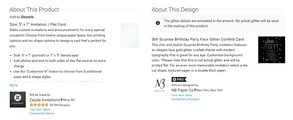
The Zazzle example is one of my favorites because it relies primarily on text but it’s so easy to skim.
The product description is segmented into two columns: info about the product and info about the design. These two areas are super important to prospective buyers so it helps to have it all laid out in one place.
One Clear “Add To Cart” CTA
When someone is ready to buy your product they’ll need to add it into their cart and check out. This usually happens with the click of a button called a CTA button.
Your job is to design a CTA that’s clear, easy to read, and accessible no matter what. Generally this means using a strong color, a distinct button style, button text that makes sense and a placement close to the top of the page.
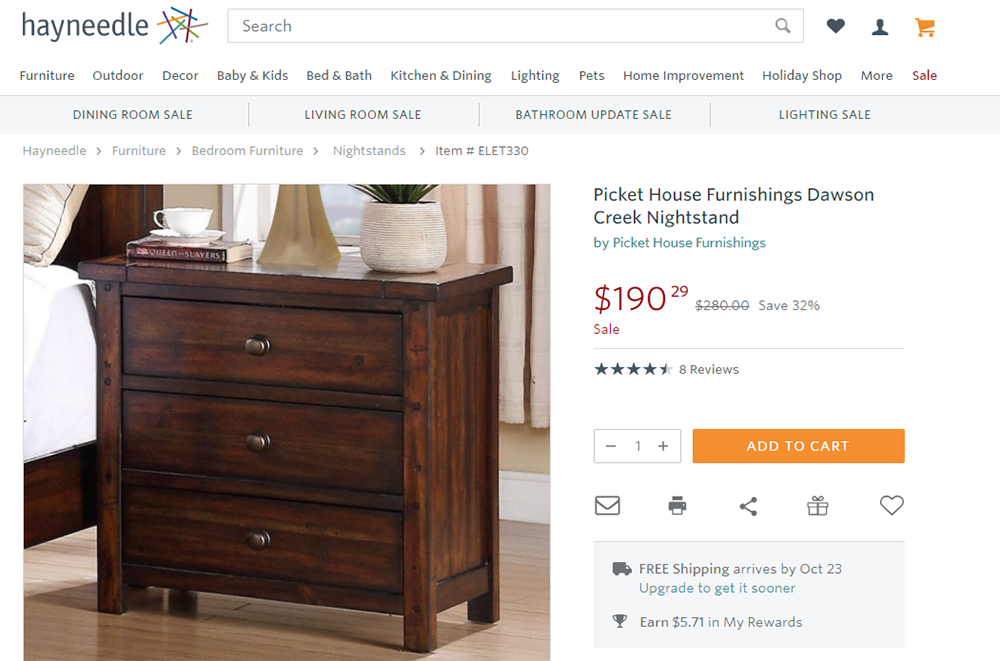
Hayneedle follows all of these ideas with its bright orange CTA. The button text reads “add to cart” which is a typical choice for ecommerce shops.
Notice this button really grabs your attention right from first pageload. It’s near all the main features like user reviews, the product price, and the total quantity.
Use something similar to grab attention and encourage people to click. Usually orange/yellow/red are the brighter “action” colors but you can see success with softer colors too.
Take for example Ugmonk’s product page using a bright blue CTA.
This one even has a small plus sign(+) alongside the button copy. This plus symbol visually tells the user exactly what this button does.
Try a bunch of different styles for your CTA with different colors, copy, icons, sizes, anything. If you A/B test the results you may be surprised to find certain CTAs perform better and increase your total sales over time.
Moving Forward
Take all of these tips along with your design journey and try applying the ones that make sense. You may not find all of this advice useful because it can be specific to the type of product you’re selling and the design of your ecommerce site.
But don’t be afraid to try new things and see what works! The ecommerce space is huge and if you’re lucky enough to have a slice of that pie you’ll be amazed how much a little UX tweaking can affect your bottom line.


