Besides the use of airports to function, airlines need a website and/or app to create sales and attract potential customers.The problem with designing for airlines is that so much information has to go on the landing page – there has to be a form for inputting flight dates, and special offer information, etc. This means that when it comes to the presentation, we are mainly looking at beautiful background images, and in this regard the designers don’t disappoint. Here is a selection of such websites mainly chosen for their static or slide show background images.
The Best Airline Website Designs
Virgin Atlantic
This British luxury, long-haul airline uses a full screen slide show of three images on its landing page. They are known for using red in their logo, and this follows through in their search-for-flights form. They also have at-a-glance links to Online check in, Manage your booking and Flight status, making this design not only attractive, but also very user-friendly.

Fiji Airways
A full width slideshow of four images on this site, showing some of their offers and a competition. Below the slideshow is a border of a kind of tribal-style pattern, with alternative links to their special offers in boxes that overlap the slideshow images. The flight search form is relatively small and unobtrusive on this page.

Kenya Airways
Unusually, this site does not greet visitors with a flight search form, but a bright red navigation menu cannot be missed here. A nice selection of 4 images rotate on the full width slideshow.

Azerbaijan Airlines
Another site that does not have the flight search form on the landing page, here it is located on the blue navigation bar, or just below the slide show.

Southwest Airlines
Southwest use a static background image and parallax scrolling for their site design. They are currently working on attracting summer vacation customers, so the image is a guy having fun on the water. The whole of this site is nicely laid out and fairly minimal in appearance considering it is a text-heavy site.

Iberia
This Spanish airline uses a four image slide show as a hero area on the landing page. They use their signature red and yellow color scheme throughout the site, and the flight search form is relatively small on the slide show images.

Scoot
This site design is very different from all other airlines – it is quite a breath of fresh air! It is a Singaporean low-cost airline, and they use a full-on yellow and black color scheme with a slide show of five hand-drawn illustrations with some cheesy headlines, like ‘Get a leg up’ for booking extra leg-room seating, and ‘Connecting to friends in high places’, referring to their onboard wi-fi service.

Porter Airlines
This airline uses a static full width image of one of their planes, with the flight search form open when you arrive at the page. You can click down the menu for Check in and Flight status that have fly-out forms, and My bookings will take you to the relevant page. The home page of this site as you scroll down has a very minimal design.

Avianca
This site has two slide shows going on at once – the main one at the top and a smaller one below it that shows news items from the company. There are three images included in the main slide show, and the emphasis is heavily on their new Boeing 787 planes. The flight search form is very unobtrusive near the top of the page.

Air Astana
This Kazakhstan airline’s website has a full width slideshow with images where, in the main, the focal point is on the left, as the flight search form takes up the majority of the right side of the screen. This is quite a different solution from that used by most airline sites.

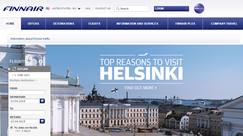
Finnair
This site design has a very clean and clinical appearance, which is good for an airline site. The slide show images are pale and mainly blue and white tones, and the flight search form occupies only a small space on the left of the screen.

Austrian Airlines
This site uses a hero area slide show at the top of their landing page, with both a top and side navigation menu. The top menu is slightly annoying as hovering the mouse over it almost anywhere brings up the huge flight search form. Otherwise, this is a nicely presented site.

Hainan Airlines
I have included this landing page of the Hainan Airlines site because the image is just so beautiful. From this page you are asked to choose your location. When you arrive on their site for your location the images are good, but not the equal of this one!

Singapore Airlines
This is the beta version of the new Singapore Airlines site, where they use a static background image of a local Singaporean scene, and the flight search form takes a large portion of the left side of the screen. Further down the page you can find the airline’s current offers and promotions.

Qatar Airways
This airline uses a full width slide show with a comparatively tiny flight search form obscuring very little of the images. The rest of the page is presented in a magazine blog-style layout.

Bangkok Airways
This airline website uses a very different idea from all the others – a curved filmstrip-style slideshow of six beautiful images. The flight search form on the right does not interfere with any of the images as it sits over the static pattern.

Oman Air
Oman Air use a slide show of five images, four photographs and this illustration that basically thanks you for returning to the site. Each of the other images has the flight search form on the left side of the screen, only this one does not.

Delta Air Lines
Delta get to the point on their site design – there are no animations, no slide show, and a top navigation menu offers all the links you need to navigate their site. The large image shows their main marketing tool: the inside of their planes, so what more is really needed?!

Emirates
This is another understated airline website. They use an image of their smiling staff as a hero area, and a red navigation menu on the right side of the image is easy to spot. As you scroll down the page for the first time, the flight search form appears at the top of the page. This can be closed and it doesn’t appear again. The rest of the page, as you scroll down, is presented in a magazine-style layout.

Thai Airways
This is the Indian version of the Thai Airways site. It has a full width hero area slide show – to move it on manually, it has titles rather than just dots, diamonds, boxes, etc. All of the images have a purple hue and have the main focus point on the right, leaving room for the flight search form on the left of the image. Another, smaller slide show just below this hero area shows the airline’s current promotions.

Conclusion
Designers and developers have solved the difficulties of text-heavy airline site design in a few different ways. These examples are among the best of the top 100 airlines of 2014, and all of them show how designers address different issues that are involved in designing a site for an airline. The main things they have had to address are: placement of flight search form, showing promotions, including beautiful images and ease of use. Airline sites probably more than most others need all of these issues solved on the landing page, and designers, as usual, have risen to the challenge admirably.
Have you come across any airline sites that you think should have made this list? Conversely, have you come across any badly designed airline sites that are difficult to find your way around? Please share your links and opinions with us below.


