
The approach of using a color differentiation is the simplest way to establish a focal point on a chosen part of a screen as well as guide the user’s eye directly to key blocks, break the monotonous content flow into digestible parts, and naturally emphasize necessary messages.
In short, being an elementary, ubiquitous and quite essential embellishment instrument, the color – in capable hands – can easily replace any marvelous illustration, spectacular image or lavish ornament, managing to produce a stylish and complicated design. Not to mention the fact that an effect that is obtained as a result of a skillful combination of various basic decorative tools can surpass all expectations.
Minimal Coloring in Website Design
Color, on its own, is a really powerful tool; so even a minimalist color scheme can add a lot of contrast to a project, giving it a properly balanced, harmonious, energetic, and even complex look. Today we are going to be digging into the notion of using minimal coloring in website design. We take a look at various designs that fall into various offbeat, common and classic color selections, which help to take the design to a whole new level.
Beautiful examples of minimal coloring design concepts
Below you will find our fresh list of website designs that ably utilize minimal coloring.
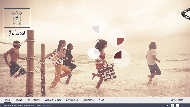
Solasie
Solasie has a hot summer vibe. The designer utilizes a warm muted color palette in order to skillfully support soft seascape pictures.
Derek Boateng
Derek Boateng’s online portfolio is mostly based on a gray coloring, the monotony of which is periodically broken up with green and red colors that are used for emphasizing important elements.
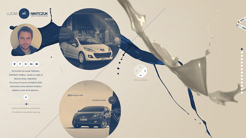
Lukas ‘NK’ Nikitczuk
The designer leverages blue and light mocha as a 2 core color scheme in order to make the website look soft and delicate. An abstract liquid-themed background with a slight 3-dimensional feel in conjunction with numerous circular elements ably establishes an elegant atmosphere.
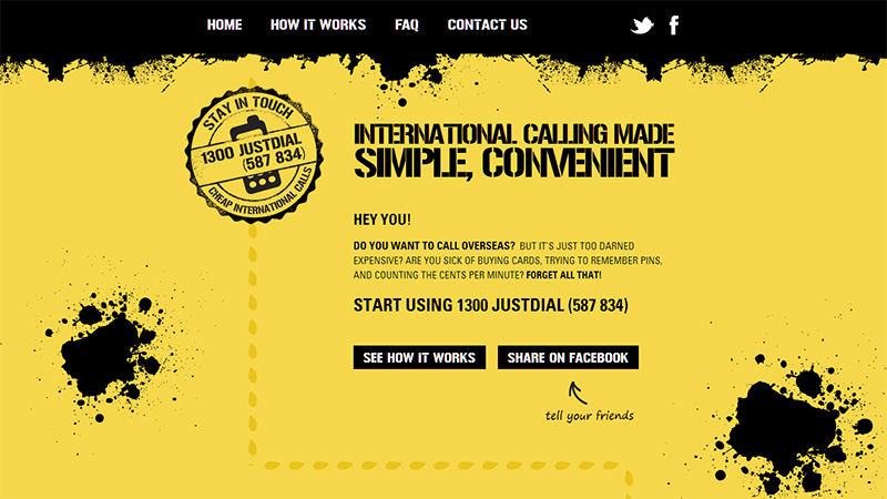
1300 Just Dial
This website, unlike the previous example, looks quite rough and sharp mainly due to the startling contrast between yellow and black that is bolstered by plentiful grunge decorations and strong digital typography.
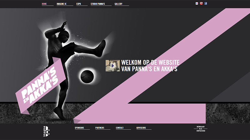
Panna’s en Akka’s
This website has an indisputably sombre appearance. The designer employs a black one-colored background, intentional blackout images, and dark textures to craft a quite enigmatic design that is nicely brightened by a soft pink color. The latter is used to create a distinct eye track from the start to the end of the website.
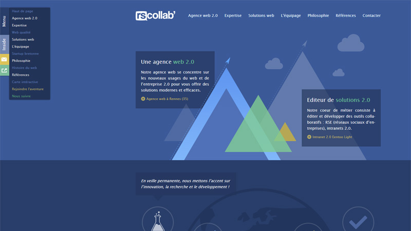
Rscollab
The blue-tone – that is definitely prevalent on the site – sets the proper business-like mood and in collaboration with simple flat geometric illustrations recreates a sense of childish amicability. The designer makes use of 3 basic colors that wonderfully complement each other.
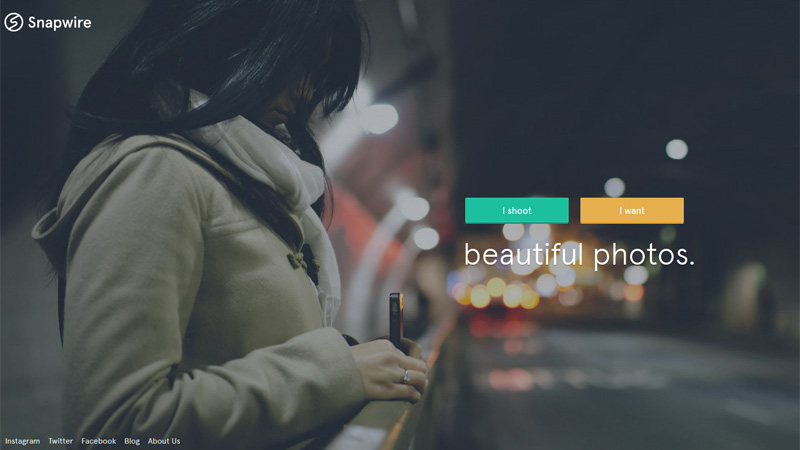
Snapwire
Snapwire has a subtle minimal landing page that includes only a picturesque image that is soaked with urban motives, and a couple of buttons that easily grab users’ attention by means of their contrasting solid color backgrounds.
Bitwip
The designer rigidly adheres to a 3-color palette that adorns the whole website. Thus, the luscious magenta hue is responsible for basic backgrounds, the sharp white for distinguishing type and graphics, and the yellow is used to highlight key points.

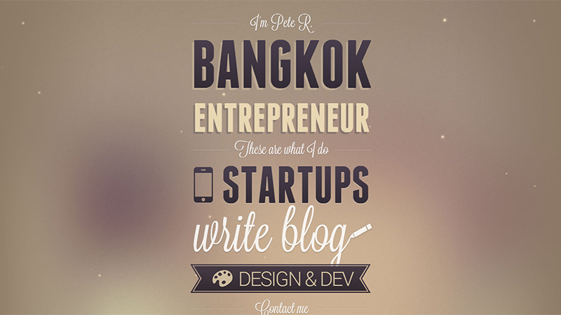
The Pete Design
The Pete Design is a stylish type-inspired mini portfolio that fascinates onlookers by its simplicity and subtlety. The designer does a good job of matching a heavily-blurred brown background with casual and handwritten fonts. All in all, the website looks like a brief and quite pleasant online resume.
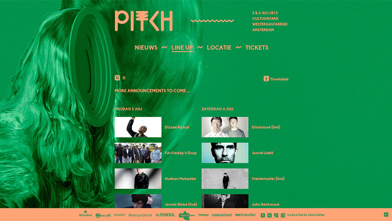
PITCH Festival Amsterdam
PITCH Festival Amsterdam has a rather offbeat but truly eye-catching website that definitely gets this sort of feel from an unconventional color choice. Warm soft shades of green and orange are harmoniously paired with each other.
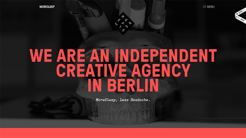
MoreSleep
The mix of black and red can be easily attributed to the classic color scheme that laconically recreates well-balanced design. The effective implementation of flat style gives the website an organized and neat look.
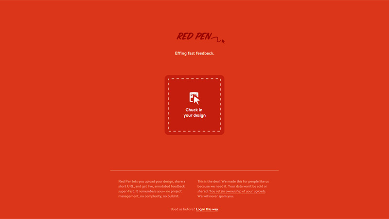
Red Pen
Red Pen is another wonderful website in our collection that ably puts into practice the minimal approach. The designer has applied the rules of minimalism not only to the layout and inner structure – the website consists of only one landing page – but also to the decorative side, using only 2 basic colors, getting rid of all graphics except for a small icon in the center and the logo.
Kerem Suer
Kerem Suer has a pretty darn clean and good-looking website that is based on a neat and gentle light-gray color scheme. The light shade of blue harmoniously balances and enhances the overall design.
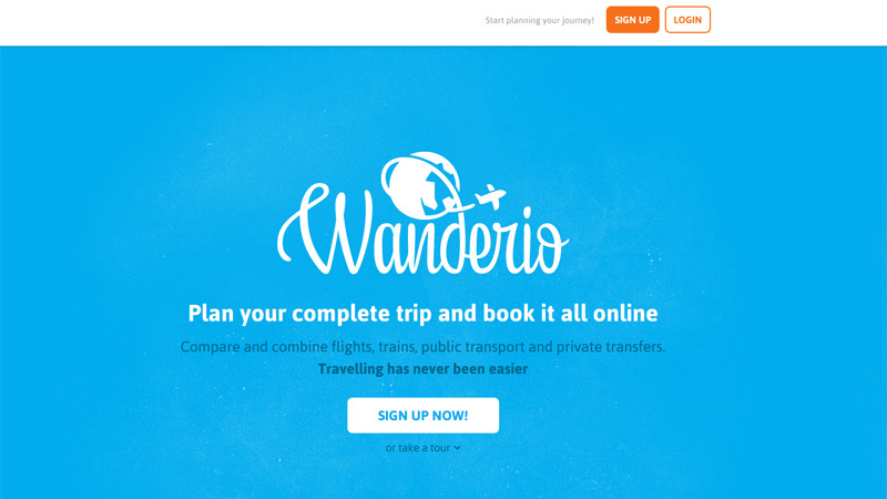
Wanderio
Wanderio has a fairly standard layout of a one-page website based on a vertical parallax. The designer beautifies the site with the help of bright blue and deep orange that work together very well. The predominant white color creates a sense of purity and airiness.
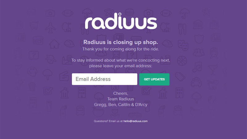
Radiuus
This simple website embraces the idea of minimalism that covers up both layout and coloring. The white type helps effectively to set the text apart from the rich violet background.
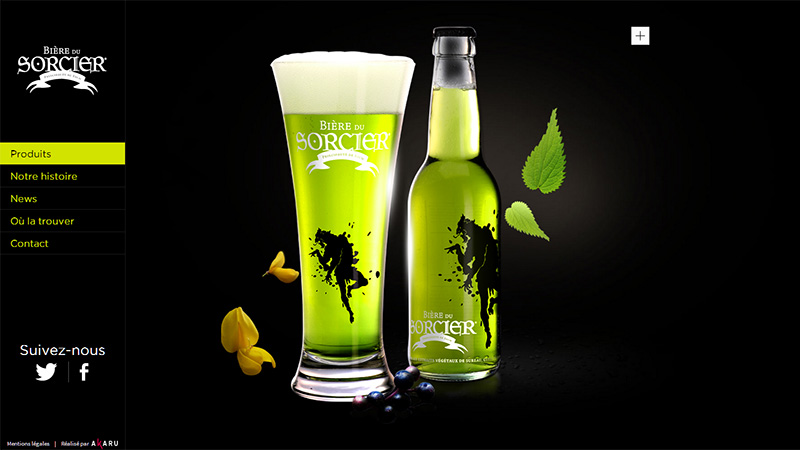
Biere du Sorcier
Here, you can notice nothing more than just an acid green spot of the advertised product and basic menu. The vibrant green-tone instantly draws readers’ attention due to a powerful contrast between the clean black background and glaring foreground elements. In this case, these 2 colors are definitely more than enough.
Kyle Thacker
Kyle Thacker’s portfolio has a dramatic monochrome background with a slight noisy touch that takes up the entire welcome section in order to efficiently draw the eye to huge muted orange buttons. It ably interacts with the white background.

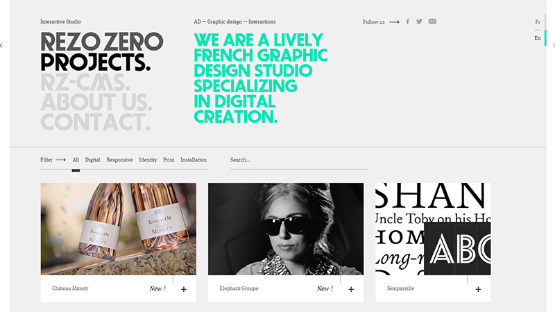
Rezo Zero
Although the website has a content-heavy layout, it looks well-organized and easy-to-explore. The designer was able to cope with a lot of content by leveraging the proper placement and minimum number of colors that help not to clutter up the site.
Romain Briaux
The designer skillfully employs a light bold type, light delicate outline boxes and light neat logotype against a spectacular dark image background. The lack of garish colors makes the website look modest and refined.

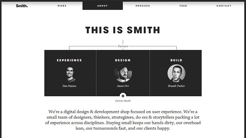
Smith
Smith utilizes a classic black-and-white color scheme that is aimed at supporting the content, naturally setting it apart. The habitual time-proven color combination gives the website a crisp and readable look.
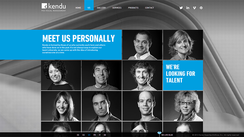
Kendu
Kendu has a clean monochrome design with a set of intentionally unsaturated images. The bright blue color – used as a highlighting tool – easily breaks the reader’s flow and captures attention.
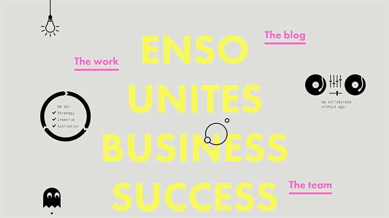
Enso
This website grabs attention with its quite offbeat and unusual look. The combination of energetic yellow and gentle pink colors manages perfectly to balance content with flat black graphics and a gray single-colored background.
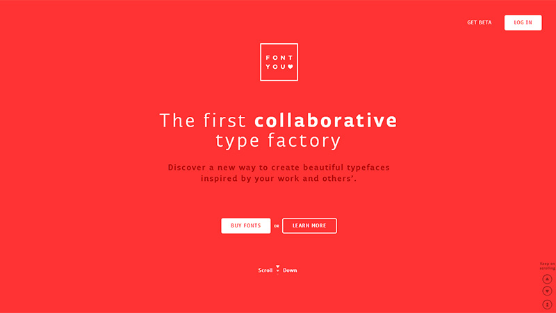
Font You
Font You looks bright and eye-catching. Its harmonious and truly exceptional color choice is what gives the website its unique appearance. Although the designer utilizes only 2 colors, the website manages to look vibrant and visually appealing.
Conclusion
Generally, minimal coloring implies 2 or 3 distinctive matching or, on the contrary, contrasting colors. However, if a layout is based on a muted color palette or utilizes different shades of the same color, it can also be attributed to design with minimal coloring.
Have you seen any website designs that have utilized minimal coloring effectively? What are your thoughts on adopting a minimal coloring design concept?


