
The first thing that springs to mind when it comes to data visualization is, of course, infographics. This sort of visual representation that, as a rule, includes charts, graphs, illustrations and other graphical stuff handles various issues on a professional level. However boring and dull statistics can be, when it is translated into an infographic it takes a different form.
Much like any other means, it has the ability to react to current tendencies and skillfully adapt to the changes thereby maturing and perfecting. From primitive Isotype-like projects to sophisticated visualization artworks, it has come a long way.
The design trends also affect it. For example, while the skeuomorphism held rein: infographics were populated with fake 3d objects and elements with shadows or glossy surfaces. In the era of flat style, everything began to look plain, neat and subtle.
Right now is the period of web-based interactive infographics that employ the latest design trends, high-end techniques and even pioneering WebGL features. Some of them are just basic combinations of dynamic charts and animated icons, while others are more advanced projects that professionally deal with the real-time data and actively cooperate with the readers.
Today we are going to take a look at ten matchless data visualization projects.
Outstanding Infographics
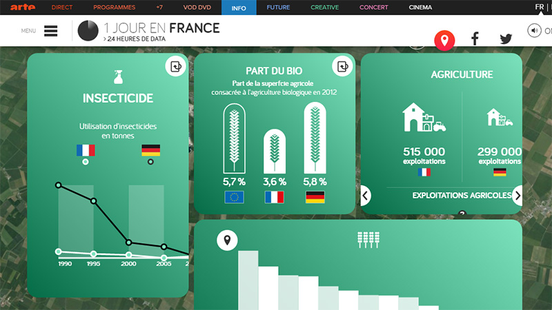
1 Jour en France
1 Jour en France is an outstanding project that is charged with the top-notch techniques. It features a location-based data visualization that is broken into three main parts. The first one is an enthralling quiz; the second one is a reply video experience, and the third one is an interactive circular dashboard with some essential functionality. The statistics are displayed via a card-centric layout filled with simple yet eye-pleasing graphics.
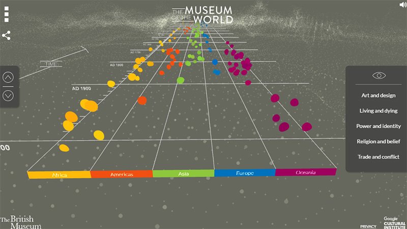
The Museum of the World
When Google is involved, we should expect something incredible and innovative. The Museum of the World is vivid proof of that. The website invites the online audience to join the adventure through history in a fascinating way. It is an inventively reproduced timeline. It resembles a speedway that is enriched with interesting facts presented as colorful bubbles. There are several tracks that identify various continents. You can use key arrows or just scroll up and down to move around.
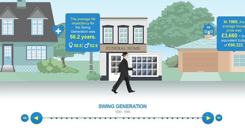
WizzCash
The team behind WizzCash has taken into account the latest research and numbers to illustrate the so-called generation debt. They have come up with a small but absorbing trip that leads through the four generations (Swing Generation, Baby Boomers, Generation X and MILLENNIALS). It demonstrates today’s economic realities and lets you compare and contrast the situations. Here all the facts are at your fingertips: just follow the characters to find out more.
INRA 70ans
It has started as a new way to celebrate the anniversary and gradually transformed into a real trend. Nowadays a great deal of huge companies prefer to acknowledge their achievements publicly through infographics.
In the case of INRA 70, the team has gone far beyond the standard and blessed the readers with a first-rate project powered by the latest interactive solutions. As a result, you can indulge in a mind-blowing visual experience.

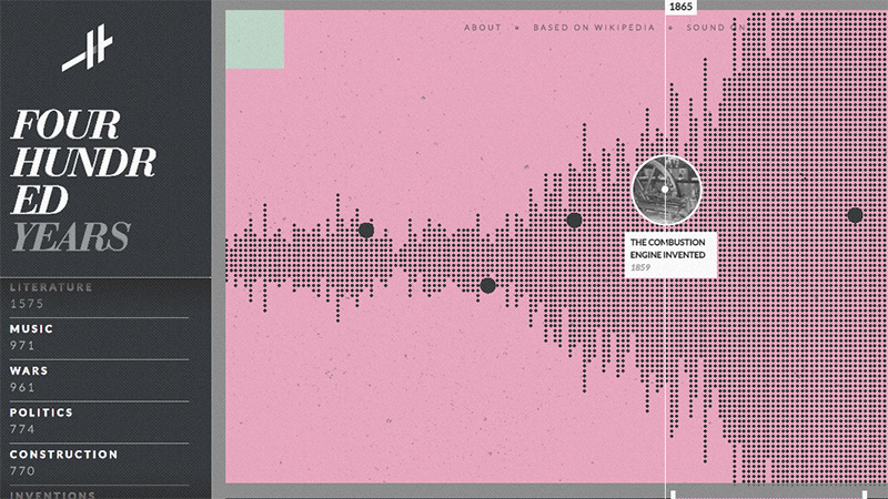
Histography
As you may have guessed from the name, the project is dedicated to historical events. Everything is assembled in one timeline that feels a bit like a scatter plot chart. It traces history from the Big Bang to the present day. Each tiny black pixel is linked to a person, achievement or breakthrough that left their indelible imprint on humankind. You can also sort out data by categories that are displayed on the left sidebar or explore editorial stories.
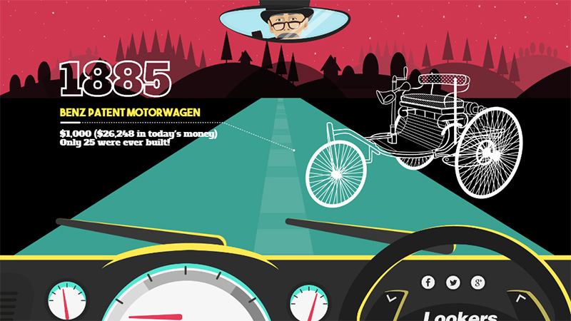
History of Cars
This is another project on our list that focuses on history. This time, it reveals chronicles of events inherent to the Motoring World. Not only does it show the most iconic vehicles but also describes how the industry responded to limitations caused by the economic crisis. The adventure begins with Benz patent (that was filed in 1885) and ends with modern Driver Free Cars. The whole journey is reconstructed with the help of excellent illustrations, parallax scrolling, and subtle little animations.
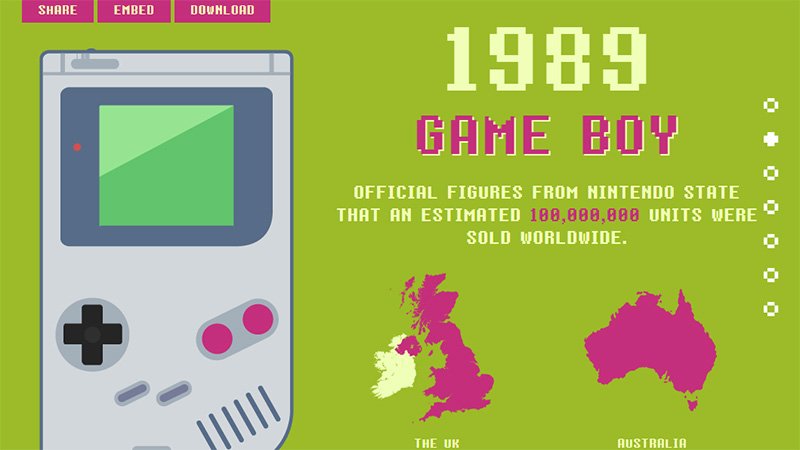
Game Boy 25th Anniversary
Game Boy 25th Anniversary was one of the first projects that had the look of present-day infographics. It was fully illustrated, included several sections that were connected via a typical scrolling effect, featured conventional charts and graphs, used appropriate typography, and perfectly reflected the atmosphere of that period. Even now, it looks interesting, engaging and simply splendid.
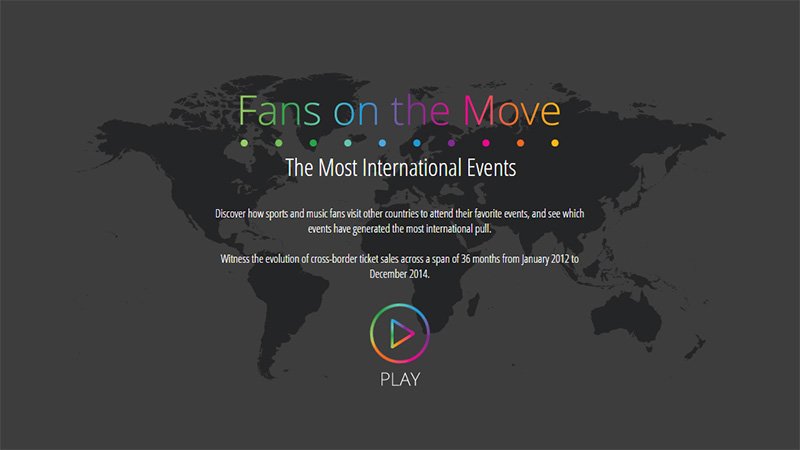
Fans on the Move
Fans on the Move is a website that gets the most out of interactive features and modern techniques. Although the design is simple, its functionality is what really matters. Here you can discover how sports and music fans drift from one country to another in order to visit their favorite concerts or championships. Find out which event was the most popular and crowded, as well as observe the evolution of cross-border ticket sales. The color-coded scheme, several statistics-related widgets and a timeline at the bottom let you efficiently operate the project.
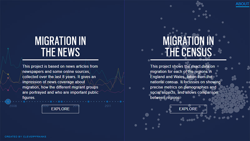
Migration in the census and the news
The project consists of two micro sites. The first one displays data about migration in the news, whereas the second one shows migration in the census. With all that, you can easily compare and contrast the population movement within all the regions of England and Wales. The demographic metrics are presented as regular charts and graphs that are skillfully set in motion. The infographic does not feel boring at all, on the contrary, it looks modern and intricate.
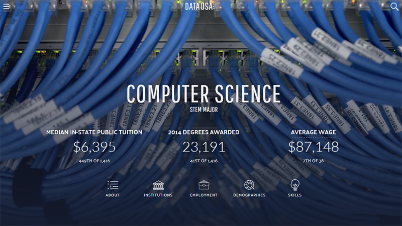
Data USA
Data USA is a massive platform that acts as some kind of visualization engine. It is comprehensive and all-embracing: you can familiarize yourself with the relevant information about numerous spheres, starting from economics and ending with developers and designers. It covers stories about everything: places, occupations, industries, education, etc. All the numbers are carefully collected and displayed in a formal yet pleasant manner. Use it to examine specific stats in order to better understand the targeted audience.
Conclusion
Whether it is a timeline that depicts the history of the car industry or a leading brand, or it is a sophisticated platform that touches pretty serious topics, data visualization projects won’t leave anyone indifferent. They will engage with their exceptional functionality, outstanding realization, inventive solutions and interesting takes on common issues.
Tell us, what example astounded you most? What piece of data seems to be skillfully presented? Which solution looks innovative to you?


