Shapes play a crucial role in web design as they help craft more engaging layouts that guide users through a journey.
Those simple square-shaped info cards, curved background elements, and even the rounded buttons have a purpose. They are not just there to add variety to the visual looks but mainly to influence user behavior and create a more functional user experience.
In this post, you’ll find some creative examples showing how to use shapes in web design to make your website layouts more effective and turn them into digital experiences. Each website will give you a lesson to learn from. Dive in and have a look.
1. Bento Grids

Bento Grids is a trendy and stylish grid-based layout that’s quite popular not just in web design but also in graphic design as well. It uses uneven shapes to creatively highlight information and visuals, giving more attention to important parts while maintaining balance and structure.
2. Interactive Cards
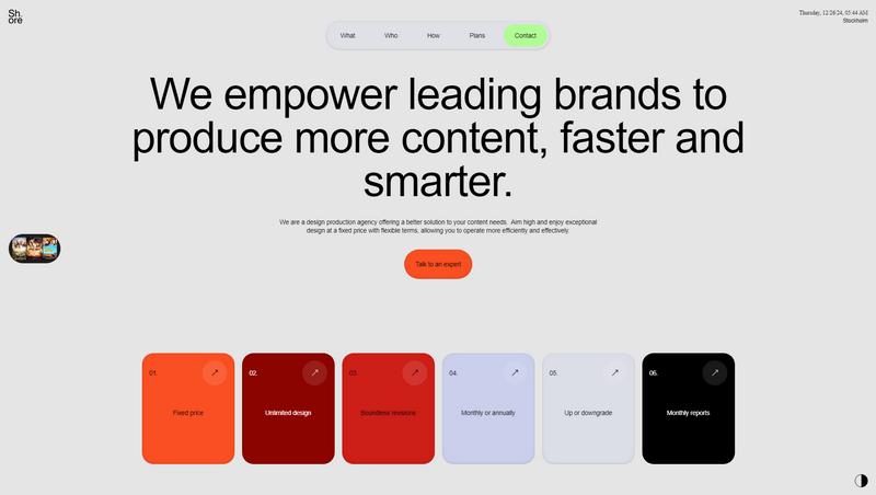
Square shapes with rounded corners are often used in web designs to create info cards. In this example, they are used to create interactive info cards that show more information when you hover over them.
3. User Guidance
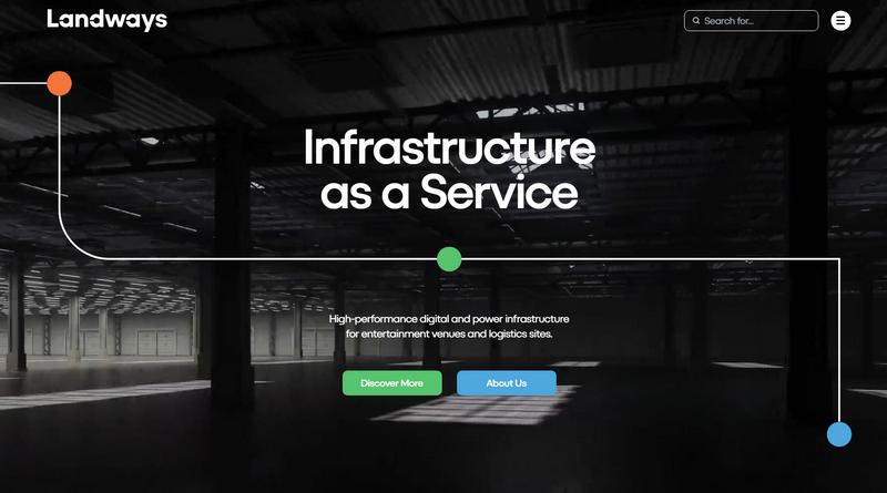
This is a great example that shows the use of shapes to guide users on a journey. Here, the shapes are connected through a line that flows downwards, subtly signaling users to scroll down to explore more. You can see this technique being used across the entire website.
4. Bold Style
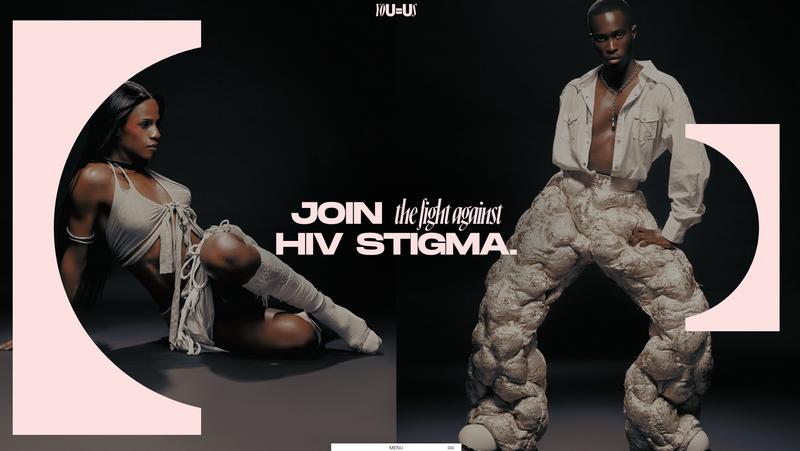
Modern fashion and luxury brands also use shapes as a way to create bold looks and statements. While they don’t serve a specific function, these shapes add a sense of elegance and uniqueness to the website that helps brands stand out from the crowd.
5. Beautiful Chaos
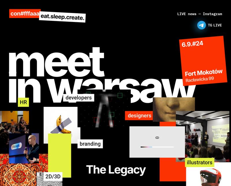
Shapes can also be used to create a unique design, unlike any other website you’ve seen before. In this example, you see a chaotic-looking design made with a mix of various shapes and visual elements. This is a great way to make memorable website designs. However, it doesn’t work everywhere.
6. Modular Designs
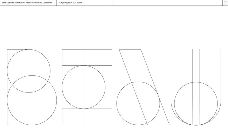
This website showcases the elegance of Spanish architecture through a unique layout. The highlight of this website is its header which features a modular typographic design made up of different shapes. You can follow this example to form unique visuals like logos and letters using shapes in your designs as well.
7. Visual Experiences
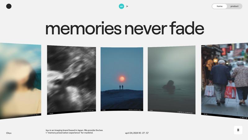
On this website, you can see a rotating section of photographs that creates an automated carousel-like visual experience for the users. A great example that shows how you can use shapes to create animated visual experiences.
8. Shape Overlays
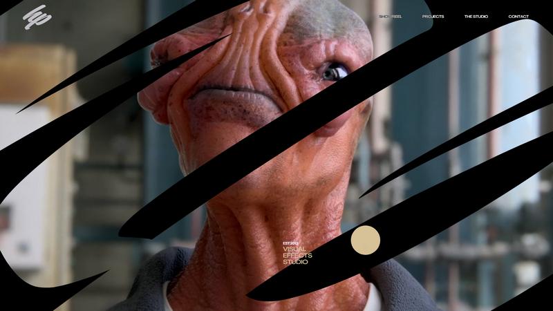
Some websites use shapes as mask overlays to create mesmerizing visuals that instantly grab attention. These “shape overlays” can be used to create animated sections as well as to showcase videos. On this website, the shape overlay is also interactive as it enlarges when you scroll down.
9. Bauhaus Design
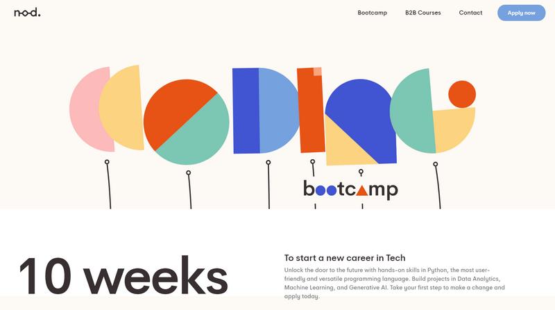
Shapes are at the core center of the Bauhaus design style. Inspired by the iconic school of design in Germany, the Bauhaus design trend uses shapes to create uniquely vibrant designs that stand out. In this example website, the shapes are used to form letters while blending with the Bauhaus style.
10. Feature Bubbles

Feature bubbles are commonly used in web design to showcase specific details and features of products. These feature bubbles come in many shapes and styles as well. Sometimes they look like speech bubbles and sometimes they also take creative forms with curvy shapes, just like in this example website.
11. Geometric
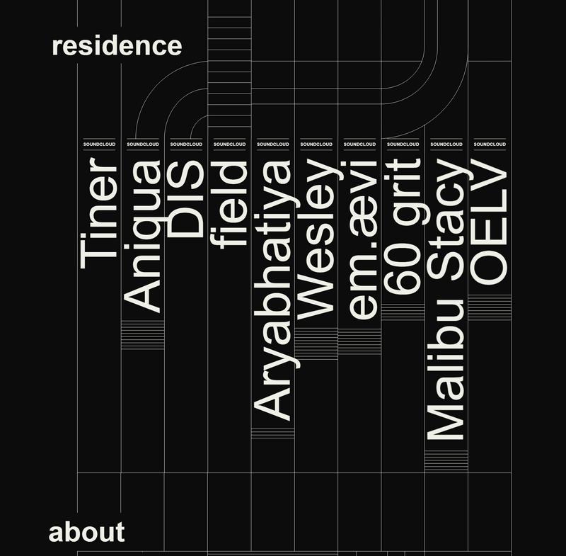
Many websites use grid and column structures to organize content. This website uses a creative approach to achieve that goal by designing a layout that consists of geometric shapes that you can visually see. It gives the entire website a very edgy look and feel.
12. Colorful Shapes
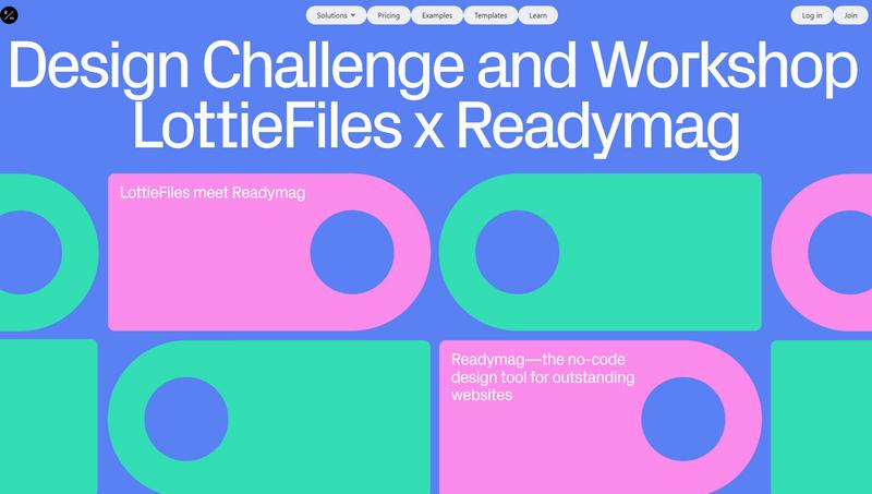
Shapes can do wonders to add a sense of whimsy and vibrance to your website designs as they allow you to get creative with colors. On this website, the shapes are not only colorful but they are animated as well.
13. 3D Shapes
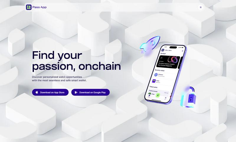
Backgrounds featuring abstract shapes are nothing new. However, on this website, you’ll see something different. It features an interactive background with 3D shapes. These shapes actually move and resize when you scroll through the website.
14. Realistic Effects
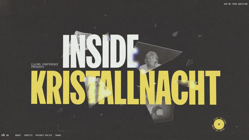
Shapes can come in various realistic forms as well. Whether it’s broken pieces of glass, a window, or shadows, they help add a sense of realism to digital designs. These realistic shapes are also perfect for adding special effects, like reflections, fire, and glow, to website elements.
15. Shapes as Displays
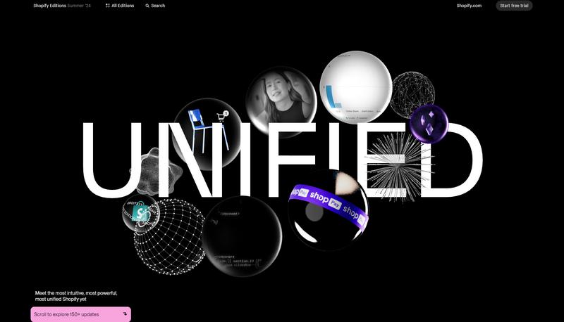
On this website, you’ll see shapes being used as displays to showcase various other visuals such as products, 3D objects, videos, and images. It’s a creative approach that allows you to frame and organize your visuals in a fun and engaging manner.
16. Outlines
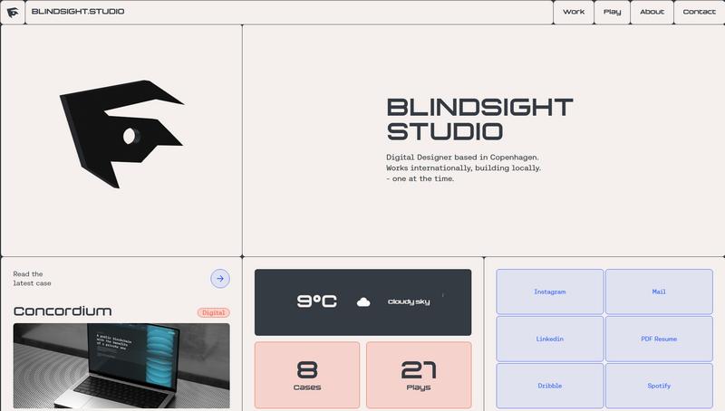
Outlines can be used in many different ways to add a new look to a basic website design. You can use them to highlight titles, products, visuals, and features. In this example, however, you’ll see outlines being used to divide the layout into sections and create a stylish overall look for the entire website.
17. Minimalist Shapes
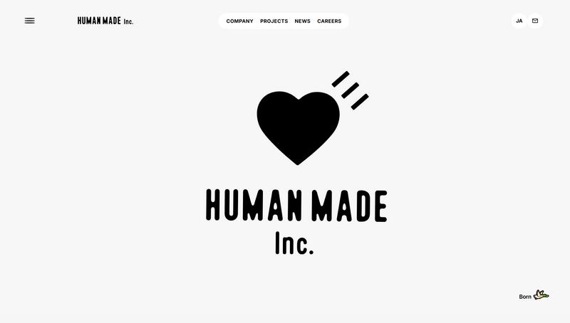
Sometimes, a simple, single shape can do wonders to change the vibe of a website design. Just look how a basic heart-shaped icon gives this website a humane atmosphere that also evokes a soft and gentle mood for the users at the same time.
18. Responsive Grids
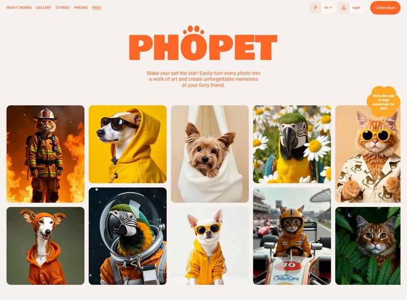
Modular-style responsive grid layouts are one of the most popular styles used in websites, especially in portfolios, to showcase media such as images and videos. This style works well for organizing content using uneven shapes that fit well on various screen sizes.
19. Patterns
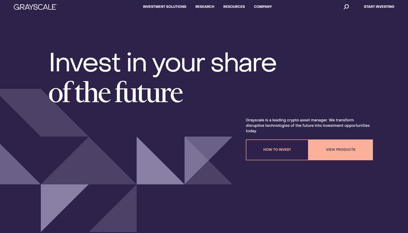
Abstract patterns are another common design element that uses shapes. They help add a point of interest to otherwise empty areas of a website. In this example website, the patterns are also animated and it changes as you scroll through the website.
20. Playfulness
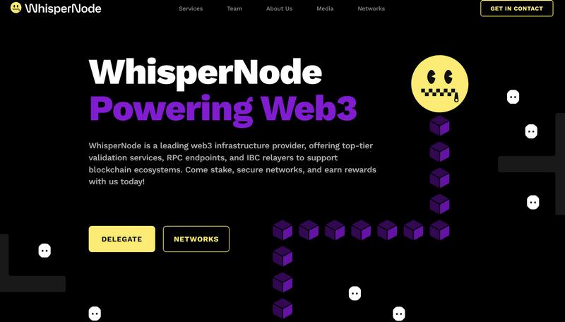
Shapes also come in handy when you want to add a fun and playful look to your website design without having to use too many visual elements. This website uses shapes with a clever approach to create a highly engaging user experience.
21. Interactive Shapes
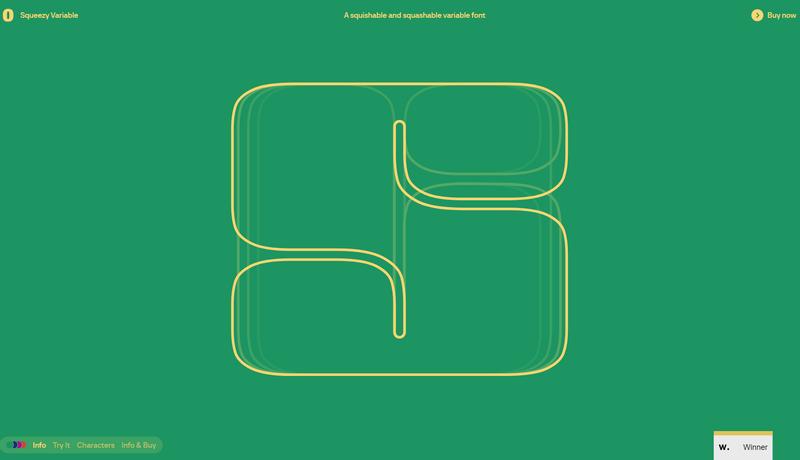
Interactive shapes are the ones that change the shape as you interact with them. These are quite easy to design thanks to the latest advancements of CSS. This website uses this technique quite well to showcase its product, a variable font.
22. Highlights

This is a great example of using simple shapes to create strong highlights. Just look at how it uses a simple rectangular shape to highlight an important part of the text and bring all your attention to it.
23. Abstract Shapes
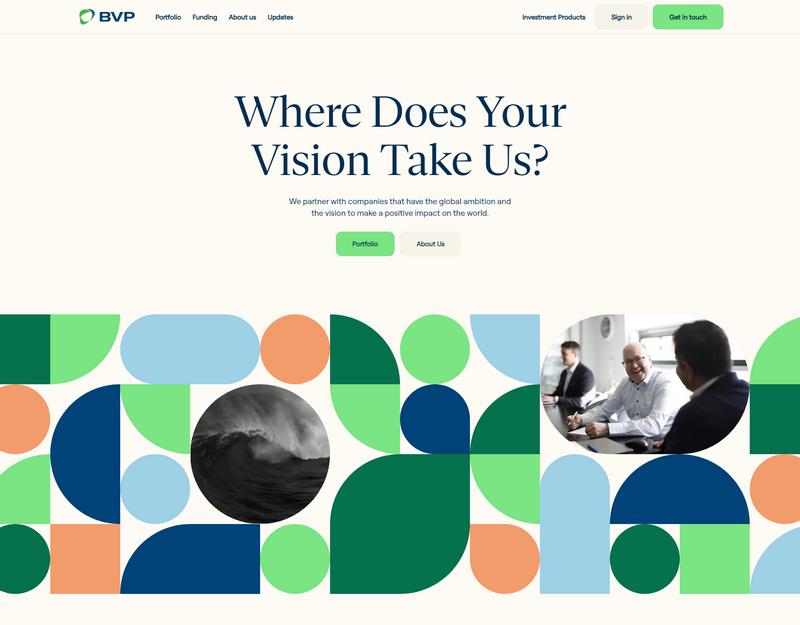
Abstract shapes look great when you bring them together to form beautiful patterns. This website uses this design style across the entire layout to create modern and stylistic visuals showcasing its brand colors. It uses some of the shapes to frame images too.
24. Modular Grid
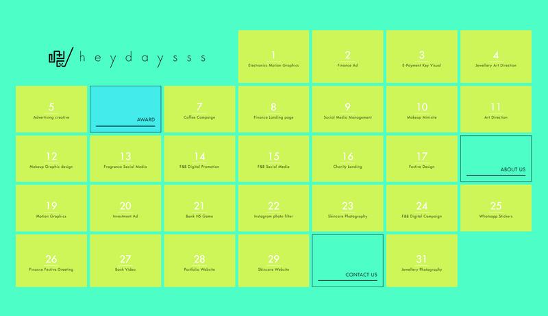
Similar to responsive grids, modular grids are also used in websites to present images and content in an organized manner. The square shapes allow you to showcase more items while taking minimum space. This is, however, a rare website that uses a modular grid to showcase the entire website.
25. Hidden Meaning
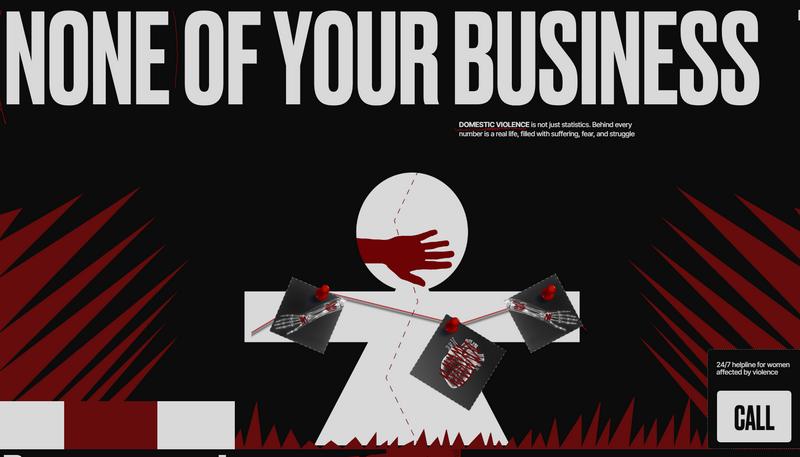
Shapes can be used to create and send powerful messages through various forms of designs. This website utilizes just a few basic shapes to create a visual with hidden meaning and to bring attention to an important cause.
26. Random Shapes
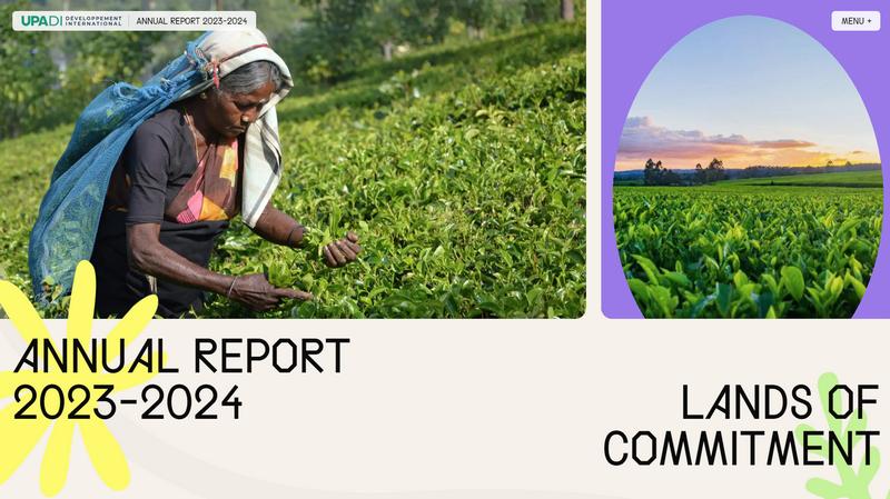
Adding a few random shapes with a touch of bright colors can bring a whole new look to even the most boring-looking designs. This brand website does the same while showcasing its annual report in a very creative way.
27. Fluid Shapes
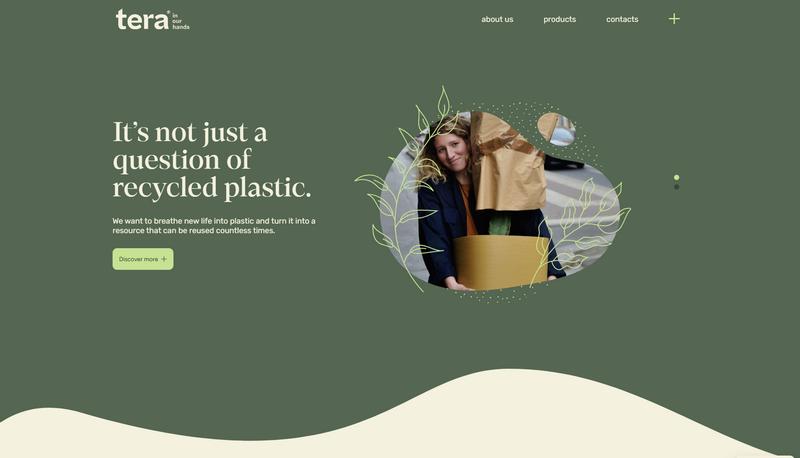
Using fluid shapes is a fun way to showcase visuals, photos, and videos on websites. This style of shapes works perfectly for creating backgrounds as well. If you look closer, you’ll also notice how the site uses a fluid shape to divide the top half of the website.
28. Background Decorations

Abstract shapes and patterns make great backgrounds for modern websites. This site uses a similar approach to create a bold background that offers a high-end look, which fits in perfectly with the brand identity.
29. Cyberpunk Vibes
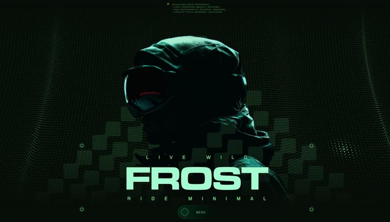
Websites that use cyberpunk, Y2K, and retro-style designs often utilize shapes in unique ways to add eye-catching visuals. From glitching objects to overlapping shapes and backgrounds, these designs are often filled with clever shapes.
30. Puzzles
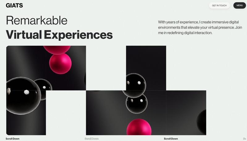
Shapes are also used to create puzzle-like experiences. On this website, the shapes are animated and work as a puzzle that keeps shuffling. It offers a hypnotic experience, making you stare as the shapes dance across the screen.