
Some consider color theory to be a science in itself while others consider it to be also a standard in all forms of design. Either way, we can all agree that the color theory is something every designer should learn and know about.
Whether you’re a graphic designer or a web designer, mastering color theory is an important skill that will not only help you craft more accurate color palettes for your designs but also reach new heights in your career as a professional designer.
In this post, we explain the basics of color theory. It’s a broad subject that branches out to different fields and categories. So this guide mainly covers the elements of the color theory that are most relevant to digital designers.
Let’s dive in.
What Is Color Theory?
The origins of color theory date all the way back to the 1400’s where the principles of color were mentioned in the notebooks of Leonardo DaVinci. However, the first color wheel, or circle, was first introduced by Sir Isaac Newton in 1666.
Color theory can be defined in several different ways and of course, it’s more than just a circle of colors. In general, it refers to the standards and the concepts related to the use of color that can be applied in various types of design and art.
Why Use Color Theory?
There’s a reason why you use the same colors in your designs no matter what type of designer or artist you are—To keep consistency.
Take a popular brand like Coca-Cola, for example. Their logo can be seen in products and billboards around the world. However, the color of the coca-cola logo is exactly the same no matter where it’s printed.
This type of consistency can only be created with the help of the color theory, which helps define colors the right way to help create consistent and accurate designs.
Color theory is mainly used when mixing colors as well. It allows you to create colors with the right contrast, temperature, and hues.
The Color Wheel
The easiest way to understand what color theory is all about is to take a quick look at the color wheel. It’s the rules set by the color theory that helped create the color wheel.
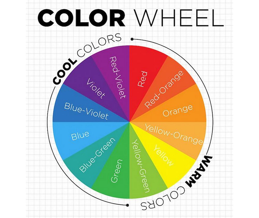
(Source: DecoArt Blog)
The color wheel we use today is a version of the original concept of the circle of color created by Sir Isaac Newton. A quick look at this color wheel is enough to understand how its three main colors (Red, Yellow, and Blue) creates the rest of the colors in contrast to each other.
Then there are the secondary colors, (Green, Purple, and Orange), that are made when the three main colors are mixed. Followed by the rest of the six Tertiary colors that are made from a mix of primary and secondary colors.
The color wheel can also be divided into 2 main types of colors— warm colors and cool colors. When you split the color wheel into two slices you can clearly see these two types of colors in the left and right sides with warm colors and cool colors.
Understanding the difference between warm and cool colors will help you create designs that are appropriate for your brand and audience as each type is associated with different values and ideas.
Important Color Terms
The color wheel is only the foundation that you can use to create more extensive and advanced color palettes. Here are the bases of color, or the terminology, you should understand to apply the color theory when creating color palettes.
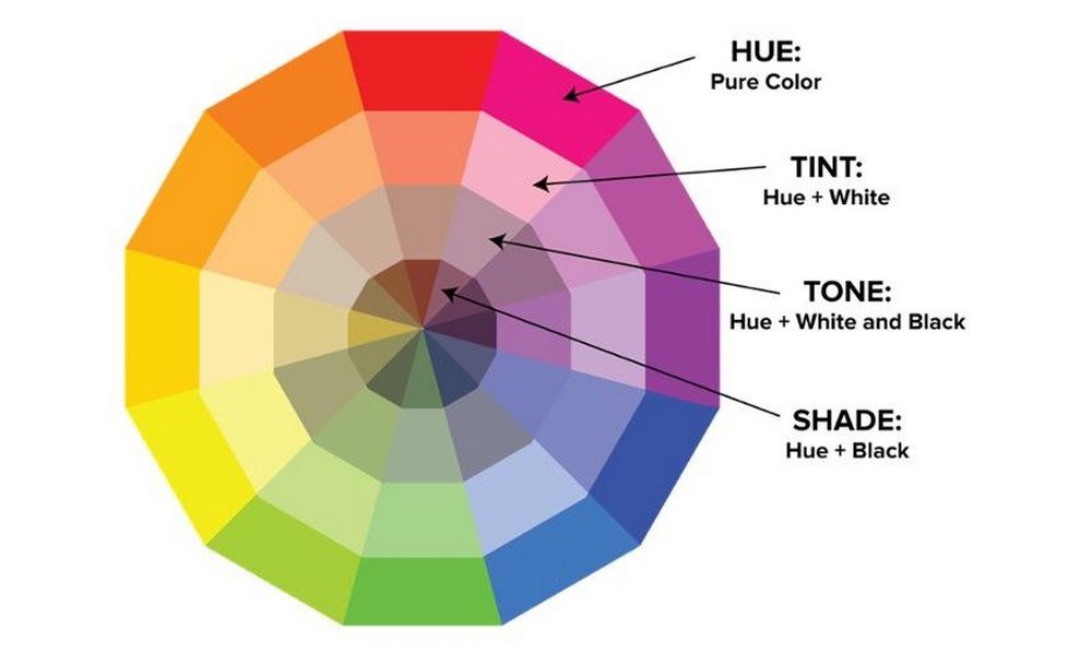
(Source: Reddit)
- Hue: Hue is the base color and nothing more
- Chroma: Chroma is the color in its purest form
- Saturation: The vividness of the color
- Shade: When you add back to a hue it creates a shade
- Value: Value refers to the darkness or the lightness of a color
- Tint: Adding a certain amount of white to a hue creates tint
- Tone: Add some gray to a hue to create tone
The 4 Main Color Schemes
Well, there are actually more than 4 color schemes out there, but for purposes of understanding, we wanted to briefly explain the 4 main color schemes used in design.
These are the main color schemes you can use as the base for your color palette when designing different web and graphic design projects.
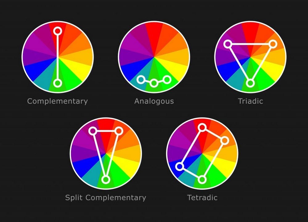
(Source: Suppachok N/Shutterstock)
Complementary: Complementary colors refer to the main colors that stand opposite to each other on the color wheel. You can add tint and shades to create unique color palettes using a complementary color scheme.
Analogous: Analogous color schemes to use the main colors right next to each other on the color wheel. This type of color schemes are quite vivid and are most suitable for casual and consumer brands.
Monochrome: Monochrome color scheme uses different shades of a single main color. This is one of the most difficult color schemes to implement in a design. But when you find a way to create a monochrome color scheme, it usually looks quite elegant.
Triadic: Triadic color schemes consist of colors that stand at the same distance to each other. This type of color palettes are mainly used in modern art and paintings and doesn’t look very pretty in digital and graphic designs.
The Psychological Effects Of Color
There’s also a psychological aspect behind colors as well. The color psychology suggests that specific colors are capable of evoking different emotions in humans.
It’s the same reason why we know when to stop and go at traffic lights based on nothing but a colored light. It’s also the reason why we’re immediately put on a state of alert when we see a red STOP sign on the side of the road.
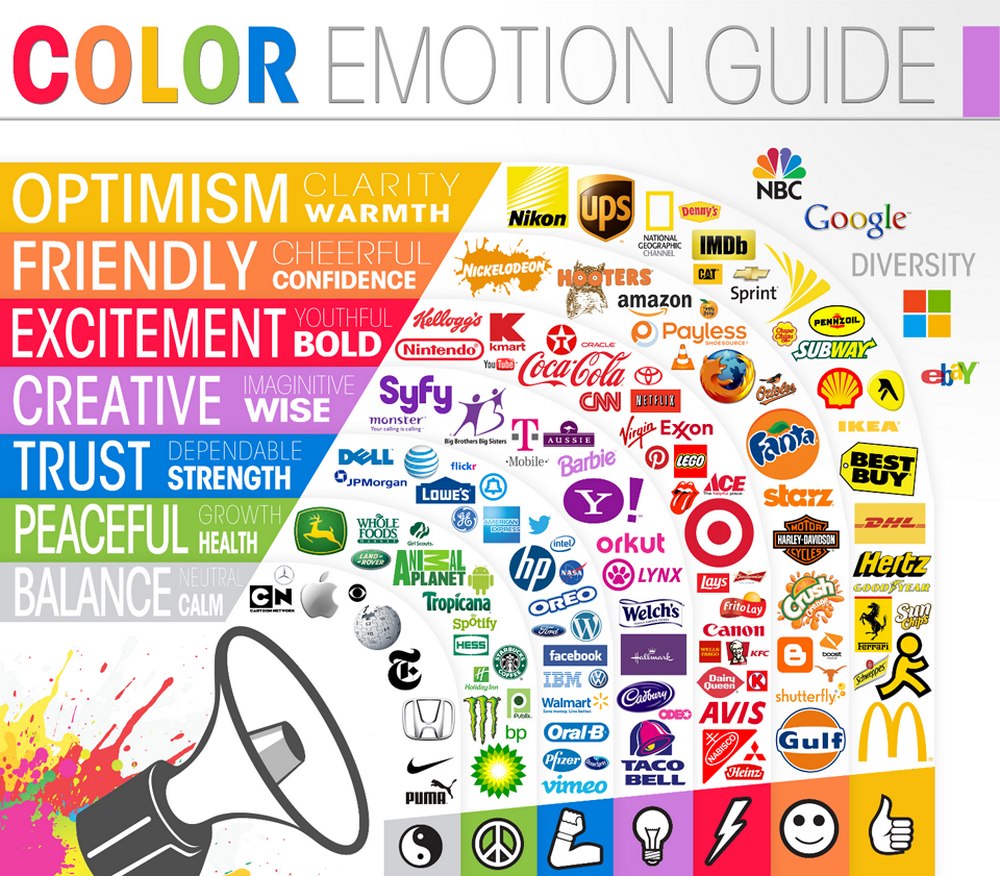
Color psychology is also cleverly used in marketing and design to generate more sales and attract attention as well. Whenever we see a red sign next to a product in a supermarket we know it’s up for sale. It’s used to influence buyers and also help them make quicker decisions as well as to improve brand recognition.
This is why brands like Dell and Facebook use the color blue as it associates with trust and dependability while large enterprises like Google and Microsoft use multi-colored logos as it associates with diversity.
Examples of Color Theory In Action
There’s no better way to understand the use of color theory than seeing how other designers have used it in real-life designs.
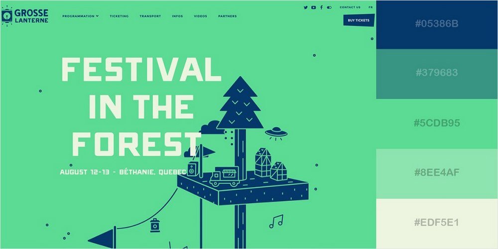
(Source: Awwwards)
This website is a great example of a properly crafted brand website that uses color theory accurately. This site uses the analogous color scheme to create more contrast and attract attention.
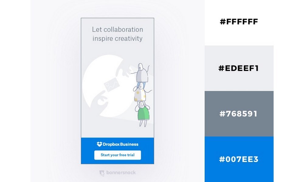
(Source: BannerSnack Blog)
This beautiful advertisement created by Dropbox uses a minimalist monochromatic color scheme and it’s a perfect fit for the brand itself as well.
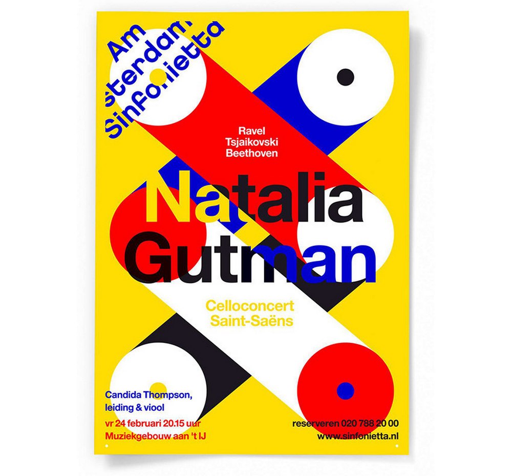
(Source: Designspiration)
At first glance, you can spot the triadic color scheme used in this poster design.

(Source: Designspiration)
This is another beautiful example of analogous color schemes in action. Notice how this album artwork uses analogous colors to create contrast in the design.
In Conclusion
We hope this guide would help you to get a better understanding of how colors work to create more professional designs in the future. Color theory is a topic that deserves closer inspection and we hope you’ll continue learning more about this subject.
In addition, you may also want to read our guide on 20 Best Tools to Generate Color Palettes.


