
Everyone who lands on your page wants information. And they want it fast.
A comparison pricing table is the best thing you can add to encourage sales and get people to act. This page element can help you push products based on relative value, and help visitors compare different products at a glance.
But how should you design your pricing tables? Which features should you compare and what do users really look for?
Let’s dig into comparison pricing tables to see how they work and what purpose they serve on the web. Whether you’re launching an ecommerce shop or comparing products in a blog review, these tips will undoubtedly help you get started on the right foot.
Intro To Comparison Tables
So what is a comparison table? It’s really just an HTML table with columns for different products and rows that compare features for those products.
This is often called a “pricing table” because it’s used by so many SaaS tools who offer different plans at different prices. The goal is to share information quickly so users can check which plan they might want.
But you can also use pricing tables for physical products or collective deals. Think about comparison tables as expedient research elements for smart shoppers.
Customers look over data before ever deciding what to purchase. If you can provide all that data in one table then you’ve made an invaluable resource that’s sure to encourage shoppers to buy.
You goal should be multifaceted but a great comparison pricing table should at least:
- Lay out all the possible options(or best options) to buy
- Include the price for each option
- Compare the main features and benefits for each option
Let’s look into some design trends for comparison tables to see which features you might want in your own table.
There is no single “right” answer because each product is slightly different. But the best tables are easy to use and clearly labeled with information that’s genuinely valuable to customers.
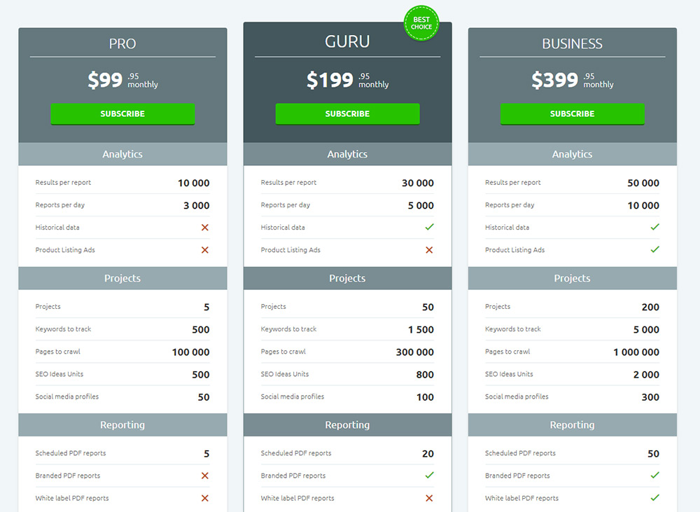
Highlighting Recommended Plans
I see this on pretty much every pricing table. It’s a trend where you highlight one column to recommend as the “best deal” or “popular choice” for most buyers.
Typically this is not the cheapest plan/item, but it’s whatever offers the best deal for the money. You can use this with buyer psychology to sell customers on whatever plan you want.
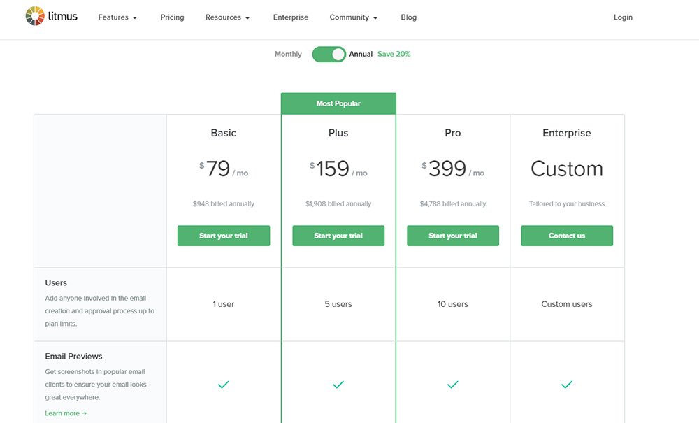
Take for example the Litmus pricing page. This runs a pretty large table with many rows comparing features between each plan.
The highlighted plan likely isn’t necessary for everyone. But it’s much more open than the basic plan offering more features for email testing. Plus it doesn’t really cost much more than the default so it’s a safe choice.
You’ll find a similar example on Slidedeck although they only offer three specific plans in their table.
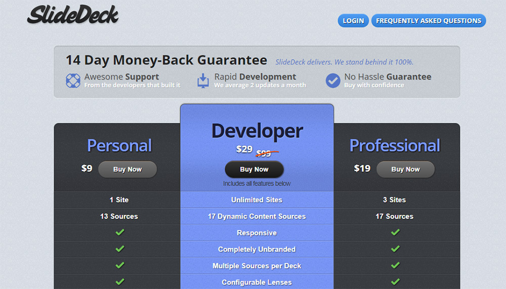
You’ll notice the center column is designed in a completely different color and style. It also includes a drop shadow to appear “on top” of the other elements.
This illusion makes it seem like the center column is jutting out of the page towards you. It feels closer to the user and thus encourages more interaction.
Granted it’s also the priciest plan so there’s good reason to push this on customers.
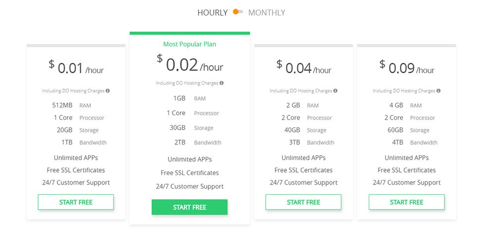
For something a little more subtle Cloudways does a good job with their table highlight effect.
Really you can use whatever design assets you want to help the column stand out. Border colors, background colors, icons, ribbons, larger text, larger CTAs.
The goal is to design a table with one column clearly appearing better than the others. It may not rapidly increase sales but it’s likely to make a difference.
Spacious Data Comparison
Remember that users really only care about information. Your job is to present that information clearly and concisely.
This means your pricing table should be designed with plenty of space surrounding each row and column. You should look around the web for other ideas but don’t just copy from one source.
Instead plan your table based on the type of information you’re sharing and whatever’s the most useful to your visitors.
I really like the Wufoo pricing page because it’s so sleek and easy to skim. The tables themselves have a neutral color scheme so any extra colors really pop(the blue and green highlights).
Plus you’ll notice that certain words in the table are colored darker & bolder to stand out. This makes skimming a lot easier with all that extra space between content.
And which bits of text are bolded? The numbers of course!
Total price, stats, measurements, subscription times, this is all important info to buyers. Present the information they care about and make sure it pops.
Another example of a spacious pricing table is SEMrush. This again uses rows with dividers to help the information stand out while skimming.
Plus you’ll notice the label text for each row is much smaller and harder to read, but the data is crystal clear and super dark.
Try to place yourself in the shoes of an average shopper. Does your table make it easy to find information? If not, why?
Usually space and emphasis are two solutions.
Focus On Valuable Info Only
I keep mentioning information because info really helps sell a pricing table. But what sort of information is the most valuable?
Obviously the price for each item/plan should be prominent. Same goes for the features your product offers(ie. hosting , content creation, banner design).
Take a look at the Shopify pricing page for one example.
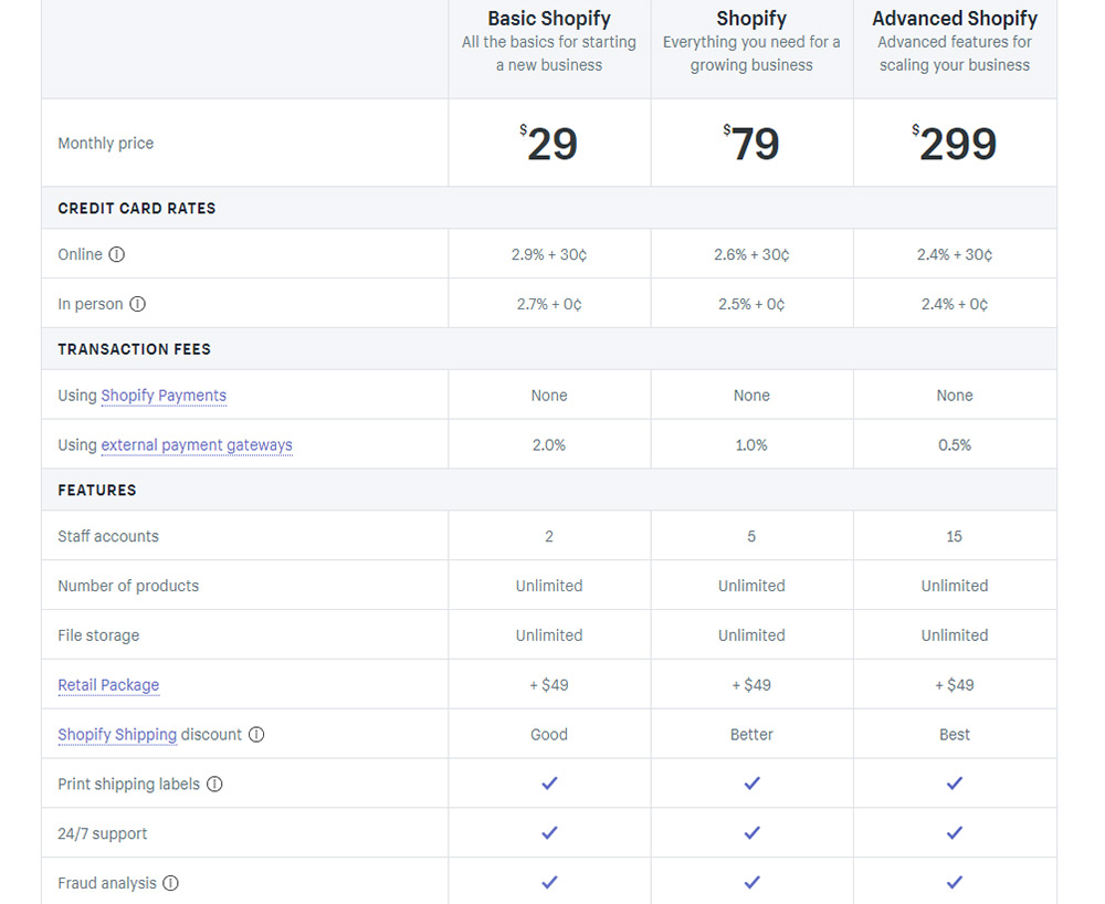
They start with a huge list of pricing details including monthly fees and surcharges based on sales. This gives each customer clear information on how much they’ll pay depending on the plan.
But lower in the table you’ll find comparisons for the total number of products, staff logins, and extra features like gift cards.
Again the goal is to think like your customer. What feature(s) might sway them to buy? Include those in your table and make sure they’re easy to skim.
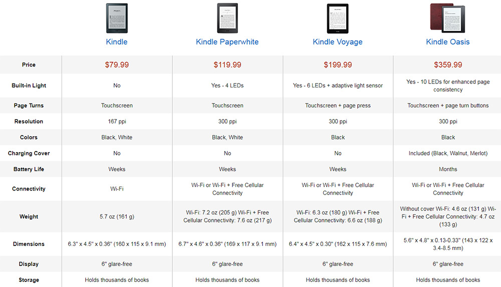
You’ll often find similar examples on Amazon’s product pages. These compare one product against similar models so prospective customers know which ones to buy.
I find this works best for physical product comparisons because you’re often comparing the size, price, and extra features(or lack thereof).
I can’t tell you exactly what to compare but as long as your table would encourage someone to buy then you’re probably doing it right.
Add Visuals For Clarity
Little icons and illustrations can really up your pricing table game. But they should be relevant to your layout and easy to consume.
The folks at DNS Made Easy do this right by adding the logos for each major DNS service and comparing them equally.
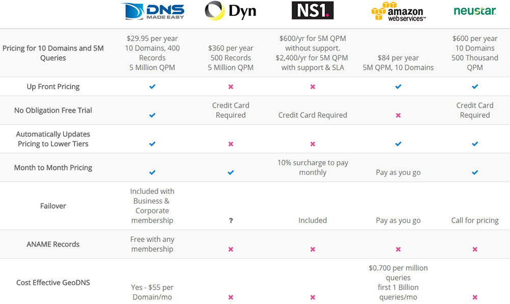
If you’re comparing different products or companies in a review then definitely consider this method. It’s an excellent way to draw attention to one product by comparing it against others.
But you can also use illustrations to customize your plans with unique branding.
Take for example the Freshdesk pricing page full of custom icons for each plan.
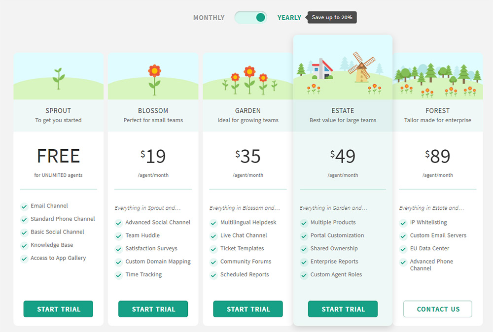
These icons don’t relate directly to the company or the product. But they help you visualize which plans are “bigger” than others so you can tell where you might fall based on your needs and budget.
Add Clear CTAs Somewhere
The buyer should know exactly where to click if they’re interested to purchase something from your table. This is why you need a CTA button and you want one for every product or plan in the table.
CTAs are a hotly debated topic because these are the buttons that help users take action. These buttons are the doorway from your comparison table to the checkout page.
Every website’s CTA will be different but they should all be prominent and easy to find.
TypeKit’s pricing page uses green buttons to stand out and grab attention. The text “sign up” is also crucial because it tells you exactly what happens when you click.
The only green elements on this page are the CTAs so they’re pretty clear. This again helps buyers skim the table at a glance.
You’ll find similar buttons on Desk.com but their pricing table uses alternating color schemes.
This ultimately affects the button color so that it blends with the featured column. A nice example of combining two trends together into one table.
Also the button text “start free trial” is unique because it implies no charge for new users. Whether this increases conversions I can’t say but it’s certainly worth testing.
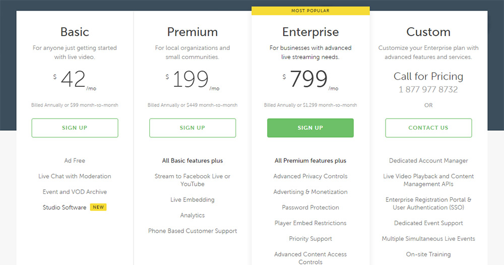
And if you wanna mix different styles try the ghost button technique like on the Livestream pricing page.
With empty button colors you can still help them stand out by adding a border. However the button with a full background is absolutely going to jump off the page more than the others.
Search around the web for CTA design techniques and try a whole bunch of styles. You can even use A/B testing on your pricing table to see which button style converts the best.
Moving Forward
With all this knowledge you should have plenty to go on for making a rockstar pricing comparison table. Study some other examples online and see if you can pinpoint other relevant trends.
It’s always good to study other designs just to see what everyone else is doing. But don’t let that be your end-all! Build onto these ideas using empathy and UX techniques from popular case studies.
Over time you’ll find the perfect way to structure a usable pricing table that converts and helps visitors find the info they need.


