
Flexbox is a layout module system that does not need any introduction, especially for those who uses CSS on a daily basis. It is a real life-saver when it comes to laying out blocks, arranging them, and distributing space among the items. The problem of centering blocks within a container that once was a nightmare has finally disappeared. That is a huge relief.
Although Flexbox was introduced several years ago, there are still coders who feel a little fuzzy in this matter. For all those folks, we have prepared a small collection to help. As learning something by example can be more productive, we have included interesting code solutions that can help you grasp the basics of the layout module so that you can successfully use it in your projects.
Flexbox Visualization
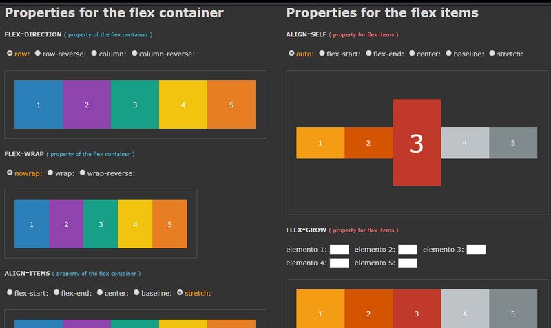
1. Flexbox playground by Gabi is a comprehensive guide to Flexbox. Each property is graphically represented and provided with the set of options so that you can experiment with its variations and see a result for yourself. It is divided into two parts: the first column is for the container, and the second one is for items. Clean, neat and apprehensible.
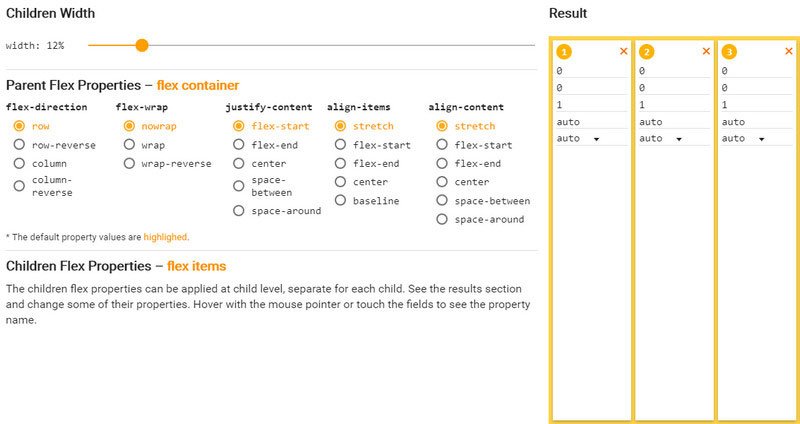
2. Flexbox Properties Demonstration by Dimitar
Much like in the previous example Dimitar has also created a tool for showing Flexbox properties in action. All you have to do is to set options on the left and preview the result on the right. It covers all the properties and their variants for parent and children.
Grids
Although Flexbox is considered to be a one-dimensional solution, yet it can be truly beneficial for building regular not-complicated masonry-like layouts.
Note, for more complex structures use a Grid.
3. A Better Responsive Image Gallery With Flexbox by Dudley Storey
Dudley Storey has focused on the common problem of all the modern responsive galleries these days. The issue lies in the fact that there always will be one child who will drop off the edge and hang by itself when the screen narrows down. Using Flexbox, he sorted out all the wrapping making changes in structure and display of blocks smooth, consistent and elegant.

4. Flexbox Card Grid by Craig Anthony
Craig Anthony shows a classic card design where all the content both visual and contextual skillfully packed inside a box. Boxes elegantly grow and shrink whereas the number of columns changes depending on the screen size.
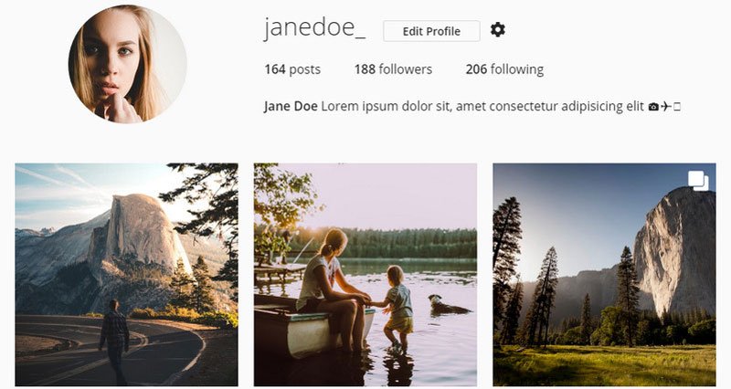
5. Instagram Profile Layout with CSS Grid & Flexbox by George W. Park
George W. Park is one of those who took smartness of Flexbox and put it inside a Grid, another module system that was created to sort out all the issues with 2-dimensional systems. As a result, his take on the Instagram layout is just perfect.
If the previous example seems to be not as grandiose as you wish we recommend exploring Kyle Lavery’s take on Google Play Music Website that includes much more than just three-column layout and a header with info. His concept comprises a search field, two menus (one of which is hidden behind the hamburger button) and of course the multi-column and multi-row grid layout whose behavior on smaller screens is outstanding.
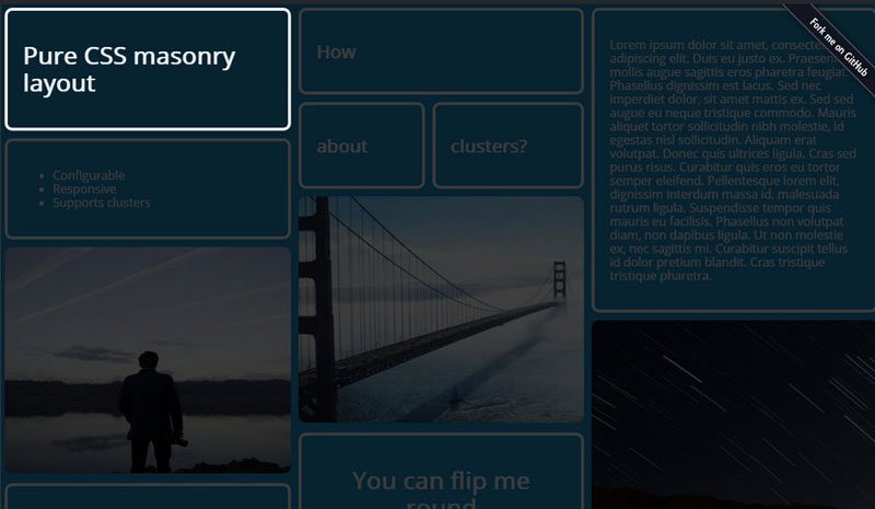
7. Pure CSS masonry layout w/ Flexbox by Jhey
While all the previous examples feature cells with equal height and width, Pure CSS masonry layout w/ Flexbox by Jhey is an intriguing solution where cells have different heights but still strike a harmony. This is a pure masonry three-column layout. Some of the cells even have different widths. Explore the pen to get the idea of realization.
8. Flexbox Madness by Joe Beason
As the title states, this is a crazy work with Flexbox properties. And it indeed is worthy of attention. Joe Basson has recreated a tournament style bracket showing the whole power hidden inside this box system.

9. Skewed Flexbox Panels by Ryan Mulligan
And the last in this subsection is Skewed Flexbox Panels by Ryan Mulligan. The project stands out from the crowd with its original appearance. As it turned out Flexbox can be used as a heart of such offbeat skewed layouts as well.

Boring problems – easy solutions
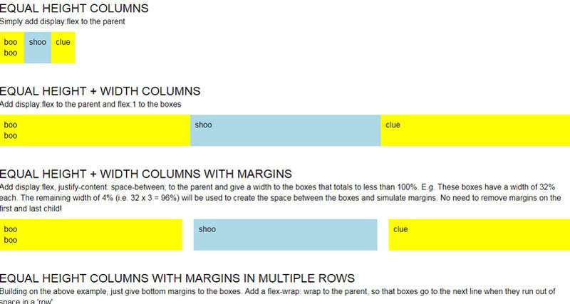
10. Equal Height and Width Columns using Flexbox by Karen Menezes
The title speaks for itself. Karen Menezes shows how to sort out one of the most burning issues: creating blocks with equal height and width. With Flexbox everything is easy peasy, take a look at the solution and find it out by yourself.
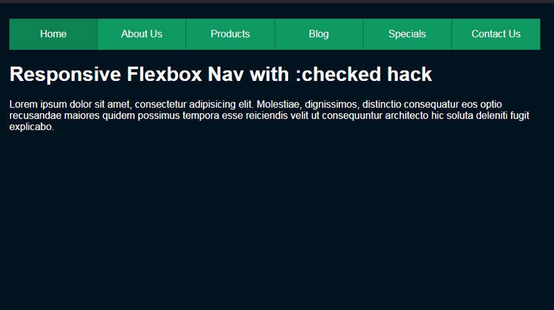
11. Responsive Flexbox Nav w/Checkbox Hack by Joe Watkins
Creating responsive drop-down menus has never been easier with Flexbox. Joe Watkins showed this in practice. His pen demonstrates a typical top bar where navigation lies. On smaller screens, it transforms into a hamburger menu.
12. Image carousel by Veronica
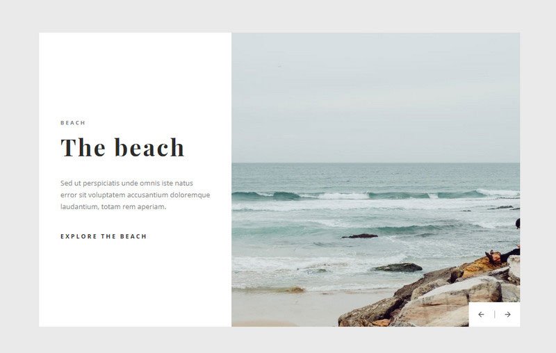
Image carousel is one of the most common components in web design, and Veronica shows how to create one using Flexbox powers. The latter is responsible for creating a sleek layout that consists of two parts skillfully covering content, accompanying visual material and arrow-based navigation. To make it alive, the artist uses jQuery.
Last but not least
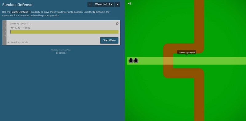
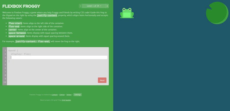
For those of you who adore learning something new in a playful way, we recommend visiting Flexbox Defense and Flexbox Froggy. Both these projects are small games that offer novice developers a playground where they can learn the basics of Flexbox and at the same time get fun while sorting out exciting tasks. Here you will be moving from one level to another using various flexbox properties to overcome obstacles. While Flexbox Defense is a classic tower defense game where you should position your towers, the Flexbox Froggy is a game where you should guide frog to the Lilly pad.
Conclusion
Flexbox, perhaps, was one of the most awaited CSS layout modules. It has solved so many common problems that we could not help but enjoy its benefits and put it into play wherever we can. Indeed it marks an era of sleek, elegant web interfaces with hassle-free code and gracious behavior that everyone with a solid base can handle.
Also, if you need more terminology and basics there are several outstanding guides out there: